Sunday, May 21, 2006

UFO Maps

Alright, this really tickles me: UFO Maps, brought to you by a mash up of Google maps and the National UFO Reporting Center.

Click on a cute little flying saucer graphic and you can find the report associated.

Edited to add: Here's another good one: Real-time satellite tracking over Google maps. Real-time in that the little satellite graphic moves as you watch, and the map shifts under it.

Friday, May 19, 2006

Joel on Being in Control

Excellent post by Joel Spolsky on the latest release of his bug tracking software, with a lot of design observations: FogBugz 4½ and Subjective Well-Being - Joel on Software. Complete with management advice, tying back to the theme that management is design too.
...the most important thing that I learned in Psych 110, the idea that when people are successful at controlling their environment they become happier, and when they can't control their environment, they get grumpy.

How do you achieve delivering a feeling of control to a user in an application? Well, good feedback and speedy response are critical elements, otherwise the user doesn't emotionally connect her action to the resulting behavior of the software. Oh, and predictable outcome from user action, of course.

Also, drat him, he got one of my hobby horse design ideas that I never understood why we didn't do at Adobe (I know that's ungrammatical)... A toggle to reveal to you the keyboard shortcuts for each app buttons so all you have to do is look and then type it. No annoying mouseover in order to find out and then force one to remember it. So simple, so obvious, so NOT DONE ANYWHERE (that I've needed it, anyway).

Brett also snuck in a feature he's been itching for: lots and lots and lots of keyboard shortcuts. There's only one keyboard shortcut you have to memorize, though: Ctrl+; switches FogBugz into keyboard mode and little letters light up reminding you what the shortcuts are for various commands around the screen. It's really pretty cool to be able to work through a bunch of cases, assigning, editing, and reprioritizing, without ever reaching for the mouse.

Monday, May 15, 2006

Mt Auburn Cemetery, Cambridge MA.

Saturday, May 13, 2006

Management, Design, Evidence

Another one on Kawasaki's blog impressed me today -- I'm just in the mood for thinking about management, as someone trying to hire now. Kawasaki posted Ten Questions with Bill Sutton, author of Hard Fact, Dangerous Half-Truths, and Total Nonsense: Profiting from Evidence-Based Management.

My boss and I spend a certain amount of time discussing how to measure what we do and determine success, a particularly difficult problem for a design organization. We aren't, after all, able to conduct experiments like having two teams in isolation working on the same problem, one with design process and deliverables, the other with none. Sutton advises that if you can't do a controlled experiment, at least make sure your supposed cause precedes your supposed effect :-)

Sutton also comments on a few "evidence-based" writers on management and innovation:

I also love Larry Prusak, the knowledge management guy. He is smart, well-read, humble, opinionated, and evidence-based. And much better read in academics than any academic I know. ...

I also like Malcolm Gladwell and Steve Levitt and their models of evidence-based management. Although, I think that Blink is much weaker than The Tipping Point because Gladwell misses that the instant judgments he praises are developed through years of experience. You have to do a lot and think a lot about something before you can do the blink thing.

Finally, a prediction, I think the next big guru, at least if ideas and ability to present them counts, is Chip Heath of the Stanford Graduate School of Business. He has a book coming out with his brother called What Sticks about the kinds of ideas that people remember and what persists. It not only is based on sound research, it is also hugely practical (I’ve seen executives get so excited by his stuff that they immediately grab him for gigs).

Design management is a special kind of management, and requires special kinds of innovation grounded in both evidence and insight. I've been reading and enjoying Managing as Design, another Stanford Business product. It's a great collection of fairly academic and thoughtful pieces on organizations and management especially around design, with a fair amount of thought on architecture in it.

Edited to add: I forgot I meant to talk about evidence in management and the role of conversation and email in decision-making. Scott Berkun reminded me in his post on The Things You Never Hear. There's all sorts of decision-making in organizations that's based on slim or biased reporting from the "ground" and managers often never hear -- or don't want to hear -- the things that would make them more effective. Worse, in a social networking sense, there's diagonal or peer-level information that would be useful, that the relationships or physical proximity or office politics don't support hearing. Gossip can be important in an office, but it does need to be evenly spread to be of a useful evidential nature. There's another whole post in this somewhere, though...

PersonalDNA

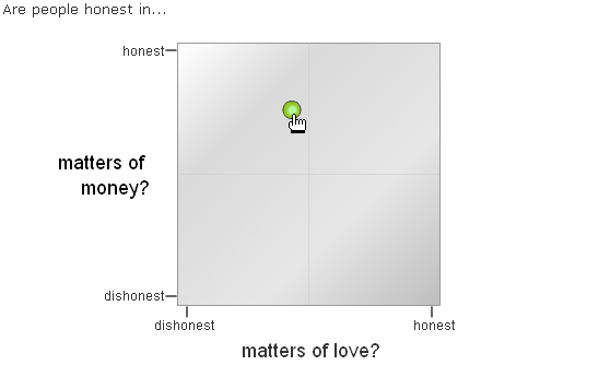
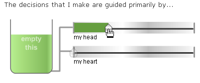
There are personality quizzes all over the net, spread as memes via sites like LiveJournal where memes have a long life. PersonalDNA is a next-generation personality quiz, with high quality widgetry that the respondent has to manipulate to set their answers. While fun to take, I am not so sure that all that gadgetry entirely supports the problem at hand and it probably detracts a bit. I found it hard to figure out where in a quadrant of 4 my "dot" should live in a case like this.

On the other hand, it's very fun to take, and you get the results in nice couple of visuals suitable for posting in a blog with the URL; and you can ask other people to rate your own personality and compare the results. It has all the makings of a successful meme, and for once it looks like some serious visual design and engineering went into the site. I wouldn't be surprised if someone like this finally figures out how to make some money off this stuff; there's millions here waiting to be had, given the massive popularity of these quizzes in social sites.

Incidentally: I came out as a "Benevolent Inventor."

PersonalDNA | Your True Self Revealed - Fast Fun Free Personality Tests.

Monday, May 08, 2006

The Top Ten Lies of Engineers

Another good one from Steve at tingilinde, this made me laugh in my coffee: Guy Kawasaki: The Top Ten Lies of Engineers. I already posted Scott Berkun's Things VP's Never Say, and this makes a great complement. Things lots of engineers say... whether intentionally lies or not. A sample:

“Our beta sites loved the software.”In twenty five years of working in technology, I've never heard a company report that its beta sites didn't like its software. There are three reasons for this: first, many beta sites are so honored to get pre-release software that they don't want say anything negative. Second, most beta sites haven't used the software very much. Third, most beta sites don't want to seem cruel by criticizing a company's new product. Doing so is as socially unacceptable as telling someone that his baby is ugly.

“I'll comment the code, so that the next person can understand what I did.” This is a lie of good intentions. Really, the engineer did intend to comment the code but as the schedule slipped, priorities changed. The question put to management became: “Do you want me to comment the code or finish it sooner?” Guess what the answer was. Luckily, the lack of comments usually doesn't matter because the code is so crappy that a total rewrite is necessary in a year.

Saturday, May 06, 2006

Watercolor Angel, Mt Auburn Cemetery.

Mt. Auburn Cemetery, Cambridge, MA.

Cloaking Device

Guardian Unlimited: Now you see it, now you don't: cloaking device is not just sci-fi:
The cloaking device relies on recently discovered materials used to make superlenses that make light behave in a highly unusual way. Instead of having a positive refractive index - the property which makes light bend as it passes through a prism or water - the materials have a negative refractive index, which effectively makes light travel backwards. It's light, but not as we know it.

Prof Milton's team calculated that when certain objects are placed next to superlenses, the light bouncing off them is essentially erased by light reflecting off the superlens, making the object invisible.

The calculations show that while the device could be used to obscure almost any shape of object, it only works over a short range of wavelengths, so if used to hide objects from human vision, they might only partially disappear.

Seems like a good opportunity for ghost sightings in the distant future.

Sunday, April 30, 2006

NY Times' market graph toy

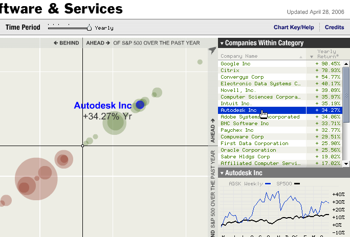
I'm only calling it a toy because it's fun. All infovis should be fun, frankly. This is another one off Information Aesthetics: the Sector Snapshot. You can pan around, change the dial for time window (weekly on up to quarterly or yearly), and hover over both the bubbles and the text (and sort the text). You can get a detail view of an individual performer in the lower right by clicking on a player. The animation is really nice and you can even change the graph units by direct manipulation. Sweet!

Saturday, April 29, 2006

Montreal, treetop and lamp.

Old Montreal 2006.

Tuesday, April 25, 2006

LiveJournal Social Networks

A year ago I did a survey on memes on LiveJournal that garnered a whole lot more responses than I anticipated. I presented some data from that survey at an informal workshop last year at the CHI conference, and revisited the same data again a year later (this week). Here are two pictures I generated of the friends' lists of 222 people, with the same 2 people highlighted in red in 2005 and in 2006.

2005:

2006:

I believe the latter one shows less network connectivity. I have some stats to support it. Stay tuned...

PS. I used Jeff Heer's prefuse toolkit to make these pictures.

Saturday, April 15, 2006

April is Poetry Month

Endicott Studio is celebrating Poetry Month nicely with a new illustrated poem every day. If you like fairy tales and poetry, this is the place for you. Featuring writers like Delia Sherman, Ellen Kushner, Holly Black, Jane Yolen...

Berkun blog » Vista and Victimization and More

I've been catching up on some of my favorite reading after being away and then swamped at work -- today it's Scott Berkun.

In The Vista saga: an opinion, Scott gives his take on the delays of Vista at MS and what's being handled well or poorly, from his viewpoint as a former Windows PM. A couple points: "A slip is infinitely better than a panned product." and "Microsoft’s PR and public management of the Vista project has been reactive and weak." Here's a sample:

Centralized authority and MSFT culture. The most comical misperception about Microsoft is the management style - everyone think’s it’s a rigid hierarchy, when it’s mostly a consensus driven place. Everyone gets an opinion and senior managers are often more skilled at consensus management than leading teams. If there’s any one thing I’d point to for large failing projects is lack of successful central authority - With a project in trouble I’d move to centralize power in a smaller number of people and free them to run with the ball. The rub is that the culture doesn’t support this well - people still want a consensus mentality (something born of small team and start-up culture), they want to own their slice, even when it’s contributing to driving projects into the ground (or at least mediocrity). It’s in the fiber of the company and it’s hard to change.

Sinofsky is an inspired move. The MSFT culture, historically, is heavily polarized between Windows and Office. In my day Windows were the smart-ass cowboys who liked risks and breaking rules - not surprisingly Windows had a history of confused early projects that came together only on the home stretch. Office (again, in my day) were stereotypically smart, reliable, consistent A students, who won through plans more than passion. Sinofsky (formerly the Senior VP of Office, now VP of Windows) is the first major attempt I know of to bridge those philosophical and management differences: there’s something to be learned in both directions.

In another recent post, Berkun discusses a fascinating and cynical piece on Victimization Metrics for taking on projects.

Basically the idea is this (a now corrected paraphrase of his post):
A = Number of problems you see
B = Number of Problems you don’t have the power to solve
B / A = Victimization ratio.

So if you work in an environment where you can point out 10 problems, but are only capable/empowered to solve 4 of them (so 6 you are powerless on), your victimization ratio is 6 / 10 = 60%.

Not being cynical by nature, Scott adds a couple factors, and inverts the ratio to call it the "empowerment ratio" instead. Nice reading and timely given my current project load. :-)

Finally, his next book is on innovation; he has asked for and gotten a number of recommendations that make interesting reading. (In another post, he summarizes the Amazon sales figures of his project management book over a year as correlated with essay posting and other publicity events --slashdot had the largest influence on Amazon sales figures. Nice.)

Ten things VPs never say

Scott Berkun posts about Ten things VPs never say, including: "Team A is more important than Team B," "the CEO and I disagree" (Leaders fear showing dissention, despite signs for those paying attention), "My morale is low," "I’m ending project X and here’s why," "No, I don’t want to be on the cover of Time." (To want to be a VP requires an ego. No person in the history of the corporation has been forced, at gunpoint, into executive status.)

All this entertainment aside, I've known a few nice VPs, especially at Mathworks (hi Roy if you're reading). (And I bet my new CEO would have said some of them as a VP, which is why I like him.)

[Updated to add: A VP reader of Berkun's blog took offense politely and Scott apologized for the stereotyping. One of the interesting things this VP cited was Joel's article The Development Abstraction Layer, about the infrastructure of management that enables delivering code to the customer, and the complexity of making it work well. It certainly made me think about the Design Abstraction Layer, and if/how that works -- but by Joel's analysis it's just a layer in the development management problem, which may in fact be correct thinking. Go read and see what you think.]

plusminus design: flashbag

This is one of those brilliant and simple ideas, that also happens to be funny. A USB device that "fills up" visibly until it's ready to explode, at which point the drive is full: plusminus design: flashbag. (Off Information Aesthetics, where else?)

Sunday, April 09, 2006

You Make Your Own Luck

A nice (positive!) story off one of my favorite blogs, Mind Hacks. You Make Your Own Luck is a summary of the book by Richard Wiseman, The Luck Factor. Wiseman's analysis says that being "lucky" comes down largely to personality attributes, such as being open-minded, optimistic, experimental, and aware of opportunities when they come up.

Principle One: Maximise Chance Opportunities Lucky people are skilled at creating, noticing and acting upon chance opportunities. They do this in various ways, including networking, adopting a relaxed attitude to life and by being open to new experiences.

Principle Two: Listening to Lucky Hunches Lucky people make effective decisions by listening to their intuition and gut feelings. In addition, they take steps to actively boost their intuitive abilities by, for example, meditating and clearing their mind of other thoughts.

Principle Three: Expect Good Fortune Lucky people are certain that the future is going to be full of good fortune. These expectations become self-fulfilling prophecies by helping lucky people persist in the face of failure, and shape their interactions with others in a positive way.

Principle Four: Turn Bad Luck to Good Lucky people employ various psychological techniques to cope with, and often even thrive upon, the ill fortune that comes their way. For example, they spontaneously imagine how things could have been worse, do not dwell on the ill fortune, and take control of the situation.

Tuesday, April 04, 2006

Greyfriar's detail, Edinburgh.

Sunday, April 02, 2006

Closeup of the Edinburgh Castle in snow.

Edinburgh Castle in the snow.

I Am Hiring

Are you or do you know a senior interaction designer? I am looking for a couple such folks. I want smart people, with a good understanding of data analysis and problem solving skills, with some humility about their design work and willingness to change it based on input. Depth of design experience, ideally on desktop software, is required for these positions, as is attention to detail and willingness to drive issues through implementation.

The job is described here: Autodesk Jobs. (It doesn't seem to display well in Firefox, although the gist is clear.) Please pass it on.

Saturday, April 01, 2006

St Giles from Greyfriar's Kirkyard, Edinburgh.

The Physics of Friendship

Another interesting (and successful) paper on modeling of social networks by physicists: A System of Mobile Agents to Model Social Networks (pdf), by Gonzalez, Lind, and Hermann. I recommend the more accessible writeup here.

The gist is that they can model friendship patterns in schools with a system of particle collisions and diffusions, and accurately reproduce the empirical data from a large survey of 84 schools' friendship relations. With a minor variation, the model extends to sexual relations in an HIV study (not at schools).

How depressing to learn we're just particles bumping into each other!

Google Romance

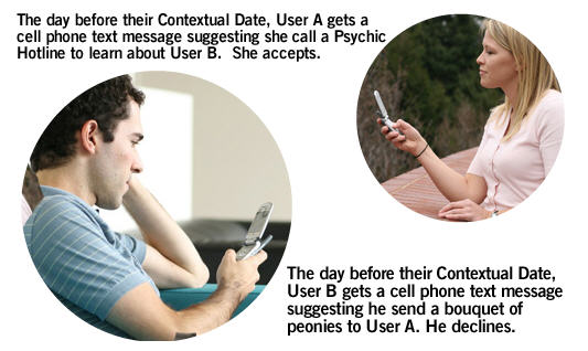
I nearly fell for one April Fool's post today (Cool Tools, I got too excited by the radio gum), but here's one I didn't (quite) fall for: Google Romance. It's very probable Google is going to be in this space. The storyboard of the two attractive users getting together surrounded by Google community products is obviously a work of realist fiction.

Wardrop's Court in the sun. Edinburgh.

Wardrop's court in the snow.

Monday, March 27, 2006

Google Finance.

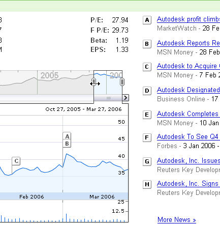
This is an new vis tool for showing stock performance correlated with news events: Google Finance (I pre-loaded my own company's data here). You can adjust the window you're seeing by size and location, and see the related stories associated with peaks and dips. It's kind of fun, although I wish they'd laid the page out a little nicer.

Sunday, March 26, 2006

Greyfriar's Kirkyard, Edinburgh.

Deacon Brodie's on the Royal Mile, Edinburgh

Why Don't We Choose What Makes Us Happy?

People are flawed. But it's rarely so well summarized as it is in the paper "Decision and Experience: Why Don't We Choose What Makes Us Happy?" (Hsee and Hastie 2006). The authors recap the many experiments in the literature of behavioral-decision theory that show that people don't choose outcomes that maximize their happiness, due to a number of failures in the human psychological makeup.
The vast popular literature on self-improvement is based on the belief that we aren’t getting everything we could out of life, and is replete with recipes to increase happiness. Recent findings from behavioral-decision research provide evidence that people are not always able to choose what yields the greatest happiness or best experience. People fail to choose optimally, either because they fail to predict accurately which option in the available choice set will generate the best experience or because they fail to base their choice on their prediction, or both.

They identify these biasing problems:

  • Impact bias: We misjudge how severe an impact will be and hence choose the wrong option.
  • Projection bias: We project from our current emotional or physical state how we will feel in the future. Hungry shopper buy more food than needed.
  • Distinction bias: Joint-evaluation versus single-evaluation models screw us up. I pick from a selection of plasma TVs, but weigh attributes incorrectly because in my home I only experience one of them and the factors I weighed weren't relevant.
  • Memory bias: We misremember peak events or significant events, and it influences future choice. (Subjects were lightly tortured with cold water for this one.) The bias disappears with gentle questioning though, good news for therapists.
  • Belief bias: Lay theories about what will make us happy -- or, poor self-analysis. (People probably differ in this area.) This section really highlights how pathetic we are, though: "Another common belief is that more choice options are always better. In reality, having more options can lead to worse experiences [38–40]. For example, if employees are given a free trip to Paris, they are happy; if they are given a free trip to Hawaii, they are happy. But if they are given a choice between the two trips, they will be less happy, no matter which option they choose. Having the choice highlights the relative deficiencies in each option. People who choose Paris complain that 'Paris does not have the ocean', whereas people who choose Hawaii complain that 'Hawaii does not have great museums'."

Failures to follow decisions, another source for the failure of rational paths to happiness, are explained by:

  • Impulsivity: We choose the short term immediate over the long-term outcome.
  • Rule-based decisions: Related to aphorisms and cultural beliefs about "what's right," this is behavior based on rules like "don't waste" rather than rational predictions.
  • Lay rationalism: Related to rules, this category represents the attempt to apply correct reasoning but getting it badly wrong. The 3 types covered here are "lay economism," "lay scientism," and "lay functionalism." "Another manifestation is ‘lay scientism’, a tendency to base choices on objective, 'hard' attributes rather than subjective, 'soft' attributes. For example, when choosing between two equally expensive audio systems, one with a higher wattage rating (a hard attribute) and the other with a richer sound (a soft attribute), most people chose the high-wattage model, even though when asked to predict their enjoyment, they favored the richer-sounding model. A third manifestation of lay rationalism is ‘lay functionalism’, a tendency to focus on the primary goal(s) of the decision and overlook other aspects that are important to overall experience."
  • Medium maximization: People confuse the medium for happiness with the actual results, the most famous example being money. People work harder to get more money but more money itself doesn't increase happiness.

The implications for this type of research are politically worrying, of course (we assume in democratic and capitalist societies that people are capable of choosing what is best for them and should be allowed to do so). For software design and other economic problems, the implications are equally sad; if people can't be relied on to choose the products that are "best" by rational means, then the well-intentioned decisions of designers are that much less important and less related to final market success. Product usability itself is a "soft" factor subject to being sacrificed as unimportant, thanks to lay rationalism and the impact and distinction biases.

Saturday, March 25, 2006

Glasgow, "The Magic Tea Rooms" (I assume all these juxtaposed colors are no accident--?)

Glasgow Railings, West End.

Friday, March 24, 2006

architecture and hygiene

A friend at work pointed out this amusing site, found after he googled "architecture, hygene" late at night (Google fixed his spelling): architecture and hygiene.

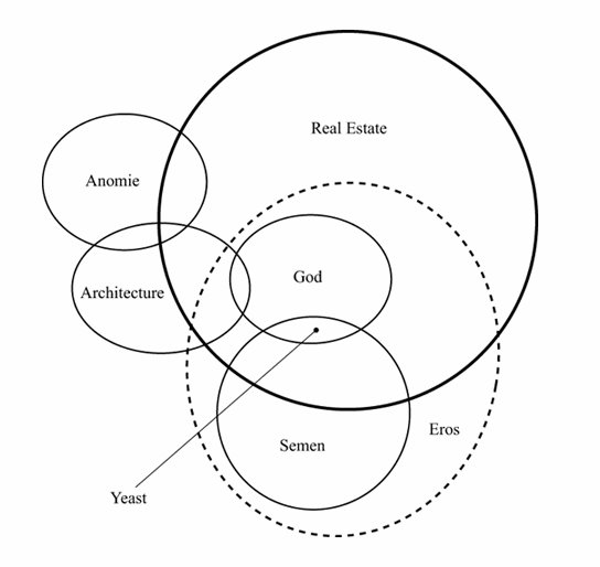
The main gist is prefab houses, but Kalkin's houses are mixed in with a bunch of other entertaining content, like this easter-egg map of how an architect conceives of the universe. (I'm surprised it doesn't have phenomenology in it, but instead it gets the more relevant "anomie.")

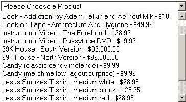
But the order form really made my night.

Wednesday, March 22, 2006

Motek, A Very Strange Software Company

I just read this article in the in-flight magazine on my way home from a short trip to Scotland: American Way Magazine: The Best Company to Work for in the World-Period.

As someone who needs at least a 3 day intro to a vacation to even start to relax, the European-style 5 weeks of vacation initially caught my eye and kept me reading. The rest of the story brought tears to my eyes (and I read a fair amount of business overview articles, for your average UI designer). A woman-owned company, with acknowledged lower salaries and internally published salary levels, in return for real quality of life outside the office? But that's not all.

Employees also know when an employee isn’t able to keep up with the workload. The result? Price offers a financial reward to employees who ask for help in order to stay on schedule. “The goal is to get the work done, not establish a star system,” she says.

Of course, it’s one thing to conjure up a cutting-edge culture and quite another to thrive amid relentless daily pressures. But Price hasn’t overlooked this aspect, either. While other companies talk about collaboration, Motek lives it. The company keeps a single to-do list... so that everyone is on the same page about priorities and the state of various projects. Anyone can enter an item, including customers and vendors. The list can include everything from ordering ink cartridges to customizing a specific function for a customer. Motek divvies up the tasks at meetings — and teams don’t pay any attention to who entered particular items.

The way Price sees it, the company’s success is a direct result of the money it invests in employees and of its commitment to developing a business structure that fosters knowledge-sharing and mutual goal-­setting. What’s more, “It’s amazing what a rejuvenated person brings back to the office, not just in terms of great new ideas but also in terms of enthusiasm and desire,” she explains. “The software industry’s idea that employees are entirely replaceable is absurd.” In fact, she believes it is precisely because of long hours and poor working conditions that today’s software is so buggy and behind schedule.

Apart from mourning that they are located in Beverly Hills (although I really do love my current job), it's now my goal to find other studies supporting her assertions. Let me know if you know of any...

Here's Motek's News page with links to many other articles about them.

Sunday, March 12, 2006

Projects: Succeeded, "Challenged," Failed

The Standish Group have done numerous studies of software project success and failure rates over the last 10 years. They've observed some trends in project management suggesting things are marginally improving out there.

In 1995, their report identifies these key factors and associated weights contributing to project success:

SUCCESS CRITERIA POINTS
1. User Involvement 19
2. Executive Management Support 16
3. Clear Statement of Requirements 15
4. Proper Planning 11
5. Realistic Expectations 10
6. Smaller Project Milestones 9
7. Competent Staff 8
8. Ownership 6
9. Clear Vision & Objectives 3
10. Hard-Working, Focused Staff 3
TOTAL 100

As you can see in the graphic below, in 1994 the the success rate for projects was only 16%, while "challenged" projects (over time and cost) accounted for 53%, and failed (canceled before completion) accounted for 31% of all projects. In 1998, 26% were successful. Then in 2004, we reached a 29% success rate. Project costs are higher and the success rates are lower for larger companies.

The 1995 piece has a scorecard to apply to your project to help you assess your potential for success. They're good questions (but a little intimidating even in 2006).

The 1999 report is quite sobering; they suggest that project size, team size, and project duration are the major factors correlated with success. They identify project management and standard infrastructure as crucial factors for team success. (Their comments on project management are well worth looking at, too, including the role of mentoring project managers.) I am quite sure that Scott Berkun would agree with them.

In 2001's report, they state that executive sponsorship replaced user involvement as the number one critical factor, because the IT world had caught on to the user involvement philosophy. Staunch business and management support now trump requirements analysis and user review of product design.

Finally, here is a telling quote about written communication on projects, from their original article:

Achieving the answers to solving project failure often lies in developing written communication such as problem statements, project plans, and detail specifications. However, one of the problems with any written communication is the participant's (reader's) level of understanding. As technologists, we think, write, and talk in a manner that is not readily grasped by many people outside our industry. Aside from sounding intimidating, you run the danger of the reader actually thinking they understand what you are saying, while your meaning may in fact be entirely different. To paraphrase the words of the English poet, Samuel Taylor Coleridge "Until you understand a reader's ignorance, presume yourself ignorant of his understanding". In other words, write the document devoid of all technical terms and pseudo technical terms. This includes words used by our industry, but rarely used outside our industry. Words like paradigm, metric, abstraction, and orthogonal, should not be used in any document if you want the normal reader to understand. Remember it is your job make the reader understand the plan. It is not your job to show how smart you are or to demonstrate that you can use big words.

Sadly, "phenomenological" is probably not a good word to put in a spec either.

Sunday, March 05, 2006

Sleep on it for complex decisions.

Complex decisions are made better after a night's sleep, according to BBC NEWS: Sleep on it. It looks like simple decisions are better made consciously than unconsciously, though. (Now, how can you tell the two apart? And why does the alert brain seem so limited-- is this another "7 plus or minus 2" result?)
The conscious thought group managed to pick the best car based on four aspects around 55% of the time, while the unconscious thought group only chose the right one 40% of the time.

But when the experiment was made more complex by bringing in 12 attributes to weigh up, the conscious thought group's success rate fell to around 23% as opposed to nearly 60% for the unconscious thought group.

Importantly, post-decision satisfaction ratings were included in this study. So -- if you have a group of people in charge of making complex multivariate decisions, who also have sleep disorders, your organization is in trouble--? Unless someone up above gets a lot of sleep on all the complex decisions everyone is coping with, perhaps.

That question cuts a little close to home, for some of us. It also begs a new candidate interview question...

Saturday, March 04, 2006

Secret Passages, "Ruse and Escalade"

Off steve: HiddenPassageway.com, an architectural folly company offering you built-in secrete passages and hidden niches appropriate to store guns in, according to one of their animations. The videos and small 3d animations are very cute.

Which site made me think of one of my favorite news stories from my time in France: The mystery of the hilltop monastery, the locked room and the missing manuscripts. A classic locked room mystery:

From that date, a succession of immensely valuable works, including precious early religious texts and several dozen heavy 15th-century illuminated manuscripts bound in wood and leather, began disappearing from the abbey's first-floor library. Police were flummoxed. "It was one of those frustrating but also rather thrilling cases," Madeleine Simoncello, the Saverne public prosecutor, said yesterday. "Quite extraordinary items were vanishing, sometimes singly, sometimes by the dozen. By last weekend over 1,000 had gone, yet the room wasn't even open to the public and as far as we knew nobody could get in."
The resolution of the mystery is better reported in this followup article after sentencing:
Gosse, a teacher at a Strasbourg engineering school and a former naval officer, faced a rare charge of "burglary by ruse and escalade", a reference to the tortuous climb in and out of the locked library.

He had found the route after discovering a forgotten map in public archives which revealed the secret access from the monastery attic. The map was a key exhibit in the trial. The attic, reached by a daring climb up exterior walls, led to a steep, narrow stairway and then the secret chamber. A hidden mechanism opened up the back of one of five cupboards in the library. The plans suggested that the secret route to the library, once the monastery's common room, served in medieval times to spy on the monks' conversations.

You can't make this stuff up. It needs to become a movie. To round out the fun, here's the wikipedia entry on secret passages, which points to an article from Jan 2006 about an enormous secret passage across the Mexican border to the USA. And finally, I found this fascinating archive of the Museum Security Network mailing list, full of tasty and weird stories of stolen antiquities.

Sunday, February 26, 2006

Office Networks in Business Week

I've been catching up on some social network blogs, and have pointers to 2 short pieces I enjoyed in Business Week Online: IBM: Untangling Office Connections and The Office Chart That Really Counts.

In the former article, Kate Ehrlich at IBM Research notes that you want weak ties to fuel innovation, but strong ties to execute on it.

I think of the process of innovation as having three different phases: One is the generation of the ideas, and that's where you really need to have, not everybody in a group, but a few people who are connected to people who are outside. That's where you get these real "Wow, I never thought that something from that domain could be applied to this domain." So when you're talking about innovation, you've got to have somebody who can bring in the ideas from the outside.

In the second phase, you need to connect those people with others in the organization who are translators, who can say, "I can see that that idea might work in the company or group that you're in, but this is what we need in order to make it work for our product or our service or our process."

Then there's a third phase. You've translated it. You've got it set up. Then it's the delivery, and the delivery now is internally within the group. Now you want very strong ties between people. In network parlance, with innovation, you want weak ties, where people are more connected to those outside the group. [In the delivery phase,] you need strong ties in order to get the innovation executed.

In my more cynical moments, I question whether most businesses really want their employees innovating -- if they're not a research lab, that is. Most employees have too much ordinary work to do to take time to innovate and innovation from the ground up is hard to manage and control. But then I remember that finding a new way to do your work is innovation, too.

The latter piece has some excellent observations about the potential dangers of showing off who is connected to whom by social network diagrams. The same concerns apply to many visualizations of statistics in office life, of course.

For all of the benefits, charting informal networks can be disruptive. "Leaders feel pretty threatened by this," says Katzenbach principal Zia Khan, speaking of people who hold high perches on the organization chart but are more isolated on the informal map... It's O.K. for some people, such as those who spend a lot of time with customers or have expertise in niche areas, to show up on the periphery of the web. Maps can also highlight which employees might be too connected and therefore a potential bottleneck.

Confidentiality is also a touchy issue. A map that reveals who is well-connected and who is not can be destructive if it is shared too widely. "I know who I named, but when I look at the map, I might see [that person] didn't name me back," says Tracy Cox, director of enterprise integration at aerospace and defense contractor Raytheon Co. Now, says Cox, who does network analyses for the company's seven businesses, that hypothetical employee "knows that he is not valuable to his boss. And not only does he know it, but 50 of his closest friends know it, too."

This came up for me during my research days; and needless to say, it was an issue even if they didn't know who was A or B in the chart -- the map itself was frightening because everyone suspected they might be the X on the fringe.

Saturday, February 25, 2006

Houston St., New York City.

Broken glass in New York City.

Sunday, February 19, 2006

Is Your Boss a Psychopath?

At the risk of my boss reading this, here's an oldie but a goodie: Is Your Boss a Psychopath?
Corporate psychopaths score high on Factor 1, the "selfish, callous, and remorseless use of others" category. It includes eight traits: glibness and superficial charm; grandiose sense of self-worth; pathological lying; conning and manipulativeness; lack of remorse or guilt; shallow affect (i.e., a coldness covered up by dramatic emotional displays that are actually playacting); callousness and lack of empathy; and the failure to accept responsibility for one's own actions. Sound like anyone you know? (Corporate psychopaths score only low to moderate on Factor 2, which pinpoints "chronically unstable, antisocial, and socially deviant lifestyle," the hallmarks of people who wind up in jail for rougher crimes than creative accounting.)

A good point is made in that some psychopaths are created, not born that way, and American individualistic corporate culture is a petri dish for this type of behavior. They get ahead in part because of their traits.

Of course, cynics might say that it can be an advantage to lack a conscience. That's probably why major investors installed Dunlap as the CEO of Sunbeam: He had no qualms about decimating the workforce to impress Wall Street. One reason outside executives get brought into troubled companies is that they lack the emotional stake in either the enterprise or its people. It's easier for them to act callously and remorselessly, which is exactly what their backers want.

The good news is that a productive narcissist makes a great balance for an executive psychopath. Or a productive obsessive. It's all just one big mental hospital in a large corporation. (See the related NY Times short on presidents with mental illness symptoms.)

Tuesday, February 14, 2006

The Dumpster (Happy Valentine's Day!)

Off Information Aesthetics, the Dumpster is a visualization of breakups described on blogs in 2005, with sample color commentary from the posts. It's very pretty, and of course it was made in processing.

Sunday, February 12, 2006

Joel on Interviewing, Me on Performance.

Joel Spolsky's latest post is on interviewing interns for Fog Creek. I love how seriously he takes this, but with the same caveats he quotes as getting from other people. Bravo that last year's interns wrote their fastest growing business product almost by themselves. That's a good use of interns! (And in an industry full of big software companies that just acquire existing products and can't build them from scratch anymore, it's refreshing.)

Joel's main goal in hiring is to get "Smart people, who get things done." (See his Guerrilla Guide to Interviewing if you haven't read it.) This makes much sense to me. Operationalizing it during interviews will mean different things to different teams and disciplines, I think. His techniques for screening developers aren't exactly the ones I'd use on UI designers, but they're not too far off. (I like giving design problems, asking for design evaluation of existing products or mockups, examples of work process and deliverables, and willingness and ability to do the boring and hard stuff in order to push work through to completion. Checking ability and interest in learning is part of this last item.)

I was talking to a friend recently about how academic journal and conference reviews are "how professionals enact their discipline," by setting up the boundaries they want on what counts as quality work and what is worth letting in to extend or challenge their field. (It takes a brave reviewer, even in a cross-disciplinary field like HCI, to recognize something from a very different perspective as a valuable contribution to the discipline.) The same could be said for the hiring process, although far less abstractly -- and it's a little more tactical. Your target processes are always going to be moving-- hopefully improving-- but you have to hire for short term success as well as investing in the future.

Hiring is hard in part because most folks aren't good at articulating what needs to get done, and how to evaluate people for those abilities. So often the emphasis ends up on wishy-washy and dangerous "cultural fit" terms, because the objective measures are missing. Performance reviews, which are obviously (or maybe not!) related to the hiring problem, are prone to the same failures; a lack of understanding of what needs to be done in an organization can lead to subjective personality measures instead of objective measures of what got done and how and what we need to do next year. (I sometimes wonder: what if, instead of the traditional performance review methods HR depts foist on us, we were to do the interview process all over again -- with a focus on what got done in the last year, instead of previous company work? No, I don't mean we fire people who get thumbs down; but we evaluate concrete work as if we hadn't spent the year with them disagreeing or drinking after hours and learning about their cheating ways or charity contributions.)

It makes sense to me that in organizations with a poor understanding of what their business is, with an incomplete understanding of how to achieve and how to measure success, you'll also find questionable (and confused) hiring and equally poor performance review processes. But in companies like Joel's that know how to measure success, hiring, retaining, and evaluation of employees is downright rational.

Saturday, February 11, 2006

TopCoder's Programming Contest

The WSJ has an article on the recent Topcoder programming contest. And Fast Company did an article on the 2004 winner.

I've blogged pointers to the MATLAB programming contest before. An interesting difference (if I read this right) is that a major focus on the TopCode contest seems to be challenging other people's solutions and invalidating them with scenarios they haven't thought of, while an important aspect of the MATLAB contest is the highly likely possibility of winning by improving on other people's solutions. The two contests are Darwinian, but in different ways.

Davos Quotes on Creativity

Fast Company Now blogged about events at the World Economic Forum at Davos, especially the themes on creativity and innovation. The pieces are all quite short, but a couple are relevant to my last post on the NSF workshop on creativity tools.

In the "Innovation and Design Strategy" session, the panel members were asked to describe what they saw as the key to creativity.

Last to be voted off the island was Ideo's Tim Brown, who suggested that creativity is spurred by approaching problems with a beginner's mindset, and by exploring ideas through the use of rapid prototyping.

And the winner is: Google's Marissa Mayer, who argued for "a healthy disrespect for the impossible" combined with the virtues of constraints. In other words, aim high, but focus. Mayer described how an artist friend once told her that it was much easier to paint on a canvas that already had something on it--a mark or a line of some sort--than to begin with an entirely blank canvas. The existing mark is a constraint, something the artist has to think about and work around. And product developers at Ikea begin with a different sort of constraint, she said. They start with a price they have to meet--say $49--and then think about what they can make for that price.

I remember once being asked to just go off and design a solution for a big hairy problem -- with no realistic inputs at all to ground it or steer my direction. What's the ideal solution, Lynn?? I could have done something, but that waste of my time would have been more than I could have tolerated after the fact. The real development world is a world of constraints, and given a million other things I was also responsible for, I would have been in a bad mood indeed when my creative exercise was shot down as unrealistic. To this day, I am careful to always include minimal acceptable versions of every design idea I come up with -- because everything gets cut down eventually.

And the blank canvas is a bitch to start from, as she said. Translating that into software tool terms, I think it's more fun to start from something not quite right (a template for a document design, a building component?) and then modify it to get what you want.

Here's another one from their coverage, just because it's pithy and reasonable and I was on the page:

A Columbia University economist, Xavier Sala-i-Martin, spoke at a session on global competitiveness in Davos this morning. He offered what I think is the most succinct statement of the stages economies move through on their way to becoming innovation-based. First, he said, you concentrate on making something cheaper than anybody else. And when you can no longer make something cheaper than anybody else, you concentrate on making something better than anybody else. And when you can no longer make something better than anybody else, you concentrate on making something different than anybody else. That's the innovation economy.

Thursday, February 09, 2006

Creativity Support Tools

Ben Shneiderman has posted the individual papers and extensive summary of the NSF-sponsored Workshop on Creativity Support Tools that took place in June 2005.

I haven't read all of them yet, but my initial impression is some disappointment that the workshop participants were academics and no one purely from the creative tool "user" persuasion was there. It looks a bit industry internal, and not just software industry internal, but research-world internal. Many of the literature citations support this, although I did find a book or two I didn't know about (e.g., Polya's How to Solve It). It wasn't surprising to see quotes from Csikszentmihalyi's Creativity but it was not clear to me that the cultural recognition of creative work as valuable should be relevant to the design of software to support the act of creating.

This said, there are interesting points, especially if you work on software design for creatives, as I have in the last 3 jobs (if you include scientists, which Mihaly Csik. does). The Design Principles article includes these items:

  • Support Exploration: First, it must be very easy to try things out, and then backtrack when unsuccessful. This means that the tools must be trustworthy so that users are comfortable trying things. For example, a very good Undo capability is required in the tools.... A second requirement is that the tools be “self-revealing” so that it is clear to users what can be done. If the flexibility is not apparent, it will not be used....Another way to support exploration is to make it very fast to “sketch” out different alternatives at the early stages of design.
  • Have Low Threshold, High Ceiling, and Wide Walls:Effective tool designs should make it easy for novices to get started (low threshold) but also possible for experts to work on increasingly sophisticated projects (high ceiling) [Myers 2000]. The low threshold means that the interface should not be intimidating, and should give users immediate confidence that they can succeed. The high ceiling means that the tools are powerful and can create sophisticated, complete solutions. Too often tools that enable creative thinking may be quite hard to learn (they don’t have a low threshold). Instead, they focus on providing numerous powerful features so that experts can assemble results quickly. Now, we add a third goal: wide walls. That is, creativity support tools should support and suggest a wide range of explorations.
  • Support Many Paths and Many Styles. People work in different ways, right brain vs. left brain, "hard" vs. "soft" approaches.
  • Support Collaboration among multiple users. In all of our projects, in schools, and in the “real world,” most creative work is done in teams.
  • Support Open Interchange: The creative process will not usually be supported by a single tool, but rather will require that the user orchestrate a variety of tools each of which supports part of the task. Creativity support tools should seamlessly interoperate with other tools. This includes the ability to easily import and export data from conventional tools such as spreadsheets, word processors and data analysis tools, and also with other creativity support tools. This requires that the data formats in the files be open and well-defined.
  • Make It As Simple As Possible - and Maybe Even Simpler: A plea to reduce featuritis, which will appeal to my boss, for sure.
  • Choose Black Boxes Carefully:In designing creativity support tools, one of the most important decisions is the choice of the “primitive elements” that users will manipulate. This choice determines, to a large extent, what ideas users can explore with the tool – and what ideas remain hidden from view.

While the principles look good to me, the examples surrounding them are a little thin, as far as my needs go. But I found it interesting reading nevertheless and recommend browsing the site.

Monday, February 06, 2006

So, no change there then.

Oursin posted a pointer to a sad but pretty piece in the Guardian: So, no change there then. What happens when February comes and we realize there was no way we were to make those New Years Resolutions and we aren't going to turn into a princess after all? There aren't enough stories about how small changes can take so much work.

There is a fundamental problem with February. It is dark and cold, and people are therefore depressed, more people than would admit it. It is also when performance reviews loom on many horizons (what bad timing!) and people at offices are getting stressed about the plans they set in motion at the end of the year and how on earth they can achieve them. It might take years. And it's a short month -- less time than it requires to compensate for all the things dragging us down.

It's a month when we should be in Belize snorkeling, but instead we're working on weekends. My one resolution was to keep a daily journal of the "I did this" variety -- rather than any insightful extensive maunderings -- and it was this past week that I fell 2 days behind. That's February for you.

Sunday, February 05, 2006

Tips for Frequent Flyers

I was just booking an international flight, and faced with a lot of flights by many carriers in the same price range, I decided comfort was my primary goal. It was surprisingly hard to find a good resource that spelled out which airline and which equipment offered the best seats for this. Nevertheless, here's one article, more focused on users of laptops than on people with legs: Mobile Computing: Tips for Frequent Flyers.

It's the Boeing 777 that comes up winning on legs and outlets. Maybe this time I can get some sleep and if not, do some work. (Oh, and for those who know me, just because I'm small doesn't mean I don't like to stretch occasionally!)

Thursday, February 02, 2006

Waterfall 2006

The best laugh I've had in, well, at least a week (the pornographic car design conversation at my corporate beer bash was pretty good): Waterfall 2006 - International Conference on Sequential Development.

Highlights of this conference agenda:

  • User Interaction: It Was Hard to Build, It Should Be Hard to Use by Jeff Patton
  • Pair Managing: Two Managers per Programmer by Jim Highsmith
  • Very Large Projects: How to Go So Slow No One Knows You'll Never Deliver by Jutta Eckstein
  • The Joy of Silence: Cube Farm Designs That Cut Out Conversation by Alistair Cockburn
  • Making Outsourcing Work: One Team Member per Continent by Babu Bhatt
The conference will also feature a number of workshops.

Unlike typical conferences where workshops involve participants talking with each other, all Waterfall 2006 workshops will be conducted by document. Come to a workshop, open up your favorite word processor and state your opinion on something. Email it to other workshop participants. (We'll set up mailing list aliases for this--after all, we want to keep this process efficient!) Then just sit back and wait for someone to reply with their own document. Don't miss this opportunity to participate in vigorous written discussion with your peers.

The Snapshirts Blog Tag Cloud Meme

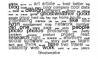
I don't know if 3 people count as meme-spreaders, but I got the Snapshirt blog cloud link off Jeff Mather who got it off someone else. I also wouldn't order the T-Shirt, but I like the cloud of terms it got off my site, so here it is.

One of the disadvantages of using blogger is that you can't tag entries, and therefore it's all one big soupy list that no one can find anything in (including me). I found another site somewhere that was offering a tag-cloud generation service for blogs, but when I tried it, it basically hung trying to do mine. Anyone have any further suggestions for how to do this easily in a useful (interactive) format for my own site? Drop me a note if so; I may hate flickr, but I like tags a fair bit.

Monday, January 30, 2006

French Wall Art Photos by Me.

Man, have I blown a lot of time on this: French Wall Art photos I took this last spring. Just the tip of the iceberg of stuff I never posted last year, especially the ones from Paris which I quite liked, for once.

Misstic from my gallery

If you like the Misstic graffiti pics I've posted before, there is more here. And some other phenomenal street artists.

Sunday, January 29, 2006

Ice Photos and Photo Blogging Wishlist

My referrer logs suggest I'm not keeping up with the needs of depressed teens on Xanga and MSN Spaces for bleak winter photos to illustrate their poetry. So here's a few recent ones of ice in Massachusetts.

In the photo blogging software update, I have none and am increasingly frustrated. I'm one step closer to just using Flickr, but I am reluctant to send people there when they click on my pics. I am not cool, I guess, in that I am not a fan of their UI for viewing, at least not till they let me customize the page experience a bit better. In case anyone has any other recent suggestions, what I need is this: tagging, auto thumbnailing and image reduction on upload, option of date or tag viewing, display of optional captions. Ideally CSS etc. for the pages themselves. Help, anyone? (I don't want to install and fix up Movable Type just for a photo blog, life is too short.)

Illusion of Explanatory Depth

Fantastic post here: Mixing Memory: The Intellectual Teeth of the Mind. Chris is writing about the Illusion of Explanatory Depth, a cognitive science observation that people often think they know how things work when in fact they don't know.

The old-time reader who knows me will automatically connect this to one of my favorite findings of recent years, that I seem to repost every six months: Incompetent People Really Have No Clue that they're incompetent (that was the popular press reportage, here's the scientific article).

Back to Explanatory Depth:

The idea behind the illusion of explanatory depth (and it may be a dangerous one) is simply that there are many cases in which we think we know what's going on, but we don't. There are many great examples in cognitive psychology (e.g., psychological essentialism, in which we believe that our concepts have definitions, but when pressed, learn that either they do not have definitions, or we don't have conscious access to those definitions), but you don't have to look to scientific research to find them. If you ask 100 people on the street if they know how a toilet's flushing mechanism works, many, if not most will tell you "Of course I do!" But if you then ask them to explain it, you will quickly find that they really have no idea how a toilet's flushing mechanism works. This is the illusion of explanatory depth. They know that when they push down on the flusher, the water leaves the bowl, and then fills back up, but they don't know how this happens, they only think they do.

In experiments, it was shown that participants' ratings of their own knowledge of a subject decreased over time, upon being asked to explain device functioning and having problems doing so, and upon receiving explanations that clarified their issues. They realized what they didn't know, by being forced to explore it and being "corrected," essentially.

Chris recaps 3 factors that influence the phenomenon:

  • Confusing environmental support with representation: People may rely on visible parts to build their (shallow) theories about how things work. For me this relates -- very tangentially-- to the notion of "affordances" in UI theory, where roughly speaking analogies to physical world behavior are sometimes leveragable for indicating functionality of controls. I have to think about the implications a bit more.
  • Levels of analysis confusion: Multiple causation means you can stop at any level you want, and usually stop early. For me this raises the question of when a level is sufficient, and whether it always matters to go further? In UI design, we want to work with and understand existing mental models of application behavior, but also educate our users with feedback in the UI about necessary differences between their "naive" expectations and how things really work. We don't need to explain object models and for-loops in our code (hopefully) but we sometimes need to indicate relationships that aren't obvious to our users from their current world knowledge.
  • Indeterminate end state: People have a hard time knowing when they know enough, partly because of the above point. Stories about how things work help clarify this, because of their determinate beginnings and endings -- assuming they're well-structured and not ultra-postmodern and intended to confuse! (This reminds me, again tangentially, of Harvey Sacks' proto-story told by a small child: "The baby cried. The mommy picked it up." Causation is represented, there's a problem and a solution, a beginning and an end. But it's also a story of the most simple analytic level possible!)

Chris says: To sum up, then, the [Illusion of Explanatory Depth] exists for explanations that involve multiple relations between parts, particularly causal relations, but not for more surface knowledge (e.g., facts, stories, and simple procedures), and it shows up fairly early in childhood. The concern it raises for doing science is that increasing specialization -- depth in branches of science -- means shallower understanding on the part of practioners of mechanisms outside their immediate field.

Now see the article noting that geniuses built their work on the work of other geniuses. Although not all examples are cross-disciplinary, it's clear that cross-disciplinary work is a huge opportunity and an increasing challenge.

Tuesday, January 24, 2006

More Adobe: After Effects Tour

Whilst avoiding blogging about irritation-provoking topics (e.g. the science article claiming men like women who laugh at their jokes but don't care if women are funny-- thanks, steve!), I happened on some good news: A video demo showing off some new features in the new release of Adobe After Effects.

Quite possibly the healthiest team at Adobe when I was there, AE had good UI design, good team process, famously good project management, good tools for tracking workflow internally and customer issues (actually integrating the two, good grief!), and a user-centered modified agile development philosophy that actually worked. Someone on their team should be writing articles about their processes, hint hint.

The new product shows some nice UI improvements in palette and window management, as well as 2 tools of great usefulness to me and many people I know: precision time fx, and smart blur fx. The graph UI controls make the chart geek in me salivate, too.

Note the increasing number of product integration features. I keep hearing about AE and Flash, so it's continuing even with Macromedia in the corporate mix now.

Saturday, January 21, 2006

Printing with Photoshop

When I was working on UI design for color management at Adobe (for CS2), one of the things that made our cut for "must fixes" was the print options in Photoshop. They looked like this, if you recall:

The goal of this original design was to provide enormous flexibility in how printing is accomplished with respect to color handling. Color "management" is a hard science topic that is not for everyone, and barely understood even by most creative professionals in the print industry. The average Jane trying to print her photos in Photoshop (or even the average consumer pro photographer) was tripped up by this dialog all the time. What does it mean, "same as source?" When should I choose something different? What combinations are good and which are bad, and for what??

The short story of color handling is that there are conversions going on all over the place -- an image viewed on the screen looks one way, because it has been interpreted by your OS and screen settings to be seen as you see it. It may not be seen the same on anyone else's screen. A common complaint from the common user of Photoshop is "I printed and it looked different." It will always look different, because you are now converting to what your printer can print, not what your screen can display.

"Profiles" are descriptions of how the colors in a file should be handled in conversion, more or less. One of the strengths of Photoshop is that it lets you simulate ("proof") how something will look on another device. You can even use your printer to simulate another printer. But you have to pick all the right combinations of profiles, and have good ones so you get accurate previews.

Photoshop has an excellent conversion engine. Some printers do too, and some consumer printers do, but you can't be sure. Every device will differ a little, and consumer profiles are batch produced. I grew up in my understanding of color handling at Adobe concluding that I'd never use my printer's color management because these consumer devices just won't be reliably good; I'd rather trust Adobe's world class color scientists, with whom I was then working!

Now, here's the shipping (CS2) version of the design I helped to produce to clarify your choices in Photoshop, showing the two crucial options for home printers:

We couldn't do much about the consumer printer drivers and in particular couldn't override their own color handling, so we relied on rollover help that I think ended up a little vague about what you need to do next. In my Canon printer dialog, the necessary place for enabling or disabling color management in the printer is buried in this "ICM" language:

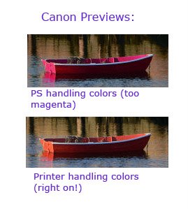
But now that I have the new Photoshop CS2 UI to experiment with, I've discovered (to my chagrin) that a color management problem I hadn't been able to diagnose is Photoshop's conversion's fault. At least, I get the best results from enabling color in my printer, instead. The preview my printer driver gives me before it prints is quite accurate, it turns out:

There's obviously a lot more to say about color management in printing (entire books have been written on it), but my reason for posting is to say: I hope we made the world of the Photoshop user a little simpler, at least as far as debugging their printing issues goes. I haven't heard any customer feedback on this myself, but it sure has helped me! (And I was privileged to have been able to work on this with the color management team at Adobe, including Lars Borg, Chris Cox, Russell Williams, and Matt Philips.)


Thursday, January 19, 2006

Map Things of Interest

Not the post I was intending to make tonight, but I've just freed myself from an accidental click on the Canadian Cartographers web blog that somehow ended up in my Bloglines reading list. A bunch of it was fun stuff, if you like maps.

First, this amusing item that I blogged right away, before editing the post to add the rest: The Prejudice Map shows a map of the world with callouts identifying stereotypes gathered by Googling "X is known for" where X is a nationality or cultural group.

Some hilarious juxtapositions appear, like Turkey's tags: "Hospitality. Using weapons." It's unscientific, but as a travel map it isn't completely useless. For instance, it makes me want to go to Cuba: "relaxed, humor, sophisticated jazz." On the other hand, you have to admit that the UK sounds pretty bad unless you like dirty but posh restaurants with nice management: "fair play, aristocratic kitchens, extemely unclean, rarely complaining."

Then, there's the now ubiquitously blogged Starbucks Center of Gravity in Manhattan map, which I include just in case anyone living in Manhattan cares to know where all the neighborhood coffee shops went in their neck of the woods. Apparently there was also once a Starbucks Avoidance map, but the link is broken.

Try the Avenza Publisher Map Awards, which are all maps produced in Adobe Illustrator using GIS support. Winners available in PDF and jpg. Good news for any Seattle readers, the Grand Prize winner is a geologic map of WA state, and a runner up is a hiking map of King county. How they were made is described, which is very cool. As is this quote from Van Gogh they stuck on top: "Great things are not done by impulse, but by a series of small things brought together." But in the "you've got to be kidding me" category, there's the interactive map of Bethesda, MD. I grew up near there, Bethesda is not interactive.

A map of the world showing dots corresponding to newspapers, from newseum, and when you roll over the dot, you get a thumbnail of the front page. It expands to mostly readable. Quite useful, actually.

Seemyroad is filming towns, and has Zurich down pat. Zoomable overhead map, plus. You can get ride-throughs of locales, reminiscent of the Paris ferrari's bumper video, except not so illegal. (They stop for pedestrians and red lights.) You can also get a tramline fly-over from the sky. I'd really enjoy this for London and Paris.

Sunday, January 15, 2006

Fair Isle Travel Tales


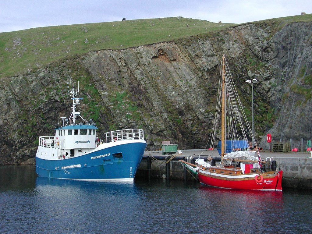
Despite what it looks like from these pictures, everything on Fair Isle is not blue and red. Some of it is green, but there are red birds. There might be blue birds too, but I didn't see any. There are definitely a lot of cliffs and weather and some very nice people with telescopes.

Read about my 2002 trip to Fair Isle in the North Sea, in my newly polished old essay, "Twitchers and Tweeters of Fair Isle". It includes many photos, and it took all day (there's just got to be a faster way to do this web stuff....).

Saturday, January 14, 2006

Donner Party, pigs, maps, mayans...

Apparently, the Donner Party cannibalism legends remain unproven.

Do we really need glow-in-the-dark green pigs? Apparently we do, and these ones are better because they are entirely green, not just patchy green like the previous attempts.

Mayan writing is older than we thought. (How old did you think it was?)

And there is a debate going on over whether a 1418 map shows that the Chinese discovered Rhode Island before Columbus found America. The fact that the admiral was a eunuch seems to merit reporting in the TimesOnline.

Wednesday, January 11, 2006

Fred Brooks and Late Projects

Scott Berkun, rapidly becoming one of my favorite reads in the internet for his sagacity about software projects, points to an interview with the legendary Fred Brooks in Fortune magazine.Fred is of course famous for The Mythical Man Month, in which he argues Brooks's Law: "Adding people to a late software project makes it later."

The article itself has some stellar bits of quotage in it, including these:

Brooks' law depends heavily on the amount of information that has to be communicated. So the argument is that if you add people to a project that you already know is late, which means you're at least in the middle of the project, you have to repartition the work.... Sometimes that can be done by subdividing the existing units, but sometimes you have to move boundaries. That's a lot of work. The next thing is, you have to train the new people.

...Peter Fagg, a really wise System/360 engineering manager, gave very sound advice: "Take no small slips." That is, if you're going to take a slip, get everybody onboard, get organized, and take a six-month slip, even though you may at the moment feel as if you're only four months late.

...The other was when I was a new IBM employee and heard Vin Learson, a VP at the time, later CEO. He said, "The problem is not to make the right decision; it's to make the decision right." ...I came to understand that he was talking from an executive-level point of view. ... Either way can be made to work, but it's very important to pick one and then go whole hog. A counter-example is IBM's PL/I language. They adopted it, they backed it, and then there was a spell when they decided maybe it wasn't going to be the language. And then they decided maybe it was going to be. As a consequence, most customers didn't stick with it. The wishy-washiness killed it, I think. Whatever you're doing, you'd better go do it.

Visibly wishy-washy corporate "positions" can be fatal or at least very damaging to a business. But it's unfortunately pretty common to hear one's customers say, "We're not sure what you're telling us to do" or "What are you recommending here, you have us confused." Brooks has some comments on open source that are interesting too.

Scott notes that there are caveats or objections to the original Brooks Law linking project lateness and adding manpower (item summary here, he says more about each): It depends who the manpower is. Some teams can absorb more change than others. There are worse things than being later. (Producing better quality work might justify being later, if you've identified a role or expertise that's required.)It depends on why the project was late to begin with. Adding people can be combined with other management action (...such as cut or reorganize work across the project, improve tools and equipment, throw a social event to accelerate team relationships, etc.).

Smart stuff.

Tuesday, January 10, 2006

Shadowland in Beta

A day late and an OS short... Adobe's first new (internal, from scratch) product in yonks is finally out in early beta: Lightroom. Only for Mac, alas. No, it's not a response to Aperture, as everyone thinks on first hearing about it; it's been in development forever, even when I was there.

This is a lengthy story of the dev. history, a bit too starry-eyed, People-magazine-style for me: Photoshop News » The Shadowland/Lightroom Development Story. Pretty much my take on this whole thing is "Don't try this at home," and better yet, "If we try this at the office, can't we all do better?" Is it that hard to innovate, incubate, and manage the release of a new product?

Maybe one of the lessons here is "Make sure you've got a good UI designer on staff during the whole process." But I'm definitely biased on that reading.

Sunday, January 08, 2006

"Popping In On PopCap" Games.

I got this nice article off Amy Jo Kim's blog. Gamasutra on PopCap: "James Gwertzman On Casual Growth" describes the process of game development of "casual games" like Bejeweled, which is one of my favorite Palm Pilot games.

"Our path of development is extremely prototype-heavy," said Gwertzman. "We'll make half a dozen prototypes, and pick just one of those to be a hit casual game. And once we develop that one, it's a very iterative process. It's a sandbox model. We try different things out, and find out what's fun. Only when we find out that the core mechanic is fun do we worry about the art, content, and all the other little details."

"We really obsess over the core game mechanics. In a game like Bejeweled, hardcore developers look at that and might think it's kind of...it's very easy to kind of dismiss it, but we literally spent weeks on just the right way for the gems to fall when you make a match. In a game like that, it's little details like that. How does it feel? Getting those little details right is what we prioritize. So when we're designing a new game, we'll spend months and months prototyping core mechanics."

As Amy Jo noted, they're iterative; and interesting to me is that they still work hard after identifying the good gameplay principles. The design details really matter! As Gwertzman says, "We compete in a try-before-you-buy market, and we believe competing successfully there is a fundamentally different kind of design." And fun is an incredibly demanding business to be in-- no one has to use your application for their paycheck, after all.

Their game engine is available for free, I was interested to see.

Wednesday, January 04, 2006

Usability Research References

Human Factors International (a well-known consulting firm) does end-of-year summaries of important usability research findings in bite-size bullet pieces. The items are useful for designers and researchers working on any UI topic, but there's a definite focus on web design (for obvious reasons). The review is titled Yeah but can you give me a reference?

The 2005 list includes:

  • What users think/ say they will do in focus groups and what they actually do in usability tests often differs. (Eysenbach and Kohler, 2002) [This is a truism often repeated, but now there's a reference you can cite!]
  • Tolerable wait time is about 2 seconds. Users will wait somewhat longer if there is feedback that something is happening. (Nah, 2004)
  • Use of whitespace between paragraphs and in the left and right margins increased comprehension by almost 20%. (Lin, 2004)
They did the same in 2004 and 2003. Interesting cites from those years include:
  • Less than half of users take advantage of breadcrumbs (even when most report having noticed them). (Lida, Hull and Pilcher, 2002)
  • Under click-stream analysis, breadcrumbs are not more efficient than other approaches to navigation. (Lida, Hull and Pilcher, 2002)
  • Color similarity has a stronger perceptual influence than common region, proximity, or grouping. (Beck and Palmer, 2002)
  • Photographs do not increase the trustworthiness of already credible sites. They do, however, improve the credibility of sites that are not generally perceived as trustworthy. (Riegelsberger , Sasse & McCarthy, 2003)
  • Heuristic review tends to uncover usability issues related to presentation (skills- and rules-based user performance). (Fu, Salvendy and Turley, 2002)
  • Usability testing tends to uncover issues related to domain-specific knowledge and interaction (knowledge-based user performance). (Fu, Salvendy and Turley, 2002)
On the final subject, another issue of the HFI newsletter features an article on Pitting Usability Testing Against Expert Evaluation. This is an excellent piece, summarizing well the things that expert evaluation can do for you and what to realistically expect from usability testing -- including where they overlap.

Tuesday, January 03, 2006

The Office 12 Blog

If you're wanting to catch up on the hullabaloo about the Office 12 redesign, Jensen Harris has just reorganized his links and provided good access to summary articles on his blog. See An Office User Interface Blog.

Also, I've been finding the Excel redesign posts interesting over here; I especially like the highlight-and-get-instant-math, and the little color bars indicating relative value differences at a glance in the spreadsheet. Lots of good stuff going on.

Monday, January 02, 2006

My Site Traffic (an Unscientific Report)

In the last year, I've browsed my traffic logs on and off, and noticed a bunch of things get visited a lot. I haven't tracked it carefully or with real numbers, but it looks like these guys are winners: Search terms that hit me a lot include "girls on boats" (no idea why!), my name, Siberia, Windhouse, and for a while the Caspian sea merman sighting brought me some occasional traffic.

In honor of the Windhouse traffickers, I have finally cleaned up my old post about the folklore of the Shetland haunted house and put it up off the essays page: The Haunting of Windhouse.

Sand Game

Steve didn't really do this sand game justice when he rec'd it. It's beautiful and surprising. Tips: fire eats plants, water feeds plants, and it's all pretty. Try mixing the sand colors.