Sunday, November 04, 2012

Strata NYC 2012 and PyData

A week ago, I gave a talk at Strata NYC on network visualization ("Beyond the Hairball"). The talk had many technical issues (I'm new to using a MBP and Keynote to present), but the slides seem to have had some kind of life on Twitter. So here's the rather large and slightly academic deck:


I was gratified to get so many RT's, email, and favorites from people including Gilad Lotan, Steven Strogatz, and Ben Shneiderman.

Strata itself baffled me a little due to size and "big data" hype factor -- I got a little tired of overhearing businessmen on their phones talking about "monetizing social." (Why did "social" have to become a despicable noun?) My favorite moments were certainly social more than technical: getting to meet Noah Iliinsky and Kim Rees, seeing Danyel Fisher from MSR and his game analyst partner Kim Stedman, Wes McKinney (with his new book, Python for Data Analysis), and Jon Peltier and Naomi Robbins. These folks made for a very nice data vis and python slice of the big data conference.

Then There Was PyData!


I love it when a technical conference isn't afraid to show code, and make code available. That was PyData! Here were some highlights for me (with two tracks, I missed half of it!):

I was sad not to see any updates on D3.py or bokeh, the ggplot2-style library for Python that Continuum Analytics and Peter Wang are working on; Peter did tell me that he's going back to it now that he's got a grant to work on it, and it will be using canvas, rather than D3.js/SVG to draw to the browser. (This was a performance and complexity decision. I fear it will reduce a lot of interactive vis design opportunities for folks like me, but I'll suspend judgment till I play with it.)

All in all, Pydata was a good couple of days, well worth the trip! They could stand to get a few women to speak at the next event, though. (No, I'm not volunteering!)

Saturday, August 18, 2012

UK Bestsellers: Remash By Genre and Gender

You know how you have a giant collection of datasets saved, but you never seem to get to them? The Guardian Datablog posted one that moved me from my usual weekend lethargy. Not about some world injustice, a critical healthcare issue, or anything Genuinely Important -- but UK book sales data, checking into whether Fifty Shades of Grey is really the UK's bestselling book of all time.

I grabbed it and had a poke around. My curiosity was less about EL James (although mad props to a fanfic writer for making the big time) than about general genre and gender distributions. At a base line, when I did some hasty labeling, I saw that as expected, fiction overwhelms, and women are writing more of it:


Then I threw in some data analysis, just to see if there were any trends there. Okay, EL James finally pops up. Maybe there is a mild trend towards women selling more here?


Then I looked at publishing houses. I wondered if any of them were perhaps making more money off women than off men, and which ones?


This one suprised me a little more than I expected. Bloomsbury publishes JK Rowling, of course (and Khaled Hosseini, who incidentally lives in the USA). The rather macho-looking Transworld has Dan Brown, Bill Bryson, Richard Dawkins (and also Joanne Harris with Chocolat).

But the quickie plot that got me really motivated to spend my Saturday on graphs was this one:


My first thought was "How very irritating: the women bestsellers are all labelled as writing for children, even though they dominate the list. And what is up with the science fiction and fantasy group there?" It seems that one of JK Rowling's oeuvre was a top seller in its "adult" edition too. The one male author in SF&F is Tolkien (for Lord of the Rings, all of them, I suppose). Which means that no actual "science fiction" is on this list, it's all fantasy, if you're tracking genre like I do. Other big names for kids are the Twilight series and Hunger Games series, also stuffed into "Young Adult." EL James is classified in "Romance & Sagas." I guess there's no "Porn" category, or "Adult," like there is for movies, which I think is a real prudish shame.

I regrouped a bit; I put the fantasy books together, whether they are for "kids" or not. That includes Philip Pullman, Stephanie Meyer, Suzanne Collins. Most adult women I know have read JK Rowling, Stephanie Meyer, and Suzanne Collins. I actually find it disgusting that publishers would trivialize these authors as writing "for kids," especially given what's in them -- but that's a gender genre rant for another day. I left Time Traveler's Wife in General Fic, although it could go in Romance or Fantasy, I suppose. I put the two Bridget Jones in with Romance, although I feel the Romance vs. General Fic to be a rather slippery slope. I did not put Chocolat in Romance. I grouped the Biography and Autobiography together. The food and diet related items seemed most interesting as a meta-group. Here's my remash of the genre and gender stats:


Men are represented in more genres, even with my regrouping. But why are there no women in Crime, Thrillers and Adventure on this list? Where are the women mystery writers? (Did I perhaps miss one I should have categorized as genre?) Likewise, there are no male Romance & Saga writers shown here. Yeah, I think the jokes about male "sagas" really are due at this point. (Note a couple links from a recent Twitter exchange on long books by men: "The Exasperating Maleness of Long Novels" and "Why Don't Women Write Long Novels?".)

Finally, I did one arranged by author, just to see, and of course JK Rowling rules the list. Male and female authors are pretty evenly distributed throughout, as well.


What's most interesting here is that the very last one listed is Suzanne Collins, despite the recent Amazon announcement that the Hunger Games books have now outsold Harry Potter on their site. Curious! A US/UK difference? Ebooks not accounted for in the Neilsen data?

Just in time, the Hunger Games DVD is out, and I know what I'm watching tonight. It's also high time I gave Fifty Shades of Grey a shot, even if it's not SF & Fantasy. If you want to check my recodes and the original data, I uploaded the spreadsheet with my new columns here. Please let me know if you think I made any mistakes in recategorizing (or especially gender labels).

PS. I screened out the weird Beano entry, which has no author listed. So this is really about the top 99 books.

PPS. At Readercon recently, a bunch of SF&F writers on a panel said the way to publishing success was to "write a boring thriller." (Me: "I could totally do that!") Now I think it's: Write a great fantasy with teen heros that a publisher will buy from a woman, that in a great act of resistance against age-ist stereotyping by The Man, adult women everywhere download and enjoy shamelessly and tell each other about where male publishers can't hear.

Wednesday, July 04, 2012

Captain America is Getting Some (In the Fanfic)


What could be more appropriate for July 4th than Captain America?

If you've seen the movies a lot already, and you're wanting more, there's always the fan fiction. Of which there is a lot. I admit, I read it. And I got a little data curious over the weekend.* WARNING: Look away now if the idea of hot boy-on-boy superhero action makes you queasy, because there's a lot of such hotness in the fiction. (Also hot girl-on-girl, and girl-on-boy, and girl-on-boy-on-girl, and god-on-HULK-on-brother, etc, cuz it's ALL there.)

Surprisingly, the dreamy super-soldier Captain Rogers is not getting quite as much action as Tony Stark is. And there are a few other surprises in there, if you click around on this little chart.

Who's Sleeping With Whom?
Select an Avenger's bar to see who they are getting it on with in the fanfic by story count...
Count of Stories by Pair (Gray With Red)


Yes, that's right, even DEAD people are getting it on in these stories. Try clicking on Phil Coulson. If you were (like me) blind to suits over spandex, he's "Agent Phil" with the tie. His favorite bunk buddy is "Hawkeye" Clint Barton! I wasn't sure they ever even talked to each other until I rewatched Thor last night (Coulson stops Clint from shooting Thor when he #fails with the hammer in the plastic building; they seemed to be on a purely last-name basis, but what do I know!).

Thor and Loki seem to have it hot and heavy too, family issues aside -- hey, they're gods, they both make and break the rules.

I'm personally a little disappointed not to see more girls getting action here, but I am definitely down with the allure of Tony Stark and Steve Rogers. All those muscles, all that antagonism to overcome! But there is surprisingly little lesbian romance in the archive. (Hang on, is there a "no two red heads" rule? Aren't they both red heads?)


But back to Tony and Steve... I dug a little further and discovered that their sexy love stories were pouring in well before the movie, as early as 2008. With the release of the movie, some new pairs got steamy, like Tony and Bruce, who really were so adorable playing with radiation together and poking each other (snicker). And there must be something in the comics about Phil Coulson and Clint Barton? It might get expensive to look into it. Perhaps I need to visit Jer Thorp('s comics collection).


But let's go back to Tony (again). He gets all the action, even if he doesn't wear spandex and look like a Norse god. And despite that unfortunate facial hair! Captain America has no serious contender for SO apart from Stark. Tony's a reformed weapons dealer, "genius, playboy, billionaire, philanthropist," who engineered his own superheroness, without any magic, medicine, or lab incidents. It's no surprise to me that men AND women love him, and he gets the bulk of the fan fiction. He's on top of the world, so of course he's on top of Steve Rogers! Tony Stark is a self-made superhero, and that's why he gets laid the most. In one of the best Tony lines ever, scifigrl47 has him saying:

"I somehow managed to get CAPTAIN AMERICA doing the horizontal mambo. Fuck you all, I win. I win everything."

And that's pretty much a real American hero talking.

*PS. I am not telling you where the stories live. The fiction database is suffering greatly from the load of Tony's authors and fans hitting it, and it keeps falling over. All this data was collected fairly manually at weird hours, and I had to squash hard my urge to crawl it properly and verify many hypotheses. Please don't try this yourself.


Friday, June 15, 2012

Eyeo 2012: Processing My Data Vis PTSD


As an ex-researchy type, I'm used to the papers and speakers at conferences like Infovis, the academic visualization conference that meets during IEEE Visweek; but last week's Eyeo Festival was... different.  In the past few years, I've been to a handful of the former-Flash-community's digital art conferences (such as Geeky By Nature and Flashbelt).  They inspired me, made me think about the value of personal digital art projects; but as someone who wants to work in data visualization, Eyeo was more challenging to me.  In a good way!

Who Was There


The audience was itself pretty amazing - you could tell by the Ignite-style talks on the first evening, which blew me away, including pal Jen Lowe (@datatelling)'s talk on the human in the data deluge, feisty Rachel Binx on animated gifs, Sarah Slobin (@sarahslo) from the Wall Street Journal, CSS artist Val Head  (@vlh), Bryan Connor of The Why Axis, Sha Hwang's (@shashashasha) dry awesomeness... The non-speaking audience turned out to be pretty astounding as well, including Jesse Thomas of JESS3, Jeff Clark of Neoformix, Mike Bostock (@mbostock) who created D3.js, JanWillem Tulp, some dude from a strategy firm advising the British Government on technology, folks from MOMA and the NYPL and the Met, and, well, really pretty much everyone I talked to was intellectually interesting in some compelling way.

"Luck is chance that matters." (Kevin Slavin)

The chance of having a randomly interesting conversation was extremely high -- for example, it turned out that a guy I got to chatting with as we crossed the street lives in my area and had been intending to email me about his startup after hearing about a talk I did locally.

Who Wasn't There


There were not many people I associate with the academic "infovis" scene, and a couple of us wondered about that. Likewise, at the Infovis conference last year, the data artists and vis consultants of Eyeo were not present either, see my post moaning about that here. I put it down to a handful of things: the Eurovis conference was the same week (super awkward if you wanted to follow the hashtag and had bad wifi/phone as I did), and the tickets to Eyeo sold out in less than a day, so if you weren't paying attention, you weren't in that audience.
"I have not yet mentioned other people's good ideas. They exist." (Moritz Stefaner being hilarious)
Since those tickets were mostly broadcast on Twitter, if you aren't following the "artistic" infovis crowd, you weren't in the running. (Check my posts here and here about the subcommunities of infovis folks on Twitter, with thanks again to Moritz Stefaner whose hairball I picked on initially, but make sure you read his awesome Eyeo slides on networks as well.)

Since Visweek this year wants to get practitioners in the mix, I think there are some things the organizers might learn from Eyeo, given how much data visualization was there: are you spending time understanding what practitioners are inspired by, what tools they use, what they're trying to learn, what they want to work on, who they want to talk to or get advice from? Academic conferences result in papers that can be read, which hopefully contributes to the evolution of the discipline (if they are accessible afterwards -- Eurovis papers do not seem to be!), but this means it's easy to justify not attending in person if you're a practitioner. A conference must have value outside the papers for the non-academics, like provocative panels, tutorials for skill building, networking options with a great audience, drinking... otherwise, we can all just read it later.

Eyeo was definitely a conference to be AT -- not to escape to go hack in your room during sessions, and not to read about later. Watching the recorded videos will give you a flavor, but it's not a replacement for the serendipitous goodness.

The Eyeo speakers who "overlap" these two communities the most in content seemed to be Amanda Cox of the NYT Graphics team, Fernanda Viegas and Martin Wattenberg, and Moritz Stefaner.  Amanda Cox was capstone presenter at Visweek last year, and was a highlight of that conference for me, because of how much she made the newspaper vis problem a design problem, even confronted with a lot of data in R. (Amateur tip: Don't tell her you have a crush on her, it won't end well.)
"+1 newspaper graphics for having a conference named for a bipolar anarchist" - (Amanda Cox re Malofiej)
Viegas and Wattenberg usually review for and publish and present at Infovis, although their talk at Eyeo was much more personal and "design" focused. Moritz Stefaner cited Infovis work in his talk on network design, including Wattenberg's Pivotgraphs and Holten's hierarchical edge bundling technique, a technique used in many circular node layouts now.

These folks bridged the two conferences a little bit, but the gap still feels overly large to me. I hope to see more discussion of artistic design aesthetics and process at Infovis one of these years!


More On How the Sausage Was Made


A deeply valuable aspect of many talks was that superstars showed us how the sausage was made, with really funny commentary about the mistakes along the way.  This is something I rarely get out of academic conferences, which would help me learn and would help my morale, I have to admit.

Martin and Fernanda actually showed their Java project in eclipse, used to sketch the pre-final wind flow map. Their intermediate stages were shockingly terrible ("look away if you're epileptic"), until they stumbled on the right direction with gradient arrows.  So reassuring to see the guts and thought process re-enacted!  The final solution is brilliant in its simplicity, but it took a while to get there.

Wind map detail (Viegas and Wattenberg)

Felton's process for his annual report design was wonderfully self-deprecating and revealing: 15 days of a mostly blank page, feeling "like a mouse in a bathtub" with no traction, until he started making structural decisions for the framing of the latest annual report.   And watching him edit his slides over his shoulder before his talk was an education in itself (he uses InDesign and Illustrator).

"What are those particles? Magic dust; that's a newbie question." (Moritz Stefaner)

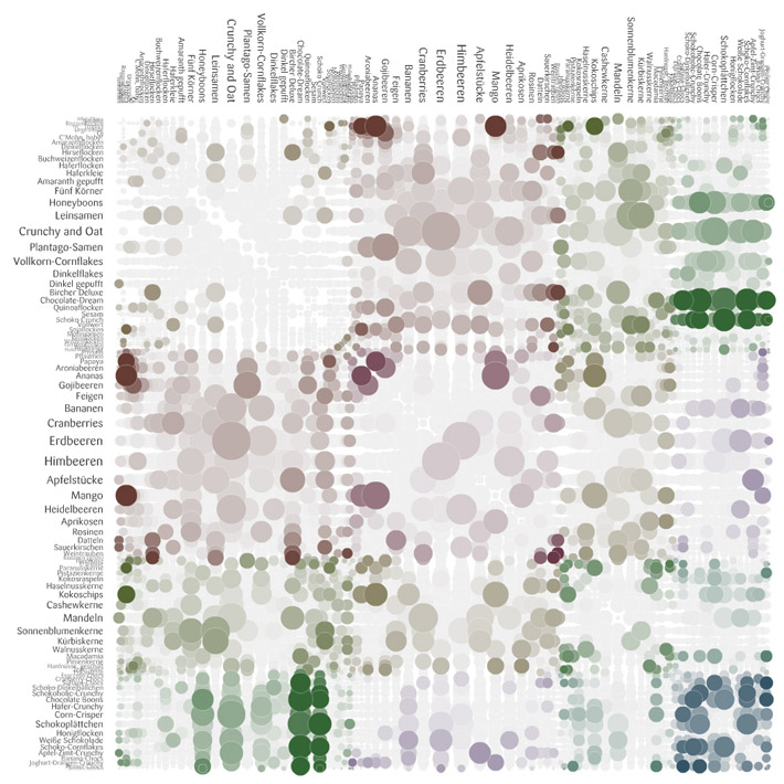
Moritz Stefaner showed his designs for the recent meusli project; he chose the chord diagram over the possibly-more revealing matrix design because the matrix doesn't look "tasty" and "meusli shouldn't look like fungi."

Stefaner's rejected "fungi" visual of muesli

Moritz was also very thoughtful in his explanation of why they deliberately avoided axes labels and the addition of the purely ornamental role of the particles in the Max Planck Research Networks.

A slightly random aside about one of Moritz's projects with Nand.io -- but if like me you wondered what that floating mill on the River Tyne looks like:

Tyne Floating Mill (Source of stats for the beautiful Tyne Flowmill visualization)

And here's a snap from the beautiful Tyne Flowmill project image archive:

Tyne Flowmill visualization details


You can find this same vein of honesty about process (and failures on the way) in the excellent and often funny Chartsnthings blog of the NYT Graphics team process, run by Kevin Quealey (@KevinQ).  Kevin was there too and took the news of my crush on Amanda much better than she did.  I was told that the NYT has no budget for travel -- yet there was a sizable contingent from their Research Labs and the Graphics Team.  I guess that's the best indicator of a conference that's a successful destination event:  People will pay their own way to attend.

Tool Use


Repeating yet again, I got really interested in that process stuff.  So, here are some of the sketching/intermediate tools used before the final versions that I heard or inferred:

  • Hand-written calculations and paper highlights (Stefanie Posavec)
  • Java (Martin Wattenberg and Fernanda Viegas) 
  • Processing and MySQL, pdf exported into Illustrator and InDesign (Felton)
  • Tableau and Excel and Gephi and Processing and Photoshop (Moritz Stefaner)
  • R (Amanda Cox) [I know this from the Chartsnthings blog and a previous talk; although the NYT Graphics team uses many other visual design and development tools as a group]
  • Processing (Ben Fry, Wes Grubbs, Jer Thorp)
  • Dat.GUI (Koblin)

Did I miss any, anyone know?


Worthwhile Career Risks


It's risky enough to be an independent consultant these days without sophisticated insurance, but it's even riskier to try to do artistic information visualization that is stays honest and solidly grounded in the data -- there are only so many gigs with Wired or GE or Popular Science out there. The people I admire seem to have them pretty well covered. Getting a business informatics gig is a lot easier, given the millions of startups and companies rolling in data right now.

"Here Are Some Words; We Hope You Find Something (and if you do, would you mind tweeting about it)" (Amanda Cox)

Even more risky is trying to limit your work to visualizing "data for good," the motto of Periscopic (represented at the conference by Kim Rees (@krees) and Dino Citraro), echoed by Jake Porway with his new DataKind project and Code for America,  represented by the very articulate Jennifer Pahlka. As Jer Thorp asked of the panel he organized, "How do you do this kind of socially conscious work, and still pay rent in New York?"

Luckily we're not all in NYC, but the same question holds in some form for most independents: turning down work based on ethical questions about the client or the data message is a luxury not all of us can afford. When "brands" come knocking, it's tough to say no, especially if they're rich and you're not.  Jake, at least, suggested a path to being involved as a part-time volunteer (see his "I'm a data scientist" signup page). Incidentally, Porway's example of a visualization that "does good" was the animated timeline that illustrated the spread of London Riot rumors--and their corrections--from the Guardian:

London Riot Rumors on Twitter from the Guardian

I found this theme of "doing good with data" an inspiring reminder, and I'm glad to see it playing a part in this kind of high-touch, high-concept conference. Enormous thanks to the organizers for this, and to the Ford Foundation sponsorship for enabling them.

Insecurity Admitted, Hilariously (and Inspiringly)


Why were so many of the speakers so funny?  No one is funny at academic conferences, unless they've had a lot to drink and you're no threat to their tenure process.  Robert Hodgin (@flight404) is basically an artistic standup comedian. Or a comedian who does digital art, I'm not sure. And he's like that every time I see him, with whatever material, so it's not like this was super-practiced.

I almost hurt myself laughing when Jer Thorp described some of the weirder Avengers from his massive comic collection (Whizzer, Starfox who "stimulates the pleasure centers of the brain" and was therefore brought up on charges for sexual harassment at one point?!).
Google "pugs in costume," it'll change your life. (Wes Grubbs)

And you too can enjoy Ben Fry's recap of the critic who accused him of having a Degree in Useless Plots from Superficial Analysis School in his "I Think Somebody Needs a Hug" post.  But I'm still waiting for the post of the very funny Famous Writers drinking saga by Ben's colleague at Fathom.

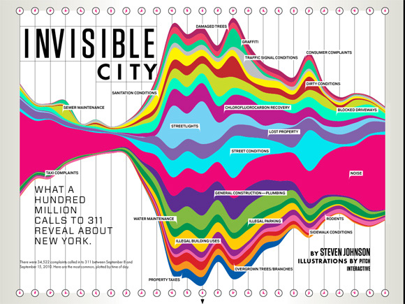
There was a lot of wry humility, too -- Wes Grubbs recounted how proud they were of the spread of their Wired piece for 311 calls, and then found out that it was in an issue with cleavage on the front.  Regardless, Tim O'Reilly used it in a TedX talk and it got a slot in the MOMA Talk To Me exhibit, so I think it had legs even without the cover boobs.


Pitch Interactive for Wired


Speaking of humility, a few days after the conference, Robert Hodgin posted his astounding talk code on Github with an awesome, hilarious, apologetic README that should be required reading for anyone trying to learn creative coding without a computer science degree:

I recognize that I can make some great looking work, and I am proud of this fact. But as soon as I am engaged in a code-related conversation with someone who knows C++, someone who knows proper code design, someone who knows how to explain the difference between a pointer and a reference, someone who polymorphs without hesitation, the bloom falls from the rose and I end up looking like an idiot. Or even worse, a fraud.

If Robert Hodgin and Jer Thorp can feel like hacks or frauds, then maybe it's okay if I have imposter syndrome too; and if I want to make an interactive vis project of Avengers' penis sizes for charity, I should probably just own that desire and run with it.  And if you made it this far and now you don't want to hire me for anything, so be it! Everyone needs to pursue their dreams.

Sunday, May 13, 2012

My Most Influential One Pixel Line


I thought I'd contribute one story to the "telling stories with data" genre, even if it's a silly one. It's silly 'cuz it features such a silly graph, which I shoved into an appendix of a presentation for a client a few years ago. Here's an anonymized version:


I put that animation with the arrow in there on purpose, because when I presented it, I had to point out the skinny line on the top. More graphs than you'd expect come with a "performance" part and in some contexts, I think this is just fine. Afterwards, one exec at the company referred to it often as "that chart with the one pixel line." (Okay, technically it had about 2 or 3 pixels. Not as punchy if you refer to it as "that chart with the 3 pixel line" or "that chart with the thin red line.")

I'm sure there are other, better, ways to present this red-and-orange tower. The point is: It was remembered. It had an impact. This graph led to more graphs being created! Roughly, we saw these steps:

  1. Acknowledged and admitted: The one pixel red line was considered to be a problem (or rather, the un-analyzed orange bar was).
  2. More descriptive graphs were made: This is key &emdash; an influential graph/chart always leads to more data investigation, with more graphs. Describe the size of the problem, delve further. The giant orange segment was tackled: How could it be made manageable? What patterns existed inside it?
  3. Sensemaking/iterpretation: What could we do, what couldn't we do? What should we prioritize or safely ignore? What tools were needed? Who owned what parts of this orange bar?
  4. Data tools sprouted: A series of ad hoc and then longer term tools were built: Excel reports with perl/python/VBA, then a Flex tool for intermediate data dives, then a dashboard in Flex for tracking larger picture trends.

Do It Well, and Do It "In-House"

It's an old analytics saw that you can't improve what you don't measure. Well, I think you won't improve what you don't measure meaningfully and then pay attention to. The client had collected the data, but then did nothing with it, because no one had made understanding it a priority. Data for data's sake is pointless and will be ignored. At the time of my one-pixel bar, an analytics cheerleader in the company described our primary data system as "buggy, opaque, brittle, esoteric, confusing." I'd add, "understaffed," and as a result of all that, usually ignored, which is how the one pixel red line came to be.

We took a brief detour in which we considered "outsourcing" the data problem to another company to do the top-level reporting for us, but our (mostly my) investigations suggested we couldn't do the fine-grained, raw-to-dashboard (ETL) reporting and analysis we needed without owning the entire pipeline ourselves. Because in all these organizational, data-driven settings, the reasoning goes like this:

  • What's going on? Now, and as a result of previous behaviors/changes. Do we have the right data? Trends, alerts, important KPIs.
  • Why is that going on? Drill in. Question if we have the right data and instruments to diagnose. A deep dive occurs, often all the way back to RAW data. This is normal! And this is necessary.
  • How might we change the bad things? This is a complicated question, never simple and often not just quantitative. This is where the profound thinking happens, when the cross-disciplinary methods and teams pull together to interpret and chop data. Sense-making and interpretation require lots of checks on data, reasoning, and context.

Cross-Disciplinary Success

Our ultimate data team was a cross-company, somewhat ad hoc group of people who cared about the same thing, but didn't report together anywhere: Customer Support, UI development management, directors of development and the API team, a couple of database gurus. Oh yeah, let's not forget the database gurus: I couldn't have even made that bar chart without badgering the database guys for info on their tables, so I could do some SQL on it.

In a year, we had achieved measurable significant improvements, via that cross-disciplinary team, and without out-sourcing our important data in any way. The short-term tools paid off almost immediately, and I hope the long-term ones are still evolving. One of the team members won an award for the tool he developed for exploring important raw data (and I did contribute to the design). None of this was done under official reporting structures. But the organization was flexible enough to support the networking, collaboration, and skills needed.

I Did Other Stuff, Too...

Since that graph is so silly, here's a little montage of other exploratory data and design work I did while I was with that client. Lots of tools were involved, from R to Tableau to Flex to Python to Excel to Illustrator. Vive la toolset!

Sunday, March 18, 2012

Digging Into NetworkX and D3


For Boston's Predictive Analytics Meetup in February, I gave a short talk on using the python library NetworkX to analyze social network link data, illustrated with some simple D3.js visuals of the results. I've since spruced up the slides to stand on their own a bit better, extended a few of the examples, and moved it all online.

Here's a link to the zip file of the ppt, heavily commented code samples, and the network edgelist I used (from Moritz Stefaner's and my previous look at Twitter Infovis folks in mid-2011). Or you can browse the slides below (the links should work fine).


A few comments, if you made it through the deck... The network stats are doubtless out of data, since I know there has been some movement in who-follows-whom among the Infovis crowd on Twitter. The overall workflow proposal is this:

  1. Read in your edgelist into NetworkX (or a json file if you already have one)
  2. Convert to a NetworkX graph object
  3. Calculate stats and save them as attributes on the graph nodes (my code shows you how/does it for you)
  4. Optionally here: Filter the network by some important attribute.
  5. Write out JSON of the network to use elsewhere (e.g., D3)
  6. Visualize (in D3) and explore what you got
  7. Optionally here: Filter the network further in the interactive visualization.
  8. Go back to (1) and add more stats. Or filter some more.

In my previous post using Gephi to analyse the infovis network, I labelled one subcommunity "The Processing" crowd, another one "The Researchers" and another one "The Authorities." In my current analysis, where I find 6 subcommunities (or "partitions"), you can see them as roughly the green partition (Processing folks and infovis artists), the orange partition (the research/analytics group), and the blue partition (with high-degree authorities like infosthetics and flowingdata).

The different demos make different things clear about this data, as you might expect!

  • The adjacency matrix of the top 88 chosen by eigenvector centrality reveals that the orange partition, or the Researchers, have more members with high eigenvector centrality than the other subgroups. This is quite clear when you sort by Partition. Other partitions are barely represented here. (NB: It was only 88 because it was all that fit easily; for the other demos, I use a subset of 100 out of the full 1644 nodes.)


  • The chord diagram, which allows you to toggle between the 100 person top eigenvector scoring subset vs. all 1644, shows a striking difference between the subset of 100 and the full set. It's even more obvious here how the orange partition (the "Researchers") overwhelms the top eigenvector subset, and how little of the large green group are represented in this subset. We can certainly speculate why this is...


  • The force network of nodes allows you to see some individual following patterns, at least among the "most important" top nodes. In this example, I filter the graph inside the javascript code, instead of in the NetworkX code. The graph shows a union of the top nodes selected for eigenvector centrality, betweenness, and degree. Some of them near the edges don't follow anyone in the "top" network sample, but they made this cut by being high in one or more measures of degree, eigenvector centrality, or betweenness. You can resize by each variable, or click on one to see the individual's values.

Once you get started making these visuals, you want to tinker forever... I hope the code samples and comments help you get started, if you want to try to do something in this line! Once again, talk slides plus source are in this zip file. Be sure to note my warnings and gotchas if you tinker yourself.

For a recent and different analysis of talk among the Twitter Infovis crowd, visit @JeffClark's posts here and here and here. (He's an orange, top N member in my graphs.) He identifies "red" and "blue" groups based on their interactions and words used. His two primary groups seem to correspond to the processing/artists (green) and researchers/analytics (orange) distinctions I found in this older data.