Tuesday, December 30, 2014

A Silly Text Visualization Toy


This little text-to-image replacement toy made me laugh, so I decided to put it up in case it makes you laugh too. In my last project, I did part-of-speech tagging in Python and used that to replace nouns with other nouns (see post and demo); in this one, I did the part-of-speech tagging all in Javascript using the terrific RiTa.js library!

With RiTa, you get the same slightly noisy results I got in the pattern.py tagging I did before: not all the nouns are good "nouns." The API for tagging is super easy:

>RiTa.getPosTagsInline("Silent night, holy night")
>"Silent/jj night/nn , holy/rb night/nn"

After generating the parts of speech, I filtered for just the nouns ("/nn" and "/nns"). I replaced those with words in "span" tags, and then used an ajax call to search for each spanned text in Google's image search API. The whole operation is outlined here, with the logic for getting the local text selected first:

$.when(
      $.get("texts/" + file_name, function (text) {
        lines = text.split('\n');
      })
    )
    .then(function () { 
      return processLines(lines);
    })
    .then(function (text) {
      $(".content").html(text);
    })
    .done(function () {
      $("span.replace").each(function (i, val) {
        getImage(val);
      });
    });


It turns out (of course) that there's a lot of repetition in certain words, especially for holiday songs and poems; so I introduced some random picking of the image thumbnails for variety.

Here's more from "Night Before Christmas" (which is really called "A Visit from St. Nick") -- yes, that's Microsoft Word:


This is the first sentence of Pride & Prejudice; it ends with the single man getting the Good Wife:


And the Road Not Taken:


I think the Night Before Christmas is the best one, but they all have their moments. Try it. Suggestions for other well-known (short) texts to try?

Saturday, November 22, 2014

Visualizing Word Embeddings in Pride and Prejudice

It is a truth universally acknowledged that a weekend web hack can be a lot of work, actually. After my last blog post, I thought I'd do a fast word2vec text experiment for #NaNoGenMo. It turned into a visualization hack, not too surprisingly. The results were mixed, though they might be instructive to someone out there.

Overall, the project as launched consists of the text of Pride and Prejudice, with the nouns replaced by the most similar word in a model trained on all of Jane Austen's books' text. The resulting text is pretty nonsensical. The blue words are the replaced words, shaded by how close a "match" they are to the original word; if you mouse over them, you see a little tooltip telling you the original word and the score.


Meanwhile, the graph shows the 2D reduction of the words, original and replacement, with a line connecting them:

The graph builds up a trace of the words you moused over, a kind of self-created word cloud report.


The final project lives here. The github repo is here, mostly Python processing in an IPython (Jupyter) notebook and then a javascript front-end. This is a blog post about how it started and how it ended.

Data Maneuvers

In a (less meandering than how it really happened) summary, the actual steps to process the data were these:

  1. I downloaded the texts for all Jane Austen novels from Project Gutenberg and reduced the files to just the main book text (no table of contents, etc.).
  2. I then pre-processed them to convert to just nouns (not proper nouns!) using pattern.py's tagger. Those nouns were used to train a word2vec model using gensim. I also later trained on all words, and that turned out to be a better model for the vis.
  3. Then I replaced all nouns inside Pride and Prejudice with their closest match according to the model's similarity function. This means closest based on use of words in the whole Austen oeuvre!
  4. I used a python t-SNE library to reduce the 200 feature dimensions for each word to 2 dimensions and plotted them in matplotlib. I saved out the x/y coordinates for each word in the book, so that I can show those words on the graph as you mouse over the replaced (blue) words.
  5. The interaction uses a "fill in the word cloud" mechanism that leaves a trace of where you've been so that eventually you see theme locations on the graph. (Maybe.) Showing all the words to start is too much, and even after a while of playing with it, I wanted them to either fade or go away--so I added a "clear" button above the graph till I can treat this better.

The UI uses the novel text preprocessed in Python (where I wrote the 'span' tag around each noun with attributes of the score, former word, and current word), a csv file for the word locations on the graph, and a PNG with dots for all word locations on a transparent background. The D3 SVG works on top of that (this is the coolest hack in the project, IMO--see below for a few more details).

Word Similarity Results

The basic goal initially was to take inspiration from the observation that "distances" in word2vec are nicely regular; the distance between "man" and "woman" is analogous to the distance between "king" and "queen." I thought I might get interesting word-swap phenomena using this property, like gender swaps, etc. When I included pronouns and proper nouns in my experiment, I got even limper word salad, so I finally stuck with just the 'NN' noun tag in the pattern.py ptag parser output. (You will notice some errors in the text output; I didn't try to fix the tagging issues.)

I was actually about to launch a different version--a model trained on just the nouns in Austen, but the results left me vaguely dissatisfied. The 2D graph looked like this, including the very crowded lower left tip that's the most popular replacement zone (which in a non-weekend-hacky project this would need some better treatment in the vis, maybe a fisheye or rescaling...):

Because the closest word to most words are the most "central" words for the model--e.g., "brother" and "family", the results are pretty dull: lots of sentences with the same words over-used, like "It is a sister universally acknowledged, that a single brother in retirement of a good man, must be in time of a man."

Right before I put up all the files, I tried training the model on all words in Austen, but still replacing only the nouns in the text. The results are much more interesting in the text as well as the 2D plot; while there is no obvious clustering effect visually, you can start seeing related words together, like the bottom:

There are also some interesting similarity results for gendered words in this model:

model.most_similar(['wife'])
[(u'son', 0.7893723249435425),
 (u'reviving', 0.7113327980041504),
 (u'daughter', 0.7054953575134277),
 (u'admittance', 0.6823280453681946),
 (u'attentions', 0.658092737197876),
 (u'warmed', 0.6542254090309143),
 (u'niece', 0.6514275074005127),
 (u'addresses', 0.6490938663482666),
 (u'proposals', 0.647223174571991),
 (u'behaviour', 0.6413060426712036)]

model.most_similar(['husband'])
[(u'nerves', 0.8918779492378235),
 (u'lifting', 0.7963227033615112),
 (u'wishes', 0.7679949998855591),
 (u'nephew', 0.7674976587295532),
 (u'senses', 0.7639766931533813),
 (u'daughter', 0.7601332664489746),
 (u'ladyship', 0.7527087330818176),
 (u'daughters', 0.7525165677070618),
 (u'thoughts', 0.7426179647445679),
 (u'mother', 0.7310776710510254)]

However, the closest matches for "man" is "woman" and vice versa. I should note that in Radim's gensim demo for the Google News text, "man: woman :: woman: girl," and "husband: wife :: wife : fiancée."

And while most of the text is garbage, with some fun gender riffs here and there, in one version I got this super sentence: "I have been used to consider furniture the estate of man." (Originally: "poetry the food of love.") Unfortunately, in this version of the model and replacements, we get "I have been used to consider sands as the activity of wise."

I saved out the json of the word replacements and scores for future different projects. I should also note that recently gensim added doc2vec (document to vector), promising even more relationship fun.

A Note on Using the Python Graph as SVG Background

To make a dot image background for the graph, I just plotted the t-SNE graph in matplotlib, like this (see the do_tsne_files function) with the axis off:

plt.figure(figsize=(15, 15))
plt.axis('off')
plt.scatter(Y[:,0], Y[:,1], s=10, color='gray', alpha=0.2)

After doing this, I right-clicked the inline image to "save image" from my IPython notebook, and that became the background for drawing the dots, lines, and words for the mouseovers. Using the axis('off') makes it entirely transparent except for the marks on top, it turns out. So the background color works fine, too:

#graph {
  position: fixed;
  top: 150px;
  right: 20px;
  overflow: visible;
  background: url('../data/pride_NN_tsne.png');
  background-color: #FAF8F5;
  background-size: 600px 600px;
  border: 1px #E1D8CF solid;
}

There was a little jiggering by hand of the edge limits in the CSS to make sure the scaling worked right in the D3, but in the end it looks approximately right. My word positioning suffers from a simplification--the dots appear at the point of the word coordinates, but the words are offset from the dots, and I don't re-correct them after the line moves. This means that you can sometimes see a purple and blue word that are the same word, in different spots on the graph. Exercise for the future!

I also borrowed some R code and adapted it for my files, to check the t-SNE output there. One of the functions will execute a graphic callback every N iterations, so you can see a plot of the status of the algorithm. To run this (code in my repo), you'll need to make sure you paste (in the unix sense) the words and coordinates files together and then load them into R. The source for that code is this nice post.

The Original Plan and Its Several Revisions

If I were really cool, I would just say this is what I intended to build all along.

My stages of revision were not pretty, but maybe educational:

  • "Let's just replace the words with closest matches in the word2vec model and see what we get! Oh, it's a bit weird. Also, the text is harder to parse and string replace than I expected, so, crud."
  • ...Lots of experimenting with what words to train the model with, one book or all of them, better results with more data but maybe just nouns...
  • "Maybe I can make a web page view with the replacements highlighted. And maybe add the previous word and score." (You know, since the actual text is itself sucky.)
  • ...A long bad rabbit hole with javascript regular expressions and replacements that were time-consuming for me and the web page to load...
  • "What if I try to visualize the distances between words in the model, since I have this similarity score. t-SNE is what the clever kids are using, let's try that."
  • "Cool, I can output a python plot and draw on top of it in javascript! I'll draw a crosshair on the coordinates for the current word in the graph."
  • "Eh, actually, the original word and the replacement might be interesting in the graph too: Let's regenerate the data files with both words, and show both on the plot."
  • "Oh. The 'close' words in the model aren't close on the 2D plot from the nouns model. I guess that figures. Bummer. This was kind of a dead-end."
  • Post-hoc rationalization via eye-candy: "Still, better to have a graph than just text. Add some D3 dots, a line between them, animate them so it looks cooler." (Plus tweaks like opacity of the line based on closeness score, if I do enough of these no one will notice the crappy text?)
  • Recap: "Maybe this is a project showing results of a bad text replacement, and the un-intuitive graph that goes along with it?"
  • "Well, it's some kind of visualization of some pretty abstract concepts, might be useful to someone. Plus, code."
  • ...Start writing up the steps I took and realize I was doing some of them twice (in Python and JS) and refactor...
  • "Now I still have to solve all the annoying 'final' details like CSS, ajax loading of text parts on scroll, fixing some text replacement stuff for non-words and spaces, making a github with commented code and notebook, add a button to clear the graph since it gets crowded, etc."
  • Then, just as I was about to launch today: "Oh, why don't I just show what the graph looks like based on a model of all the words in Austen, not just nouns. Hey, wait, this is actually more interesting and the close matches are usually actually close on the graph too!"

There were equal amounts of Python hacking and Javascript hacking in this little toy. Building a data interactive requires figuring out the data structures that are best for UI development, which often means going back to the data processing side and doing things differently there. Bugs in the vis itself turned up data issues, too. For a long time I didn't realize I had a newline in a word string that broke importing of the coordinates file after that point; this meant the word "truth" wasn't getting a highlight. That's one of the first words in the text, of course!

And obviously I replaced my word2vec model right at the last second, too. Keep the pipeline for experiments as simple as possible, and it'll all be okay.

Sunday, October 26, 2014

A Roundup of Recent Text Analytics and Vis Work

Some really exciting things in text analysis and visualization have crossed my Twitter feed recently; I thought I'd pull together some pointers in case you missed any of my tweetspam about one of my favorite subjects. Maybe posts like this will become a regular thing!

Shiffman's P5.js and Javascript Text Tutorials


Dan Shiffman, famous for his excellent books and lessons on Processing, is doing a course for ITP that includes a lot of text analytics work done in javascript and p5.js (the new javascript Processing lib). The git repo for his course content (code and tutorials) is here. He includes accessible content on TF-IDF, Markov chains, Naive Bayes, parsing, and text layout for the web.

Topic Modeling News


David Mimno updated Mallet, the Java reference package for LDA, with labeled LDA (topics within labeled documents) and stop word regular expressions. Blog post with some explanation here.

Alan Riddell released a Python implementation of LDA with an interface inspired by scikit-learn. He points to an interesting semi-supervised topic modeling package also in Python, zLabel-LDA.

I liked this paper by Maiya and Rolfe with ideas for improving labeling of topics as compared to using raw LDA results. (Every time I teach topic modeling I confront the "but what do these mean" question, and the notion of post-processing the results for more meaningful representation gets a pretty short answer, because we've usually run out of time.)

Here's a nice recent project release from Peter Organisciak for making timeseries charts of topics across digital books in the Hathitrust Digital archive. Full instructions for the python and R package. Here's a section of his example of some topic distributions across The Scarlet Letter:


Words in Space (Multidimensional Scaling)


I was rather excited when Mario Klingemann posted his evolving project on visualizing the topics of the images in the Internet Archive's Book Collection -- a giant zoomable map of related subjects crunched with t-SNE. The links open the related images collections on flickr (e.g., here's "playing cards"). If you like old book images, especially woodcuts, this is a trap you may never escape from! I got lost in occult symbols and finally had to shut the tab.


Related to topic modeling, Lee and Mimno posted a paper on drawing convex 2d (or 3d) hulls around "anchor words" to outline topics in their co-occurrence spaces, such as from t-SNE (t-Distributed Stochastic Neighbor Embedding) or PCA. From their paper:


Meanwhile, David McClure has an interesting post about creating something like these algorithms "by hand" and generating network diagrams from the results. (Thanks to Ted Underwood for passing this on.) Here's his hand-labeled map of War and Peace:


Other words-in-space multidimensional scaling projects of recent note include word2vec, which has a nice Python gensim implementation (see great blog post and demo by Radim Řehůřek);
and GloVe, which claims to improve on word2vec but looks similar to me from the usage perspective (here's a "maybe buggy" Python implementation). t-SNE also has implementations in lots of languages including Python and R, all listed on their page. Also see a nice overview explanation of word embeddings with t-SNE visual examples by Chris Olah here and his demo of dimensionality reduction and t-SNE here.


Narrative Vis


In a fascinating project on Visualizing.org, Georgia Panagiotidou and Anne Pasanen visualize the oscillation of characters between good and evil in the Finnish Kalevala epic. Really lovely and worth a browse in full screen.


Nick Beauchamp's Plot Mapper: Paste in a text and a complex PCA visualization reduces it to something amazingly simple. He says,

The text is chopped into N chunks, and each "chapter" is plotted in a 2-dimensional space (connected by lines) along with the top X words in the text. You can see how the trajectory of the text moves through the space of words, emphasizing different themes at different stages of the work.

Here's a surprisingly sweet Peter Pan:


Note: Keep options for words to generate low, or you may get an error. Thanks to David Mimno (@dmimno) for passing that one one!

Text Generator Art


Darius Kazemi (@tinysubversions) is doing NaNoGenMo (National Novel Generation Month) again this year - repo and rules here. Let's all work on text generation in November! Instead of, you know, actually writing that novel by hand, like an animal.

It was a few weeks ago, but it still makes me giggle - the Vogon Poetry Generator that uses Google Search to build something based on the title (which you can edit in-page).

Wrapping Up


I really love text visualization projects that combine great analytics with great applications. Keep sending me pointers (@arnicas on Twitter) and maybe I'll do more of these roundups when the awesome gets to me enough. For more inspirational links, try my Pinterest board of text vis, my twitter list of text vis, art, nlp folks (who talk about a lot of other things so YMMV), and this hopefully growing index of academic work from the ISOVIS folks.

Sunday, May 11, 2014

Data Characters in Search of An Author


My last post on Implied Stories was about how we fill in the blanks to create story contexts in even very short works, like Hemingway's example of "the shortest story every told": "For sale: Baby shoes, never worn." In that post, I used Pixar's 22 Rules of Storytelling and Emma Coats' talk about them at Tapestry Conference, plus some sociology, to frame my points about how audiences find implied stories.

I closed that post with some concerns about how this applies to data visualization, as we "read" the stories implied in visuals and look for causation, for example. Our brains are telling stories even when they might not be there; as a designer or journalist you might want to head them off at the pass, or face a stampede of weird conclusions. You get those with correlation plots, which everyone reads as causation (after all, you must be implying something, right?). Some great new examples of spurious correlations came up this week in a popular linkmeme, the Spurious Correlation site. I dare you not to try to create a story in your head to try to rationalize this one:

Per capita consumption of cheese and number of people who died becoming tangled in their bedsheets. From tylervigen.

It's at least a well-known "myth" that you shouldn't eat cheese late at night.

Over at Eagereyes, Robert Kosara argued with me and Hemingway that the baby shoes ad isn't a story, because it lacks the formal elements of narrative structure. Part of my point was in how much we bring to the interpretation independent of what is written or shown explicitly. Our brains look for stories and remember stories, as was noted in the recent excellent Data Stories podcast on the topic. But I do think a lot (or most) of data visualization — including the most successful work — lacks story element completeness, and the metaphor is weak as a result.

This is part 2 of my post on implied stories, suggesting that good data visualization is often about characters. What we as readers or as designers do with those characters to fill in the story around them isn't the focus here. But readers are hooked by characters. 8 out of the 22 Pixar Rules focus on character. While the story metaphor for visualization might be weak in places, I think it works when we look for characters in successful visualizations, especially with respect to data outliers.


Heroes & Villians


Sometimes the data provide the heroes and villains of the story, and the rest of the work is finding out the setting and events that got them there. Often that reporting is at least partly in text, not in another data visual.

This is just one recent visual from the many news stories currently analyzing the depth of America’s health care problem, from the Atlantic. The outlier, who in this case is the hero (for readers of the Atlantic), is here cast as the villain, making a pretty compelling point:


Image from Atlantic article.

Underdog Heroes (in Search of an Author)


Another case, one of my favorites, is hidden in the movie data released for the Information is Beautiful movie data contest a few years ago. I didn’t enter, but looked at the data out of curiosity. It turns out there is an extreme outlier in profitability, Paranormal Activity, which cost almost nothing to make in 2009 and racked up 1289040% of its cost in profit (or 1311200%, depending on how you calculate). The next closest profitability is Insidious in 2011 with 6467% profitability. Paranormal Activity blows away the scale unless you revert to logarithmic. It looks like this, otherwise:

Graphing an extreme outlier without a log scale.

Since the data was released as part of a contest, I checked the entrants to see how they had handled this. A lot of them just filtered it out, didn’t deal with it at all. There’s a giant story in that data point, if you ask me what’s interesting in that data set, and it wasn’t told in most entries. In a few interactives, it was, but far fewer than you’d expect. Surely the point of interaction is the ability to dynamically change scales, add explanations, zoom and filter? Instead, the “outlier” that most folks found convenient to report is Avatar, which fits on a non-log scale. Here’s the default view of James Fisher’s entry, showing raw profit, not % profitability. That particular outlier is Avatar:

James Fisher's Hollywood vis.

McCandless (or his blogger) says that this entry “Encourages the user to draw their own conclusions with highly customizable elements and hundreds of data combinations.” A lot of the interactive visualizations do this, showing off their app building skills, creating exploratory tools rather than finding and highlighting that interesting data point or points. To Fisher’s credit, he does revert to a log scale view and doesn’t hide that amazing outlier, if you can find the controls to display by profit and then see the tiny dot that is my hero:

James Fisher's Hollywood vis in action.

As an aside, I found McCandless's brief elevator pitch text for each shortlist entry really interesting; what's the take-away pitch for your vis? "It's a tool to allow exploration" vs. "It shows that X" or "When you compare X and Y you see that..."? More of McCandless's intro text: "Sometimes bubble charts are all about color, aren’t they? Choose the right ones and let your brain and eyes do the rest." (Hmmm.)

But how about "Did you know that the average audience rating for love stories is highest around spring, summer holidays and christmas?" Now that's kind of interesting and definitely makes me want to explore. The entry in question, Confluence by Blimp Design, used a clever and funny labeling trick to handle the Paranormal Activity scale problem — although it might not be clear to folks without a footnote (look to the right end point of the second scale slider):


Gordon Chan’s entry ("sometimes bubble charts are all about color") does some nice things with the spacing between y-axis gridlines to compress and expand where room is needed, but he gives up on Paranormal Activity as a lost cause. You can see Paranormal Activity 2, though, the top red blob here!


If I were a journalist looking for a story about money in this data, I’d probably be more interested in the underdog heroes of the Paranormal franchise than the James Cameron Avatar success story. The Paranormal data point sent me to Wikipedia where I learned that indeed, it is the most profitable film ever made based on return on investment. Just because it’s inconveniently extreme doesn’t mean it’s not an important data point to showcase in a visualization, especially an interactive. (Admittedly not everyone entering the contest was focused on profit, however, as their angle of choice.)


Our Hero Joins a Gang


Related to the heroes and villains is the character “fell in with a bad crowd” and “joined a great band” posse story. The technique here is to show a group your readers associate something negative (or positive) with and how your hero/villain can be seen as a member of that group. Here’s Russia along with other scary outliers in mortality rates:


Combining characters into groups that behave similarly is a nice technique for reducing the visual noise of these types of plots. Regions like “EU” or “Northeast” make for good obvious groupings. Sometimes non-obvious groupings are the story, and we’re back to the “Band/Gang” theme, where we learn about a character by the company it keeps; look for the U.S. in the upper left quadrant here:


There may not be an obvious bad or good gang, but groups help you tell a cleaner story anyway.
Rule 5 in the Pixar rules starts “Simplify. Focus. Combine characters.” We're all familiar with the technique of re-coding our data in groups, like turning 12 months into 4 seasons, to highlight patterns that may be seasonal. Usually the data determines the reasonable groupings for you, like this nice illustration from NOAA of what months constitute "dry" vs. "rainy" seasons in Florida:


6 (or 60) Characters In Search of an Author


I’m also a fan of small multiples, but sometimes we're presented with exploratory visualization with no analysis applied. Here’s an example where I have no idea what to take away from it — if you squint you’ll see a small green blip that might’ve been a story here, but I don’t know.


Here’s a nice small multiples example, though, from a good blog post:

Image and discussion about storytelling charts found on XLCubed Blog post.

Some reasons it’s good: no hunting for the good/bad cases from the reporter’s perspective (the color helps), trendlines annotate the important cells; high points of interest are labelled; the mean of the data is in the background of the small cells so you can see the relative that’s being shown; text is helping guide the interpretation too. This is the well-known "annotation layer" at work for us. (Yes, there are cosmetic things I don’t love, but it’s overall very nice.)


Wrapping Up (So I Can Go Eat)


Without a lot of supporting explanation (or performance, in the case of Hans Rosling), I don't believe a visualization can tell you the "whole story," in terms of who, what, when, where, why, and how; a visualization usually implies only a few of those, and our brains leap to conclusions the author of the visualization may or may not expect. Spurious correlations that suggest causation are a great example. If the author shows the data, it must be important and mean something, right? But sometimes visualization creators make poor choices, as in any design activity.


One of Emma Coats’ most resonant points at Tapestry was that audiences for movies want to be enthralled, delighted, connected — they don’t necessarily want to learn, but they are curious. Presenting a visualization hook of a hero or villain outlier and the company they keep might make a reader curious — curious enough to explore the visualization or topic further. But I still think some authorship is needed; otherwise, you risk your reader leaving your piece in frustration after hitting a few buttons and, if you're lucky, admiring the work you did re-inventing Excel online. If your authorship amounts to having screened out a really interesting outlier because it was inconvenient for your code, well, I'm not giving your story 5 stars.


Notes: Heroes and Villains is a book by the late Angela Carter, and 6 Characters in Search of an Author is a play by Pirandello, some of which involves the characters arguing about what their drama is about. You really should listen to the Data Stories podcast on the storytelling in vis debate.

Sunday, March 23, 2014

Implied Stories (and Data Vis)


At the excellent Tapestry Conference in February in Annapolis, Emma Coats (@lawnrocket) spoke about storytelling, the theme of the conference. Her talk was based on her internet-famous 22 Rules of Storytelling developed while she was at Pixar.

Lacking the video of her talk ([ETA: here it is!]), I cracked open the ebook based on her principles by Stephan Bugaj, Pixar’s 22 Rules of Story (That Aren’t Really Pixar’s) (— which, incidentally, Emma says was written without her permission and none of her involvement. Caveat Lector).

Pixar Rule 4:

Once upon a time there was a ______. Every day, ________. One day ________. Because of that, _______. Because of that, _______. Until finally ________.

Bugaj points out this is a summary of a basic plotting structure, the “story spine,” suggested in many books on writing fiction: setup, change through conflict, resolution. The details make it a good story, of course (character, context, conflict…).

Emma talked about confounding the expectations of an audience: The ghost of what they expected should remain at the end, but your story arc should win (and convincingly). Related was an important point: the implied story line. You suggest a shape to what will or might happen (or has happened), and the audience fills it in. Her pithy example was Hemingway’s “shortest story every told”, a 6-worder:

“For sale: baby shoes, never worn.”

There are lots of ways the story here can be filled in, all of them sad. The reader brings the detail and does most of the work, but the author set it up very well to allow this.

Another Short Story


I’d like to offer another example, a very short story deconstructed in a series of lectures by sociologist Harvey Sacks (Lectures on Conversation) — which coincidentally also features a baby:

“The baby cried. The mommy picked it up.”

Maybe it’s not as GOOD a story as Hemingway’s, but Sacks argues it’s a story, based on having a recognisable beginning and end, the way stories do. There’s a dramatic moment, and a resolution. And while you may think we can read less into the plot than into Hemingway’s, Sacks spends 2 lectures (plus book appendices) on this story and how we understand it the way we do.

Ok, let's accept it’s a story. Secondly, we infer that the baby and mommy may be related: it’s the baby’s mommy. “Characters appear on cue” in stories, he says; the Mommy is not a surprise in the normal setting conjured in our head; it doesn’t feel deus ex machina, like cheating.

Notice the story didn’t say “his mommy” or “her mommy” or “the baby’s mommy.” Juxtaposition of category terms often used in family contexts helps us infer this, Sacks argues. It’s clearly possible the baby was abandoned outside a supermarket and someone else’s mother picked it up to comfort it, as I hope one would! It’s not the simplest reading, though. Notice that we also assume they are humans, not apes or cats. Our human context draws that story, an Occam’s Razor kind of principle to reading.

Thirdly, Sacks notes we read the story as having cause and effect. Again, this is related to the juxtaposition and assumptions of normal family roles. That’s partly the expected story spine at work, too: conflict, resolution! Cause, effect, NOT just correlation.

Fourthly: the action in this story is believable, interpretable, unlike “colorless green ideas sleep furiously.” (That’s an old linguistics chestnut.) Babies cry; babies who cry should probably be picked up. Sacks notes that a mother can say plausibly, “You may be 40 years old but you’re still my baby.” In that case we don’t expect the crying 40-year old to be picked up, even if he’s “acting like a baby.” We fill in the blanks in this story in the most consistent way possible for the details we’ve been given, which means a lot of assumptions based on what we know and expect about social and human behavior.

Surprise!


A thing I didn’t tell you right away is that this story is a story by a 2 year old, that Sacks got from a book called Children Tell Stories. Sacks spends a certain amount of words on why this is a story because it comes from a child: the drama is a child’s, the resolution is a child’s happy ending. Sacks suggests that children, as speakers, might start a story with a dramatic moment, as a method of getting the floor. He says the dramatic problem here is a valid child’s talk opener, like “Hey, did you notice your computer is smoking?” would be for a stranger addressing you in a coffee shop while you’re getting a napkin. The ending is a valid ending, because for a child being picked up is a resolution. For this story to have a tidy ending, we infer that being picked up results in a non-crying child, or at least a happy child. But the actual non-crying denouement is implied here because of Mommy doing something expected.

The child’s story is arguably less sophisticated than Hemingway’s story, but notice that it’s more of a classic, plotted story in that 2 events occur, the crisis and the resolution. I hope I’ve convinced you that’s it’s still quite sophisticated in terms of the amount we bring to it when we read it, and how it successfully carries us along despite being terse. Hemingway’s is a suggestion of events behind a public for-sale ad, and all the action and characters and emotion occur in your head.

Story, Discourse, Visuals


What does this have to do with data visualization? Emma Coats wasn’t quite sure how to relate her story telling principles to vis design, but left it to us as adult vis creators to make that connection. I’m going to spell out some of what I take from the Pixar and Sacks points, as well as a little more storytelling thinking.

First one useful distinction in terms from Dino Felluga's General Introduction to Narratology:

"Story" refers to the actual chronology of events in a narrative; discourse refers to the manipulation of that story in the presentation of the narrative. [...] Story refers, in most cases, only to what has to be reconstructed from a narrative; the chronological sequence of events as they actually occurred in the time-space ... universe of the narrative being read.

(This isn't necessarily the way a linguist would define discourse, but it'll do for now.) Discourse encompasses all the similes, metaphors, style devices used to convey the story, and in a film, all the cutting, blocking, music, etc. The story is what is conveyed through these devices when the discourse has succeeded. (So, for Felluga, telling "non-linear" stories is an attribute of the discourse, not the story itself.)

Hemingway's short story's discourse structure is very different from a two-year old's discourse structure. The artistry lies in the discourse choices as well as in the stories they picked to tell.

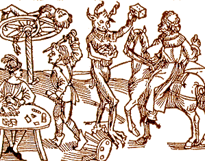
Felluga illustrates how stories can be told in a visual discourse form with a Dürer woodcut:

(Woodcut to Wie der Würffel auff ist Kumen (Nuremberg: Max Ayrer, 1489). Reprinted in and courtesy of The Complete Woodcuts of Albrecht Dürer, ed. Willi Kurth (New York: Dover, 1963)

The story goes something like this: 1) The first "frame" of the sequence is the right-hand half of the image, in which a travelling knight is stopped by the devil, who holds up a die to tempt the knight to gamble; 2) the second "frame" is the bottom-left-hand corner of the image, where a quarrel breaks out at the gambling table; 3) the third "frame" is the top-left-hand corner of the image, where the knight is punished by death on the wheel. By having the entire sequence in a single two-dimensional space, the image comments on the fact that narrative, unlike life, is never a gamble but always stacks the deck towards some fulfilling structural closure. (A similar statement is made in the Star Trek episode I analyze under Lesson Plans.) [Note from Lynn: Love this guy.]

George Kampis took out these lessons from this example, for his own introductory course:

  • Narratives can be visual
  • Time is Space here
  • Actions and events are consequences (causation), not just occurring in a sequence.
  • Narrative is therefore offering "explanation" — why did things happen?
  • But order has been imposed.

I would not argue that the woodcut is easy to read, at least for most of us. Reading this story requires background in themes and socio-cultural contexts that a lot of modern viewers don't have anymore. It's not as simple as "the baby cried" or even the Hemingway "for-sale" discourse format.

Causation in Vis

We look for cause and effect in sequences of events, which is why I suspect there’s so much confusion over correlation and causation in data reporting. Charlotte Linde, in Life Stories, talks about this as "narrative presupposition." She offers us the following two examples, which we read differently:

1. I got flustered and I backed the car into a tree. 2. I backed the car into a tree and I got flustered.
Linde toys with the idea that this is related to cognition, but falls back to suggesting it's a fact about English (and possibly related languages') story telling discourse and morphology. Regardless, it is a "bias" of interpretation we bring to bear on how we interpret sparse details juxtaposed. If a data reporter chooses details that juxtapose the rise of one thing with the rise (or fall) of another, the average reader will assume causation is implied by the reporter.

What's an example of a simple causation story in data vis? A timeseries of measures might be a good example. But without added context, it’s often just "X, then Y". Filling in some explanatory context on timelines has become standard, at least in journalism. The labels here help us contextualize the data, and arguably to infer some causation:

(Image by Ritchie King in a Quartz article.)

Here the designer has imposed order by suggesting causation or at least relevant correlations behind the measures shown over time and the labeling of events. Some of the labels may be just "informational," like the recent presidencies. For readers who know about the Clinton era economy vs. Reagan and Bush economies, the annotations carry more meaning. Regardless, by choosing to annotate in this way, the reporter suggests relationships in the minds of the reader, very deliberately. Less clearly related events also happened on those labelled time periods — births, deaths, scientific discoveries — and yet their relevance wouldn't be so "obvious" and so easy to glance over as reasonable. Economy and war go together like babies and mommies.

Because readers assume the author has juxtaposed items on purpose, suggesting odd relationships in your discourse automatically evokes weird stories in your reader's heads. These might be entertaining from an artistic perspective, of course...

(A super example from this paper on fallacy summarized on Steve's Politics Blog.

It's a little unlikely that lemon imports over time have a direct causal relation to accident rate, although we immediately want to figure out how they could!

Artistic &/or Journalistic

Is journalism better served by 2-year old storytelling with simple discourse forms ("X, then Y")? Maybe, for some purposes. Even so, there are a lot of unwritten implications behind every chart, from what's reported to how it's reported. It's easy to classify some work as simple propoganda — see Media Matters History of Dishonest Fox Charts for a lot of examples of apparent intentional misleading by implication.

Periscopic’s Stolen Lives gun deaths visualization was criticized by some for being un-journalistic, and yet, it makes its implications quite explicit and well-marked in the discourse (gray lines). The visualization walks the viewer through the interpretation with a slow intro, to show exactly where the artistic license begins to deviate from the data source.

(Visual from Periscopic's work.)

This work may be be more like Hemingway's for-sale story than a 2-year old's story, although in fact it leaves less to the imagination while it veers further from traditional journalism as it does so. Yet this is still data visualization taking an artistic narrative risk, for the sake of activism.

Wrapping Up (So I Can Watch TV)

Even very simple stories, whatever the discourse form, rely on the reader filling in a lot of invisible holes. Some of the interpretation we do is so "obvious" that only sociologists or cognitive scientists can make explicit the jumps we don't notice we're wired to make. Choice of structure, of juxtaposition, of annotation, of what's implied versus made explicit: these are discourse maneuvers that can clarify, mislead, open up possibilities, or even evoke emotion in surprising ways.

A willingness to borrow insights from other disciplines' thinking about these subjects was one of the reasons I liked Tapestry's programming. Emma Coats made me get out some old books, and writing this up helped tune my thinking a little bit. Good conference, and hopefully a thought-provoking post for a few readers.


Incidentally, some recent related articles: Periscopic's A Framework for Talking About Data Narration and Jen Christiansen's article "Don't Just Visualize Data — Visceralize It." [ETA: Also, a followup to this post by Robert Kosara at eagereyes.]