Saturday, December 31, 2005

Nerd A.D.D.

This post is dedicated to my brother... another nerd who thinks he has ADD. I myself recognize the symptoms all too well, especially after a week at my sister's house where it was not ok to sit with a latop all the time. (The question on my mind today is: can I go to a party tonight and take along a book, my ipod-wannabe, and a palm pilot, in case I need more than conversation and drink to make it through?)

On RandsInRepose, the description of N.A.D.D.

Here's a tip: If the building you are currently in is burning to the ground, go find the person with NADD on your floor. Not only will they know where the fire escape is, they'll probably have some helpful tips about how to avoid smoke inhalation as well likely probabilities regarding the likelihood you'll survive. How is it this Jr. Software Engineer knows all this? Who knows, maybe he read it on a weblog two years ago. Perhaps a close virtual friend of his in New York is a fire fighter. Does it matter? He may save your life or, better yet, keep you well informed with useless facts before you are burnt to a crisp.

Friday, December 30, 2005

New Scientist 2005 Roundup

Two good NS pieces: NewScientist.com's top 10 news stories of 2005, ranging from 13 Things That Do Not Make Sense (blogged here before) to the Pentagon's rejected sex weapon designed to make enemy soldiers fall in love.

And then there's the Year in Solar System, a look at all the amazing space mission discoveries in 2005, full of links to the articles.

In the future... Sam's comics.

In the future we will all be connected by a network. 37Signals' weblog Signalvs.Noise is hosting some great comics by artist Sam Brown. He is illustrating "in the future" sentences supplied by readers in the comments. It makes reading the comments really fun and kinda Zen.

His style reminds me a little of my friend Ken's What Cartoon site.

Thursday, December 29, 2005

form doesn't follow function-- in architecture.

In biology, the fact that form and function are closely related is proved over and over, especially with respect to protein shape and behavior. As a newbie to architecture, I wasn't surprised to hear that architects also believe in the mantra that form follows function. Building shape should reflect and reinforce what it's for, more or less.

Except, experimentally it doesn't seem to be true most of the time. This is an entertaining article reporting an experiment testing whether people can recognize the type of building from the exterior design. In short, they can't. I'll leave you to read the details of their experiment (and what it suggests about the sad state of American architecture) and just report the ending:

Other studies have shown that people already "read" buildings to judge the status of people who live or work inside, and to determine if the buildings are in a safe neighborhood, among other things, Nasar said.

"Buildings convey meaning, whether they are meant to or not," Nasar said. "So it makes sense that buildings be designed to indicate their use. But our results suggest it doesn't often happen."

Salem.

Flora's paw.

Sunday, December 25, 2005

DTV's TiVo vs. Replacement DVR

Weaknees has a side by side proper comparison of the sadly no-longer-offered DirecTV-branded TiVo vs. the newer DVR they are now promoting, the R15.

The TiVo still comes out ahead, on many points. But read and decide for yourself.

Fashion Meets Processing

Clayton Cubitt shot A beautiful collaboration between fashion photographer Clayton Cubitt and and Processing generative artist Tom Carden: Metropop's denim issue.

Friday, December 23, 2005

Best of Best of 2005 Lists

Off Cluefairy, the long list of 2005 summary lists on Fimoculous.

My favorite list titles, content aside: Top 10 Most Confusing (Yet Widely Used) High Tech Buzzwords from Global Language Monitor, Bad Sex In Fiction Shortlist from The Guardian, Ten 2005 Ads America Won't See from Ad Age, 10 Most Pathetic Media Meltdowns from Ad Age, Cheap Toy Roundup from The Onion A/V Club, Top 25 Military-Friendly Companies from GI Jobs (!), 25 Britons Who Wield Influence In America from The Times of London, Weirdest Tech from ZDNet.com, Top Reality TV Whores from Reality Blurred, Top Cryptozoology Books from Loren Coleman, 50 Photos Of People Smiling from LowCulture, Top 10 Kitchen Utensils Of This Year from Utter Wonder, Top 40 Weather Days from WXnation.com.

Sorry, it was too much work to get the actual links for all those into this post. You know you want to see the source page, anyway!

Tuesday, December 20, 2005

Getting it Right (or Wrong, at Blink)

An interesting post-failure analysis of why social bookmarking site Blink failed while del.ico.us has succeeded. Ari blames product design, although in the comments some people blame the development decisions, the growth of the company, the loss of focus, the ad and registration burdens... in short, all the dot com era fools are to blame.

The worst decisions seem to have been using folders, leading to an insupportable number of performance and downstream design problems impacting user experience; and then the decision to make folders of links private by default instead of public. I think tagging is prone to issues similar to folder creation, but the immediate visibility of content on del.ico.us, instead of just the containers, makes the design work better. There's a real immediate payoff without a lot of digging when you look around on del.ico.us.

My links are public, if you want to browse them. See sidebar.

Monday, December 19, 2005

Microsoft hires user interface guru

This just in from steve: Microsoft hires user interface guru Bill Buxton, formerly of Alias Wavefront and long HCI history. He's being hired by MS Research, of course, and will work on ubiquitous computing ("ubicomp"), as so many people do these days.

This is an entertaining paragraph close: Buxton in the past has been critical of software companies' failure to integrate appropriate design processes into products. However, he said that Microsoft is hiring more designers, which is encouraging. "My sense is that Microsoft is in transition from an engineering-led company to as much a design-led company," he said. "There are more designers at Microsoft on any single team as there were, not too long ago, in the entire company. It's a wonderful change."

I followed up his criticism, and found this right-on abstract for a talk he gave at Graphics Interface 2005 on exactly this topic:

...We are now seeing articles appearing that are warning about the danger of a schism in user-centred design (UCD) between the ethnography and usability camps. (See for example the spring issue of Interactions.) The apparent voice of reason points out that both have distinct roles: ethnography can feed design, while usability can evaluate it. All very nice as far as it goes. But what is missing is any detailed consideration of who actually does the design. There is something missing.

In this talk I want to speak to both the role and nature of design in the overall process. Along the way, I will argue a few points, including the claim that usability and ethnography are distinct from design. Relevant to design? Yes. Design? Decidedly not. I will also speak to the whole nature of iterative design, and argue why iterative and incremental software engineering practices such as extreme programming and agile software techniques are not the same as design. Again, relevant? Yes. Design? Absolutely not.

As I will show, the software industry has an abysmal record at creating new products. I will argue that the absence of anything vaguely resembling a design process is a key reason. My talk is directed at altering this situation.

I can't wait to see what he thinks about working at Microsoft after a couple of years! Now if only more companies understood the distinction between usability and design and how to operationally overcome the issue in a way that led to product success.

Saturday, December 17, 2005

FAQ on Usability Testing in Progress

I am writing an FAQ on usability testing for my new team. I want to do a real one, not a marketing-style intro level one that establishes that testing your software is like eating Mom's apple pie. (Wait, that's a weird metaphor.) What I am after is the common objections, the issues people really have about topics like potentially poor recruiting, validity of testing with small numbers, the value of qualitative data at all, the variability and difficulty of analysis of the results, the biases that may go into defining tasks for the test, etc.

If anyone reading has any concerns, however un-PC(!), about doing usability testing on software (or has heard anyone else express doubts about the value), I will try to put them in. Whether I have a great answer or not (some concerns are entirely valid). If I get anything from you, I'll post the results here as a web essay too.

Go on, be tough.

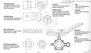
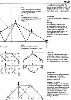
Ching's Visual Dictionary of Architecture

Ching cover This is a wonderful book. I mean, wonderful like Tufte and Bringhurst and Christopher Alexander and Scott McCloud... a book you open and can't put down because you get drawn into the beauty and details.

Even architects think it's a thing of amazement, and will tell stories about the original edition with Francis Ching's handwritten annotations, before later editions switched to the cursive font.

I spent about half an hour incapable of picking examples to display, but here are a few that I liked in that time. The discussion of rooms and room arrangements is enchanting. I've cut off the little people ascending to the adject level, alas.

Here's another example showing stress diagrams for trusses. (Trusses have been a big deal in my office recently. I had to look them up.)

There are sections on the tiniest details of joints to the widest of concepts, drawing, and what it's used for and how. Architects love it. Buy this book for someone for the holidays and then get it for yourself!

Good Experience Games online

A nice list of online, well-designed Good Experience Games pointed to by steve on tingilinde. I am deliberately not going there till I am on my holiday break, and even then I have a long list of stuff to do.... eeee. Tempting examples include a great-looking online Set puzzle (surely I can make one stab at this without losing the day), Samorost 2 (gorgeous!), a Scott Kim game or two, a bird feeding game called Pyoro (I think I will have to go see this, despite their warning it's "hypnotic"...)

Like I said, "Eeeeeee, I have stuff to do right now! Get them away!!"

Sanibel Island Beach Regurgitation

Bird vomit? Anyone have any explanations? (It may not be pretty, but it was a "lucky shot" so I'm making you admire it too.)

Bird scratching in Sanibel Island, Florida (November)

Thursday, December 15, 2005

Bumblebees Recognize People

This article explains that bumblebees trained with photos can remember faces. Does that mean bees could be used to assassinate people who are allergic? I go to the positive immediately...

From bees to wasps, spiders and even sheep, other animals have proven they can not only recognize our faces, but they navigate mazes, match objects and shapes and even associate smells with previous experiences. "Sometimes I wonder what we are doing with two-kilogram brains," mused Srinivasan.

Uh, making mazes and training insects to recognize photos?

Saturday, December 10, 2005

Motif #1, a red shack in Rockport.

This is "Motif #1" in Rockport MA. I was here a few weeks ago with my brother and sister-in-law. We recognized it immediately from a description in the guidebook, and then we said it as often as possible: "That's nothing like Motif #1." "Here's a house that could be Motif #2." "Maybe they have postcards of Motif #1."

Here's a webpage explaining how it go its name. It had something to do with the French!

Your Breakfast Toast is Talking...

I assumed this was a joke project when I read the very serious BBC Online article about it, but it's not -- your toast might tell you the weather report, if you let this kid at Brunel University toast the bread for you.

"He decided on the toaster to make his work stand out from the worthy and helpful devices many of his fellow students were creating. "I couldn't compete, so I went for fun and cool," he said. Mr Southgate's ambition is to follow in the footsteps of influential British designers such as Jonathan Ive, the man behind Apple's sleek iMac computer."

He sounds serious, so here's a serious concern. The palette of bread isn't a very high resolution for information display; if you ask what people want from weather forecasts you'll probably find this: "What's the forecast for the weekend? What's the precipitation plan for the night vs. the day? Is there a winter storm warning? Temperature matters, sure, but I want to know the other conditions too."

Is that burnt crumb an indicator of a low pressure system, or a piece of bread that was caught on the rack when I pulled it out? Will cinnamon bread (my favorite) obscure the messaging?

Monday, December 05, 2005

Tabs Gone to Hell

Everyone knows by now that multiple rows of tabs aren't such a good idea -- or do they? Here's an egregious example from my new Thinkpad. This has more than a few tab-related problems: there's some kind of duplication between resources and allocation (2 tabs for each overlapping concept); many of them seem to be empty anyway; there are so many that's it's actually hard to go through them all, even with the counting option, because there's so much shifting around as you click on them (making it hard to tell what you've seen already).

This UI is a small part of a worse UI issue: the Thinkpadders duplicated a bunch of OS-level stuff, often by overriding it completely, in their own custom UI. This is particularly awful in the area of networking. There's no way to scan for Wireless networks from the Microsoft dialog-- you have to figure out it's been overriden and is controlled from somewhere "new" and how to work that instead.

Why do companies so often make the mistake of trying to "brand" the hardware experience with their own custom (often poor) software experience where it's not needed? (Ok, it's still a sore spot from my TiVo era.)

Saturday, December 03, 2005

The Beauty of Simplicity

Fast Company has a nice article on the tension between simple design and sufficient design. (That's characterization of the problem, not the author's). The Beauty of Simplicity gets into some useful case studies after the lead-in on Google's home page.

Some highlights: Less isn't more, just enough is more. What constitutes "just enough" is harder than it looks. ... "It's easier," says Charles Golvin, principal analyst with Forrester Research, "to market technology than ease of use." "Every new feature makes things more complicated , even if you never use them." But.... "The market for simplicity is complex," says Dan Ariely, a business-school professor who is spending a year off from MIT figuring out how to quantify the value of simplicity at Princeton's Institute for Advanced Study. "If I offer you a VCR with only one button, it's not all that exciting, even if when you use it, it's likely to be easier."

There's the Philips corporate retooling story:

How do you make your products simpler? You start by simplifying your company. ...Philips deployed researchers in seven countries, asking nearly 2,000 consumers to identify the biggest societal issue that the company should address. The response was loud and urgent. "Almost immediately, we hit on the notion of complexity and its relationship to human beings," says Andrea Ragnetti, Philips's chief marketing officer. Rather than merely retooling products, Philips would also transform itself into a simpler, more market-driven organization. That initiative has been felt from the highest rungs of the organization to the lowest. Instead of 500 different businesses, Philips is now in 70; instead of 30 divisions, there are 5... While many of the new products have yet to hit the market, early results of the business reorganization, particularly in North America, have been dramatic. Sales growth for the first half of 2005 was up 35%, and the company was named Supplier of the Year by Best Buy and Sam's Club.

Then there's the Intuit story, which rings loudly to me.

... So Hicks's team first tried a knockoff of Intuit's QuickBooks Basic, with a bunch of features turned off. Then they confidently took the product out for a test-drive with 100 potential customers. And it bombed. It was still too hard to use, still riddled with accounting jargon, still too expensive. They realized they had to start from scratch. "We had to free ourselves and say, 'Okay, from an engineering point of view, we're going to use this code base, but we need to design it from a customer's point of view,' " says Lisa Holzhauser, who was in charge of the product's user interface. ...They pared back 125 setup screens to three, and 20 major tasks to six essentials. They spent days worrying about the packaging, knowing that to this audience, something labeled "Simple Accounting" was an oxymoron.

Above all, they subjected their work to the demanding standards of Intuit's usability lab, run by Kaaren Hanson. To get a product by her, users must be able, 90% of the time, to accomplish the tasks deemed most critical. It's a draconian standard. But "if our goal was to make it 'as easy as we can,' " Hanson says, "we wouldn't be as successful as if we had set a concrete number."

The Simple Start team thought they had nailed the user-interface problem after their third iteration of the product got rave reviews for its look and feel. But task completion results from the lab were dismal. The launch was delayed for months while the team reengineered the tools until they measured up. [Lynn's bold, not theirs.]

The additional time was worth it. Simple Start--a product with 15 years of sophisticated QuickBooks code lurking behind an interface even a Luddite could love--sold 100,000 units in its first year on the market. Even better, reviews from target customers indicate that Intuit hit the mark. Ken Maples, owner of a tiny flight-instruction school in Cupertino, California, summed it up: "It's easy to use. It's got everything I need and nothing more."

Friday, December 02, 2005

Jelly at the NE Aquarium.

Thursday, December 01, 2005

justcurio.us // strangers helping strangers

This is cool -- you have to answer a question from a stranger, which could be about anything at all, before posting your own. I posted my own question, the first thing that occurred to me after a hard week of conference partying, and now I can track the answers here.

Wednesday, November 30, 2005

TiVo Conference call follow up

Notes from the latest TiVo quarterly conference call.

Some discussion of the Comcast deal, of the impact of advertising spots, HD issues...

Saturday, November 26, 2005

Showering penguin at the Aquarium.

Penguin at the New England Aquarium

Thursday, November 24, 2005

Number Factoids

Another break in the Thanksgiving cooking. Check out tingilinde: take a number .... I'm far from a mathematician (and was even when I dated one), but I find this list of number facts magical and opaque. These are my favorite of the inscrutable, OCD, and sometimes just silly observations:
  • 4 is the smallest number of colors sufficient to color all planar maps.
  • 11 is the largest known multiplicative persistence.
  • 17 is the number of wallpaper groups.
  • 36 is the smallest number (besides 1) which is both square and triangular.
  • 38 is the last Roman numeral when written lexicographically.
  • 92 is the number of different arrangements of 8 non-attacking queens on an 8x8 chessboard.
  • 136 is the sum of the cubes of the digits of the sum of the cubes of its digits.
  • 405 is a pentagonal pyramidal number.
  • 570 is the product of all the prime palindromic Roman numerals.
  • 1005 is the smallest number whose English name contains all five vowels exactly once.
  • 1084 is the smallest number whose English name contains all five vowels in order.
  • 1435 is a vampire number.
  • 1650 has exactly the same digits in 3 different bases.
  • 1666 is the sum of the Roman numerals.

Anyone know what a vampire number is? An amicable number? And can anyone help him fill in the ???'s? (Huh, looking at the list, I'm reminded that I kind of liked geometry.)

Paris seen from a Ferrari's bumper

I got this one off Steve's tingilinde which I'm catching up on after a couple week's of distraction with a new job...

I used to love late night taxi rides home from dinner or bars in Paris-- being a bit tipsy made the lights and the curves in the road and the people on the pavement cafes flow together in a very scenic and exciting blur. (I fantasize about going back with a camera and trying to recreate that sensation.) Well, some nut has made a film of an early morning high-speed drive through Paris, shot bumper-level, from a sports car.

I counted about 22 red lights he ran. I could be off by as many as 5. I got lost in the northern Paris roads, but wasn't surprised where he ended up. (The most entertaining and hair-raising section is in the middle, where he has to get through the center of town around the Louvre and just north of it. The last scene is really nice and very French. I read her expression as "Wow, you didn't get caught or killed!") Note, the starting text says it hasn't been accelerated or cut in any way.

Tuesday, November 22, 2005

Fairies Stop Building Plans

Yes, this happened recently in Scotland. I'm sadder about the plan to move the stone and carve the development name into it than I am about the fairies who live under it being disturbed, but then I don't live near them.

And an award winning last paragraph, a good start for a B fantasy novel: "The new estate will now centre on a small park, in the middle of which stands a curious rock. Work begins next month, if the fairies allow."

Thursday, November 17, 2005

MATLAB Programming Contest

The MATLAB programming contest just gets bigger and better. Here are Matt Simoneau's charts and graphs of the evolution of the submissions and scores over time. What could be cooler than this contest??

Tuesday, November 15, 2005

Bird head, Sanibel, Florida.

Reasons ease of use doesn't happen

Martha Stewart has her 10 Rules for running a business, and Scott Berkun has 14 reasons Why Ease of Use Doesn't Happen on Engineering Projects. I wanted to cheer out loud as I reread this. Maybe it's just because I've lived through so many of them and some so recently.

Take 2, "ease of use is not an actionable goal." If there's no criteria for success, it's easy to stop paying attention to this, even if you thought it was an objective rather than lip service to "doing the right thing." "When stressed, most humans prefer to focus on things that are tangible and well defined, rather than vague and poorly defined. So even if ease of use is an explicit goal of a project, if it is not broken down into discrete and measurable pieces, or tasks and work items for someone to do, it will remain an abstract idea that no one feels pressure to fulfill."

Item 3, "decision makers don't see the tradeoffs," is probably one of the most important but most difficult to manage. Because it requires management to be bought in and innovative in software processes. "To get an easy to use product, a different kind of thinking and planning is required.... Team leaders have to recognize how ease of use effects other engineering decisions, and must modify their decision making process to account for it." This is echoed in #7, "Technical focus dominates the view of the project," wherein team leaders get obsessed by brilliant architecture and leave the UI to last or second place. Hey, your customers don't care how brilliantly it's architected, even if it saves you time later. "Wise engineers understand when they don't have the right sensibilities for certain kinds of decisions, and know to yield them to someone more appropriate. An arrogant engineer will tend to assume that what they do not understand must be trivial, or worse, doesn’t exist at all, and will proceed to apply their hammer to things that are definitely not nails."

"Confusion over who the customer is" vs. client vs. user is a good reminder issue. Often the person buying it isn't the person using it, and more often, the person building it isn't really representative of all users, even if they think they are or have some domain expertise.

#8, "Diffusion of design authority (Too many cooks)," is reminiscent of the post I made recently about free software usability issues; "When authority over the design of a project is distributed across too many individuals, the likelihood of a high quality final design decreases. The worst approach is design by committee, where lots of people who don’t have shared goals or shared high level ideas, get in a room and torture each other with compromises until mediocre results that no one likes, but everyone can just barely manage to live with, are achieved." Good design requires good design leadership, unified vision ownership, not widgets built separately thrown together into a patchwork at the end of the day. Good design isn't just the sum of all the features you are adding to the latest release. "In either case, being an effective designer, or design authority, means the ability to: generate good ideas (creative), convince others of an idea (conviction and communication), and integrate the best ideas and feedback that others around them have (mature egos). Good design leaders are therefore quite rare." Of course, you have to know you need them and how to identify them, in order to hire them.

This is closely related to point #12, "The wrong people are involved," the case in which the wrong people own the design decisions. Even on teams with UI designers, I've watched this play out in team dynamic. And it's worse when there's no recognized UI design authority or the wrong person has it for the problem at hand. "The craft of designing interfaces is a unique skill. It requires an individual to have at least four personal attributes: compassion for other people, abstract problem solving skills, the ability to communicate or detail web/software design ideas, and experience crafting designs and watching people use them. Giving design authority to programmers or project managers without these traits is unlikely to work out well."

"Feature design vs. task design," #9, is the reminder that just because you have the bullet on the box doesn't mean anyone can achieve a work goal with it. Did your customer do something real with it? (This could be one of your actionable criteria for #2 above.)

#11, "General incompetence," is another good reminder -- teams might suck, and leaders might suck, despite all best intentions and well-produced documents. Check your team chemistry and ability to Get Things Done Well as a Group.

Well, they're all excellent points, and I think it's worthwhile using them as a diagnosis form for your organization if you think poor usability is a problem you suffer from. The Root Causes may be deeper and more diverse than you thought, but Scott has suggestions for almost all of the issues he lists. If you don't know if you suffer from poor usability, you're even one step behind the need to diagnose why you've got it -- and trust me, you're probably very sick.

Sunday, November 13, 2005

The Stone Balls of Costa Rica

While looking for information on a fellow UI designer at Autodesk whom I heard about at the Group05 conference, I tripped over this article: The Stone Balls of Costa Rica.

Apparently there are hundreds of these round carvings all over the country, ranging in size from centimeters to meters. They are now used as lawn ornaments by the rich! Also, according to this archealogy thread, as doorstops at a tourist cabana. Like all stone artifacts, they aren't reliably dated, and could have been "created" anywhere from AD 200 to 1500.

"For me, the spherical shape probably evolved in response to the need to move these objects. After all, spheres roll in all directions with minimum resistance. We find spheres weighing several tons atop 100 m high hills, so transport was an important consideration," says John Hoopes in the email thread. This argument seems, to me, a bit circular (not to mention spherical). I mean, primitive man moved monoliths to Salisbury plain, without having them spherical. (On the other hand, maybe the ancient English just weren't smart like the Costa Ricans?)

The photo of the stone ball is credited to Erin Bradner, who may or may not be the same one I was searching for at Autodesk. If she is, I think we'll get along just fine! (She also seems to have a respectable publication record in the field of computer-mediated communication, where my dissertation fit as well.)

Saturday, November 12, 2005

Review of the DirecTV TiVo "replacement"

As you probably know, DTV ended their deal with TiVo and their offer of a TiVo unit for their subscribers, and have now developed their own ripoff. I say "ripoff" because it sure looks like a close copy in the review and screenshots this guy has up here: A Review of the R15.

Admittedly, there are a couple of things in here that I consider improvements, things we got wrong that haven't yet (AFAIK) been fixed in the TiVo UI. And they do offer the often-requested disk usage measure :-) But they have outright copied much of the UI including a lot of the TiVo UI wordings, while losing the friendly look&feel and sound effects. I imagine there are grounds for lawsuit, especially if it's true that they copied the fast-forward autorewind correction, for which I am quite sure TiVo has a patent.

Birds in Ding Darling Preserve, Sanibel Florida

Bird ballet...
Ballet 2:

Wednesday, November 09, 2005

Stats on LiveJournal

Some friends helped me out with a short panel talk I gave on LiveJournal today at a conference, so I thought I'd share a couple pictures and stats. One person on LJ asked me about the demographics of LiveJournal usage. LJ admin posts regular automatically generated stats on their stats page. I collected some in March this year, and then again this month for this talk, and they showed this pattern.

Note that the number of accounts has increased, but the level of activity is flat. This suggests some disturbing things for the growth of LJ usage, at least in terms of persistent regular usage.

Also, it's been true for the lifetime of LJ as far as I know that the usage has always been 2/3 women, 1/3 men; with age frequency peaking at 18 (with a long tail down to 55 or so).

Finally, here's a picture of some community structure I generated, too far out to see any identifying people:

Thursday, October 27, 2005

Shropshire, Tree Art.

[Note for RSS readers: This is an old post, on which the comment spam had gotten out of control. I've removed and republished disallowing comments.] This was surprisingly eye-catching and disturbing as I was tooling down the road in Shropshire last month:
To be honest, I found it pretty horrifying. I went out of my way to drive past it and take more closeups, when I came back from a couple nights in Wales.
I asked in a local pub, and it's some kind of strange art project, of which I can find nothing on Google in a quick search ("red tree art painted Wales Shropshire what the hell were they thinking I almost drove off the road it looks like a pagan devil worship site").

Why Free Software usability tends to suck

Matt Thomas, a Mozilla contributor, has some interesting observations about design on free software projects. If you're a fan of evolutionary design by accretion and multitudes, you might want to check out his concerns in Why Free Software usability tends to suck. (It was picked up by a number of people including Joel back in the day.)

One of his points will be controversial to some people, I think: Every contributor to the project tries to take part in the interface design, regardless of how little they know about the subject. And once you have more than one designer, you get inconsistency, both in vision and in detail. The quality of an interface design is inversely proportional to the number of designers.

I don't think this is necessarily true in a non-opensource environment; and, to be more concrete, in a software environment where people aren't argumentative prima donnas, communicate regularly, and reach consensus before implementation of the crucial features. But when there's frequent handoff of work, a tendency towards grandstanding or power plays in the design phase, or poor communication, it will be true.

Updated to add: He has a sequel article based on comments he got on the original, at Why Free Software usability tends to suck even more. His points continue to be good, including the inspiring last comment, which I think is also is true in any organization: As with previous critiques of Free Software, each of these weaknesses will become less of an issue proportionally to the number of contributors who read about them, and learn to recognize and combat them.

In software companies, this is known as "risk management." Doing that well in a design process requires recognizing the failure modes, worrying about them, and making yourself immune to them.

Sunday, October 23, 2005

Beyond Salmon

A friend of mine, Helen Rennie, once entertained me and several work colleagues on the subject of fish for a good half hour. We were on a work trip (to Disney, but that's another story) and we were sitting beside a fake pond; she told us an awful lot about different kinds of fish with suspicious enthusiasm. I hadn't known her very long, and I thought, "Wow, this is almost weird."

Later it all came clear: she's a fish cooking expert! She's been writing a fish cookbook, which involves interviewing fishermen and fish dock storage warehouse people (or whatever they are), teaching popular fish cooking classes at Cambridge Adult Ed, eating at and reviewing excellent restaurants online, and now has a fish blog: Beyond Salmon. Go read about fish. She's smart about it.

Saturday, October 22, 2005

Ohio Ghosts Like Golf

An unusual article: a detailed look at Ohio golf course ghost stories. Read about them at GolfStyles : Ohio.

Scott Berkun on Train Wrecks

A week or so ago, I went with a couple colleagues to hear Scott Berkun talk on software project train wrecks. It was entertaining, albeit rather painful, for people who have been victims or occasionally contributors to such disasters.

Like any UI guy worth his paycheck, Scott notes that the crux of the software design matter is often team management and project management. I find it not the least surprising that he and Joel Spolsky, also noted for his UI and design observations, are both so sensible on the topic of project management. Scott's new book, The Art of Project Management, is getting raves on Amazon, and I'm cheering as I read it. (I'm not sure you'll recognize the insights for what they're worth if you haven't lived through the kinds of process issues he describes, but I find him right on.)

Scott's slides are here. His diagnostics for train wreck projects are these:

  • We know we won’t meet goals
  • No one is happy / Everyone is frustrated
  • Things keep changing, but there is little progress
  • We don’t know if we’ll be able to solve them
  • We don’t agree on the existence of problems
  • We don’t know whose job it is to solve them
Sound familiar? For some people, this might describe entire companies! He has more specific criteria for design disasters, which may be even more familiar, since design is so hard to do well (depending as it does on more factors than simple project management):
  • Disconnect between the “design” and what’s being built
  • No one knows what the “design” is
  • No one knows what the goals are
  • There are competing designs being built simultaneously, and unintentionally, by different people
  • The design has no possibility of satisfying goals: Customer / Technology / Business;
  • Note: People with different goals will define disasters differently.
And finally, he hit my favorite subject, good teamwork. Good teams:
  • Avoid many problems and rat holes
  • Are good at recognizing/communicating issues
  • Are good at using each other to help solve its problems
  • Teach each other how to find and resolve problems
  • Make mistakes, but are encouraged to learn (not hide)
  • NOTE: One team’s train wreck is another team’s good day.
I was surprised not to find my favorite study of effective teamwork (Teamwork: What Must Go Right, What Can Go Wrong) in his bibliography.

Update: Here's another good review of Scott's book.

Thursday, October 20, 2005

Networked Governance: Network & Teams

Harvard University has a Program on Networked Governance, on whose site I found some nice links on networks and teams. I thoroughly enjoyed the literature review in their first article link, Building Effective Intra-Organizational Networks: The Role of Teams (pdf). The starting observation is that there hasn't been a lot of research cross-over between people studying social network analysis (SNA) and effective teamwork in organizations.

As a tourist in both fields, I found the literature review and the points of contrast and comparison very interesting. It's a good intro to both fields.

  • Bavelas and his colleagues at MIT conducted experimental analyses of how communication patterns among teammates influenced team effectiveness ... When the information was simple, centralized communication was optimal. When the information was complex, centralized communication was dysfunctional.[Me: For decentralized communication to work, the network must be highly functional.]
  • The paradigmatic focus of team research is on the task performance of a small group with a clear and well-defined boundary (Alderfer, 1977) “Clear and well-defined” means that team members and outsiders know who is on and who is off the team (Hackman, 1990). This is a critical element of the very definition of a team. [Me: This is also the in-group/out-group issue I found in the community studies literature in my dissertation research. Individuals who are shared across multiple teams may have a harder time identifying with any one team, and this may impact productivity or team relationships.]
  • For teams with little autonomy or with overloaded team members, communication initiated by the external environment negatively affected team performance. [I guess this includes management wrenches thrown in the game very late...]
  • Do team members know each other before the team exists? Jehn & Shah (1997) found differences in intra-team communication when they compared teams composed of friends to teams composed of acquaintances. [Not surprising. Check who has lunch with each other!]
  • We know that a team’s success or failure can influence subsequent feelings of cohesiveness among teammates (Turner, Hogg, & Smith, 1984). One possibility is that misery (lack of success) breeds company (connectedness). Another possibility is that successful collaborations result in increased communication. Lack of success may lead to a vicious cycle of failure, leading to disconnectedness, leading to more failure, and so on. [As a manager I would think hard about retaining the same team members in a context where their first product was seen as having been a failure... or where they thought it was.]
  • While knowledge networks describe who knows what, each individual in the organization also has his/her own perception of who knows what, or a “cognitive knowledge network” (Contractor, Zink, & Chan, 1998). Cognitive knowledge networks are a combination of knowing who knows who, and who knows what – i.e. who knows who knows what. Cognitive knowledge networks vary in their accuracy and completeness (Contractor et al.), where higher levels of accuracy can be expected to result in greater access to the knowledge in the network. [An environment where people don't know what other people know, or who knows what is a risky environment for the success of a teams and individuals.]
  • Another mechanism social systems have that regulates individual tendencies toward noncooperative behavior is the possibility of continued relationships, because the fruits of future collaboration are at stake (Axelrod, 1981). ... We would expect teams made up of relationships with a greater expected duration will suffer from less free riding. When one free-riding team member can “crash” the entire team, and free riding is thus a dangerous risk, a desirable network will feature high levels of embeddedness, strong ties within the team, and expectations for future interaction. [Free riding, of course, is slacking off, in a work context. So, if the team hasn't felt it has been a failure, the existence of the group over time encourages individual performance and communication.]
  • When a manager assigns people to teams, he/she is molding the social capital of the organization. .. There are two overarching points here: (1) when assigning people to teams, managers should consider the impact of a team on the organization’s long term social capital; and (2) managers should consider viewing social capital the same way they view other types of capital: it may need to be amortized over time. Under certain conditions, it may even be worth sacrificing some short-run team performance for the sake of fostering long-run organizational performance.
I really enjoyed this article, but then I'm a great tourist.

Sunday, October 16, 2005

TextArc's text displays

TextArc is a rather stunning thing -- I can't tell how useful it is, but it sure is pretty to play with. To encourage you, here's the view of "Alice in Wonderland" as it's being crunched and cruised by me.

isometricblocks, by ben fry

isometricblocks is a genome comparison visualization applet by Ben Fry, who is currently working local to me at the Broad Institute following his MIT PhD. He does wonderful, artistic visualizations. His Processingtoolkit for infovis apps, which I've blogged about before, just won an award at Ars Electronica.

Ben's dissertation is available online, which made me very excited just now when I found it: Computational Information Design.

Data Visualization: Best in Show

DMReview had a contest for best infovis application, and Jock Mackinlay's submission won. The scenario and data were not prescribed. The winning solution was a display of video game advertising strategies.

Jock is an alumnus of Xerox PARC, along with many of the world's best infovis HCI folks. He's now the UI Director at Tableau Software, a company I keep coming across. Jeff Heer, also formerly at PARC and main author of prefuse (which I've played with for network diagrams), was also at Tableau for a while. But I hit Tableau on the web-- knowing nothing of their distinguished staff-- when I was looking 6 months ago for companies doing interesting infovis and data mining applications. I thought their UI and featureset looked very nice.

Too bad they aren't posting more jobs for UI designers! (Although, they are located right down the road from my old Adobe digs in Seattle, and I know I can't take that climate.)

The DMreview article is especially good because it also shows some losers and why they lost, despite their slick design (like, immersive 3d virtual worlds for 2d graphics). I just wish it were longer.

Friday, October 14, 2005

Signage in Shrewsbury

Textile designers.
Lyon's Tea sign on the back wall of an old Shrewsbury building.

Funfurde: oops. revisit.

Aren't we circularly referential today! The other day I blogged about Funfurde and the "bad table," Pavel commented about a similar designer in my comments, the Funfurde author searched and hit my post and Pavel's comment, and has now blogged Pavel's reference for him/herself. Check out the blogosphere in action on this post on Funfurde.

Wednesday, October 12, 2005

"Psst--wanna see Photoshop 15?"

John Nack was the product manager on Photoshop who worried the most about the encrusted menus and overload of expert features in Photoshop, as it went into it's millionth release cycle. It's a software industry problem, as he points out in more angst in this blog article.

From a design and usability perspective, it's a nightmare problem with few solutions, and the problem just gets worse. You can't remove features, you can't do major surgery (see the angry comments referenced in John's post), you can't NOT add features because that's what keeps you selling! And you want to add things that help your customers, that they've asked for.

You reduce the product usability with every new item you add after a certain point: it becomes increasingly hard for your customer to sort out what the task flow for any particular problem is (especially tasks involving multiple commands/palettes/menus), and it's harder for them to discover the new and interesting or even refind the old and true in all that built up cruft. John says: "And the sheer volume of options can be overwhelming. At one point I counted 494 top-level menu items in Photoshop CS. In CS2 we've added roughly 60 more, and that's not counting the new Adobe Bridge application. So, back to the hypothetical Photoshop 15: at our present course and speed, we'd add at least 350 more menu commands. We'll need to raise the minimum screen spec just to hold the menus!"

Splitting out a new app, like breaking it apart into different consumer market products (like Photoshop Elements vs. Photoshop for Gurus) are one way to go. I think that's not bad, actually -- your customers then have 2 things to buy, and the usability of each is a little better. Assuming there's a good place to cut them apart. Allowing customized menus is another (John's fix for CS2 release--he's not sure anyone cared); patching your workflow problem by adding "wizardy" walkthroughs aimed at common tasks is yet another way to go. You still need access points for the wizardy walkthroughs, which is yet more functionality on menus/palettes/toolbars...

This is a truly hard UI problem, which every mature software product faces eventually. I'm just pointing at the pain, I don't have deep solutions; it's at heart a business problem that in turn points to harder economics problems about why people buy things that aren't good for them.

Sunday, October 09, 2005

Pix: Oak beam carving in Shropshire.

Jacobean carving, Ludlow (The Feathers).

Carving on gatehouse of Stokesay Castle, Shropshire:

Funfurde's latest: Phone Modes, Bad Tables, DNA art

Funfurde's wacky furniture/design pointers continue to amuse me.

Right now they've got a cool-looking plastic phone with a bunch of big plastic "pages" you turn to switch modes on the phone -- the "phonebook." And a peeing table, which you have to see to understand ("Bad Table"):

The Straight Line Design folks who do the bad table mainly do wonderful children's furniture. It's really worth a visit, especially to see the melting cabinets!

Also, funfurde points at DNA art for your wall -- your own DNA, sequenced and visualized. I wonder if you can ask for indicators showing off your tendency towards alcoholism and your wonky knee on it?

Saturday, October 08, 2005

Winners of the Ig Nobel Prize

The 2005 winners were presented at Harvard last Thursday. I thoroughly enjoyed it.

Some of my favorite awards:

  • LITERATURE: The Internet entrepreneurs of Nigeria, for creating and then using e-mail to distribute a bold series of short stories, thus introducing millions of readers to a cast of rich characters -- General Sani Abacha, Mrs. Mariam Sanni Abacha, Barrister Jon A Mbeki Esq., and others -- each of whom requires just a small amount of expense money so as to obtain access to the great wealth to which they are entitled and which they would like to share with the kind person who assists them.
  • PEACE: Claire Rind and Peter Simmons of Newcastle University, in the U.K., for electrically monitoring the activity of a brain cell in a locust while that locust was watching selected highlights from the movie "Star Wars." The locust responded mostly strongly to scenes of Darth Vader in his tie fighter. Don't we all?
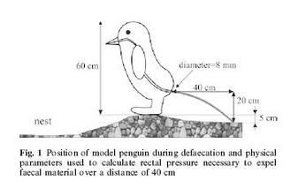
  • FLUID DYNAMICS: Victor Benno Meyer-Rochow of International University Bremen, Germany and the University of Oulu , Finland; and Jozsef Gal of Loránd Eötvös University, Hungary, for using basic principles of physics to calculate the pressure that builds up inside a penguin, as detailed in their report "Pressures Produced When Penguins Pooh -- Calculations on Avian Defaecation." The winner wore a t-shirt of the penguin poop diagram.

Other good moments included the news that the physicist who swept the paper airplanes off stage for the past 5+ years was unable to attend because he was being awarded a Nobel Prize at the moment (Roy Glauber); and the 24/7 lectures in which scientists explained complex concepts in 24 seconds and then summarized concisely in 7 words or less. "Purring is melodious snoring" got a most excellent round of applause.

pixelfest

Another one that made me think, sometimes surprising things. The principle of the experiment is "can a bunch of random people, by changing one pixel at a time on a canvas, create something?" Pixels can be overwritten. Is it art, garbage, or just an online experience?

You decide by watching the animation, from the blank canvas to the current piece: http://haub.net/pixelfest/. Watch that first, then go read and try it: Add your pixel here. (Don't go there before watching the animation, though.) Here's some text and discussion.

Here's some of my thought process as I watched it:

  • Blank canvases are more conducive to text than pixel art. Watch the words appear and get hijacked. Someone should create a "change one letter at a time" game now, if it hasn't been done already. Would Scrabble just evolve? I think it would.
  • Is that a tree? Is this one person under many anonymous entries, or multiple people?
  • Can good design really happen without a guiding principle or vision? Don't we need organized vision here, if we want a "good" (coherent? attractive? interesting?) end result? There's a reason websites need information architects and wikis are so disorganized and become hard to travel as they evolve....
  • Can people who aren't communicating make something anyone really likes at the end of the day? They need a spec and some discussion. If none of them are good at thinking in pixels and planning out the layout and process, it will still be bad "art" although it might look more organized.
  • A pixel is too small a unit of design and communication. What if they had vector art, objects on the page.
  • What are those black things that keep appearing? Is there an attempt at meaning here, or just chaos (modern art)?
  • Why did the text stop appearing? Is it easier to imagine it on a blank canvas, and the filled colors make people lean towards visual art instead?
  • Wow, is this thing ugly at the end of the day. But I'm glad the sun came back.

Friday, October 07, 2005

Negative Network Ties

This is an unusual article (a pdf): an examination of negative relationships in social networks, particularly in organizations. The bulk of social networks studies and community studies are about the positive -- benefits acrued, capital, positive reciprocity, sharing of resources, emotional feeling and trust -- but humans do have negative feelings and interactions and groups exhibit negative behaviors both by individuals and collectively.

Labianca and Brass point out that negative work relationships may be non-reciprocal, and may be a result of loss of trust, friendship, or just dislike; significant social liabilities may result from more extreme negativity, as one or both participants in the relationship avoid one another or change work habits to prevent interactions that would be unpleasant. Although they don't associate relationship "conflict" with negative ties directly, they do point out that there may be negative repercussions to the individuals regardless of the existence of conflict "episodes," because of avoidance behaviors impacting work.

This, incidentally, may be related to the "Lovable Fools" article that was summarized on a bunch of sooial network studies sites: it stated that people are more likely to seek out people they like, who may not be competent, in a workplace; which might, of course, also impact work performance at some point. But quoting Negative Ties:

While a great deal of research has been conducted on friendship formation, interpersonal attraction, and the evolution of friendships (see Berscheid & Walster, 1978, and Hays, 1988, for reviews), little has been conducted on the formation and development of negative relationships (Wiseman & Duck, 1995). The evolution of negative relationships may be very different from positive relationships. Friendship development is viewed as a gradual process. According to social penetration theory (Altman & Taylor, 1973), friendship development proceeds from superficial interaction in narrow areas of exchange to increasingly deeper interaction in broader areas. Perceptions of the rewards and costs of interacting with a potential friend drive this progression – if you feel that the rewards from a relationship outweigh the costs, you will continue to progress toward closer friendship.

However, Wiseman and Duck’s (1995) qualitative work indicates that negative relationship development is a much faster process that tends to lead to the other person being included in coarse-grained categories such as “rival” or “enemy.” By contrast, fine-grained ranking distinctions are created for friends as they move through a relationship progression from casual acquaintances to close friends. Thus, the formation of negative relationships is not the mere opposite of the way that positive relationships form. Not only is there evidence that negative relationships form differently, but there is also evidence that they may have greater power in explaining some socioemotional and task outcomes in organizations than positive relationships.

Some of the factors they associate with negative relationships are absenteeism and turnover (lack of organizational attachment), disproportionate impact on job satisfaction (i.e., a negative far outweighs any positives), disproportionate impact on promotion and salary (negative outweighs positives by far at review time).

So what do you have to do to find happiness?

There's some coverage of the increasing study of what makes people happy in the Sunday Times Online. Some sample quotes in an excellent article:

Public surveys measure what makes us happy. Marriage does, pets do, but children don't seem to (despite what we think). Youth and old age are the happiest times. Money does not add much to happiness; in Britain, incomes have trebled since 1950, but happiness has not increased at all. The happiness of lottery winners returns to former levels within a year. People disabled in an accident are likely to become almost as happy again.

...Showing how easy it is to give people an intellectual boost, Isen divided doctors making a tricky diagnosis into three groups: one received candy, one read humanistic statements about medicine, one was a control group. The doctors who had candy displayed the most creative thinking and worked more efficiently.

..."The things that you desire are not the things that you end up liking. The mechanisms of desire are insatiable. There are things that we really like and tire of less quickly — having good friends, the beauty of the natural world, spirituality. But our economic system plays into the psychology of wanting, and the psychology of liking gets drowned out."

...In essence, what the biology lesson tells us is that negative emotions are fundamental to the human condition, and it's no wonder they are difficult to eradicate. At the same time, by a trick of nature, our brains are designed to crave but never really achieve lasting happiness.

Regardless of the pessimistic finding, there's hope at www.reflectivehappiness.com website, if you pay $10 a month. An interesting footnote in the article states that women and men do have different emotional makeup, with women more extreme in their highs and lows. Not surprising to me.

Wednesday, October 05, 2005

Killer Dolphins, a History

The Independent has jumped on the killer dolphins bandwagon, and some of you will have noticed that the original Observer story even got coverage on the Daily Show this week! This Independent article has some (I think) unintentionally hilarious sections towards the end:

One dolphin known as Tuf Guy was trained to carry tools and messages to an undersea base called Sealab II, and could undertake tasks that were physically impossible for a human diver. Dolphins were on active service before the first Gulf War, where they were mainly used for mine detection. More sinister was the use of dolphins in a "swimmer nullification program", where a long hypodermic needle was fastened to a dolphin's beak for the purposes of firing a bullet of carbonic acid into an enemy frogman.

The US Navy has even reportedly used dolphins to patrol and guard Trident submarines in harbour - though once they had had their fill of fish they were apt to wander off duty. With both the Russians and Americans using dolphins there was, for a while, the science-fiction prospect of "dolphin wars", in which one lot carried electronic counter-measures to jam the sonar of the other. Fortunately with the ending of the Cold War, the prospect of rival dolphins attacking one another has receded.

Monday, October 03, 2005

Preschoolers Drive Flu Epidemics

Surveillance Data Suggest That Preschoolers Drive Flu Epidemics. I found this linked off a social network analysis blog, bemoaning the lack of SNA in the study. I would have thought epidemiology was all up on social networks as a mechanism of disease spread. At least on TV the CDC are -- even if it's just a masked doctor asking who the carrier had contact with in the last 2 days, and then sweating and hissing, "It's getting out of control, shut down O'Hare and then LAX!!"

Quote:"The data suggest that when kids are sneezing, the elderly begin to die. Three- and 4-year-olds are sentinels that allow us to focus our surveillance systems." I wish they better explained what the "biosurveillance" system is.

The Ig Nobel Awards

The IgNobel Awards are this Thursday at Harvard. Based on Steve Crandall's recommendation, I impulse-purchased a ticket today. If anyone else local is going, it would be fun to meet up for a drink before or after.

Saturday, October 01, 2005

Pull and Post pix.

Pull. Croft Castle bell.

Postbox outside cottage in Shropshire:

Physical Models of Virtual Spaces

Tom Vollaro has an interesting item on his website: A visualization of the virtual contents of a MUD, which is a virtual chatspace with a user-expandable geography. He did a site map of the rooms of BayMOO, and then built a model showing what it looks like. I like the concept of turning compass directions in a text engine into a plastic model you can walk around. His site is here.

Tuesday, September 27, 2005

Strange church decorations in Shropshire

Middleton church pottery display, Shropshire.

Pottery detail.

Monday, September 26, 2005

Pavel's Second Life

Pavel recommends checking out Second Life.

They have a few features that make them sound destined for financial and usage success: a simple programming model, rights to intellectual property remain with the user creators, an internal economy that does real business for users, and a rate structure based on pay for creation rights.

Sunday, September 25, 2005

Armed and dangerous dolphins are missing.

According to the Observer, dolphins trained to shoot darts at underwater terrorists in wetsuits are missing from their training ponds in the aftermath of Katrina.

Hmmm. I hope they just seized the opportunity to escape from slavery.

Saturday, September 24, 2005

The illuminated continent

On the Official Google Blog: The illuminated continent. Data layers on Google Earth showing links to National Geographic stories and images, even a webcam. It's all hyperlinks in the end, but the experience seems different!

'Bride' Made with dSLR

This is a nice technical article on the making of the Corpse Bride using digital still cameras (the Canon EOS-1D Mark II) and Final Cut Pro. There's even a bit about custom Python scripting in here.

(Gotten off John Nack's Adobe blog. His post about the Undo in the elevator in the new tower is great, too.)

Another owl at Ray's Farm. (Since Pavel liked the first one!)

Shropshire hillside, UK.

Friday, September 23, 2005

The Nag's Head Ghosts

From Shropshire Walks with Ghosts and Legends, p. 46:

About halfway up the hill you will see the Nag's Head pub on your right which has a most unusual haunting. Look up at the little window on the top floor. Within this room there is a cupboard and within the cupboard is a painting -- and it is actually the painting that is haunted. The painting is of an old prophet and it's said that anyone who looks at it will be driven mad. Certainly, there have been three occasions in the past when people, perfectly sane and seemingly perfectly happy, have stayed in that room and then, for no apparent reason, committed suicide. One was a man who had just been promoted, another was a young girl looking forward to getting married and the third was a First World War soldier who had just returned from the front. Not surprisingly, the cupboard is always kept locked so that no one can inadvertently see the painting these days.

The pub has more normal hauntings too. Some work was being done on the building in the early 1980s when a previously unknown panelled room was discovered. Opening the room must have released the ghost associated with it. Perhaps he was also the man in the "funny long coat and hat who came through the wall" that a young girl once saw there.

Thursday, September 22, 2005

Dawn in Shropshire, taken from my B&B window.

Owl at Ray's Farm in Shropshire, UK.

Thursday, September 08, 2005

Boston Harbor take 2.

Tuesday, September 06, 2005

Boston Harbor, Labor Day, at dusk.

Sunday, September 04, 2005

Children develop cynicism at an early age

How sad: Children develop cynicism at an early age.
In the second part of the study the children were asked how self-interest might lead someone to make an incorrect statement. Children were provided with three choices: intentional deception, unintentional bias, or pure mistake. They rarely endorsed bias as the best possible explanation for being incorrect. The youngest children were more likely to think the characters were lying. ... "It is not until sixth grade that children begin to endorse lies and biases as equally plausible explanations for self-interested incorrect statements," Mills said. "Adults are clearly sensitive to all three sources of inaccuracy. How children begin to understand what it means to be biased is an open question."

Alice in Wonderland by Annie Leibovitz

I haven't blogged about photography in a while, and this is a good excuse: Annie Leibovitz has photos of Alice in Wonderland fashion scenes, staring the designers and the characters and some really weird dresses. I don't recommend it for the fashion as much as for the surreality and the facial expressions. She's got the right feel for the story.

Alice by Annie

Friday, September 02, 2005

Silicon Valley Network Analysis

"Saxenian (1994) presented a systematic argument that network structure in Silicon Valley was quite different from that in the Route 128 corridor of the Boston metropolitan area, for a variety of historical, economic, and cultural reasons, and that this difference translated into what she called, in her book’s title, a distinct “regional advantage” for the Valley." One of the reasons for the difference is the dense social network linkages in Silicon Valley, the high mobility of employees, and the sharing of knowledge at sidewalk cafes -- impossible in a cold, secretive Defense-funded climate like Boston's.

On the SiVNAP--Papers's site, the last article summarizes the network effect on the founding of the semiconductor industry, the growth of Venture capital firms, and the relationships between Stanford and local industry.

I miss the Bay Area! Although it was somewhat disconcerting how small the world felt, every time you went for an interview ("what do you think of so-and-so--?").

Physicists vs. Sociologists, oh my.

Apparently there's been a bit of bad blood over the fact that physicists are doing social network analysis. An account of some of the "hmph, why don't they cite us" is over at Crooked Timber.

It probably sounds like I'm not sympathetic, but actually I am. I had it bad in the cross-disciplinary early days of Internet research when I wrote my dissertation. It was hard to figure out who to read, what to cite, and where to follow-up. Hard, but not impossible, and so I am sympathetic. (But possibly the relatively powerless position of grad student made me more concerned about this process than tenured physics professors?)

Eszter at Crooked Timber has a nice reading list for social network studies. And here's the link to the infamous social network paper by physicists, on the Eurovision song contest -- always an interesting subject! Even more entertaining, from their abstract: "We investigate the complex relationships between countries in the Eurovision Song Contest, by recasting past voting data in terms of a dynamical network. Despite the British tendency to feel distant from Europe, our analysis shows that the U.K. is remarkably compatible, or ‘in tune’, with other European countries. Equally surprising is our finding that some other core countries, most notably France, are significantly ‘out of tune’ with the rest of Europe."

I'd guess the physicists are British.

Monday, August 29, 2005

Ghostweather: The HP Scanner Dialog

I found a UI so bad last week that I've been jumping up and down trying to find time to post about it. Finally, here it is:

The HP Scanner "Copy" Dialog, a new low.

Saturday, August 27, 2005

Hyssop addict in my backyard.

Red Dragonfly, Broadmoor.

History of Social Networks Analysis

Here's a review of The Development of Social Network Analysis, which looks like an entertaining history.
Freeman defines social network analysis as having four key features: a structural intuition, systematic collection of relational data, graphic images, and mathematical or computational models. (I would add a fifth feature that is ancillary yet crucial: a study of the flows through the network.) The first four features alone tend to produce a static network, though in Freeman's own work flows are often important. When flows are added, networks become channels through which ideas, values, friendship, esteem, money, sales, disease, or almost anything can travel. The same network structure may pass flows of different kinds, or different structures may better facilitate different flows. The impact of social network analysis and its utility depends in large measure on which flows are studied. The way the different flows capture the popular and academic imagination determine, in part, the place of network analysis.

There were plenty of kooky characters in this history, like in any academic field: Moreno had dark side: "self-centered, self-serving ... admitted hearing voices, he sometimes thought he was God, and he was convinced that others were always stealing his ideas" (p. 31). Though to gain a full appreciation of his bizarre side, there is nothing like reading Who Shall Survive, available in the original 1934 edition for about $175 (what to give your favorite network scholar) or the even more bizarre 1953 edition that -- oddly -- costs about the same. "For the most part Moreno seemed to be unfocused but, when he was involved with a woman who could serve as a muse, he succeeded in concentrating and was able to write" (p. 34).

Ew. On the other hand, it's probably a fun read.

Thursday, August 25, 2005

TiVo's investor call

I've been afraid to read the news since the end of the DirecTV deal, but the news in yesterday's call with TiVo is actually not bad at all. For the first quarter, they made a profit! And the Comcast deal is coming along.

Yesterday's investor call | PVRblog.

Haunted Korean Airplane

This story details a number of weird experiences on an airplane after a woman hanged herself in the bathroom (the mind boggles -- are Korean airplanes outfitted with bigger bathrooms?). Possibly the oddest aspect of this story is that a Buddhist monk travels by first class. Check it out.

Sunday, August 21, 2005

Crossing the canal in Honfleur.

French bulls.

Wednesday, August 17, 2005

danah boyd: the biases of links

danah boyd has a bunch of observations about blogrolls and linking in an essay here: Many-to-Many: the biases of links.

The dark-- or at least gray-- side of blogging includes the fact that most of the Technorati Top 100 blogs are group blogs or professional blogs, usually aimed at marketing in some way. I suppose it makes good business sense to hop on the buzz-mot-du-jour bandwagon, just like Hagel and Armstrong did with Net Gain: Expanding Markets through Virtual Community. Who people link to in their sidebar, their "blogrolls" (which are often labeled "who we read"), is overwhelmingly gendered, in her sample. And the top dogs all get linked to, but don't link anyone.

It's not a solid quantitative research study, but it's interesting to read.

Monday, August 15, 2005

Levitated | Jared Tarbell

Here's more interactive art from Jared Tarbell, of Complexification: Levitated.

Seriously, go now, and play. Try the walking insect generation or the walking things that change when you click on them or the gorgeous 3-d text space (I just wish it were infinite).

Sunday, August 14, 2005

Color Words and Color Products

Two things made me think of each other today:

Martin Wattenberg has a fascinating look at the colors that lie behind the lexicon in his Color Code: A Color Portrait of the English Language. It's really fun to browse and mouse around, like most of Martin's work.

And this guy over on Flickr has Safeway aisles as color bars, abstractions of the colors of products in an American supermarket. They're surprisingly pretty.

Saturday, August 13, 2005

Complexification

Complexification's Gallery is an awesome, hypnotic site. This is Jared Tarbell's art created by algorithms, and it can be drawn in real-time in front of you. As an unusual bonus, you can see the applet source code for the non-Flash ones. The software tool used to create the applets is Processing, an open-source visual and audio art programming language (which I will download after I finish playing with Tarbell's animations).

Update to add: There's some entertaining explanation of the simulations behind the art, especially the robot offspring one: Offspring is a visualization of the pair bonding process of a theoretical robot colony. Each robot is assembled, ages through youth, comes into a reproductive stage, and eventually dies of fatigue. If a robot is lucky enough to find a mate during it's reproductive stage, baby robots may be assembled.

offspring thumb

Folding T-shirts

Pavel Curtis has geek cred defined: with a history working on Smalltalk, Lisp, and Scheme, and then creating internet community before it got cool via the famous LambdaMOO at Xerox PARC, then founding a startup, Placeware, which was finally (ahem) purchased by Microsoft... well, bottom line is, he's got a lot of T-shirts, as anyone in the computer industry does. He has more than most people, in fact.

His most popular blog entry is about how to fold t-shirts. Here's more on the phenomenon: Pavel's Blog: A Very Specialized Website.

Wednesday, August 10, 2005

Whose Fish?

This is a brainteaser logic puzzle attributed to Einstein.

Whose fish is it?:

There are five houses in a row in different colors. In each house lives a person with a different nationality. The five owners drink a different drink, smoke a different brand of cigar and keep a different pet, one of which is a Walleye Pike. The question is-- who owns the fish?

Hints:
1. The Brit lives in the red house.
2. The Swede keeps dogs as pets.
3. The Dane drinks tea.
4. The green house is on the left of the white house.
5. The green house owner drinks coffee.
6. The person who smokes Pall Malls keeps birds.
7. The owner of the yellow house smokes Dunhills.
8. The man living in the house right in the center drinks milk.
9. The man who smokes Blends lives next to the one who keeps cats.
10. The Norwegian lives in the first house.
11. The man who keeps horses lives next to the one who smokes Dunhills.
12. The owner who smokes Bluemasters drinks beer.
13. The German smokes Princes.
14. The Norwegian lives next to the blue house.
15. The man who smokes Blends has a neighbor who drinks water.
According to the home page on Coudal Partners, over 7000 people wrote in, and over half of them got it right.

Sunday, August 07, 2005

Honfleur old harbor, Normandy, 2005

Saturday, August 06, 2005

Quantum information can be negative

According to this article, Quantum information can be negative. Science reporting is often iffy. I especially liked this section:
One can also have situations where someone knows more than everything. This is known as quantum ‘entanglement’, and when two people share entanglement, there can be negative information.

I'm pretty sure I've seen this situation, even without quantum particles.

Rob's Amazing Poem Generator

I love semi-random text generation, and especially like it when you can seed it with a good starting sample. Here's an example: Rob's Amazing Poem Generator.

I fed it a few URLs including my own, but the results I like best come from my favorite website for oddities, The Anomalist. I think they're probably better than average because the theme is more uniform.

THE standard gravitational model.
East Kingston Woman Reports a big
Foot. Is overloaded with Big
Bang theory of exploding stars in front of the hydrophone. The
Books and about
three four feet long and
Orkney was
actually
fairly common during hurricanes. And: vibrated.

Friday, August 05, 2005

Groups and Teams and Growing Pains

I've linked before to Big Dog's Leadership page, which summarizes the stages of team development described in Tuckman's classic "Developmental Sequence in Small Groups."

If you've got deja vu because you remember my post, well, so do I, since I'm going through the same phenomena yet again with a new group-- supporting how universal his observations were. Tuckman's stages are these, named with silly names (I'm quoting from here) :

  • Forming: The group gets to know each other. It's non-threatening. The major task functions also concern orientation. Members attempt to become oriented to the tasks as well as to one another. Discussion centers around defining the scope of the task, how to approach it, and similar concerns.
  • Storming (my favorite because it's the one I always notice and hate): Because of "fear of exposure" or "fear of failure," there will be an increased desire for structural clarification and commitment. Although conflicts may or may not surface as group issues, they do exist. Questions will arise about who is going to be responsible for what, what the rules are, what the reward system is, and what criteria for evaluation are. These reflect conflicts over leadership, structure, power, and authority. There may be wide swings in members’ behavior based on emerging issues of competition and hostilities.
  • Norming: Group members are engaged in active acknowledgment of all members’ contributions, community building and maintenance, and solving of group issues. Members are willing to change theirpreconceived ideas or opinions on the basis of facts presented by other members, and they actively ask questions of one another. Leadership is shared, and cliques dissolve. When members begin to know-and identify with-one another, the level of trust in their personal relations contributes to the development of group cohesion. It is during this stage of development (assuming the group gets this far) that people begin to experience a sense of group belonging and a feeling of relief as a result of resolving interpersonal conflicts.
  • Performing: The Performing stage is not reached by all groups. If group members are able to evolve to stage four, their capacity, range, and depth of personal relations expand to true interdependence. In this stage, people can work independently, in subgroups, or as a total unit with equal facility....Members are both highly task oriented and highly people oriented. There is unity: group identity is complete, group morale is high, and group loyalty is intense. The task function becomes genuine problem solving, leading toward optimal solutions and optimum group development. There is support for experimentation in solving problems and an emphasis on achievement. The overall goal is productivity through problem solving and work.

The Big Dog site points out that groups aren't teams, and the above stages really characterize the formation of teams that work towards a known, shared goal.

While teams have an identity, groups do not. It is almost impossible to establish the sense of cohesion that characterizes a team without this fundamental step. A team has a clear understanding about what constitutes the team's 'work' and why it is important. They can describe a picture of what the team needs to achieve, and the norms and values that will guide them. Teams have an esprit that shows a sense of bonding and camaraderie. Esprit is the spirit, soul, and state of mind of the team. It is the overall consciousness of the team that a person identifies with and feels a part of. Individuals begin using "we" more than "me."

The formation of teams requires some special commitments -- everyone knows everyone is on board and working for the same goal; they can be relied on. If some of the members aren't reliable, or have split loyalties and agendas, there's not going to be a real team at the end of the day. There are lots of potential barriers, including prior history; I think I'm currently part of a subclique in the new group composed of survivors of another successful team (where some group members evolved to a real team and others dropped out); we're dubious about whether the new group will become a team, given what has gone before and who we're missing now.

Teamwork is hard to get right, that's all there is to it.

Next-Gen Tools in Global Software Development

Another link from Barney's: Barney Pell's Weblog: VC Taskforce on Next-Gen Tools in Global Software Development. The topics covered with Barney's great notes are the risks of outsourcing, getting requirements wrong (a costly problem made worse in distributed development), and investing in software tools.

Some of Barney's big takeaways from the panel discussion:

  • Individual programmer productivity is always nonuniform. Some programmers are 10 or even 100 times as productive as others.
  • The results of outsourcing are often disappointing
  • A recurring theme in the panel was the difficulty and importance of getting software requirements right. Despite all the improvements in tools and processees for developers, there have been limited improvements in the way people create and validate the requirements in the first place. Errors in requirements ripple through the downstream flow and get more expensive to fix the later they are caught.

I contend that a good user-centered design process that starts during requirements gathering will achieve the results that are wanted, assuming the business has a goal that's addressing a real user need. A good designer helps bridge that communication gap between business analysts and "the IT folks who got it wrong." More of Barney's notes:

"Do your business people and IT people understand each other? Answer to this is usually 'no.' The problem: Missing, ambiguous and contradictory requirements. 60-80% of project failures can be attributed to requirements errors. at the very front of the process. not the arch, dev, or testers! The biz people say you didn't understand, the IT guys say you didn't explain. Scope creep and rework usually mean you didn't find the errors it the beginning; Good requirements are hard. Requirements definition and validation cycle: informal primarily text requirements -> spec -> formal spec documents -> validation -> visual inspection and review of spec for errors -> elicitation. This is a laborious process, with error detection that's bad."

Almost every usability practitioner in industry or consulting moans about "not being involved early enough." That moan is usually because the problem is with the requirements, on a project that's already made it to the point where it's too late to change direction....

Wednesday, August 03, 2005

The March of Pies: Gallery of Data Visualization

The Gallery of Data Visualization offers examples of good and bad statistical displays. The Have Something to Say category is especially amusing:
Blind Lemon Jefferson, the great blues musician, was once asked why there were so few white bluesmen. He replied, 'Knowin' all the words in the dictionary ain't goonna help if you got nuttin' to say.'

pie chart

This image, from the graphic design book Diagraphics II, attempts to show the relative market shares of Sotheby's vs. Christies over time. The graphic designer has cleverly used a variety of tricks to show.... What? Well, it does make clear that time is increasing over time. But there surely isn't much else going on.