 You can pan around, change the dial for time window (weekly on up to quarterly or yearly), and hover over both the bubbles and the text (and sort the text). You can get a detail view of an individual performer in the lower right by clicking on a player. The animation is really nice and you can even change the graph units by direct manipulation. Sweet!
Sunday, April 30, 2006
NY Times' market graph toy
I'm only calling it a toy because it's fun. All infovis should be fun, frankly. This is another one off Information Aesthetics: the Sector Snapshot.
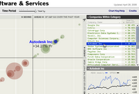 You can pan around, change the dial for time window (weekly on up to quarterly or yearly), and hover over both the bubbles and the text (and sort the text). You can get a detail view of an individual performer in the lower right by clicking on a player. The animation is really nice and you can even change the graph units by direct manipulation. Sweet!
You can pan around, change the dial for time window (weekly on up to quarterly or yearly), and hover over both the bubbles and the text (and sort the text). You can get a detail view of an individual performer in the lower right by clicking on a player. The animation is really nice and you can even change the graph units by direct manipulation. Sweet!
Subscribe to:
Post Comments
(
Atom
)
No comments :
Post a Comment