Showing posts with label infovis. Show all posts

Monday, December 23, 2019

Another Year in France (Consulting Again)

It's that time of year - time for a recap of what I've been up to!

NLP and Toxic Speech

I spent a year after I left my teaching gig doing remote consulting for a London-based startup.  I was lead data scientist doing NLP, primarily working on toxic speech detection in game chat.  We used a mix of keyword-based approaches, SpaCy models, and neural nets (pytorch and later tensorflow, for speed).  I wrote a lot of Spark code.   In the course of this work, I labeled a lot of chat data myself and became convinced this is an almost unsolvable problem that will always require human-in-the-loop moderation.

Talks I Gave / Personal Projects

Every time someone invites me to speak, I use it as an opportunity to finish a personal project and talk about it.  Sometimes it's a learning project (like "learn about the state of the art for summarization") and sometimes it's an artistic or data vis project.  So, invite me at your own risk :)
  • Euro Python 2019 Invited Keynote and PyData London 2019 Keynote: I gave the same talk because they were less than a week apart. I did a data vis personal project, and showed some text vis/poetry generation apps. Lots of people said they enjoyed them tons.  Slides here.
  • PyData Warsaw invited keynote - I talked about summarization.  Slides here
  • EMAEE 19: Invited panelist on data vis, I spoke about big data and EDA (exploratory data analysis). Slides here.
  • Micro Macro Mesa Conf in Lyon (invited): I spoke about visualizing and generating poetry with VAE's (variational autoencoders), based on a project by Allison Parrish.  My slides (which need to be written up) are here.
Example generation of poem lines (red) from a VAE using a TSNE layout of training lines as guide.


Reboot of the TinyLetter "Things I Think Are Awesome"

I didn't feel very awesome during a lot of the toxic speech consulting, but I revived the newsletter this fall!  I added a poem, recipes, and tv shows to the latest edition.  It's all about recommendations.  My goal is to keep it positive, short, and tech-arty.  Join here

Current Consulting

I took a month off between gigs and primarily worked on text generation with VAEs.  I've started work again, splitting my time among 3 clients:  Google Arts and Culture in Paris (a possibly short-term contract on data analysis, NLP, and vis of museum assets), writing Python charting tutorials for Flowingdata, and generating poetry for the UK Dubai Pavilion 2020 (working with Kyle McDonald).

Design by Es Devlin (source link)

Next year, I will be a judge and speaker at the data visualization conference Malofiej 28 in March.  Come see me in Pamplona, Spain?  

Happy holidays, and a great 2020 full of inspiring creative tech and datasets to all!


Wednesday, May 03, 2017

Updates and Links

Teaching


A few updates since last year... I am now teaching as an Assoc. Professor of Data Science in Lyon, France, at EM-Lyon Business School. The plan was 2 years and "we'll see." I finished year 1 of teaching business analytics, python and python data and text analysis. It was hard but rewarding when I had good students!

Talks / Slides

Since last year, lots of talks and slide decks!  Creative first, then data sciency and visy.

Eyeo 2016: A talk on generative text, tools for creatives, and generally wonderful collaborations between humans and machines.  Slides and code are here.


Eyeo 2016 – Lynn Cherny from Eyeo Festival // INSTINT on Vimeo.

I also gave a similar but earlier form of this talk at Alt-AI, a small conference organized in NYC at SFPC a month earlier. Slides here.

Dato/Turi Data Science conference, June 2016.  A tutorial talk on doing NLP-like things in Elasticsearch, with python and javascript code.  The code examples are here.

JSM 2016: I was on a panel organized by Hilary Parker, where I gave a talk called "Cocktail Party Horror Stories: Data Vis for Clients."  For various reasons, I don't want to make the slide deck public, sorry.

Lyon Datavis Meetup: "Design for Interactive Data Vis" - an updated version of a talk I gave in Miami at a local data vis conference, delivered in Lyon at the Datavis Meetup in November 2016.

Miami 2015 Seminar in Comm Dept.: A talk I gave while I was a Knight Fellow in Miami, "Text Analysis Without Programming."  Should really be updated a bit since teaching business students, too.

I also gave an NLP tutorial for Eyeo 2016 (python notebooks).

Writing / Posts

I finally opened a Medium account, and posted a well-received article on "Data Visualization 'Versus' UI and Data Science."  This post explores the career options and relationships in neighboring fields.

I've started a tinyletter in a spirit similar to my Eyeo talk, "Things I Think Are Awesome." (archive) Keywords: AI, creative tech, data vis, generative text, games, occult...   I'm also cross-posting them to Medium to reach a perhaps wider audience because there's virtually no feedback from a tinyletter!


Monday, July 18, 2016

Spring Semester D3 Class (take 2)

I reprised my class on interactive visualization with D3.js at University of Miami with twice as many students in the spring semester. It was successful again, but I found it noticeably more work having more students. We did not focus on UNICEF this time; instead each student explored a topic of their own interest. More on how it scaled (or didn't) after some project highlights...

One note: Very few of them are reading their school email over the summer, so there wasn't much chance to update bugs or design issues I requested fixed. Fair warning :)

Iceland's Energy Use


The project by Zhiming "Eric" Sun is gorgeous and draws smart data comparisons about energy use over time by different countries. Iceland is the star here. There are nice tooltips with plots of use over time in this first display in the scrollytelling story.


In the next stage of the story, there is a slightly hidden lovely feature, which is that a mouseover on a bar zooms the map to locate the country in question. Useful!


There is a super interactive line chart with some smart commentary, and then a great connected scatter plot showing comparison country trajectories.


I think there are still some odd aspects of the scrollytelling display—as we constantly discovered in my class, getting the scrolly display/hide tuned right isn't that easy, at least the way we were constructing them.

Eric will be an amazing hire for someone when he's finished with his MFA. He was a superb help with other students' coding issues and has a strong sense of data story. His technical curiosity and ability to figure hard things out on his own were superior.


Chinese Tourism


Yuxuan "Sunny" Xie did a great project on Chinese tourists, specifically on where they go and what they spend. Her project features small multiples, scrollytelling, lines charts, bar charts, and a neat exploding map of China. The map is built with the d3-exploder, which she dedicated herself to trying to adapt and use.

The map of Chinese provinces shows tourism outbound, with mouseover and clickable provinces. Each provinces has a little story typifying a traveller from that area.


The scatterplot version of the map shows each province along 2 axes, population and income, using the same color scale for traveler percentages.


Sunny is a dedicated journalist with a strong sense of data design, visual design, and interaction. Another excellent hire!

Transport in Miami Dade


Jennifer Hernandez looked at the distribution of public transportation options in Miami-Dade county. She made some amazing point maps of bus stations (the small blue dots, which have tooltips) and the metrorail stops (bigger dots).


In contrast, the locations with the most affordable houses are shown in pink here:


Jennifer has other stats on ridership by location and commuting preferences in her original project. She is another excellent MFA student in the Communications Department at U of Miami.

Climate Change


Shi Li, who was auditing my class, nevertheless did all the (hard) work and produced a lovely project on climate change. Her project features a number of striking charts, including a small multiples-details-on-demand array of bar charts based on modifying Jim Vallandingham's coffeescript demo. There is also an animated bump chart of the causes of global warming, with the dramatic lead going to greenhouse gases ever since 1990.


Cost of Education (2 Projects)


Sherman Hewitt, my only undergrad student this semester, did a great project on cost of college across time in the US. This bar chart from his data shows that as of 2012, there had been an increase in the number of folks attending college, in part fueled by an increase in the number of Hispanics attending.


His map shows that the most expensive states for public universities are Vermont and New Hampshire, with the cheapest being Colorado.


Sherman's project is strong in the reporting text as well. He has a great future and is working as a data journalism intern this summer.

Terrorism Over Time


Claudia Aguirre is working with a large dataset on terrorism, and produced a solid project on incidents and deaths by different terrorist groups over time.

One of her more interesting charts shows incidents by group by year, and the extreme and sudden increase in ISIL is the steepest, highest, and most recent of the blue lines. (The other highlights are Taliban, Al-Shabaab, and Boko Haram. The 1980ies are dominated by Shining Light and other Central/South-American groups.)


Formula One


Zhou Fang indulged her knowledge of Formula One racing stats to focus on the history of the Ferrari team.


In the map above, she shows the win history of Ferrari vs. other teams across 15 years of F1. When you click on a country in the map, small multiple line charts are displayed for each country by team, as well.

Travel Prices


Sevika Singh did a project on hotel costs in different cities. The differences between one-star and five-star prices in the same cities are particularly interesting. Here's a scatter plot showing the relationships, with some UI to help you find a city of interest. (I believe the dots are sized by average price, with New York having the largest average.)


Developer Survey


Jose Fierro looks at the responses to the Stack Overflow Developer Survey. Although he uses raw counts instead of percentages by country, the results are interesting, especially on the topic of future technology plans. The "big data" and hipster tools like Rust get lots of "intend to use in the future" votes, but tools like Javascript don't. Uh, good luck with that?


Other Projects...


Han Huang's autism project looks at the incidence of autism in the US by state. She uses donut charts, maps, a timeline, bar charts, and other techniques.

A look at California's educational attainment stats from Cibonay Dames shows that California students are underperforming. California is the largest and most diverse state in the US in terms of educational enrollment figures. She uses maps, small multiples, and bar charts.

Luying Wu's project looks at causes of US road accidents. As of 2013, Montana had the most deaths due to road accidents and District of Columbia had the least. Her map of top reported causes by state is very interesting (and may reflect some state data categorization artifacts).

Hyan de Frietas's project looked at which states invest in early education support. He documents that early education enrollment impacts future success.

Eliot Rodriguez investigates drug use by teens in the USA including alcohol, over time. Although prescription drug overdoses are on the rise, teens are still primarily using alcohol, marijuana, and cigarettes.

Former Students!


My fall semester students have done some great things since our D3 class. Barbara Poon got a job in the Emerging Technologist Program (ETP) at Nielsen. Halina Mader has been consulting as a web designer and D3 developer while she settles on her next job. Shiyan Jiang is a data journalism intern this summer with the Florida Sun Sentinel and so far has worked on a map for a story. Louise Whitaker is still an MFA student for another year and is an intern at Sapient this summer.

Jiaxin Liu did her journalism capstone project on the status of financial support for Chinese retired folks, using D3 in strategic places. She is working now as a data journalist in China. Zhizhou Wang is in the Lede Program at Columbia School of Journalism, pursuing further data journalism credentials (a program which looks amazing, to be honest). Luis Melgar is still working as a journalist at Univision, and he also used D3 in his capstone project for his master's on homeless students in Florida.

Three former students (Jiaxin Lui, Zhizhou Wang, Shi Li) worked together on a lovely multi-media article about shark tracking. They did it for Alberto Cairo's Maya class. They used D3, Maya, video, and nice web design. I helped them very little!


Debrief on Teaching This, Take 2.


Did I Help Too Much?
With twice as many students, I had twice as many visitors in my office wanting help making custom, and often very advanced, visualizations. I think I promised that they could do anything with my help; but my help and time were finite resources, and I never remembered that before it was too late! If I were teaching this again, I'd probably be a little more restrictive about the coding I did for them myself. It takes them—and me —longer if I prompt them to solve it themselves with a million hints. This just wasn't practical with the number of people needing help and the weekly deadlines. It's easier for everyone if they just watch me do it while sitting beside me as I talk through it. But I'm not sure that process teaches them enough and it still doesn't scale well. The alternative is for them all to have much less ambitious and interesting portfolio pieces, though. (Sadface.)

My former fall semester students who wrestled with their own problems achieved some excellent results on their own, as you can see above. One of them said as she did, "I'm finally starting to like and understand D3 now." So maybe they did learn even while watching me or reading my code fixes?

And Some Never Asked For Help
There were some students I never heard from and only realized were struggling when I saw their weekly homework or prodded them quite explicitly. The amount of help given was not even across the students, certainly. I put this issue down on my "teaching to-learns" list with some ambivalence about how to solve it. Some of the onus is on students to request the help, certainly...

Data Analysis
I saw a lot of data analysis and data manipulation issues this semester. The real work of data visualization is to get your data in shape, explore it, and then design your visualization and code it. Often the coding requires specific manipulation either before loading or in Javascript, to get the ideal structure from which to "draw." None of the steps can really be skipped. Our course program was definitely lacking in this "munging" and analysis training. Given the choice, I would not teach this class again without a preceding required data analysis class. (And even then, I've heard from other faculty friends that a data analysis course can easily go off-the-rails into endless custom work for the teacher if the students get to use their own data sets. This is a hard teaching problem.)

Javascript Difficulties
On the Javascript side, I assigned more work with Javascript programming and data "munging" than previously. I also spent a fair amount of time on Javascript refactoring and structuring of code, based on issues that had come up during the first semester, especially in the sizable final projects. I heard from some that these assignments were "too hard." A lot of students struggled with the basic programming I thought they knew in advance, e.g., what's a variable, what's a function, how to call functions, scope. Along with the required data analysis class, I would prefer this class is preceded by more solid Javascript preparation or some other programming experience. (Many students had had a prior class in JQuery or P5.js, but since those classes weren't about doing data manipulation, some of the higher level concepts didn't cross over.)

Bottom Line
Teaching this class to people without much programming experience is very hard, and doesn't scale to a large group of students. At least not without a lot of experienced TA support which I did not have. Doing it the same way again, I wouldn't be able to handle more than 15 students.

Updated Course Repo
The class materials, in some parts radically updated, are posted here. I especially added a lot to the maps section, including more Leaflet examples, and added some nice small multiples code examples. I'll probably update one more time soon to remove mention of student homeworks.

News: My New Teaching Job


Meanwhile, my next teaching gig is in Lyon, France, at EM-Lyon, where I will be teaching data analysis, data science, and NLP classes. I will be there for at least 2 years. I am looking forward to focusing now on the "front-end" of the analysis stage, teaching Excel, Tableau, SQL, Python, and R. Look for more insights on teaching those in the future!


Thursday, January 28, 2016

Fall Student D3.js Projects

Here's the followup I promised on my post about teaching D3.js to journalism students: A selection from their projects! Their project goal was to produce a data story using UNICEF data (and possibly related data) about child mortality. The grading criteria were pretty rigorously spelled out as follows in Week 14 of the repo:

  • 20% for using 4 chart types we covered in class (can include small multiples as one)
  • 20% for good interactivity: Transitions, highlights, tooltips, filter/sort, animation...
  • 15% on text: Connective text holding the story together, intro and conclusion, annotations on graphs, good explanations, good writing (good English style)
  • 10% on storytelling: You create a useful, interesting data story flow using a mix of text, steppers/buttons, highlights, scrollytelling. (You don't have to use all of them.)
  • 10% on graph/chart elements: Good labeling of values/axes, tooltips, readability of chart contents and labels
  • 10% on visual style overall: Color scheme, attractiveness, clarity in graphs, use of UNICEF style somewhere in page
  • 10% for good data analysis: Interesting findings/results, nice use of top 10s or top N, relating data sets to each other intelligently
  • 5% for page layout/design: Good visual and functional CSS, useful external links, resume/CV link, header/footer with info about the project and data as needed.

I realized later I should have had a separate line item or aspect of "Good UX," which is embarrassing to me since that was my job for 18 years. Anyway, live and learn. Extra credit was given for using special layouts or interaction methods we didn't cover in class, as well as going above-and-beyond on any single aspect (such as using new external data).

Grading was NOT based on good code. It was primarily based on user-facing results. Expect the code to be not the best, as these were not computer science students and this wasn't a software engineering class! However, everyone is still learning and is interested in doing better, given opportunity to practice.

Also note: Several students were not native English speakers. Regardless of the injunction to check the English, there may be remaining writing issues. It's apparently hard to fit copy-editing into the project delivery cycle at the end of the semester :)


US Child Mortality


One of my favorites, this project by MFA student Louise Whitaker explores child mortality in the US as compared to the rest of the world. She starts with a "scrollytelling" line chart and moves into bar charts and small multiple bar charts with linked mouseovers and linked scatterplots:


There is a lovely tooltip on the map with dual dot plots in it:


And we end with more small multiple linked bar charts showing the relative status of different US states on health issues:


Louise will be looking for work in UX and/or data vis design after this semester. Amazing hire, I'd say.

Fertility and Mortality


Halina Mader's excellent project features a study of fertility and mortality rates for children under five. She uses a "stepper" structure with "next" and "previous" buttons.

Her first view is a world map colored by 2015 infant mortality rates. The tooltips are a lovely detail: a bullet-style bar graph showing the rate of the country vs. the world avg and the worst.


The next state is a little subtle if you aren't watching closely: the map animates shading over time with the decline in death rates. The line chart is synced with the map on rollover:


She shows useful trendlines and correlations on small multiple scatter plots which have linked mouseovers by country:


Earlier, in only Week 6 of my class, Halina also produced this wonderful line chart block that was widely fav'd on Twitter:


You should hire Halina, she's available now and she's outstanding.


Malawi and Under Five Mortality


Graduating senior Barbara Poon produced a lovely project with helpful graphics and a nice analytic edge. Her scrollytelling trends story is particularly good:


She also uses dotplots, one of my favorite plot types:


Barbara is looking for analytics and data visualization work and would be another excellent hire!

The Effect of War


Grad student Shiyan ("Yan") Jiang's project focused on the effect of war on child mortality. She opens with a choropleth map with line chart tooltips (ok, if you see a trend, I maybe have told them all they'd get instant A's for tooltips with charts in them):


She uses a scrollytelling style to walk through her data story. At one point she highlights key sections of trend lines to show long-term impacts of wars:


Yan is a graduate student who is available for summer work and contract work.

Disasters and Mortality


Jiaxin Liu's project uses a unique button legend method for controlling the views. This line chart's focus on worldwide disasters and their impact on child deathrates was especially good:


She also features some synchronized interaction between plots -- highlighting world regions on the line chart also highlights the same countries in the scatterplot on the right:


Jiaxin became such a big fan of D3 during the class that she used it for another web class project as well. Jiaxin will be looking for data journalism jobs after this semester!


Female Education


Zhizhou ("Jo") Wang produced a very graphic, dramatic visual project related to female education and childhood mortality. Her magnum opus interactive piece is the linked map, line charts, and bar charts. Clicking on the map updates all of the data on the right:


She also features a nice "scrollytelling" scatterplot section:


Jo will be pursuing graduate journalism programs after this semester.


A Sad Story: Sub-Saharan African Infant Mortality


Luis Melgar's project focused on the sad story of sub-Saharan Africa. He uses a choropleth map linked to a line chart, animated bar charts, small linked multiples inspired by Jim Vallandingham's Flowing Data tutorial materials taught in my class (Week 10), and an epic scatter plot animation with 11 "stepper" buttons that looks specifically at diarrhea and pneumonia.


Luis Melgar is a journalist at Univision and a grad student at University of Miami. He says he is also a cheese addict, but aren't we all.

Thanks are Due


Thanks to the University of Miami's School of Communication and my visiting Knight Chair position in the Center for Communication, Culture, and Change for giving me some dedicated, hard-working students for the first run of my D3 vis class. The repo materials are here and being tweaked for the second run of the class, with twice as many students!

Also thanks to Guy Taylor of UNICEF in NYC for supporting my students and help with data questions.

Sunday, September 13, 2015

Knight Projects for the Year


I am installed in Miami for the academic year as a Visiting Knight Chair in the Journalism department; I've been busy (frantically, insanely busy) trying to put together class materials for the semester, grade stuff, produce talks and workshops, and keep up with Twitter.

As a nice benefit — or responsibility — I have project money to spend on activities or products that will improve the lives of the journalists of the future. Or of the now, if I do it right. Apart from some conference organization with Alberto Cairo, I'm thinking hard about how I'd like to spend that money. Here are a few things I tweeted about a week ago that I think would be of great benefit to data journalists, which don't yet exist fully:

"A few of my Wish List items for improving work, probably out of my project $ and scope:"

  1. "A data-wrangler tool like Trifacta, easy to get/use."
  2. "A customizable, comprehensive interactive vis lib with easy basics - like Vega 2 but maybe more baked? Vega in a year?"
  3. "A non-programming tool for visualization creation that outputs code you can tweak. Lyra, basically, baked."
  4. "A Shiny Server and similar paradigm for Python."
  5. "HTMLwidgets for Python -- we need one ring to bind them, or something. Soooo many attempts to make notebook vis graphics."
  6. "One more - tools/methods for making training and sharing entity recognizers easier. HUGE problem in text analysis."
A few of these tools are under active development in the University of Washington's Interactive Data Lab, particularly Vega and Lyra. (I recommend this video of Arvind Satyanaryan demoing Lyra at OpenVis Conf.) One, Trifacta, is a spin-off company and product from Jeff Heer (Director of the IDL) and student Sean Kandel, who created Data Wrangler. If you want to see some of the excellent tool future in the works at UW's IDL, Jeff Heer's keynote at OpenVis this year was outstanding.

And apparently there's more goodness in the works addressing my needs for IPython notebook interactive widgets in a sub-vega project on Github, pointed out by Rob Story), called ipython-vega right now. Also on the Python front, Rob Story suggests we might want to look at Pyxley from Stitchfix, but to me that still currently looks like a lot of programming and manual setup for a non-programmery analyst. Shiny apps are dead-simple for data analysts with a little gumption to throw up and share with folks right from their R Studio environment.

The future looks great about 5+ years out when all the grad students have finished and productized (or gotten significant coding support). But right now there is still a lot of pain, especially when you're trying to teach folks and recommend tools that are stable, documented, and tested (by people, not unit tests, although those too). Trifacta, of course, is not open-source. A competitor product, Alteryx, looks nice and has an academic license scheme but the non-academic version is $4K! Both for students and data journalists, enterprise level pricing for data wrangling tools is looking scary.

Aside on Entity Recognizers

Oh, a little note on the #6 item, entity recognition tools... Anyone who is trying to do named entity recognition (NER) in text files has a horrible slog getting good results. NER means things like looking up all the people, places, products, or companies in a text. It's hard because different strings are used to refer to the same things. To get results that are any good, especially on dynamic recent data (like news!), you need to train a recognizer with labeled text. (This is because the "out of the box" models and tools like Stanford NER etc. are almost always inadequate for what you really want.) The tools to do the labeling, and the labeling itself, pretty much suck. (Although I admit I haven't looked at the most recent one recommended to me by the Caerus folks.) I know a lot of grad students are suffering with this, when doing research on text in highly specific domains.

I'd love to see a marketplace for trained models customized for different domains, and easy-peasy tools for updating them and sharing improvements. I wish someone's NLP student would tackle this as a startup. Or, I suppose, I could do it with my project money and some help.

Instead, Text Analysis and Vis How-To's?

In the realm of things I can deliver that don't require a corporate team of developers, I'm thinking about doing an online repo ("book") of text analysis and visualization methods. This will be a combination of NLP and corpus analysis methods (in R and Python, I hope) as well as a handbook of visualization methods for text (with sample D3 code). The audience would be journalists with text to analyze, digital humanists with corpora, linguists wanting to get more visual with their work. Because my time is shockingly limited, I'll probably recruit an external helper with my project money to create code samples. If you've seen my epic collection of text vis on Pinterest and want to know "how do I make those?" I hope I'll be able to help you all.


How does this sound? Useful?

Any other ideas from folks out there? I'm chatting with my pals at Bocoup (Irene, Jim, Yannick) about other options for collaborations between us.


Local Workshops on Data Journalism Topics

One of my contributions to the local community at U of Miami is a series of workshops on topics hopefully of interest to data journalists (that I am qualified to teach). The first was a well-attended one on Excel Data Analysis (files here), and upcoming topics include:
  • Excel Charts and Graphs
  • Just What is Big Data (and Data Science) Anyway?
  • Intro to Web Analytics: A/B Testing and Tracking
  • Intro to Tableau
  • Python and R: What Are They Good For?
  • Text Mining with Very Little Programming
  • Visualizing Network Data

I'd like to do one on command line data analysis, and some more on Python and R tools, but am not sure yet where the group wants to go. Stay tuned for more links!

Tuesday, December 30, 2014

A Silly Text Visualization Toy


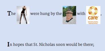
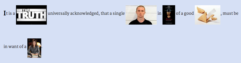
This little text-to-image replacement toy made me laugh, so I decided to put it up in case it makes you laugh too. In my last project, I did part-of-speech tagging in Python and used that to replace nouns with other nouns (see post and demo); in this one, I did the part-of-speech tagging all in Javascript using the terrific RiTa.js library!

With RiTa, you get the same slightly noisy results I got in the pattern.py tagging I did before: not all the nouns are good "nouns." The API for tagging is super easy:

>RiTa.getPosTagsInline("Silent night, holy night")
>"Silent/jj night/nn , holy/rb night/nn"

After generating the parts of speech, I filtered for just the nouns ("/nn" and "/nns"). I replaced those with words in "span" tags, and then used an ajax call to search for each spanned text in Google's image search API. The whole operation is outlined here, with the logic for getting the local text selected first:

$.when(
      $.get("texts/" + file_name, function (text) {
        lines = text.split('\n');
      })
    )
    .then(function () { 
      return processLines(lines);
    })
    .then(function (text) {
      $(".content").html(text);
    })
    .done(function () {
      $("span.replace").each(function (i, val) {
        getImage(val);
      });
    });


It turns out (of course) that there's a lot of repetition in certain words, especially for holiday songs and poems; so I introduced some random picking of the image thumbnails for variety.

Here's more from "Night Before Christmas" (which is really called "A Visit from St. Nick") -- yes, that's Microsoft Word:


This is the first sentence of Pride & Prejudice; it ends with the single man getting the Good Wife:


And the Road Not Taken:


I think the Night Before Christmas is the best one, but they all have their moments. Try it. Suggestions for other well-known (short) texts to try?

Saturday, November 22, 2014

Visualizing Word Embeddings in Pride and Prejudice

It is a truth universally acknowledged that a weekend web hack can be a lot of work, actually. After my last blog post, I thought I'd do a fast word2vec text experiment for #NaNoGenMo. It turned into a visualization hack, not too surprisingly. The results were mixed, though they might be instructive to someone out there.

Overall, the project as launched consists of the text of Pride and Prejudice, with the nouns replaced by the most similar word in a model trained on all of Jane Austen's books' text. The resulting text is pretty nonsensical. The blue words are the replaced words, shaded by how close a "match" they are to the original word; if you mouse over them, you see a little tooltip telling you the original word and the score.


Meanwhile, the graph shows the 2D reduction of the words, original and replacement, with a line connecting them:

The graph builds up a trace of the words you moused over, a kind of self-created word cloud report.


The final project lives here. The github repo is here, mostly Python processing in an IPython (Jupyter) notebook and then a javascript front-end. This is a blog post about how it started and how it ended.

Data Maneuvers

In a (less meandering than how it really happened) summary, the actual steps to process the data were these:

  1. I downloaded the texts for all Jane Austen novels from Project Gutenberg and reduced the files to just the main book text (no table of contents, etc.).
  2. I then pre-processed them to convert to just nouns (not proper nouns!) using pattern.py's tagger. Those nouns were used to train a word2vec model using gensim. I also later trained on all words, and that turned out to be a better model for the vis.
  3. Then I replaced all nouns inside Pride and Prejudice with their closest match according to the model's similarity function. This means closest based on use of words in the whole Austen oeuvre!
  4. I used a python t-SNE library to reduce the 200 feature dimensions for each word to 2 dimensions and plotted them in matplotlib. I saved out the x/y coordinates for each word in the book, so that I can show those words on the graph as you mouse over the replaced (blue) words.
  5. The interaction uses a "fill in the word cloud" mechanism that leaves a trace of where you've been so that eventually you see theme locations on the graph. (Maybe.) Showing all the words to start is too much, and even after a while of playing with it, I wanted them to either fade or go away--so I added a "clear" button above the graph till I can treat this better.

The UI uses the novel text preprocessed in Python (where I wrote the 'span' tag around each noun with attributes of the score, former word, and current word), a csv file for the word locations on the graph, and a PNG with dots for all word locations on a transparent background. The D3 SVG works on top of that (this is the coolest hack in the project, IMO--see below for a few more details).

Word Similarity Results

The basic goal initially was to take inspiration from the observation that "distances" in word2vec are nicely regular; the distance between "man" and "woman" is analogous to the distance between "king" and "queen." I thought I might get interesting word-swap phenomena using this property, like gender swaps, etc. When I included pronouns and proper nouns in my experiment, I got even limper word salad, so I finally stuck with just the 'NN' noun tag in the pattern.py ptag parser output. (You will notice some errors in the text output; I didn't try to fix the tagging issues.)

I was actually about to launch a different version--a model trained on just the nouns in Austen, but the results left me vaguely dissatisfied. The 2D graph looked like this, including the very crowded lower left tip that's the most popular replacement zone (which in a non-weekend-hacky project this would need some better treatment in the vis, maybe a fisheye or rescaling...):

Because the closest word to most words are the most "central" words for the model--e.g., "brother" and "family", the results are pretty dull: lots of sentences with the same words over-used, like "It is a sister universally acknowledged, that a single brother in retirement of a good man, must be in time of a man."

Right before I put up all the files, I tried training the model on all words in Austen, but still replacing only the nouns in the text. The results are much more interesting in the text as well as the 2D plot; while there is no obvious clustering effect visually, you can start seeing related words together, like the bottom:

There are also some interesting similarity results for gendered words in this model:

model.most_similar(['wife'])
[(u'son', 0.7893723249435425),
 (u'reviving', 0.7113327980041504),
 (u'daughter', 0.7054953575134277),
 (u'admittance', 0.6823280453681946),
 (u'attentions', 0.658092737197876),
 (u'warmed', 0.6542254090309143),
 (u'niece', 0.6514275074005127),
 (u'addresses', 0.6490938663482666),
 (u'proposals', 0.647223174571991),
 (u'behaviour', 0.6413060426712036)]

model.most_similar(['husband'])
[(u'nerves', 0.8918779492378235),
 (u'lifting', 0.7963227033615112),
 (u'wishes', 0.7679949998855591),
 (u'nephew', 0.7674976587295532),
 (u'senses', 0.7639766931533813),
 (u'daughter', 0.7601332664489746),
 (u'ladyship', 0.7527087330818176),
 (u'daughters', 0.7525165677070618),
 (u'thoughts', 0.7426179647445679),
 (u'mother', 0.7310776710510254)]

However, the closest matches for "man" is "woman" and vice versa. I should note that in Radim's gensim demo for the Google News text, "man: woman :: woman: girl," and "husband: wife :: wife : fiancée."

And while most of the text is garbage, with some fun gender riffs here and there, in one version I got this super sentence: "I have been used to consider furniture the estate of man." (Originally: "poetry the food of love.") Unfortunately, in this version of the model and replacements, we get "I have been used to consider sands as the activity of wise."

I saved out the json of the word replacements and scores for future different projects. I should also note that recently gensim added doc2vec (document to vector), promising even more relationship fun.

A Note on Using the Python Graph as SVG Background

To make a dot image background for the graph, I just plotted the t-SNE graph in matplotlib, like this (see the do_tsne_files function) with the axis off:

plt.figure(figsize=(15, 15))
plt.axis('off')
plt.scatter(Y[:,0], Y[:,1], s=10, color='gray', alpha=0.2)

After doing this, I right-clicked the inline image to "save image" from my IPython notebook, and that became the background for drawing the dots, lines, and words for the mouseovers. Using the axis('off') makes it entirely transparent except for the marks on top, it turns out. So the background color works fine, too:

#graph {
  position: fixed;
  top: 150px;
  right: 20px;
  overflow: visible;
  background: url('../data/pride_NN_tsne.png');
  background-color: #FAF8F5;
  background-size: 600px 600px;
  border: 1px #E1D8CF solid;
}

There was a little jiggering by hand of the edge limits in the CSS to make sure the scaling worked right in the D3, but in the end it looks approximately right. My word positioning suffers from a simplification--the dots appear at the point of the word coordinates, but the words are offset from the dots, and I don't re-correct them after the line moves. This means that you can sometimes see a purple and blue word that are the same word, in different spots on the graph. Exercise for the future!

I also borrowed some R code and adapted it for my files, to check the t-SNE output there. One of the functions will execute a graphic callback every N iterations, so you can see a plot of the status of the algorithm. To run this (code in my repo), you'll need to make sure you paste (in the unix sense) the words and coordinates files together and then load them into R. The source for that code is this nice post.

The Original Plan and Its Several Revisions

If I were really cool, I would just say this is what I intended to build all along.

My stages of revision were not pretty, but maybe educational:

  • "Let's just replace the words with closest matches in the word2vec model and see what we get! Oh, it's a bit weird. Also, the text is harder to parse and string replace than I expected, so, crud."
  • ...Lots of experimenting with what words to train the model with, one book or all of them, better results with more data but maybe just nouns...
  • "Maybe I can make a web page view with the replacements highlighted. And maybe add the previous word and score." (You know, since the actual text is itself sucky.)
  • ...A long bad rabbit hole with javascript regular expressions and replacements that were time-consuming for me and the web page to load...
  • "What if I try to visualize the distances between words in the model, since I have this similarity score. t-SNE is what the clever kids are using, let's try that."
  • "Cool, I can output a python plot and draw on top of it in javascript! I'll draw a crosshair on the coordinates for the current word in the graph."
  • "Eh, actually, the original word and the replacement might be interesting in the graph too: Let's regenerate the data files with both words, and show both on the plot."
  • "Oh. The 'close' words in the model aren't close on the 2D plot from the nouns model. I guess that figures. Bummer. This was kind of a dead-end."
  • Post-hoc rationalization via eye-candy: "Still, better to have a graph than just text. Add some D3 dots, a line between them, animate them so it looks cooler." (Plus tweaks like opacity of the line based on closeness score, if I do enough of these no one will notice the crappy text?)
  • Recap: "Maybe this is a project showing results of a bad text replacement, and the un-intuitive graph that goes along with it?"
  • "Well, it's some kind of visualization of some pretty abstract concepts, might be useful to someone. Plus, code."
  • ...Start writing up the steps I took and realize I was doing some of them twice (in Python and JS) and refactor...
  • "Now I still have to solve all the annoying 'final' details like CSS, ajax loading of text parts on scroll, fixing some text replacement stuff for non-words and spaces, making a github with commented code and notebook, add a button to clear the graph since it gets crowded, etc."
  • Then, just as I was about to launch today: "Oh, why don't I just show what the graph looks like based on a model of all the words in Austen, not just nouns. Hey, wait, this is actually more interesting and the close matches are usually actually close on the graph too!"

There were equal amounts of Python hacking and Javascript hacking in this little toy. Building a data interactive requires figuring out the data structures that are best for UI development, which often means going back to the data processing side and doing things differently there. Bugs in the vis itself turned up data issues, too. For a long time I didn't realize I had a newline in a word string that broke importing of the coordinates file after that point; this meant the word "truth" wasn't getting a highlight. That's one of the first words in the text, of course!

And obviously I replaced my word2vec model right at the last second, too. Keep the pipeline for experiments as simple as possible, and it'll all be okay.

Sunday, October 26, 2014

A Roundup of Recent Text Analytics and Vis Work

Some really exciting things in text analysis and visualization have crossed my Twitter feed recently; I thought I'd pull together some pointers in case you missed any of my tweetspam about one of my favorite subjects. Maybe posts like this will become a regular thing!

Shiffman's P5.js and Javascript Text Tutorials


Dan Shiffman, famous for his excellent books and lessons on Processing, is doing a course for ITP that includes a lot of text analytics work done in javascript and p5.js (the new javascript Processing lib). The git repo for his course content (code and tutorials) is here. He includes accessible content on TF-IDF, Markov chains, Naive Bayes, parsing, and text layout for the web.

Topic Modeling News


David Mimno updated Mallet, the Java reference package for LDA, with labeled LDA (topics within labeled documents) and stop word regular expressions. Blog post with some explanation here.

Alan Riddell released a Python implementation of LDA with an interface inspired by scikit-learn. He points to an interesting semi-supervised topic modeling package also in Python, zLabel-LDA.

I liked this paper by Maiya and Rolfe with ideas for improving labeling of topics as compared to using raw LDA results. (Every time I teach topic modeling I confront the "but what do these mean" question, and the notion of post-processing the results for more meaningful representation gets a pretty short answer, because we've usually run out of time.)

Here's a nice recent project release from Peter Organisciak for making timeseries charts of topics across digital books in the Hathitrust Digital archive. Full instructions for the python and R package. Here's a section of his example of some topic distributions across The Scarlet Letter:


Words in Space (Multidimensional Scaling)


I was rather excited when Mario Klingemann posted his evolving project on visualizing the topics of the images in the Internet Archive's Book Collection -- a giant zoomable map of related subjects crunched with t-SNE. The links open the related images collections on flickr (e.g., here's "playing cards"). If you like old book images, especially woodcuts, this is a trap you may never escape from! I got lost in occult symbols and finally had to shut the tab.


Related to topic modeling, Lee and Mimno posted a paper on drawing convex 2d (or 3d) hulls around "anchor words" to outline topics in their co-occurrence spaces, such as from t-SNE (t-Distributed Stochastic Neighbor Embedding) or PCA. From their paper:


Meanwhile, David McClure has an interesting post about creating something like these algorithms "by hand" and generating network diagrams from the results. (Thanks to Ted Underwood for passing this on.) Here's his hand-labeled map of War and Peace:


Other words-in-space multidimensional scaling projects of recent note include word2vec, which has a nice Python gensim implementation (see great blog post and demo by Radim Řehůřek);
and GloVe, which claims to improve on word2vec but looks similar to me from the usage perspective (here's a "maybe buggy" Python implementation). t-SNE also has implementations in lots of languages including Python and R, all listed on their page. Also see a nice overview explanation of word embeddings with t-SNE visual examples by Chris Olah here and his demo of dimensionality reduction and t-SNE here.


Narrative Vis


In a fascinating project on Visualizing.org, Georgia Panagiotidou and Anne Pasanen visualize the oscillation of characters between good and evil in the Finnish Kalevala epic. Really lovely and worth a browse in full screen.


Nick Beauchamp's Plot Mapper: Paste in a text and a complex PCA visualization reduces it to something amazingly simple. He says,

The text is chopped into N chunks, and each "chapter" is plotted in a 2-dimensional space (connected by lines) along with the top X words in the text. You can see how the trajectory of the text moves through the space of words, emphasizing different themes at different stages of the work.

Here's a surprisingly sweet Peter Pan:


Note: Keep options for words to generate low, or you may get an error. Thanks to David Mimno (@dmimno) for passing that one one!

Text Generator Art


Darius Kazemi (@tinysubversions) is doing NaNoGenMo (National Novel Generation Month) again this year - repo and rules here. Let's all work on text generation in November! Instead of, you know, actually writing that novel by hand, like an animal.

It was a few weeks ago, but it still makes me giggle - the Vogon Poetry Generator that uses Google Search to build something based on the title (which you can edit in-page).

Wrapping Up


I really love text visualization projects that combine great analytics with great applications. Keep sending me pointers (@arnicas on Twitter) and maybe I'll do more of these roundups when the awesome gets to me enough. For more inspirational links, try my Pinterest board of text vis, my twitter list of text vis, art, nlp folks (who talk about a lot of other things so YMMV), and this hopefully growing index of academic work from the ISOVIS folks.

Sunday, May 11, 2014

Data Characters in Search of An Author


My last post on Implied Stories was about how we fill in the blanks to create story contexts in even very short works, like Hemingway's example of "the shortest story every told": "For sale: Baby shoes, never worn." In that post, I used Pixar's 22 Rules of Storytelling and Emma Coats' talk about them at Tapestry Conference, plus some sociology, to frame my points about how audiences find implied stories.

I closed that post with some concerns about how this applies to data visualization, as we "read" the stories implied in visuals and look for causation, for example. Our brains are telling stories even when they might not be there; as a designer or journalist you might want to head them off at the pass, or face a stampede of weird conclusions. You get those with correlation plots, which everyone reads as causation (after all, you must be implying something, right?). Some great new examples of spurious correlations came up this week in a popular linkmeme, the Spurious Correlation site. I dare you not to try to create a story in your head to try to rationalize this one:

Per capita consumption of cheese and number of people who died becoming tangled in their bedsheets. From tylervigen.

It's at least a well-known "myth" that you shouldn't eat cheese late at night.

Over at Eagereyes, Robert Kosara argued with me and Hemingway that the baby shoes ad isn't a story, because it lacks the formal elements of narrative structure. Part of my point was in how much we bring to the interpretation independent of what is written or shown explicitly. Our brains look for stories and remember stories, as was noted in the recent excellent Data Stories podcast on the topic. But I do think a lot (or most) of data visualization — including the most successful work — lacks story element completeness, and the metaphor is weak as a result.

This is part 2 of my post on implied stories, suggesting that good data visualization is often about characters. What we as readers or as designers do with those characters to fill in the story around them isn't the focus here. But readers are hooked by characters. 8 out of the 22 Pixar Rules focus on character. While the story metaphor for visualization might be weak in places, I think it works when we look for characters in successful visualizations, especially with respect to data outliers.


Heroes & Villians


Sometimes the data provide the heroes and villains of the story, and the rest of the work is finding out the setting and events that got them there. Often that reporting is at least partly in text, not in another data visual.

This is just one recent visual from the many news stories currently analyzing the depth of America’s health care problem, from the Atlantic. The outlier, who in this case is the hero (for readers of the Atlantic), is here cast as the villain, making a pretty compelling point:


Image from Atlantic article.

Underdog Heroes (in Search of an Author)


Another case, one of my favorites, is hidden in the movie data released for the Information is Beautiful movie data contest a few years ago. I didn’t enter, but looked at the data out of curiosity. It turns out there is an extreme outlier in profitability, Paranormal Activity, which cost almost nothing to make in 2009 and racked up 1289040% of its cost in profit (or 1311200%, depending on how you calculate). The next closest profitability is Insidious in 2011 with 6467% profitability. Paranormal Activity blows away the scale unless you revert to logarithmic. It looks like this, otherwise:

Graphing an extreme outlier without a log scale.

Since the data was released as part of a contest, I checked the entrants to see how they had handled this. A lot of them just filtered it out, didn’t deal with it at all. There’s a giant story in that data point, if you ask me what’s interesting in that data set, and it wasn’t told in most entries. In a few interactives, it was, but far fewer than you’d expect. Surely the point of interaction is the ability to dynamically change scales, add explanations, zoom and filter? Instead, the “outlier” that most folks found convenient to report is Avatar, which fits on a non-log scale. Here’s the default view of James Fisher’s entry, showing raw profit, not % profitability. That particular outlier is Avatar:

James Fisher's Hollywood vis.

McCandless (or his blogger) says that this entry “Encourages the user to draw their own conclusions with highly customizable elements and hundreds of data combinations.” A lot of the interactive visualizations do this, showing off their app building skills, creating exploratory tools rather than finding and highlighting that interesting data point or points. To Fisher’s credit, he does revert to a log scale view and doesn’t hide that amazing outlier, if you can find the controls to display by profit and then see the tiny dot that is my hero:

James Fisher's Hollywood vis in action.

As an aside, I found McCandless's brief elevator pitch text for each shortlist entry really interesting; what's the take-away pitch for your vis? "It's a tool to allow exploration" vs. "It shows that X" or "When you compare X and Y you see that..."? More of McCandless's intro text: "Sometimes bubble charts are all about color, aren’t they? Choose the right ones and let your brain and eyes do the rest." (Hmmm.)

But how about "Did you know that the average audience rating for love stories is highest around spring, summer holidays and christmas?" Now that's kind of interesting and definitely makes me want to explore. The entry in question, Confluence by Blimp Design, used a clever and funny labeling trick to handle the Paranormal Activity scale problem — although it might not be clear to folks without a footnote (look to the right end point of the second scale slider):


Gordon Chan’s entry ("sometimes bubble charts are all about color") does some nice things with the spacing between y-axis gridlines to compress and expand where room is needed, but he gives up on Paranormal Activity as a lost cause. You can see Paranormal Activity 2, though, the top red blob here!


If I were a journalist looking for a story about money in this data, I’d probably be more interested in the underdog heroes of the Paranormal franchise than the James Cameron Avatar success story. The Paranormal data point sent me to Wikipedia where I learned that indeed, it is the most profitable film ever made based on return on investment. Just because it’s inconveniently extreme doesn’t mean it’s not an important data point to showcase in a visualization, especially an interactive. (Admittedly not everyone entering the contest was focused on profit, however, as their angle of choice.)


Our Hero Joins a Gang


Related to the heroes and villains is the character “fell in with a bad crowd” and “joined a great band” posse story. The technique here is to show a group your readers associate something negative (or positive) with and how your hero/villain can be seen as a member of that group. Here’s Russia along with other scary outliers in mortality rates:


Combining characters into groups that behave similarly is a nice technique for reducing the visual noise of these types of plots. Regions like “EU” or “Northeast” make for good obvious groupings. Sometimes non-obvious groupings are the story, and we’re back to the “Band/Gang” theme, where we learn about a character by the company it keeps; look for the U.S. in the upper left quadrant here:


There may not be an obvious bad or good gang, but groups help you tell a cleaner story anyway.
Rule 5 in the Pixar rules starts “Simplify. Focus. Combine characters.” We're all familiar with the technique of re-coding our data in groups, like turning 12 months into 4 seasons, to highlight patterns that may be seasonal. Usually the data determines the reasonable groupings for you, like this nice illustration from NOAA of what months constitute "dry" vs. "rainy" seasons in Florida:


6 (or 60) Characters In Search of an Author


I’m also a fan of small multiples, but sometimes we're presented with exploratory visualization with no analysis applied. Here’s an example where I have no idea what to take away from it — if you squint you’ll see a small green blip that might’ve been a story here, but I don’t know.


Here’s a nice small multiples example, though, from a good blog post:

Image and discussion about storytelling charts found on XLCubed Blog post.

Some reasons it’s good: no hunting for the good/bad cases from the reporter’s perspective (the color helps), trendlines annotate the important cells; high points of interest are labelled; the mean of the data is in the background of the small cells so you can see the relative that’s being shown; text is helping guide the interpretation too. This is the well-known "annotation layer" at work for us. (Yes, there are cosmetic things I don’t love, but it’s overall very nice.)


Wrapping Up (So I Can Go Eat)


Without a lot of supporting explanation (or performance, in the case of Hans Rosling), I don't believe a visualization can tell you the "whole story," in terms of who, what, when, where, why, and how; a visualization usually implies only a few of those, and our brains leap to conclusions the author of the visualization may or may not expect. Spurious correlations that suggest causation are a great example. If the author shows the data, it must be important and mean something, right? But sometimes visualization creators make poor choices, as in any design activity.


One of Emma Coats’ most resonant points at Tapestry was that audiences for movies want to be enthralled, delighted, connected — they don’t necessarily want to learn, but they are curious. Presenting a visualization hook of a hero or villain outlier and the company they keep might make a reader curious — curious enough to explore the visualization or topic further. But I still think some authorship is needed; otherwise, you risk your reader leaving your piece in frustration after hitting a few buttons and, if you're lucky, admiring the work you did re-inventing Excel online. If your authorship amounts to having screened out a really interesting outlier because it was inconvenient for your code, well, I'm not giving your story 5 stars.


Notes: Heroes and Villains is a book by the late Angela Carter, and 6 Characters in Search of an Author is a play by Pirandello, some of which involves the characters arguing about what their drama is about. You really should listen to the Data Stories podcast on the storytelling in vis debate.