Saturday, March 24, 2007

Web Infovis: Crispyshop.com review

Found on Information Aesthetics, a regular read for me...

Crispyshop.com is a fascinating blend of data and shopping results that, sadly, doesn't quite work for me on grounds of overall design usability. I love to play with it, but I can't figure out how to use it to pick the GPS device I'm looking for. It has some very basic issues, which in this era of "user experience" shouldn't be happening! (Hey, I know, hire me to consult for you, guys!)
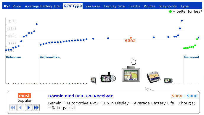
The main display is this very fluid graph showing price on the Y axis, and the dots represent products. The green dots are a great idea, but don't work in practice: you see one suggesting it's a better "deal" (by some number of unknown factors) and you head for it, and it disappears. The UI is simply too fluid. Also, you should never get an error for a simple search like the one I just got:
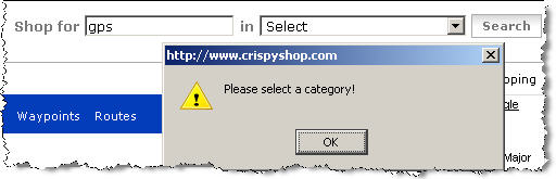
Whatever you do, you've gotta return results from any search done. Not an error and not a "not found" page. Finally, once I did find a product I wanted to look at, I did the usual thing -- clicked off to a merchant site to look at the details there to make sure it's what I was expecting. And an annoying popup error kept grabbing me back to the crispy page: "A script on this page is causing Mozilla to run slowly. Abort it?"

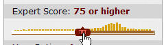
One last bash: the passion here is in the beautifully fluid graph details, clearly. To the left of it is a disappointingly "normal" set of filters that most people just don't use when searching, because they pose various cognitive problems when you're just browsing around and trying to educate yourself about a product space. These ones are particularly poor, in that the pulldown menus don't show the number of results associated with each choice (for instance, if I filter by "10% off and More" will any show up, or will I be wasting a click?). The way Kayak.com handles this is inspirational, of course, in that you get lots of information to help you manage your filters, including some little graphs showing ranges. Wine.molecular.com's demo app is a nice one too, but only works in IE for me. They show a small barchart, but only when you mouseover the slider:
Search is hard to design well: it's all about successful data reduction, for the end-user. People don't scroll through pages of results. But I'm always disappointed by cool ideas partly executed. Is the Crispyshop site intended to support a common task, or just showcase the author's brilliance in one domain (and I admit, he's pretty brilliant at that)? Is it meant to be done, or is it another beta like the endless Google beta empire?

This sadly reminds me of the conversation I had with a spokesperson for Tableausoftware at last year's Infovis conference: There was no usability testing done for that product during design, and it shows in use. I needed an in-person tutorial to get anywhere with it after having downloaded the demo version already. The functionality is excellent, but for a new user making a purchase decision, that's unfortunate in today's software world. Old software products, I will cut them some slack -- but a new product? Even just a professional once-over by someone like me can help catch a lot with the basics.

Wednesday, March 21, 2007

Past and Current Employees and Your Reputation

As my current contract winds down, and a friend quits a job I once quit too, I've been thinking about how employees can affect your company "word of mouth." Just in time, Scott Berkun posted about why you should treat your contractors and temps well :-) Not that I have in any way had a bad time of any contract, but that's relevant to the overall topic here. Manage your reputation by taking care with your own staff.

Scott makes the point that interns and temps are potential future employees, are sources of networking for your future hires, and may be top notch in the idea department, especially since they bring in fresh perspectives. "Treat them like idiots in a box, and you’ll get idiots in a box. But give them a chance to outperform your expectations and your next star recruit might already be in your office." This is a regularly delivered message on Joel Spolsky's blog too.

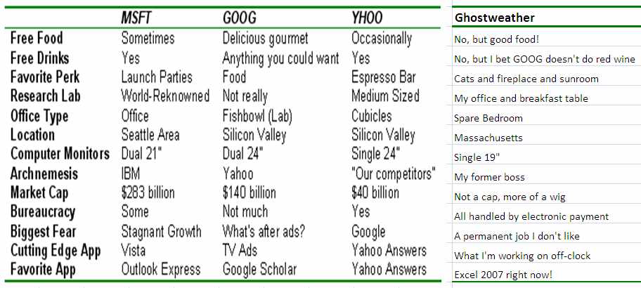
Don't miss the terrific post from the guy who interned at Google, Microsoft, and Yahoo, and compared the three in a blog post with a small chart. :-) (He ended up taking a job at Yahoo.) Here's how my situation compares in an added column on the right:

Another subject of relevance is what I call the "Departure Story," or how you mutually end it with someone who is not happy working for you. My advice is not to let anyone leave suddenly, especially someone in contact with your customers; not because they will badmouth you, but because it will cause a crack in your coherence as a place that can be depended on to handle customers carefully. Imagine how that customer feels when their email to the old account bounces, and they had no warning that their contact was leaving for other pursuits? Redirecting their email to another account where someone else gets it is probably even worse; if there's any indication to that customer that the person they were in touch with had any issues at the company, this will be damaging to the company.

Sudden departures also affect the morale of other employees, just like a big riff will; they'll wonder what happened, how safe their position is, how much of an asshole you were or the boss was. Rumors and stories will inevitably get passed around. Regardless of whether the departee signs confidentiality exit papers, this is still going to happen. So is the conversation they have with their professional industry colleagues at the next conference about whether that's a good place to work or not.

Finally, if you treat a departing employee as if they're a risk, they're more likely to become one. Just like idiots in boxes.

While I was interviewing with a local company that had gone through some troubled times with lots of layoffs, I talked with current and former staff and heard an earful about their last year. It was all on condition of anonymity, and I was grateful to hear it. It made me a bit wary, I will say, and played a role in my decision process. As a manager, you need to know this is going to happen and it isn't something you can "discipline" or "threaten" out of your staff and contractors. Equally likely is the good rep and good word of mouth, if you handle them all well.

A lot of managers moan about how hard it is to hire good people. Sometimes the problem isn't the market, it's you. Checking your street reputation due to former employees and contractors might be a good idea. Someone might like you enough to tell you the truth. Then you can go about figuring out how to change your practices and image.

The current issue of Harvard Business Review has a thought-provoking piece on how companies can't be all things to all employees, but knowing what they are and capitalizing on that is a starting point in attracting the right people for your culture who won't end up telling friends, "It wasn't like it was described in the job ad, that's for sure!"

Sunday, March 18, 2007

Tuesday, March 13, 2007

Organizing for Product Design and Production

I had an interesting chat yesterday with a manager in a large international company that is restructuring to support better innovative product creation. He asked my opinion on a number of topics, relevant to their effort:
  • Matrix organization of cross-disciplinary teams: marketing, engineering, and operations, for instance. I suggested that at the innovation phase before product development, the team might look different and have different skills, such as design!
  • Does long-distance collaboration really work during product design? I said it can, and that although video gets a bad rap, we used it effectively at Adobe in the same time zone. I am less sanguine about major timezone differences, and still a firm believer in regular face-to-face, especially at the start and during times of tension, for defusing it over a drink or meal. For designers, there's more artifact production to communicate ideas long-distance; and the whiteboard collaboration hasn't really been adequately replaced by any conference tools I've seen, but I'd love to be wrong if someone has a suggestion.
  • Quality of product: Get it out or get it right? I said this depends on ability to absorb risk in a brand, and first to market vs. competitor situation. A first-to-market product can get a few things wrong, and still have the advantage. Not if they got the major things wrong, though, and destroyed their own business and can't absorb the hit. Soft launches and long betas are another tried and true method. Google seems to live on eternal betas -- but of course they did get search pretty much right, first, as far as state of that art goes now.
  • Outsource concept design or do it inhouse: I said this depends on how much product innovation is meant to be a core competency. I think it should live in-house if it's meant to be core, because it's a risk to outsource all good idea creation. Also expensive.
It wasn't a specific question, but I pushed for the value of ethnograhic research for identifying new product areas and gaps in markets; and the value of design of both the industrial variety (closer and closer to home for software now) and the usability/interaction variety. The need to reward and remember failures is important here to encourage iteration and re-application of old ideas in new ways.

Tuesday, March 06, 2007

Pretty Visual Generators

I've been looking at online generators for the last few days (a recurrent interest) and was reminded of these pretty visual ones. Worth checking out.

Jared Tarbell's beautiful I'Ching interactive display. Hard to describe, and a little mysterious in practice, as it should be.

The Walking Insect Generator, which is also beautiful, but funnier. Seriously, do click and marvel.

A scribbler art project -- this one is fun to watch, like a lot of these visual noise generators. It tends to fuzz up your drawing.

Sunday, March 04, 2007

Test Your Psychic Powers

Participate in an online study of psychic powers run at Psi Experiments. Their first experiment is up, and all you have to do is guess (or divine) which cup the ring is hidden under. No, it's not a street hustle. You can sign up for the results, too.

Experiment One: "In Which Box is the Ring?"

Saturday, March 03, 2007

Product Idea Generator

This is addictive, like any good generator. It's especially well-done. Too bad the reload link is so tiny, but you won't miss it. Samples I got:
  • It's a rubber fish that shouts 'WARNING!' at the first sign of danger! It sounds better than it looks and mimics the movements of a lizard.
  • It's a blow-up doll that's inflammable! It kills weeds down to the root and talks.
  • It's a video recorder that scares dogs and stays exactly where you leave it.
  • It's like a normal shoelace, but it runs on six little wheels.
  • It's an aquarium that keeps track of your personal calendar!
  • It's a trouser press that flies like a rocket! It doesn't need batteries and may cause drowsiness.

Web Log Analysis: Site Flow Charts

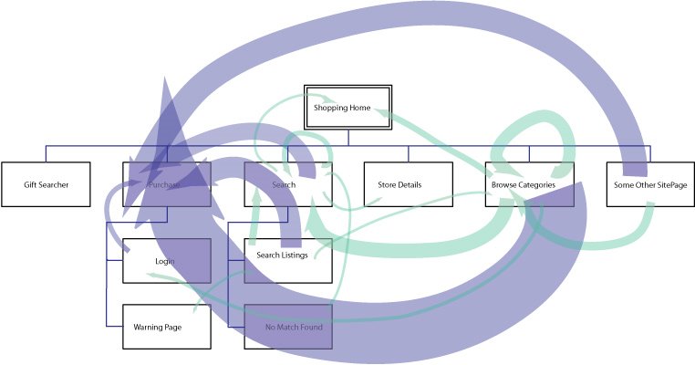
I've been working a bit on web log analysis recently (see my contracting info), and while I didn't deliver this for a client, I did spend a little time seeing if it would be worthwhile to do in the future. After doing the usual freqencies of referrers and requests and such, I also looked at median page views per visitor.

I then did a small sample extraction of page views of the users matching the median page view profile, and generated arcs corresponding to what page types they went from and to. I overlaid them on a site map I threw together, done by hand in Illustrator (and here anonymized): the width in pixels of the line directly corresponds to how many arcs there are between each node (or page type). Blue lines are going into the "purchase" process, while green are just the rest of the traffic patterns. It's a little more suggestive than the simple frequency counts that don't show actual paths; because in this I can see how few people in my sample subset go from, for instance, the "not found" search results to searching again. And it's quite obvious how relatively many people in these logs were buying products while browsing rather than after searching. It's probably worth doing this a larger scale and figuring out a good algorithm to automate the drawing, but I ran out of time on this contract project. If anyone else wants to pay me to do this for their site, drop me a note. :-)

Friday, March 02, 2007

Big Ball o' Mud: Code Tangles and Organizations

A friend pointed me to this a month ago, and I'm only getting around to this now: Foote and Yoder's Big Ball of Mud, on legacy code that no one can understand or modify without risk to, well, sanity and schedule.

They illustrate their points with physical world architectural examples, a lot coming from Stewart Brand's How Buildings Learn, because design in other domains and design of software aren't so different when you look closely.  I was, of course, thinking about interface design and organizational design while I was reading it, and about the book Architecture Without Architects, which I really like in both concept and fact after meeting a few (I'm kidding--mostly).  Foote and Yoder's interest in XP (extreme programming) is in part because of the need to accommodate changes in user requirements, but they don't talk a lot about UI design and the difficulties with keeping UI code flexible and modifiable.  (I still think it's a shame that agile and XP communities don't connect and work better with UI/UX/UE folks -- apart from the active agile-usability mailing list, of course.  The goal of a good designer is to get the right decisions made right and executed well; these goals are the same for both UI designers and code designers, and should be the goals of managers and executives who support them.  But.)

Selections from the Ball of Mud article:

  • One reason that software architectures are so often mediocre is that architecture frequently takes a back seat to more mundane concerns such as cost, time-to-market, and programmer skill. ... Architecture is a long-term concern. The concerns above have to be addressed if a product is not to be stillborn in the marketplace, while the benefits of good architecture are realized later in the lifecycle, as frameworks mature, and reusable black-box components emerge [Foote & Opdyke 1995].
  • In other words, the software is ugly because the problem is ugly, or at least not well understood. Frequently, the organization of the system reflects the sprawl and history of the organization that built it (as per CONWAY’S LAW [Coplien 1995]) and the compromises that were made along the way. Renegotiating these relationships is often difficult once the basic boundaries among system elements are drawn. These relationships can take on the immutable character of "site" boundaries that Brand [Brand 1994] observed in real cities. Big problems can arises when the needs of the applications force unrestrained communication across these boundaries. The system becomes a tangled mess, and what little structure is there can erode further.
  • Architecture and code quality may strike management as frills that have only an indirect impact on their bottom lines.

The same can be said of usability and design excellence, of course.  It's a special organization that doesn't erode the desire of people to produce quality work by saying "it's good enough to make us money right now."

A good closing quote: Alan Kay, during an invited talk at OOPSLA '86 observed that "good ideas don't always scale." That observation prompted Henry Lieberman to inquire "so what do we do, just scale the bad ones?"

Pretty often, both on the idea itself and the execution. In the short term, the prototype code works well enough, and the design is okay unless you look closer or start trying to add onto it. Same happens with UI design, without enough iteration, and tacking on new features without refactoring is like adding dirt and grass to a ball of UI mud.

I'm now using the new Office 2007 products, and I regret not seeing more refactoring of the UI, despite the famous ribbon. If you're going to start doing a UI refactor, you may as well go all the way once you've disoriented your users a little bit; for instance, why keep Word's header and footer commands under the "view" tab now, and I have to question whether "home" means anything real to anyone except on a website. Some of the changes are a great improvement, but I think a little card sorting might have helped them out a bit, too, and I find some of these choices surprising.

Sunday, February 25, 2007

Social Networks of Video Editors on LiveJournal

A few months ago, I did a talk at IBM Research in Cambridge on video (or "vid") editors and their online and offline communities. I made a few social network images, which I thought would be interesting to folks here, and I know I have readers on LiveJournal.

The basic gist of the talk was that hobbiest television fan music video editors existed long before YouTube and their history and organization reflect how they use the internet now -- which is verifiable with some simple data analysis. (NB: I used to be one myself, and in the talk I used a lot of personal examples and anonymized the rest, to protect privacy of anyone who wasn't contacted about this talk. So I'll say "we" here although I'm not practicing myself these days.)

In a quick sum of my talk: We used to do music video editing with VCRs. We existed before the internet was our main way of communicating, and we used fanzines and APAs to exchange tips and tricks (but truthfully, this was borderline before my time, although the friends who taught me all did this). We had and still have conventions at which we showed off our work, to supplement the now popular online posting mechanisms of distribution. (YouTube is not a major site for fan video editors, but another current social network tool that supports video has just become very popular among my friends who use LiveJournal for their conversations.)

Knowing the history makes for interesting cruising of the video communities on LiveJournal. The anime video makers turn out to be, for the most part, a distinct group. This isn't too surprising when you read the "about" text on one of the video community pages (slightly disguised here):

Anime "vidders" are told they may not be as comfortable here, and that VCR vidders are welcome.

This image shows the network of members in the anime community (highlighted) which is somewhat separate from the group (and its affiliates) quoted above:

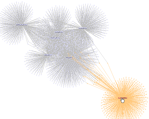
One of the communities that is closely related to this one is one in which an annual face-to-face convention is discussed, started and fed by some of the older VCR editors and now pretty much populated by the non-linear digital folks, of which former VCR people are now a part. The convention-discussion community members, highlighted below in orange, are closely interconnected to the community quoted from above, which is circled in red here:

The group circled in blue is a Battlestar Galactica video group, less closely related but more so than the anime group. The closely inter-connected groups in these images are the generic discussion groups, at which the craft and technique and technical discussions occur. More specific discussion groups are generally less connected.

I made these images with prefuse, and apologies for the quality of the uploads. I'm available to talk about this stuff anytime :-)

Sunday, February 18, 2007

A Postcard to Windhouse

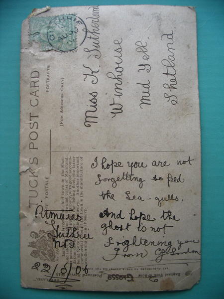
Since my last update a month ago on the haunted Windhouse stories, I received email from a reader in Stirling, Scotland, whose family lived in the house in Shetland at the turn of the (last) century. Even then the house was known to be haunted, well before it turned into a picturesque ruin on the hill. Justine scanned and sent me a copy of a postcard her great-grandmother's sister Katie received referring to the ghost.


windhouse postcard

I updated the essay again, and posted some more photos and links to the family history. They're at the bottom: my Windhouse story.

Saturday, February 17, 2007

Mayan Art

From Chichen Itza this January. The eagle is eating a heart.

I am reading a great book, Breaking the Maya Code, by Michael Coe. The first paragraph says, "It was 12 cycles, 18 katuns, 16 tuns, 0 uinals, and 16 kins since the beginning of the Great Cycle. The day was 12 Cib 14 Uo, and was ruled by the seventh Lord of the Night. The moon was nine days old. Precisely 5,101 of our years and 235 days had passed since the creation of this universe, and only 23 years and 22 days remained until the final cataclysm that would destroy it. So the ancient Maya scribes and astronomers would have calculated, for the day was 14 May 1989, and we were in Leningrad."

Saturday, February 10, 2007

Owls in Massachusetts

Last weekend was an "owl festival" at my local Audubon nature preserve. First was a great presentation on snowy owls at Logan Airport (not given there, about owls who hang out there) by Norm Smith of the Blue Hills Audubon nature preserve. Yes, there are snowy owls all over Logan's landing strips. No, this is not good for the airplanes. Yes, they are hard to spot if you're flying out from there, as I discovered a day later-- white could mean snow, trash, or owl.

Norm has some great pictures of them, and points out how little we understand them -- they don't seem to be migratory in the usual sense, and might even be circumpolar. They are able to filter out the sounds of the jets to tune in on squeaking rats. They all look a bit different, and have different personalities, too.

Some articles and links worth looking at on this work:

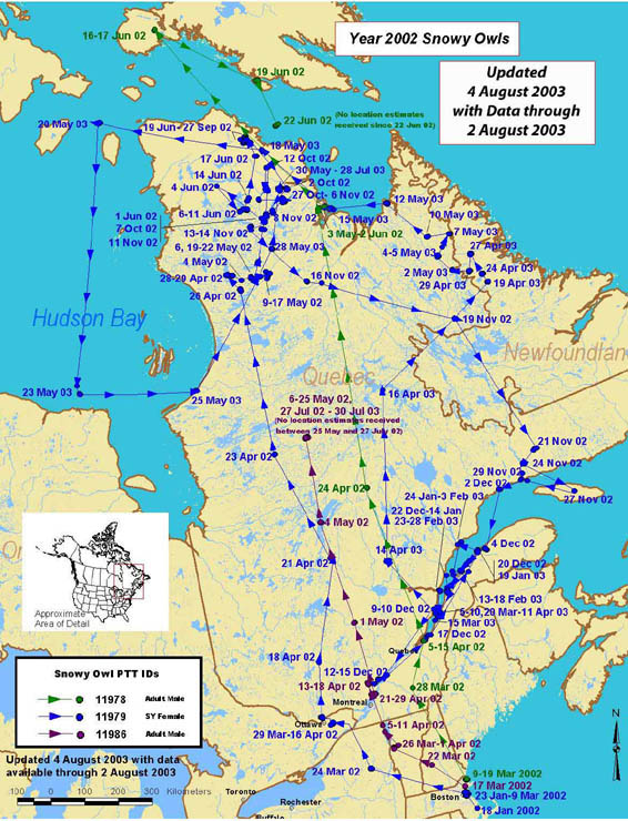
This is a map of where some of the owls he attached transmitters to ended up in Canada -- mostly up towards Hudson Bay. Some have been tracked to Siberia, though. (Hey, I've been there. I saw no owls, however.)

The day after Norm's terrific talk and slides, a guy brought in some birds living in captivity because they've been hurt or grown up with people and now identify too much with people to hunt properly. These were beautiful birds. Below you'll see this fellow with a screech owl, incredibly cute, and a wonderful great horned owl. None of my pictures turned out very well due to the interior lighting, but you get the idea.

After the demo of the birds, we went on an "owl prowl" walk in what was probably 14F degrees at best. In the gathering dark, I add, because at the point where I'd had enough of the cold, I didn't think I could see my way back to the lodge. We crunched all over the grounds of Broadmoor making dumb owl calls, and hearing not a peep back except for the bored kids shifting around while we listened and whining a little and sometimes pretending to be owls themselves which didn't really help us. It was so cold even the CD player with some real owls on it wouldn't perform properly. An owl bust, all around. Now that I know what screech owls and saw whets sound like, I can confirm I have never heard them where I live beside the reservoir. Too bad! They are really cute.

Saturday, February 03, 2007

New Moon and the Stock Market

I've been quite busy recently, and am getting a backlog of post material. Here's on oldie I never got around to blogging, which is weird and short: there is evidence that the lunar phase affects stock market performance.
We find strong lunar cycle effects in stock returns. Specifically, returns in the 15 days around new moon dates are about double the returns in the 15 days around full moon dates. This pattern of returns is pervasive; we find it for all major U.S. stock indexes over the last 100 years and for nearly all major stock indexes of 24 other countries over the last 30 years. In contrast, we find no reliable or economically important evidence of lunar cycle effects in return volatility and volume of trading. Taken as a whole, this evidence is consistent with popular beliefs that lunar cycles affect human behavior.
You can see the abstract and download the paper here: Lunar Cycle Effects in Stock Returns, on the Social Science Research Network.

Sunday, January 28, 2007

Windhouse Haunting Updated

I'm pleased to announce that I've updated my article about the haunted Windhouse in Scotland, based on a very interesting reader story I just received. I've added his account at the end as a postscript with a few more photos; and below that I added the Shetland online forum stories I found that appeared after I posted the original piece last January. (I got "seems to be the best researched" in the forum citation :-)

Saturday, January 27, 2007

MultiTouch Display

I guess it's a Tipping Point phenomenon, but I wonder who the cool kids are, everytime this happens. The iPhone demo features a multitouch display, and Jeff Han's demo of this functionality on YouTube has been getting a lot of blognoise; but this idea has been around in the research community for a while. What makes something finally get out of R&D "interesting idea" and into "must have innovation wow" in a product seen as widely as the iPhone? It was even around at Apple, and ignored for years. What does it take to get visibility and get on a product development and business radar? Some links:
  • The Jeff Han video that's been circulated a lot (ok, points for music, for high density of info and fast cutting to demo points -- is this what makes it spreadable?)
  • The Tog column that discusses some of the design history that went into the iPhone (many many ideas over many years, including random access voicemail -- we discussed and prototyped this at AT&T and at Excite 10 years ago too), some of it (but not most of it) at Apple itself.
  • Bill Buxton's article referenced by Tog on multitouch displays. I know some of the people he's referencing, and I feel their mystification too.
I guess this is one of the reasons I stay as plugged in as I can to what's happening in R&D--the best of that work will eventually make it into products, and I'd like to lessen that time by figuring out the tipping point for it.

Wednesday, January 24, 2007

Democratizing Data Insight

It's an exciting world right now... i-Stuff and the spread of "design" as a buzzword aside, I'm thrilled by the spread of data and graphs into the public world. A few recent pointers on the theme of public data exploration:
  • Gapminder.org's Hans Rosling presented to TED a year ago, with the beautiful animated charts that his site made famous. His final comments say, in paraphrase, "Publically funded data is public, but hard to get at, hard to search, and presented in boring ways. We can and should change this." One of his great takeaways, for me, from his data illustrations of "third world" healthcare is that the error in the data is no doubt much less than the truth in it, at the magnitudes he illustrates.
  • Swivel is a new site for data upload and exploration, with a fun blog. They also allow community discussion around their charts. I like their enthusiasm and enjoy the blog a lot.
  • Friends from IBM (Martin Wattenberg and his group) have just announced a similar concept to Swivel's, but with even more graph types and they're all nicely interactive. Upload data, create a picture, and post it... other people can play with your data and present their own insight pictures, or modify yours. And comment on them. It's Many Eyes, and it even has a nice website!
  • Google claims to be making real time stock quotes available, which means live data plotting is possible. Found on swivel's blog, a post on Googleblog: Real Time Quotes for Free.
  • And don't forget processing.org. There's a nice visualization of State of the Union speeches highlighted there, including word frequencies and grade levels of the speech. (It's by Brad Borevitz.) They've been averaging around 9th or 10th grade level, but notice the great spike of Jimmy Carter's at grade 15.

Sunday, January 21, 2007

Friday, January 19, 2007

Annual Site Stats and Changes

I don't have time to do real stats on my server logs, but I offer the annual impressionistic ones, at least, as well as some updates on the site.

Search phrases that strike me as funny, that show up every single week (usually with multiple counts):

  • girls on boats
  • alcohol induced blackouts
  • temporary wallpaper
  • real ghost photos/ghost photos/real life ghosts (etc)

Posts or pages with high hit counts, regularly:

  • The crop-circle google-montage (I should put a Google ad or two here, it's ludicrous; and no one ever comments, but it's hit 68 times or more per week.)
  • The weird red tree in Shropshire that almost made me drive off the road. It has 67 comments, which I should really trim/clean/purge most of. Also, add a Google ad.
  • An incredibly short post on Bara Hack, haunted village in CT. With a lot of chimers-in on the illegality of going there, or not.
  • My travel essays, especially the Siberia one. They're low on the page, but very popular, and the Windhouse and Fair Isle one are catching up in hits.
  • The bio/resume page is visited at least 20 times a week. I've added some info to it recently.
Visitors in sizable numbers are coming from images searching (no surprise there), a few companies where I think I know the folks :-), and increasingly from Stumbleupon, which is nice.

I spruced up the blog template a tiny bit, since Blogger has added tagging ability. Now you can click on a link to items in categories I post on regularly: design, tech industry, management, archaeology, funny stuff, weird stuff, information visualization and data analysis, etc. It took hours and hours to do a cursory tag job on my 504 posts of the last few years, so if you notice a mislabel, let me know. The tags list is on the right side under the index of recent posts.

Thursday, January 18, 2007

Powerpoint Hilarity

Le Grand Content by Clemens Kogler is an animated riff on powerpoint presentations of data and Big Questions (mostly those found in bad teenage poetry). It's very funny. Go and click on "view movie" and giggle.