I've been working a bit on web log analysis recently (see my contracting info), and while I didn't deliver this for a client, I did spend a little time seeing if it would be worthwhile to do in the future. After doing the usual freqencies of referrers and requests and such, I also looked at median page views per visitor.
I then did a small sample extraction of page views of the users matching the median page view profile, and generated arcs corresponding to what page types they went from and to. I overlaid them on a site map I threw together, done by hand in Illustrator (and here anonymized): the width in pixels of the line directly corresponds to how many arcs there are between each node (or page type). Blue lines are going into the "purchase" process, while green are just the rest of the traffic patterns.
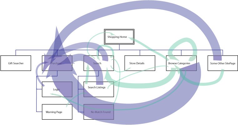 It's a little more suggestive than the simple frequency counts that don't show actual paths; because in this I can see how few people in my sample subset go from, for instance, the "not found" search results to searching again. And it's quite obvious how relatively many people in these logs were buying products while browsing rather than after searching. It's probably worth doing this a larger scale and figuring out a good algorithm to automate the drawing, but I ran out of time on this contract project. If anyone else wants to pay me to do this for their site, drop me a note. :-)
No comments :
Post a Comment