Crispyshop.com is a fascinating blend of data and shopping results that, sadly, doesn't quite work for me on grounds of overall design usability. I love to play with it, but I can't figure out how to use it to pick the GPS device I'm looking for. It has some very basic issues, which in this era of "user experience" shouldn't be happening! (Hey, I know, hire me to consult for you, guys!)
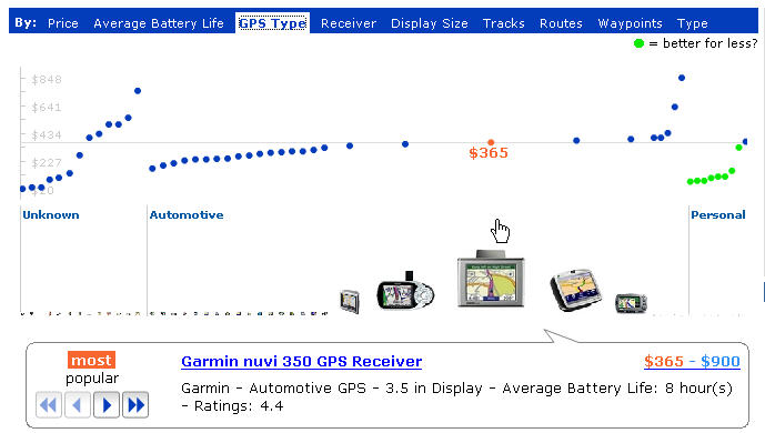
The main display is this very fluid graph showing price on the Y axis, and the dots represent products. The green dots are a great idea, but don't work in practice: you see one suggesting it's a better "deal" (by some number of unknown factors) and you head for it, and it disappears. The UI is simply too fluid. Also, you should never get an error for a simple search like the one I just got:
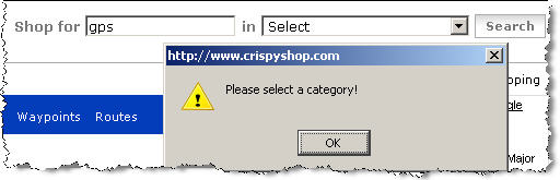
Whatever you do, you've gotta return results from any search done. Not an error and not a "not found" page. Finally, once I did find a product I wanted to look at, I did the usual thing -- clicked off to a merchant site to look at the details there to make sure it's what I was expecting. And an annoying popup error kept grabbing me back to the crispy page: "A script on this page is causing Mozilla to run slowly. Abort it?"
One last bash: the passion here is in the beautifully fluid graph details, clearly. To the left of it is a disappointingly "normal" set of filters that most people just don't use when searching, because they pose various cognitive problems when you're just browsing around and trying to educate yourself about a product space. These ones are particularly poor, in that the pulldown menus don't show the number of results associated with each choice (for instance, if I filter by "10% off and More" will any show up, or will I be wasting a click?). The way Kayak.com handles this is inspirational, of course, in that you get lots of information to help you manage your filters, including some little graphs showing ranges. Wine.molecular.com's demo app is a nice one too, but only works in IE for me. They show a small barchart, but only when you mouseover the slider:

Search is hard to design well: it's all about successful data reduction, for the end-user. People don't scroll through pages of results. But I'm always disappointed by cool ideas partly executed. Is the Crispyshop site intended to support a common task, or just showcase the author's brilliance in one domain (and I admit, he's pretty brilliant at that)? Is it meant to be done, or is it another beta like the endless Google beta empire?
This sadly reminds me of the conversation I had with a spokesperson for Tableausoftware at last year's Infovis conference: There was no usability testing done for that product during design, and it shows in use. I needed an in-person tutorial to get anywhere with it after having downloaded the demo version already. The functionality is excellent, but for a new user making a purchase decision, that's unfortunate in today's software world. Old software products, I will cut them some slack -- but a new product? Even just a professional once-over by someone like me can help catch a lot with the basics.
1 comment :
My parents' Garmin Nuvi 680 is really nice.
It is, however, always surprising to me how quickly anything that talks (it reads directions) becomes a "she" (or he, but it reads with a female voice, so.. she).
As in "I don't know why she took us down this way through all these turns when we could've stayed on that other, larger, road and gotten here just as fast."
In a weekend or so of using it to drive around an unfamiliar area, it only led us astray once when it carefully guided us through some side streets to take a turn onto a main road that was closed, presumably to prevent people from cutting through there.
It was useful information anyway, though, since the fact that the city bothered to close that off means the main street must get pretty crowded -- enough so that people were cutting through there.
(The answer, of course, was "the maps it had didn't know the street had been blocked, it was shorter, and those side streets and the turns weren't small enough to count as higher cost vs the main road.
Post a Comment