Sunday, March 18, 2012

Digging Into NetworkX and D3


For Boston's Predictive Analytics Meetup in February, I gave a short talk on using the python library NetworkX to analyze social network link data, illustrated with some simple D3.js visuals of the results. I've since spruced up the slides to stand on their own a bit better, extended a few of the examples, and moved it all online.

Here's a link to the zip file of the ppt, heavily commented code samples, and the network edgelist I used (from Moritz Stefaner's and my previous look at Twitter Infovis folks in mid-2011). Or you can browse the slides below (the links should work fine).


A few comments, if you made it through the deck... The network stats are doubtless out of data, since I know there has been some movement in who-follows-whom among the Infovis crowd on Twitter. The overall workflow proposal is this:

  1. Read in your edgelist into NetworkX (or a json file if you already have one)
  2. Convert to a NetworkX graph object
  3. Calculate stats and save them as attributes on the graph nodes (my code shows you how/does it for you)
  4. Optionally here: Filter the network by some important attribute.
  5. Write out JSON of the network to use elsewhere (e.g., D3)
  6. Visualize (in D3) and explore what you got
  7. Optionally here: Filter the network further in the interactive visualization.
  8. Go back to (1) and add more stats. Or filter some more.

In my previous post using Gephi to analyse the infovis network, I labelled one subcommunity "The Processing" crowd, another one "The Researchers" and another one "The Authorities." In my current analysis, where I find 6 subcommunities (or "partitions"), you can see them as roughly the green partition (Processing folks and infovis artists), the orange partition (the research/analytics group), and the blue partition (with high-degree authorities like infosthetics and flowingdata).

The different demos make different things clear about this data, as you might expect!

  • The adjacency matrix of the top 88 chosen by eigenvector centrality reveals that the orange partition, or the Researchers, have more members with high eigenvector centrality than the other subgroups. This is quite clear when you sort by Partition. Other partitions are barely represented here. (NB: It was only 88 because it was all that fit easily; for the other demos, I use a subset of 100 out of the full 1644 nodes.)


  • The chord diagram, which allows you to toggle between the 100 person top eigenvector scoring subset vs. all 1644, shows a striking difference between the subset of 100 and the full set. It's even more obvious here how the orange partition (the "Researchers") overwhelms the top eigenvector subset, and how little of the large green group are represented in this subset. We can certainly speculate why this is...


  • The force network of nodes allows you to see some individual following patterns, at least among the "most important" top nodes. In this example, I filter the graph inside the javascript code, instead of in the NetworkX code. The graph shows a union of the top nodes selected for eigenvector centrality, betweenness, and degree. Some of them near the edges don't follow anyone in the "top" network sample, but they made this cut by being high in one or more measures of degree, eigenvector centrality, or betweenness. You can resize by each variable, or click on one to see the individual's values.

Once you get started making these visuals, you want to tinker forever... I hope the code samples and comments help you get started, if you want to try to do something in this line! Once again, talk slides plus source are in this zip file. Be sure to note my warnings and gotchas if you tinker yourself.

For a recent and different analysis of talk among the Twitter Infovis crowd, visit @JeffClark's posts here and here and here. (He's an orange, top N member in my graphs.) He identifies "red" and "blue" groups based on their interactions and words used. His two primary groups seem to correspond to the processing/artists (green) and researchers/analytics (orange) distinctions I found in this older data.

Sunday, November 20, 2011

A Kindle Fire Review (from a Media Fan)


I'm a Kindle fan, and an Amazon fan. I really like their media content: I buy Amazon music, Amazon Kindle books, TV shows, Android apps. So when my Kindle Fire came, it was pretty much pre-loaded, and that was really nice. All my stuff is sitting there with a little "download to device" arrow, which rocks.

I got this thing because of upcoming travel over the holidays (I don't own an iPad, I think they're too big). I was never intending to take the Fire instead of my reading Kindle, and after 5 days, I still wouldn't. Partly that's battery-life-related; I adore my reading Kindle for the everlasting, never-needing-to-charge-it, one-handed reading wonder that it is. The Kindle Fire battery supposedly lasts about 8 hours, and that may not be true with video watching and wifi on (I haven't tested that part yet).

So, this is not a Kindle-killer, anymore than it's an iPad killer, 'nuff said there.

More specifically, I got the Fire for video watching, web browsing/email/twitter, PDF reading, and light app use (Solitaire, Angry Birds, etc), in about that order of priority. So let's hit those, with some UI observations along the way, because that's where the chance for the Fire's improvements really lies. Then I'll finish up with a few comments on major navigational issues, e.g., scrolling, selecting, typing, which permeate the product.

Video Watching and Disk Space


The Fire seems to want you to mostly stream, which doesn't surprise me. The 8GB drive, and the free Amazon Prime (streaming only) support this. Netflix and Hulu Plus work on it (install their free apps from the store). If you have ever paid for a TV show ep (I sure have!) from Amazon, THOSE can be downloaded to your device.  (Browse to a show you have bought episodes for, and they tell you they're still yours, and you can download to your device now!)

Why does this matter? If you're wanting to use it on an airplane, or in iffy hotels off the grid, which I do, you need to download to your device.  And if you want to load video you already have, I did the research: It only recognizes MP4, so you need to convert stuff. (I'm using AVS Video Converter; my version does only one file at a time, which is proving to be a giant slow babysitting process.)

You can load videos (or PDFs, or mobi files, or anything else) when you attach your device by USB cable. Drag them into the Videos folder.

But don't expect them to show up in the Videos section of the UI, reachable by the top tabs! They will be found in the rather hidden pre-installed "Gallery" app, which is where your photos and videos live. And then you may be surprised by how poor the UI is for the videos (I am praying they fix this, it's un-manageable!) They appear as a tiny thumbnail with no text; you must select, and then choose "Properties," in order to figure out which one is which. This will get old fast, not just because selection is so funky on this device (more on that later). Here's the videos display with 2 videos:

Video in Gallery

A short season of one show could run just over 3GB. The actual disk space available to you is not 8GB, because of the OS etc; it's really 6GBish. To find out what you're using, you need to hunt a bit. There is no disk meter in the top accessory bar where Wifi, battery, and other settings live. Tap that bar, and you'll see options like volume. (Yes, it says "Lynn's 5th Kindle," I don't want to talk about it.)


You need to hit "More" and then click into "Device" to see the disk usage. That's really annoying for a device with such a small drive. I wouldn't be hoarding content on it, but for non-wifi situations, having downloaded content seems pretty important to me. I'm really befuddled by this one.

Disk usage

This said, my MP4 videos do look and sound nice. I'll be spending the evening getting ready for that trip.

Web Browsing, Email, Twitter, Etc.


I am guardedly pleased with this so far. I had some issues getting the built-in email app to recognize a Verizon Yahoo address, but the Yahoo mail app worked fine. Tweetcaster works nicely, and I even get a tiny cute beep in the notifications bar when someone @ mentions me, which is nice (same cute beep for email I receive).

The web browser does support tabs, which is great; but the favorites/bookmarks have one major issue: There seems to be no way to delete one. Huh? So it came built in with ESPN.com and a few others I never use, and I can't remove them. If this was a UI design mistake, it's shocking; if it was policy for some payment by partners -- unlike Amazon in so many ways, who are usually all about the customer.

Please fix this, Amazon.

Web pages also allow you to remember passwords, which - thank goodness. Typing is such a damn pain (see below).

Since web pages look good, and play video (including flash), this is a real plus on the device. Selection of links is funky, and I sometimes don't know if the selection problems I am having are due to the OS, touchscreen, or some web loading/processing issue.

PDF Files


PDFs on the e-ink "reading" Kindles are terrible - when they took away the text reflowing option for PDF docs, it becomes impossible to really read them, requiring too much zooming, scrolling, etc, and any images take forever to load and are, of course, B&W.

Most of this is awesome on the Kindle Fire! Definitely a reasonable PDF reader. The documents look great, and my only issue is the weird scroll-down, then to the right, for navigating a large document. It would be nice to have an option for "just scroll down" to get through a PDF document, instead of trying to use the book/paper metaphor of flipping pages. Here is how pretty PDFs look (yes, this is fanfiction, deal with it; of course I tested academic articles too).

Gorgeous Color PDF

Here's a page in portrait, with arrows suggesting how I need to scroll (down to get to bottom of the page, then flick to the right to "flip" to next page).


Thumbs up on PDF reading.
They appear in your Documents folder as you would expect, and you don't need to send them to your device for conversion, they just "work." There isn't a Kindle Fire Instapaper app, but since you can save the site in your bookmarks and read text only, or download as Mobi files, you are all set there.

App Use: Angry Birds


Angry Birds is great. So is Solitaire. I haven't tried to install any apps that aren't in the Amazon app store, although you can (instructions abound on this). Note: I installed these on my Android phone and can't use them on it, screen is too small to really do it right. This form-factor is just fine for games that need a wider field of vision, or for people who are getting older and blinder.

I also installed a drawing app, but I don't much want to draw with my finger, so.

I like, and have always liked, the Amazon Android Apps store experience. In some ways, it's better than Google's app store. I'd expect that from Amazon UI, but it's nice to see on Amazon's first dedicated Android device.

Typing, Scrolling, Selecting, Turning the Page


The use of the touch screen is my biggest peeve. It's just buggy! If it's software, I expect a fix update -- Amazon is always good about updating Kindle software. If it's hardware, it's just a damn shame, and I'm kind of shocked it shipped this way.

Typing: The on-screen keyboard behaves very badly in portrait mode. My space bar and the letter "c" seem to be hyperactive for any key I pick on the right side of the keyboard. It's so bad, I will just switch to landscape for anything I ever need to type. The typing issues make the device less fun for email/twitter than I hoped. I am very sad about this.

Scrolling and Selecting: I have had so much trouble trying to scroll vs. selecting what's under my finger that I even looked it up in the help, and watched some demo videos online to see if they were doing it differently. It's not obvious. I have similar problems on my Android phone, which either means the OS itself is to blame, or making good touch screens is really really hard and Amazon's hardware providers failed. I spend a lot of time hitting the "back" button to undo a selection I didn't mean to make while I tried to scroll, especially in Tweetcaster or email.

If I were creating an Android app, I might consider making a dedicated scroll bar, just because it would offer some (admittedly old-school) way around this crappiness in the UI.

Incidentally, scrolling is very important in the apps that Amazon built for showing your bookshelf, your music, your videos... so this problem is quite profound.

Turn the Page: For books, without the e-ink hardware buttons, you need to flick or tap to turn the page. It's a slightly delicate maneuver, since it's easy to hit too hard and bring up the menu bars etc. Also, I am not so convinced this is a read-with-one-hand device. I'm not convinced by the reviews of the Amazon Touch either; if you're holding it in your left hand, tapping on the left side goes to the previous page. This is another surprising gaff on the UI side, for me. I'm not left handed, but I read left-handed about half the time.

Summary


I am very pleased by the PDF experience, and mostly like the apps and Web experience. I didn't buy this to replace my reading Kindle, so no real comment on that side.

I am shocked by these things, and expect software updates to fix some, if not all:

  • Lack of a disk usage meter on the top info bar. Related to having very little storage on the device -- I admit, I wondered how hard it would be to crack it open and install a larger hard drive. We all did that with our first TiVos for years...
  • Touch screen badness - for typing, selecting, scrolling... If this is hardware, we're rather screwed, I bet.
  • Inability to delete web bookmarks (sheesh, seriously, Amazon?)
  • Better UI for seeing your installed videos on the device. Option to see what the darn video is, without having to select it and go into "properties" first. Which is hard because of the touch screen issues.
  • Possible option to just use a down-scroll on PDF docs, rather than flick-right to turn the page.

My quibbles aside, I do like it, especially for PDFs and apps. I'm looking forward to the Fire evolution and expect to see software updates (or at least good apps) addressing some of these problems very soon.


Sunday, October 30, 2011

A Personal Take on Infovis 2011

I haven't had time to go thru the papers I liked and didn't like yet, but I have been musing on some other aspects of Infovis that I thought I'd recap. To situate this, I usually go every other year to Infovis, and have been doing so since mid-2000's, I guess.

Who Went, Who Didn't; Design vs. "Science"


Partly due to irritable blog exchanges in the past couple years, and partly due to perceived relevance of papers and audience, many of the artistic practitioners of infovis did not come. Or, if they did, I didn't know they were there. By this I mean academic artistic sorts like Golan Levin and Casey Reas and Dan Shiffman, and the practitioners like Stamen, Moritz Stefaner, JanWillen Tulp, Jer Thorp, Wes Grubbs, Ben Fry and Fathom, David McCandless, etc. (Kim Rees from Periscopic did attend. I wish I'd gotten a chance to talk with her.)

Martin Wattenberg and Fernanda Viegas, who are successful straddlers of artistic, industrial, and academic infovis, didn't make it either. They weren't boycotting, it was due to work and personal reasons. (Google+ Ripples, a project of theirs, launched while we were sitting in paper sessions.) I mention them because a handful of years ago they tried to bridge the communities (with Golan) in starting an art track. I don't think the momentum has been entirely conserved. Certainly the papers didn't reflect great focus on emotional, artistic, or design processes. The one most focused on design as process was a very dry and obvious overview how to do "user-centered design for beginners" that caused an industrial colleague of mine to observe "the bar for acceptance seems very low here." (It's not, but that one did make me raise my eyebrows.)

Again, this said, Amanda Cox's brilliant capstone talk, which was largely about design process and decisions at the NYT, was a huge success. As was Jessica Hullman's talk on visual engagement methods (or "chart junk, the sequel," as someone noted--Jerome Cukier, possibly).

I know some members of the program committee are trying to figure out how to get more industrial attendance. CHI has been through this for years, and added various case study tracks, panels dedicated to industrial talks, alt.chi for less mainstream academic works, among other strategies. Infovis could use some of this, but attracting people who have successful careers already, and convincing them there is value in attending given the pricetag, needs some more thinking through. I see value for them in the algorithm side of many of the papers -- but that might not be worth the cost of attendance for them.

Maybe the drinking would? I know some of us talked about the artistic non-attendees over drinks, since they weren't there to participate. More on this below...

One more contingent: there were a lot of folks from the intelligence communities, DoD, the government in general. My perception is that this has increased. And I think they asked smarter questions this year; they certainly weren't shy about going to the mic.


Paper Experience Sure Differs, Depending on Your Perspective


During a bunch of papers, the demo or video had some astoundingly beautiful angle or process moment that just wasn't published "point" -- it was almost incidental. I'm thinking especially of the beautiful organic edge bundling videos from "Skeleton-Based Edge Bundling for Graph Visualization" by Ozan Ersoy et al. (see this page for some recap.). My comment to Jen Lowe was that Jer Thorp and the Processing crowd would have loved this, and with the algorithm detail in the paper, would be able to implement and tweak quite easily. I can't find their videos anywhere, though! (Note: Even the first questioner afterwards said "I could watch your videos forever," but it was kind of in an undertone, not her point either. Let's have more talks where creating beautiful effects is a part of the point, perhaps?)

Ersoy et al. Skeletonization

Mike Bostock's D3.js talk was fascinating to those of us who had read his slides from SVG beforehand, but hadn't heard his commentary on them; and if you knew the DataMarket protovis-vs-d3 history online. It was also nerve-wracking worrying about who would ask what afterwards given some of that historical controversy. Apparently not so for other attendees, I heard later! I find Mike's arguments convincing, although I have not tried to build anything sizable in D3 yet.

Jo Wood's et al.'s BallotMaps talk about name-order biases in voting districts was a wonderful "process" talk on using their HIVE system to visually test hypotheses. (For general info, see their org page.) I feel that the talk with demo of stages of visual exploration was important in making the story work, and the paper isn't as easy or fun to grok. Aidan Slingsby et al's talk on showing uncertainty in cluster results was similar (and surprisingly, the paper seems to differ quite a bit in the system design shown).

Ballotmaps

Program Committee: I'd like to see more videos in the proceedings!

Student Distractions: To Finish or Not?


As an ex-research type myself, I'm always interested in what grad students are going through now, what topics they and their advisors find valuable to study, and what my friends are facing as advisors. Stanford and Berkeley students seem to have a lot more distractions from start-ups given the "big data" and "data science" world we're in now. At the Stanford-sponsored party, I actually found myself recapping all the reasons to finish a Ph.D. to some poor guy who had no intention of quitting his. (Sorry, S, too many drink tickets.)

I don't necessarily use my own Ph.D. (except maybe socially at conference parties), but I have certainly concluded that spending years in a university surrounded by other smart people is not a bad thing. After all, the business world is usually not as smart, face it. And you will have many years to work a 9-7 job after school, so why rush out? The chance to sit in on other departments' classes, even when it's not a requirement, is a chance you don't usually get after graduation. Infovis, like HCI, is (or should be) interdisciplinary; being able to be in stats courses, graphic design courses, programming courses, psychology courses... well, if I were a student now, I'd want take advantage of those wonderful distractions. (I did when I was finishing up, but did NOT take enough stats. Luckily this is fixable with online courses, to some degree.)

Overall, More Drinking Than Usual


I definitely had more fun drinking with people who knew a lot about drinks than I have in previous years. They knew about whisky, cocktails, wine, vodka infusions. Beer too. I was humbled by their depth of alcohol knowledge. Doesn't this convince you to come next year? Stanford threw a good party too, to try to improve the conference party scene.

Maybe you'll come next year.

Wednesday, September 07, 2011

Combing Through the Infovis Twitter Network Hairball

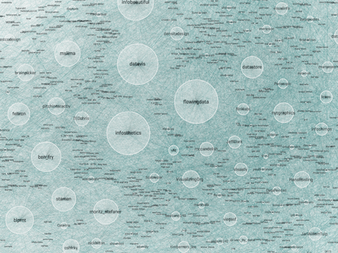
A month or two ago, Moritz Stefaner posted this image of "infovis" folks on twitter, with nodes sized by number of followers ("in-degree"):


I dropped him a note wondering if he'd tried any social network analysis methods to simplify it, or otherwise break it down -- so he sent me the data and said "have a go!" If I had crawled twitter links myself, I might not have used his criteria or seed set, but I was curious if I could make any more sense of his data set as is. (So I've neither re-crawled, nor added any info such as frequency or content of tweets to this data set).

I compared some of the measures calculated by the python library NetworkX with measures calculated by Gephi. The two tools produce slightly different scores for some metrics, an interesting fact which I have not investigated deeply. I've made my spreadsheet of the calculated stats available for you on Google Docs. (Variables prefixed with "NX" are calculated with NetworkX and with "Gi" were calculated by Gephi.)

First, some overall stats on the network in Moritz's dataset:


  • 1644 twitter id's are represented, and there are 145,382 edges, or links, between id's.
  • Gephi reports the average path length is 2.5.
  • Gephi and NetworkX say this is a connected graph; Gephi reports 1 weakly and 5 strongly connected components.
  • The average degree is 89.9, but the median is 51. There is a long tail here, meaning that some nodes have very high degree (see below) but most do not.

Derek Green's excellent tutorial for NetworkX suggests doing community detection using another python library for the Louvain method. At superficial review, it's similar to the Gephi modularity class detection algorithm, but I got slightly different results from the two methods. [Update: The method is non-deterministic and results will vary depending on starting values used]. NetworkX generally finds 5 communities, and Gephi alternates between finding 4 or 5. Here is one confusion matrix, showing the differences between node allocations assigned by NetworkX and Gephi; in this chart, squares are sized according to number of nodes assigned to each group:

So, interpreting this: In one run, Gephi split up the folks who are in NetworkX's community 0 into Gephi's communities A, B, C, D. Gephi's community C mostly overlaps NetworkX's community 1.

For the rest of this post, I'll illustrate from NetworkX's community divisions, which I spent more time investigating. When I looked at the force-directed layouts and stats for the community members, I decided on these approximate group names, based on what I knew of the id's in each group:
  • Group 0: The Authorities
  • Group 1: The Researchers
  • Group 2: The Processing Crowd
  • Group 3: The Small NYT Group
  • Group 4: MSLima's Crowd
These are a bit arbitrary as names - based on who I myself recognized among the high degree members. (I myself live in group 1, way down the list-- feel free to check out where you live, in the spreadsheet!)

To make sensible (i.e., less hairy) plots, I filtered for the top 5% by degree calculation. "Degree" corresponds to sum of in-degree and out-degree edges; in other words, how many people a node (or twitter id, in this case) is linked from and to by other nodes. High "in-degree" count usually implies someone is a perceived authority in the network. High "out-degree" might suggests a social media corporate type. Well, not necessarily - but it means they follow a lot of folks, and could themselves be a useful information source if they also have high centrality and share their information. (Like I said, I didn't look at who said what or how often they tweeted, which would be important measures of health in this network.)


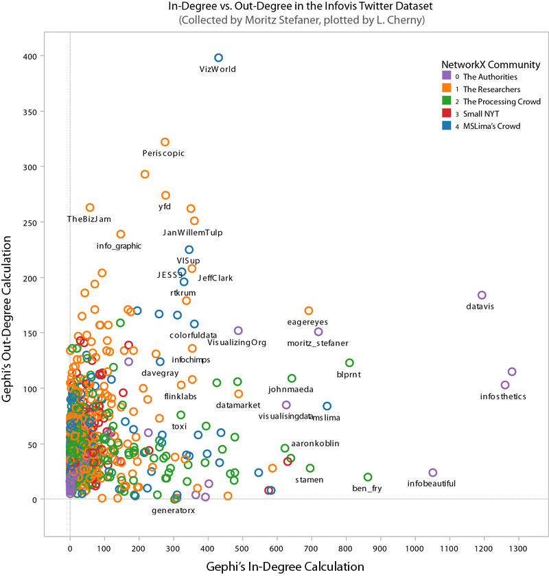
Here's a plot of Gephi's authority calculation vs. degree, strongly correlated (you may see why I named Community 0 "The Authorities"):


Sorting by degree, the top players are these (pulled from the spreadsheet):


LabelNetworkX CommunityGephi ClassDegreeCloseness CentralityBetweenness Centrality
flowingdata0D13940.4469304230.043313537
datavis0A13760.4821901680.072294856
infosthetics0A13620.4352909910.034115345
infobeautiful0D10740.3912108910.007498017
blprnt2B9320.4101151730.02337346
ben_fry2B8820.3656250.006936445
moritz_stefaner0B8700.4523612260.028942168
eagereyes1C8610.4551264240.031837862
mslima4A8280.4334480020.014404322
VizWorld4A8280.5244956770.08984938

Showing edges in hairball graphs makes things really complicated. For the following network graphs, I've limited the displayed nodes and edges to the top 5% by degree measure. Here's an animation of the difference between all edges visible vs. just community-internal edges (I know it's subtle, sorry; the id names are sized by relative degree):


Non-animated, larger versions: With All Edges, Only Intra-Community Edges

The largest names are purple, community 0, or "The Authorities" (a proxy for degree in this case).

Since I chose "degree" for relative sizing, it's worth seeing that in- and out-degree are not always correlated. Here you can see that some "true" authorities have much higher in-degree than out-degrees.  In particular, VizWorld has very high out-degree but rather smaller in-degree.  And by NetworkX's community assignment, he does not end up grouped with the purple community 0.  (Click for larger view.)


However, when we look at betweenness-centrality, VizWorld scores quite high. Betweenness-centrality (or centrality) roughly measures connectedness to components of the larger graph.


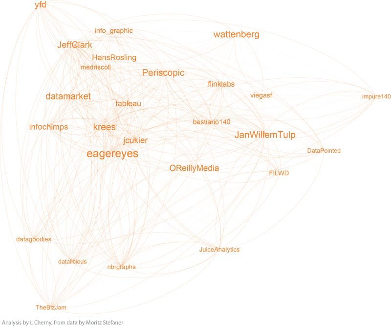
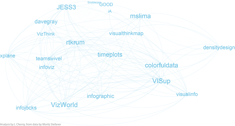
If you'd like to inspect the internal linkage structure corresponding to each community subgroup, click on the small images below to view. I've filtered out all but the top 5% by degree, to highlight the authorities in each sub-group.  (Note that this was insufficient for community 3 -- so I expanded it a bit more.)  The curved edges indicate "mutual" follow relations, while the straight edges indicate uni-directional, or one-way follow relations.

community 0, The Authorities

community 1, the Researchers

community 2, the Processing Crowd

community 3, the small NYT group

community 4, MSLima's crowd

Notice that community 0, the purple one, has a surprising number of unidirectional links, as does community 3. The others seem to be dominated by curved lines, a high degree of mutuality. (Hopefully I can explore this later!)

Depending on what you know about the players in these graphs, you will probably see things I don't see.  I myself have very little familiarity with the names in communities 3 and 4, while I admit to being surprised or entertained by the links and organization in the other 3 graphs.  For example, in community 0, the placement of Visually, and its straight line uni-directional links, is especially interesting to me.  (Remember this graph represents the top 5% by degree-- so Visually at this time scored high on degree, and was classified as a member of the "Authorities" group 0 by the community algorithms, but was not itself closely followed by the others in this elite group.)   Green community 2 is also interesting; certainly the artistic folks are there, including the founders, authors, and teachers of Processing courses (ben_fry, REAS, shiffman, blprnt, toxi, mariuswatz, ...); but this group also includes Brainpicker and well-known design firms like Stamen and PitchInteractiv.

Wrapping up, these are the tools I used for the analysis, charts, and graphs: Excel, Tableau (for scatterplots), Python, R (correlation plots which weren't shown here), Gephi, Google Docs, Illustrator and Photoshop. It took more time than I expected, in part because of Gephi's alpha status, and having to adjust a lot of the plots by hand in Illustrator! Hopefully the need for hand-tweaking will disappear as Gephi becomes more mature.

Postscript: While I was working on this, MS Lima's new book, Visual Complexity, shipped from Amazon.  It's a beautiful collection of network visualizations.


Sunday, March 20, 2011

PyCon 2011 - Data, Men, and Me

In the past couple years, I've switched from sending myself to research conferences (like CHI) to more down-and-dirty developery conferences. I'm looking for skills development and tools I can use day-to-day. This spring I went to PyCon in Atlanta, since I've been using Python more and more for data analysis problems. (Complete talk videos are here on blip.tv.)

The initial draw was the tutorials. I aimed for cloud data and machine learning. Olivier Grisel's tutorial Applied Machine Learning in Python with scikit-learn was a definite high point of the conference for me. His talk on text analysis was very good as well -slides here, and video here. His French accent was very nice, but I kept mishearing "scikit-learn" as "psychic learn." :-) I also really enjoyed the talk on Genetic Algorithms by Eric Floehr, a fellow who seems to do weather prediction consulting. His slides and a bunch of other interesting supporting material (including code) are up on his site.

There were a lot of talks on data, big data, cloud data, and scaling Python (to handle big data and data problems). Other examples: A talk on Pypes by Eric Gaumer included a good reminder that big data problems existed in the search engine space long before other kinds of big data became "hot" to work on. Pypes is a quasi-visual toolkit for doing data processing inspired by Yahoo pipes. (The gist being that since a lot of data handling involves discrete steps to clean and transform, you can put these steps into little modules that allow you to view the big picture of what's going on with your data munging.)

Hilary Mason's excellent keynote made a lot of us data geeks happy; she called for programming language evolution to get closer to the data problems, and to be less cryptic when it comes to support for multi-threading and map-reduce strategies needed these days. (I loved her "WTF?" comment on her multithreading code example.) Yelp's "mrjob" library for the cloud might answer some of her issues, but I missed that talk for some reason!

Another talk on big data that was well-tweeted was C. Titus Brown's "Handling Ridiculous Amounts of Data with Probabilistic Data Structures." Slides here - probably requires the video to fully interpret this, at least it does for me (yes, I missed this one too).

Not all talks were excellent, of course. My linguistics degrees got grouchy during one on the linguistics of twitter -- or maybe it was my geeky side asking "what can I do with this?" Some talks were nice surprises, too, kind of the point of going to conferences! Based on lunch table happenstance, I ended up going to a Blender API talk by Chris Allan Webber, a subject about which I knew zilch. Blender is apparently beefing up its API for external calls and automation; as a visualization person, I'm interested in tools that I can "drive" with data as input. I have big hopes for the evolution of processing.py and Nodebox2, two pythonic visualization options, but I am not sure they're there yet for me as a data vis person.

My sad female nerd note: I was one of 3 women in the Machine Learning tutorial. Out of perhaps 40? I later heard via Twitter a guess that there were only 8% women at the conference as a whole, based on t-shirt orders. I loved Hilary's talk, but was a bit bummed out by the Dropbox keynote that featured the social network of "friends of Arash" who started that company -- yeah, all men.

A final comment for any UX folks reading this: This would've been a great audience for a talk on UI design in open source, or UI design for Python UI's. There were a lot of companies presenting: Dropbox did their "we use Python" talk; Evite apparently has rewritten their entire java backend in Python; Threadless, a sponsor, is all Python... One of the reasons for its growth at these companies is the ease of writing things fast in Python; the "prototype and iterate" philosophy showed up over and over in various presentations as a real strength of Python. As a light coder myself, I can't agree more. I was there as a data-oriented geek, but I saw UX opportunity everywhere, for the right kinds of UX folks.

Sunday, August 08, 2010

Fan Video Editing Community and Copyright

In April, I gave a talk at UIUC's HCI department on fan video remix artists, or "vidders," as they are known within the fan media community. To build the talk, I drew on several years of LiveJournal network data, and a large 2-part survey I did in the spring of 2010 to document current attitudes, trends, and self-reported demographics of the community. Afterwards, I made my slides available in an annotated deck for the vidders themselves, as I had promised I would -- there were some interesting comments, including disagreement with certain aspects of the technical commentary (whether meta-data is really useful and available for management of clip collections) and whether the quote I pulled about "political correctness" as a dampener on some fans' "fun" was fair and balanced as a critique of the recent years' vidding discussions on issues of race and gender in vids. I haven't updated the annotations or the deck -- I'm posting it as I posted it to them; if someone is interested in hearing more about the community discussion, I'm happy to reply in comments or email.

I'm posting about this now because of two great things happening for this group of video editing fans -- this weekend is the annual meeting of Vividcon, a fan-run con all about vidding and vids as art and fun. I'm following the tweets with great jealousy -- I never made it off the entry waitlist this year.

The second great thing of recent days is the passage of the new DMCA exemptions from copyright-infringement laws for vidders (and other video artists) using copyright materials for artistic purposes. Since Internet sharing began, fans have regularly had their videos removed from many media sharing sites by copyright police. Some still post on password-protected private servers, rather than making them public and findable by "The Powers That Be."

Francesca Coppa posted on the blog of the Organization of Transformative Works that the case for the copyright-law exemption had been made in part based on the artists' need for high quality original source material for their remix works.

That said (and it's true), it's ironic to me that my own history goes back to the pre-Internet-sharing days, when we borrowed n-th generation tapes and made fuzzy vids with stone knives and bear skins. Check out my slide deck (pdf) for more on this. My talk includes some network analysis, one slide of which shows the "age" effect for when a vidder started vidding, and whose work they admire -- the VCR-era folks (including myself) are now off to the edges on the right and top. Fortuitously, right after my talk, Mimi Ito's article on anime fan editors came out in First Monday. I had already exchanged mail with her about her anime research, and it influenced my second round of survey questions to the vidders. Anime editors differ enormously from the vidder community; one major difference is that fan vidders are mostly women, while anime is more mixed, tending towards more male, and anime editors seem to be younger or to have started earlier, from what Mimi found. In my network graphs and quotes from the community, I show some points of overlap between anime and fan vidders, points and nodes which have increased in the past few years as the two groups learn about each other online and at cons like Vividcon.

Anyway, here are my slides: "Vidding Evolution: Community Change Among Fan Video Editors" (2010).

Sunday, January 10, 2010

My Take on Big Company Suckage

Scott Berkun wrote a good post on Why Big Companies Suck, at popular request on his site. It made me think about my own experiences at small, medium, and large companies over the past 20 years. I'm assuming Scott and his readers were mostly talking about "why it often sucks to WORK at a big company," rather than why big companies suck from the outside looking in.

The individual is lost in the machine. The opportunity to be noticed, to get feedback for doing a job well, or for improving someone's life in or outside the company, is that much less. Which may limit your chance of a promotion, or just make you feel your job is pointless. One company I worked at had a famous management mantra, "If you're not making the product or selling it, what are you doing here?" Which is absolute bullshit, and dismisses the administrative roles of accounting, the benefits department, travel and admin staff, tech support, and other critical team members at a large software business. Functional companies need a lot of people doing different things, otherwise the people writing the code can't do THAT job.

Communication from the top is often poor, intentionally or not. The message that trickles down from management, or that's delivered from main stage at company meetings, tends to be diluted for the common denominator, which means it's not really addressed to anyone in particular. Sometimes it contains no information at all, as a result. Scott may have covered this under "they believe their own bullshit," but I think there's another slant on it: They don't know what's going on. The more levels and divisions there are, the more distorted the signal is, and the more likely you are to hit people who aren't sure they're supposed to be telling you something that they know.

Secretiveness. I don't get it - but bigger companies tend to keep more secrets from their own employees. I have nothing to say about this right now, because I'm just baffled by it.

Managers are rarely evaluated well or fairly at any sized company. Even in times of turnover or economic distress, management are the last to go (unless they're a very public, board-threatened figure, like a CEO, in a very bad political environment). Scott mentioned the Peter Principle, but I think it's more profound -- with power working as sum of the people below you, the weakest point in the tree is the bottom. Even when the bottom is arguably the most valuable part of the workforce. Companies with a lot of management structure will have fewer people doing quantifiably good work, occupying the org chart and protecting themselves at the expense of the workers under them.

Evaluation of what's good or valuable often happens on idiotic scales. When I worked at AT&T Labs 15 years ago, the company didn't think about anything but a sure business that would pull in billions -- never mind betting on smaller startup ideas to see if they could create new markets or businesses. Other companies like 3M and Google have since made this a visibly stupid way to do business, but it's definitely an easy way that managers can avoid risky bets on new verticals or product lines.

The small company made crap, and now the big company has to support it. Staff in big companies are sometimes stuck in trying to repair what was made by the small company, or what was acquired from the small company. This really sucks for the people in the big company. Bad design that was produced in a "proof of concept prototype" as VC's pounded on the door and the cash ran out -- well, those guys saying the good old days were great got rich off that crap, and now it's everyone else's job to "fix it."

Because the small company made so many mistakes, and the bigger company learned from them, there is more process and review of decisions. Face it - a lot of the processes and checks and balances in bigger companies exist because of bad things that happened when the company was smaller. The big company "learned." It decided it was too risky to do that stuff again. Stuff like having no usability review of the most important feature of the release!

Smaller companies sometimes feel more homogeneous -- the individuals know each other better, and there's usually less role differentiation and processes involving a lot of people you don't understand. This can make it more pleasant, give the impression that you're "getting things done," but it can also mean less original or high quality work is produced in the end. See above, about producing crap and making mistakes.

People who have their own money at stake, or make a lot of money from something they did, tend to be very engaged and happier about their contribution. This is a guess, but I think this study about hourly workers supports it. The study says people feel a stronger correlation between happiness and rate when they are paid hourly, rather than by salary. There's a direct reward connection between money and time. People who got a lot of money from a startup --either from selling one, or being there and getting the stock profits -- no doubt feel they were rewarded by the world for something of value that they did. It's less easy to feel rewarded either monetarily or by subjective feeling in a big company. Because the individual contribution is much harder to make or to recognize.

Finally, a few ways in which small companies can suck, too: There's never enough money, or for long enough; there isn't enough staff to do things that need doing (travel booking, accounting, etc?); the hours can really suck, related to the money issue, no doubt; there are STILL cowboy coders and often secret politics about decisions and design directions and what we're hiring for next.

Sunday, November 15, 2009

Tips and Tidbits from the UI14 Conference

Back to blogging after a long hiatus of work and travel... UI14 in Boston had some good stuff for designers and managers! I heard a lot about techniques for creativity and design generation before winnowing; good reminders to generate multiple approaches before "settling."

Dan Rubin had his workshop group generate 20 different thumbnail sketches in 5 minutes. (Maybe it was less - it seemed like less.) Then combine the best aspects of their favorites into one bigger one. Hard, and a good way to make you get crazy early, if not go crazy, or just to think very broadly.

Leah Buley's charming "How to Be a UX Team of One" presentation is worth watching online. Her link includes her templates for wireframes with notes - useful for her excercise of 6 designs in 5 minutes (or less? again, I forget). After doing those sketches, she took a room vote on which idea in the 1-6 range the audience preferred out of their generated sketches. Most of the votes indicated it was not the first idea drawn.

There were some other interesting creativity exercises in Scott Berkun's excellent "Myths of Innovation" workshop (based on his excellent book of the same name). For a stuck team that's gone dry on good ideas, try brainstorming the worst product features possible for a while -- this will open up the wild and funny ideas. Then invert them, for the germ of some good ideas to pursue. Another alternative was to go from completely unconstrained brainstorming (such as "ideal features of the perfect cell phone") to slightly more constrained ("ideal features of a $10 cell phone").

I found Scott's most entertaining activity to be one in which the group listed 30-40 (again, early onset memory loss) random words - nouns describing things/activities/states and adjectives. Each small group had to pick 3 of them, brainstorm a new product or service around them, and create a pitch for it. All in ten minutes.

Strangely, from our workshop list with "TiVo" (I did not propose it!) and "guitar" and various sports... many of the groups picked the word "tomato." No idea why. But their weird product pitches were all very clever and funny. Scott pointed out afterward that this illustrates how a bunch of people who had never met before could self-organize, be creative, and even have a good time doing something that initially seemed impossible. On the "self-organization" topic, he noted that the person who takes notes in the group (self-nominated, of course) is usually the person who ends up delivering the pitch for the group, which also seemed to be true for several of these groups. As a conclusion to that one, he said that the reasons for this activity being difficult for many people (despite their success!) were these:

  • Creativity creates confusion
  • Unclear roles [group self-organization takes a few minutes or lots more]
  • Responses to uncertainty differ
  • Responses to subjective criteria differ
  • Group dynamics influence decisions
  • Time pressure [creates more stress]
  • Lack of trust / relationships [although I noticed that one team had a bunch of people from the same company, a team I wish I'd observed during the activity]

Scott gave out copies of his newest book, Confessions of a Public Speaker, at his second UI14 talk. That talk was great fun as well.

Dan Rubin's short talk on Visual Design tips was excellent as well. A couple of his tricks will definitely go in my toolbox, especially the use of an image that a client chooses for setting a color scheme using kuler. (My take on it: Choose a bunch of images that might convey the mood of a site or product that a customer wants, and be sure the palettes are sufficiently different. Ask her to choose the "mood" she likes, and generate the colors from sampling that image.) Another of his tricks - using a 1 pixel sample of a photo to generate a gradient lighting effect with layer blending - was deeply cool!

UI14 is a great conference, and this year it was in an even better venue than it has been before (a plush hotel in more accessible South Boston instead of cramped Cambridge). Some things that make it annually so good: power strips under every table, and working wifi; a great drinks party; long workshop sessions as well as sampler short talks; accessible speakers who hang out and attend each other's sessions (or else, just check the bar). For a tech-industry conference, it does an excellent job of being gender-balanced for speakers. UI14 also has the odd honor of being the funniest conferences I've been to in a while -- possibly because Berkun, Gerry McGovern, and Jared Spool are all very entertaining! Check it out next year.

Sunday, August 16, 2009

Recent Consulting Links

A few articles on consulting in the current economic climate, thanks to the Freelancers Union newsletter:

The Freelancers' Guide to Getting Paid On Time, or getting paid at all, from the Wall Street Journal. Some good advice in here, especially "deal directly with payroll" to avoid touchy discussions with your primary client; and advice on how to approach a suit if you need to go to small claims court.

For the Self-Employed, It's An Endless Work-Week, another one from the WSJ, this one about how difficult it is to go on vacation or take time off when you're constantly worrying about the next gig. While I don't personally have this problem, I will work on a vacation if an exec requires it, it turns out. So will a lot of other consultants out there, especially as the competition increases (more layoffs mean more freelancers, at least short term).

Now Hiring: Contract Workers? From Business Week, argues that employers are looking for non-perm employees now, and it means business for consultants. "In a recession, contract workers are often the first to go. But often, they're the first to be hired back, because in an uncertain environment, employers want to be flexible." This matches my observation of how the past 6-8 months has gone. The article notes that cutting of contract workers has slowed, and that contract workers are being hired back, but at lower pay than previously.

My own rates were cut by a long-term client a few months ago -- and my health insurance has gone up $100/month in the past year. My work expenses haven't dropped any, either.

Sunday, July 12, 2009

Cheap and Interesting Travel Resources

Since I've been busy vacationing, I haven't been busy blogging much - so I thought maybe I'd update with some references for travel sites and lists I use. A few friends have asked me for tips, so here is the collected recent lot.

The Caribbean

There are lots of deals right now. I just went to Turks and Caicos using Lastminute.com, but there are other options. With Lastminute, you often have to check carefully for catches, like overnight flights, or trips priced for 2 if you're not going with someone. (I like solo travel, because I get to read more.) CheapCaribbean is one site that I think a friend and I used for an all-inclusive Cancun trip a few years ago. It's not hard to find resources like this. I've enjoyed winter trips to St. Croix and Grand Cayman for snorkeling using these types of sites. You'll still want to find a good site on the destination itself, to help you pick your hotel location, if you're not driven solely by price.

Adventure Travel

A few years ago, a friend recommended this site Adventurecenter.com and their trips (she'd been on 2). I've been a drooling over their catalogs for the past several years myself, ever since going on a very wonderful trip to Morocco that they advertised. They offer group travel for active adults, sporty or cultural or no-frills, sometimes with an eco-orientation. I wouldn't go to Morocco alone, and I'm not sure I'd even go with just a female friend. But I had a terrific time in a group of young adult (mostly UK-based) adventurous travelers. It may have helped that an Irish woman brought along a bottle of gin. Note that their prices do not include the airfare, while the Caribbean deals above generally do.

Another adventurous option, solely in the UK, are the National Trust volunteer working holidays. These are also group trips, based in one spot, usually with lodging in a youth hostel; you are doing some type of local volunteer labor while there, with breaks for genuine sight seeing and socializing built in. The ages are quite mixed, without any young kids along. I myself did an archaeological survey trip in the Midlands. Lots of fun, albeit also some hard labor clearing off brush from a buried hill fortification. (I see their web site now says that for legal reasons they are currently only accepting EU and Swiss residents for their bookings. How sad!

A friend recommends EarthWatch expedition volunteer trips, but I find them a bit expensive for my tastes. There are some volunteer trips in the AdventureCenter catalog, as well. I'd like to know about more that are not extremely pricey, if you want to leave a comment or send me email?

Rentals in France

I know this is a bit specific, but since I did it recently (and have done it on and off for years), I thought I'd post the how-to's.

The primary source for good-value housing rentals in France (not Paris, but the rest of the country) is the French Gite system, on the Gites de France site (English available). Originally all arranged by paper catalog, it is now online, and many of them take internet bookings directly via the site. Normal reservations during high season are for weekend to weekend only; outside of high season, you can negotiate for different days or less than a week.

A few things to be aware of: You may need to pay a deposit or full amount in advance (by wire, or they may agree to hold a paper check); you often have to pay a surcharge for water, heating, and other fuel costs, and often for bed linen and towels. You are expected to clean before you go (they are not hotels - think of it more like a well-equipped private hostel). But if you can handle this, there are many beautiful farmhouses, cottages, and apartments, often old historic ones, for a steal - especially if you split the cost.

I admit I went out of the system for my recent Brittany vacation because it was easier to search for wifi on this UK site, French Connections. (Yes, it sounds like a bad dating site.) Some of these rentals are also cross-listed in the Gites listings.

Rental cars are easy to hire in France, from Avis, Alamo, etc.; use their sites, or a local European wholesaler like Nova. Pickup options that are most convenient are train stations in the main towns (I used Rennes) or airports. Even tiny airports that are taking RyanAir and other discount airlines have rental car options. It's much cheaper to get a manual transmission, but you can reserve automatics too.

The French train system requires reservations on many lines, and the TGV especially: You can use this RailEurope site instead of the SNCF site to book an electronic TGV ticket with a claim code that allows you to retrieve it at a kiosk at the station in France.

Paris rentals are a lot pricier. There are a zillion sites out there - use at your own risk, or get a hotel.

FYI, my trip recently was Boston-London, cross London by bus to Stansted airport, fly by cheapo Ryan Air (bought on their site) to Brittany (Dinan), pick up car there, drive to apartment with wifi. This was because I got a much better deal on a ticket to London at the time, and it saved me 2 train rides and a lot of time to go via Ryan Air direct to Brittany rather than travel via Paris.

Travel Deal Resources

I'm on a lot of lists and get notifications about travel deals. I recommend Kayak.com's airfare alerts, notifying me of current low prices from my home airport to wherever I care about, which is most of the world! Kayak also has email newsletters on deals they find. You need to register on the site, and then find their alerts section if you can. They let you set a price threshold, like "any flight under $600 to Europe." This will keep their notifications to the minimum you care about. (I use different price levels for different regions of the world.)

Other newsletters I subscribe to, which have been useful: Travelzoo, Booking Buddy's list, and Go-Today, a site I enjoy browsing too.

Friday, May 08, 2009

In Defense of Hard Skills for Designers

The other day I was in a meeting in which evaluation criteria for developers came up; nice concrete stuff, like writing code that other people can read and modify, putting in comments, resulting bugs, etc. It made me pause and admire the local weather of that strange country. In my experience, it's vanishingly rare for an interaction designer, usability specialist, or User Experience professional to have such nice hard criteria applied in evaluation of their work. Far too often, we're judged on mushy subjective factors like whether some team likes working with us, or feels we're doing something valuable--often outside their expertise or range of view to make this judgment, but that rarely stops anyone. I have some stories about this subjective mushiness in my article in HCI Remixed, titled "Designing 'Up' in the Software Industry."

Why is this--sign of an immature field? evidence of double standards, for sure, but also imprecision of job role? Poor management, perhaps contributing?

I suspect it's related to the observation that many designers have trouble achieving credibility in their role. Scott Berkun's seminar for UIE on Why Designers Fail advocated working on "soft skills" over hard skills, such as learning ways to win friends and influence people via negotiation, diplomacy, and other interactional condiments.

Not to pick too hard on Scott - it's hard to disagree that people skills are valuable and most of us in the computer industry are weak in some of them - but I think it's generally NOT true that designers have sufficient hard skills. I think gaining and using hard skills are our best bet for being taken seriously in places full of skilled workers. Most interaction designers spend too much time in "soft" areas that can too easily look like matters of opinion to others, or overlap and sometimes threaten other existing professional roles like product management: user testing (which often looks like "anyone could do this"), observing people work and suggesting improvements to their tools, pointing out issues in existing products that could confuse users (heck, everyone has an opinion on that), scheduling and managing stakeholder meetings, writing requirements documents and functionality specs. Most of these activities are politically difficult, and don't make other colleagues drop in their tracks and say, "Oh, you're so valuable and provide skills we don't have!" As I pointed out in my HCI Remixed article, a common reaction to much of this work is, "Didn't we already know that?" Finding problems with software is relatively easy; creating solutions is not.

We can convey solid, indisputable value when we focus on creating concrete, skilled deliverables that NO ONE ELSE CAN MAKE. In economic crunch times like now, consultants hear this from the front line. If a client or potential client has someone on staff who can apparently do what they do, they're not a clear asset. Never mind that they have 15 years of experience doing it, if their value looks like primarily "opinion" or "process," it's not very convincing when it comes to opening the bank account.

Here are some of my suggestions for hard skills, that many interaction designers and usability folks could stand a more training in:

  • Technical prototyping skills: Flash programming, javascript/ajax, css, html site design, Flex, Expression. Use of the tools that are used by developers, at a basic prototyping level, is a solid PLUS, because you can make things that everyone can see are relevant to the end product.
  • Ability to make high quality visuals: Visual design training, skills with Illustrator, Photoshop, page layout applications, and other design tools for good looking mockups. Low fidelity may be useful and helpful with fast user testing and concept evolution, but you want to be able to make something your client or non-designer colleagues can't make. I know one case of a visual designer hired into an interaction design role because of the caliber of his mockups. Never mind how wrong this was for him and his manager eventually-- it got him the job to start with.
  • Data analysis: For user research, learn some solid statistics. Even just pivot charts! Maybe some VBA for automating actions in Excel. Eventually, data mining, increasingly important with the large amounts of data around. (This is a career growth area all on its own right now.)

I'm with Scott that it's not a highly valuable proposition for a usability engineer to learn to do a cognitive walkthrough when they already know how to do 5 other methods for usability evaluation. But that's the wrong "hard skill," in my opinion. One who learns to make beautiful designs, which no one else could have made, will have a serious edge in their job role. Same goes for other skilled, niche deliverables. True story: A client with a budget problem told me recently that she had people in-house who could do an InDesign layout project, and that my value to her was in the data analysis and recommendations I could deliver for her that no one else could do. Good thing I'm working on that array of hard skills!

If only the university programs for HCI, UX, and usability thought like this, designer credibility issues would start going away a little faster. And performance evaluations for more designers could be done in concrete terms like how much good stuff we MADE during the design process, not how much we talked in meetings and if the other people there liked us when we did.

Saturday, April 25, 2009

Why Failure Isn't Working for Me

A response to a number of posts and talks on failure recently, particularly this one by Michael Krigsman, Five Reasons to Discuss Project Failure, linked from Scott Berkun's blog.

Based on Krigsman's points, I wonder, Is failure really instructive? In my observation, there are a lot of people who don't learn from other people, or even hear what they say. Maybe they're "experiential" learners. Maybe they don't think like researchers--who are trained to build on other work--or they aren't smart. I personally hope they are genetic dead-ends. It seems a rare person who takes on board the lessons or advice from others; at least, it takes a listener, and someone who isn't arrogant.

On the subject of arrogance: A lot of organizations suffer from "not invented here" syndrome. They're in successful companies, don't see why they should do anything different, don't think they need to do other than tweak their current environment. And they're unlikely to hear from outsiders or new people. No matter how much they say they embrace change, learning, growth, new ideas... in general, in practice, it's not so true. Or it's better coming from someone internal with an extremely tailored message for that environment.

Do success stories really not work? The fun book Made to Stick doesn't entirely agree. One of my issues with stories of failure is that they end up being a lot like usability test results: Show you everything you did wrong, but provide no solutions for how to fix things. And it's hard to get the "right" lesson, because lessons are almost always hypothetical. IF we hadn't cut this feature, it would have sold better. IF we had done user testing earlier, we would have caught this. IF we'd had longer to develop the right architecture, this would be faster and people wouldn't be complaining about performance. IF IF IF. No one really knows, it's all just opinion.

If you don't understand your successes, you can't replicate them. And you can't use them to inspire anyone. You had a project team that cleaned up a disaster in record time and shipped something people loved. What was different about that team? What did they do better? Okay, it may be partly a comparison with the failure before, but it's surely instructive!

Root cause analysis of failure always has to skirt around sticky, difficult, subjective personality issues. This is often unproductive to discuss, and doesn't lead to positive outcomes. The people who name names look bad, and often suffer for it later. That guy who's the blocker for a zillion projects - everyone hates working with him, but he's critical path. Yes, it's been elevated to his boss before. VPs have been involved. Multiple VPs, on one occasion, during which ego bristles poked everyone. Nothing has changed. That guy is going to continue being a root cause problem on a lot of things. Talking about it means VPs and bosses are implicated too. And isn't it just personality issues for everyone involved? (Note, I advocate firing his ass, or moving him to another role; but I'm not in charge. The organizational dysfunction, which is usually just human nature, is in charge.)

design is invisible, till it fails.

Now, to switch onto on the subject of design failure. A hot topic among design gurus right now (see Spool on "Failure is Not an Option, It's a Requirement" and Scott's recent talk on "Why Designers Fail"), we're being told that good design involves failure and failure is important for innovation. I'd argue that designers themselves often know that design is iterative and exploratory, with important dead-ends that lead to strong results, but their managers or other necessary stakeholders don't know this. I hope Scott and Jared are being heard by these other folks, too, and not just by designers.

The people with the money are the ones that matter. They determine what constitutes failure, in the short term, like it or not. Many design consultants worry that client judgments don't take this iterative process into account. We are paid to be fast, creative, and accurate, all at the same time. Mistakes or dead-end work aren't seen as productive value for the money by many hiring managers. And their own sometimes flawed design judgments are at play in their judgments of our work. What should be a success is seen as a failure, through the squinty eyes of a manager that doesn't get it. It takes design talent to recognize design talent, yet most hiring managers aren't skilled or talented in this way.

This phenomenon leads to failures that shouldn't have been failures - good work was thrown out, bad work was done instead. Happens all the time. Happens on every dialog, every icon, every wording argument. Most of us live with failure very regularly: The little voice inside blaming us for not arguing the point just a little longer, for not standing up to that bully on the team about this important issue, for not getting to that other issue that's probably more controversial and yet more important for the user in the long run, for not making one more mockup to try to show how it could be better, or moving to Flash to show how it would work for real.... Oh yeah, we've got a lot of failure all the time. And our failures are much more visible than the guy writing some code on the backend that thrown an uncaught exception, which may not be noticed for years!

My point of greatest concern about these homages to failure right now is that they don't take into account power dynamics in most engineering organizations. (To be fair, Scott's talk does, and he found that managers who aren't skilled in design are a major cause of failures.) Designers are a minority discipline, and often we're trying to change processes and methods while also delivering on our work. We're trying to set an example with our deliverables and methods. The odds of success are already long against, given the weight of org history and number of people we need to convince. As minorities, we're often trying to argue for more headcount, and every misstep can be seen as another argument against hiring more of us.

Visible failures aren't generally a positive option, when disciplinary credibility is at stake.

Friday, April 10, 2009

CHI 09 Panel: Moving UX Into Strategic Importance

At CHI 2009, I took a lot of notes at the panel "Figuring Out the 'One Thing' That Will Move UX Into a Position of Strategic Importance." This is a rather random summary of it; see a similar topic in my post on User Experience Organizations discussed at BostonCHI a couple years ago.

Jim Nieters, Director of UX at Yahoo!, advocated speaking the language of business, and addressing business concerns in our design work and priorities. UX at Yahoo is now in marketing, after another reorganization. They will be providing input on the product funnel, helping to prioritize company efforts.

He reminded us that even at the executive level, it's a life or death battle, and everyone has someone to answer to at the end of the day. Convincing stakeholders of the design profession's value is less important than delivering as individuals; we need to be personally accountable for our work and stay focused on the right projects.

Regarding the standard issue of having too few resources: Invest in projects carefully. A team too diluted on too many projects can't be as visibly effective. Turn things down, and focus on the most important. Work on the revenue generators, and work with the business to understand the right problems and the solutions that can come from design.

During questions, he revealed that for products to move forward at Yahoo, they need "3 in a box": key stakeholders from Product Management, Engineering, and UX have to all be in agreement before work proceeds. Sounds good to me!

Laurie Pattison, Senior Director of UX at Oracle, was up next. Her message was that you get one chance, and have to sell yourself well. You only get one chance to make that first impression. At the management level, you have a calendar quarter to make an impact. Since you can't succeed at everything, you need to pick projects carefully, and provide business value. Businesses are in the business of money, after all.

As part of the sales process, deliver something other peers at the company can't do themselves. Make smarter wireframes, prototypes, or more attractive deliverables. Come up with innovative ideas that they can't think of themselves and the value will be clear.

Her example case study was a project to help reduce tech support calls. The team did simple usability studies and discovered that users couldn't find answers to items that were in the documentation. Their redesign put answers in context and reduced the need for the search functionality; the number of calls reduced as a result, and the bottom line was visible. The CEO was educated about the process and methods and it was a clear win for the team and their methods.

One questioner asked her why not just do this on every project, it's the standard research and design process. But resources limit what you can work on. "Pick projects that matter to the bottom line. You pick mind share or market share."

In a somewhat depressing note, several panelists agreed that your team (or your contributors) are only as good as the most recent success, that failure follows them around forever otherwise. "If you spend only ten minutes working on something because you don't have time, and it fails, people will remember you were associated with it and blame you. Better not to work on it at all." I'm disappointed when I hear this sentiment, given the recent discussions in other places about taking risks and embracing failure during design. I'm afraid failure may be a luxury for very well established teams.

Craig Peters, consulting as Awasu Design, argued that we need to pay more attention to the individual contributors in our organizations and their basic skills and effectiveness. "No matter what the strategy, if we don't think about the individual level interactions, the big picture won't be helped." He described a situation at Wells Fargo in which a UX team had reached a limit on their effectiveness; and he investigated and found that non-UX colleagues had had varying types of interactions with the team and found no consistency in their expertise or work. (I'm reading this in - Craig was pretty vague about the actual details of the findings and recommendations for improvement.)

During the questions, the panel and audience debated some on whether we count as a "young" field after 20 years of CHI conferences. Regardless, it does seem that different skills may be needed to convince different organization types and sizes.

Lauri represented the absent Killian Evers, UX Program Manager at PayPal, who argues for the need for program management skills in larger companies. Program managers can successfully bring metrics and rigor to UX and bridge UX and development. (I myself agree with the need for project management everywhere, but think that UX teams need to be able to work with software culture metrics, processes and tools, and there's no excuse for requiring a third party to manage this. But I may have misunderstood the points here.)

Some comments made during the question period, not all of which I was on board with:

  • If your company doesn't value your contributions, move on to another one. Corporate Darwinism works.
  • Don't waste too much time on ROI attempts. Testimonials from internal folks can go a long way. If you can find someone who needs something and you make an improvement, communicate it afterward with a story. Could even create internal portfolio of examples to help support your value.
  • "If you're in a confrontation or argument, you're already lost." (I find this of some concern; many dev cultures produce lots of argument and confrontations, and if UX people aren't allowed to play in those, the field is not level and we're really handicapped.)
  • The impression of many UX teams is "often you come in too late, you don't understand our jobs, our deadlines, our deliverables." My comment: Who's fault is this, actually? Bring us in earlier, etc.
  • UX teams without domain knowledge can be seen as liabilities. Response: Get them educated about the domain, it's part of onboarding.
Finally, there was an acknowledged tension between the desirability of being an outsider brought in for point expertise ("like a lawyer") or a team member long term. These are obviously very different models, for staffing, for hiring, for seeking positions of corporate influence.

At this panel and at the one on "Fault Lines of UX," individual contributors asked how they can make change as single UX people alone in non-UCD environments. There were no simple answers for these folks. I particularly feel for the student who said to me after the Fault Lines panel, "I was taught UCD very rigorously in school, and I thought everyone did it. Now I find out most companies don't. How can I proceed, what should I be doing?"

An ongoing exercise for our profession, as mentors, educators, and colleagues... We need to help her.

Sunday, March 29, 2009

So You Need to Do a Usability Test... But the Product So Obviously Sucks.

Most of us in interaction design jobs have been asked to do a usability test on something that we don't think is ready for prime time. You think it needs some design work before it even gets to users. The usual scenario is that your company or client is unwilling to listen to another stakeholder with design opinions (yours, or your team's), but will believe it coming from users. Either that, or they don't know what design is yet, but do have an idea that usability testing is a good idea.

Some strategies for turning this to your advantage, if your ultimate goal is being involved in the design, not the evaluation:

  • Make it a test that's just Pass/Fail. Don't allow room for wiggling on the results, or you wasted your time getting them data they don't want to hear. Agree up front on what this thing is supposed to support, scenarios they think it has to handle, and be firm on delivering the news afterwards. It's too easy to get wishy-washy about informal usability testing, and leave room for argument, otherwise.
  • Create alternate designs for use in the usability test. One of the best ways to educate the organization about the value of design is to DO IT. And to turn the test into an evaluation of multiple designs will help build your credibility and turn post-hoc evaluation into formative, and more useful, usability testing. Throw in some mockups at the end, or at the start, and ask for comments on those in comparison to the product that so clearly has problems, from your perspective.
  • Write the report before the test. No, not as unethical as it sounds - you won't deliver it, but you're checking on your skills to predict what's going to be hard to use. So, you got all worked up about how this thing is hard to use, for obvious reasons; now check to see if you were right! Better yet, have more than one person on your team do their own reports, privately, before the test, and seal them up. Afterwards, see who was the best at predicting the disaster. Chances are, the users will fail in ways never imagined (thanks to Kevin Berni for this line), and you'll be a little less cocky next time this situation comes up. But if you get it all right, you're building your case and confidence for pushing back on this kind of request next time around.
  • Ask others in the org to predict what might cause the users problems in the current design before the test. I used this tactic once when a QA organization felt the way I did about the usability of the product we were testing. I gave an award to the person with the most accurate prediction of user difficulty after the analysis. You want everyone in the company to know who has good insights into design and usability, right? People with good instincts need to be making the judgment calls, in the future. And you need to be able to illustrate that not everyone's opinion is equally valuable when it comes to making design decisions. Design insight requires talent and skill. This contest before the usability test helps identify talent-- skill development can come later.
Again, the only way you'll get involved in the earlier stages of design is if you show you can do that part, and what it entails. Make alternatives, and show why they are better. Next time, you'll be at the table for that part of the job instead.

Sunday, March 22, 2009

R, for Open Source Data Goodness

After I left The MathWorks, I stopped being able to afford MATLAB for stats, and switched to the open source R. Recently, there have been a few articles on how R is being used at companies like Google and Facebook (here and here). I thought I'd post some names of books and sites to help out those new to R.

Some books:

  • Data Manipulation with R, by Phil Spector. One of the new Springer R series, and note that these books aren't cheap. This could be twice as long as it is, and I found a lot of the meat is towards the end. But still a good book to have. The power of R is that it's a programmable environment, allowing you to do data transformations on the fly, as well as automating your tests/displays/operations. You have to know how to move stuff around.
  • Lattice: Multivariate Data Visualization with R, by Deepan Sarkar. Lattice is a very powerful visualization library, highly recommended. This is The Book, another Springer one.
  • Interactive and Dynamic Graphics for Data Analysis With R and GGobi, by Dianne Cook and Deborah Swayne. You can check out the GGobi site for flavor. I will have to admit that while my initial forays into using it have been enticing, the UI has some learning curve, and I've backed off a bit and not gone in very far yet. YMMV.
  • Statistics: An Introduction Using R, by Michael Crawley. This is an excellent book; it has intro stuff and is very deep on the stats, in terms of application and big picture. Obviously all examples use R, so you can replicate anything you want. The almost artistic side of statistical modeling really comes through here. Don't be fooled by "introduction," though - it's not light and easy reading.
  • Introductory Statistics with R, by Peter Dalgaard. I think this is more basic than the one by Crawley. Or just not as deep. I don't look at it as much-- mainly for contrast.
  • A Handbook of Statistical Analyses Using R, by Brian Everitt and Torsten Hothorn. A heavy-duty guide with applications of different methods for different types of questions and data sets, including (e.g.) survival analysis, recursive partitioning, multidimensional scaling, longitudinal analysis. A good purchase.
  • R Graphics, by Paul Murrell. This is not my favorite book. You can customize anything in an R graph, but it's nasty and difficult to do so. The book doesn't make it easy, and neither did the course I took online from statistics.com from the author. Still, this could be kept around for extreme need. Some of the chapters and source code live here on his site. I think you're better off getting Lattice, which is slightly higher level; and if you must get very pretty output, get the numbers or basic shapes out and use another tool like Excel or Illustrator. Except this guy Steven Murdoch had some real success in his Tufte experiment with R, shown below:
Steven Murdoch's Graph in R

Some tools and helpful sites:

  • Quick-R, a great site for getting started, and getting readable nice overviews of different techniques. Lots of pointers and basic help for stuff like graph customization.
  • Togaware's Rattle GUI - a timesaver for a bunch of basic and advanced descriptive stats.
  • I use SciViews as my R UI, because it has a variable browser and a script area. Some people like Tinn-R. I haven't checked out the emacs client for R yet but intend to.
  • There is an R Python interface. Haven't used it, but it makes me happy. (Other languages are supported too.)
  • Since R is open source, most of the useful help lies in mailing list threads. There are a few R-specific search engines, including Dan Goldstein's and others listed here on Jonathan Baron's page.
  • A nice list of R "tips" lives here.
Well, this could go on for quite a bit... R is infinitely powerful, but has a learning curve. That flexibility really pays off, I find! Excel just doesn't scale for big data problems.