Saturday, December 15, 2007

Designing Your Home Page

Kicking this one off, here's a good article by Joel Spolsky about the design of the product home page for FogBugz, which nicely spotlights the badness of committee decision-making in design. They tried to achieve too many things with too much input, the results frayed, and finally they [he] had to make the tough decision to start over and stick to a single unified vision with fewer "votes" on the matter. You can track this in the mockup screenshots.

Joel also makes a good point about the difference between the company page and the product page in terms of their goals. Nice willingness to go with entirely different styles, as a result. A brave decision!

I've been involved in a few home page design discussions the past year of consulting. They tend to be wicked problems (i.e., ill-defined, messy, and circular). Some of the reasons for this:

  • There may be a difference between who you are and what you do, which may be important and hard to describe. Or hard to recognize.
  • There may be a difference between who you WANT to be and who you are. This is hard to design for, because when you stray from what you are, you tend to confuse people.
  • Conveying who you WANT to be in a clear fashion can only happen if you have a clear idea of who you want to be, and test your methods of conveyance on people to see if it flies. This is different from usability testing as usually understood.
  • A bunch of company stakeholders who disagree on these things (who we are, who we want to be) can't communicate this to a designer very successfully. Design will then take a longer time, with more iterations, and may turn into a committee consensus nightmare.
  • Design directions can be contradictory -- sometimes you can't say two or more complicated things, and you can't do both well enough to succeed at either. Let alone 10!
  • If your business is confusing or going through a change of some kind, it's almost inevitable that the design reflects this, without a very strict control on it. No designer will succeed in clarifying confused input when the underlying problem is actual confusion. The designer may see this going on and be able to point it out, but that won't get it solved. The problems may be too high, too deep, and too wicked themselves. Solving them is much harder than the simple design problem at hand.

One client was working on a new project that was barely outlined in a development spec. He asked me "What do we do for our home page? We're really worried about that." It was premature for this, because most of the business plan didn't exist yet. The design input they REALLY needed was "Your business idea is a little too complicated right now. Can you simplify it first? Here are a bunch of others in your space with successful 3 bullet explanations on their home page. Can you meet that level of simplicity?"

Sadly, most designers aren't in a position to spur you to clean up your entire business plan. Or to make it clear that this might be needed because it's hard to make it sound simple when it's not. (At least, without lying.)

I think design is a strategic activity - requiring hard, brave, high level decisions in order to direct the minds and hearts of customers; and a creating a good business plan is therefore partly a design activity. To create a business that is clear and attractive to prospects, and therefore portrayable as such, requires high-level decision making inside a company. If more business leaders thought like designers, or more designers were in business roles, the execution of the home page would be a lot simpler.

Friday, December 07, 2007

Food for Brains

It's been a tough week - minor road accidents in snow, encounters with consultants that earn $2500 for a few hours of phone time [I don't earn this!] - so here's venty post on something that bugs me: People with bad memories. I don't mean bad in the sense of "I lost my keys again," more in the sense of "Weren't you going to schedule that meeting?" No, you were, you said you would! Why do I suddenly feel so defensive, when I did nothing wrong??

Any number of excellent books have been written about project management and scheduling, but few of them confront this phenomenon head on, and I've now seen it at a bunch of companies. Someone important, or even just useful, can cause a lot of damage by having a bad memory. If they're a manager, it might become their employee's second job to stockpile email in case they need to "prove" who's mistaken at review time. If it's a peer, they don't pull their share of the work because they conveniently forgot to do most of it and someone else has to, or some schedule slips. This might be passive aggressive (if they're not a psychopath or an asshole), but since it's the holidays, let's consider that it might be a medical problem. Maybe they're eating badly?

A few suggestions for coping: Start ordering in veggie platters. Take them out for sushi whether they like it or not. Leave them Secret Santa Ginkgo Biloba supplements by their monitor. And finally here's a list of some nice articles from Psychology Today on food for your brain, which I rather enjoyed:

Happy holidays, and eat better! [Edited to add: Consider hiring a chimp instead if your team mate or manager can't remember things after eating better.]

Sunday, December 02, 2007

Fan Videos, Redux or Three

There's been a sudden spurt of press about fan video creators recently, specifically New York Magazine's profiling of Luminosity, in Online Videos 2007. Henry Jenkins has a short writeup here, suggesting he nominated her work. And here's a coincidentally timed article in the Japan Times on anime fan music video, pointed to by a vidder friend of mine.

While I'm at it, here's a link to my older post about a talk I gave at IBM on fan video creators. LiveJournal is one of the main places they are hanging out now, and in that post and talk I showed some network relations among "vidder" groups on LJ. The anime vid crowd is very distinct from the other TV show vidding crowds. They have an aesthetic and interests that evolved very independently. (As a former fan vidder myself, I don't love LiveJournal and what it's done for and to fandom's communication, but it has certainly been a nice central point for many folks to find each other and also avoid each other if wanted. LiveJournal's prominence in online media fandom is also mentioned frequently in Henry Jenkin's Gender and Fan Culture discussion.)

And speaking of gender and academic studies, I have a minor peeve about the discussion of vidding and Lum's work in that New York mag article, and in Henry's writeup. I suppose this is also one reason I got disillusioned by the academic studies of fandom while I was on their fringes as a fan vidder and grad student. There's a bit too much focus on stuff like "feminist critique" of TV shows and other big concepts that seem to "legitimize" something that to outsiders probably looks goofy and crazy. (Unless they're active in sports fandoms, and even then, that's okay in a way that TV fandom isn't!) The very vids that were picked of Lum's to host on NY mag's site in a postage-stamp-sized, stopmotion playback fashion are kind of off-topic, to me. They aren't the emotional ones about plot and story and character, they're commentary with gorgeous images and effects. I don't mean this in any way to criticize her work, which is excellent as always; but they aren't the ones of hers that are best-loved by the fan consumers. She herself says she goes for the emotional punch; so to me this makes these vids odd choices for the story, perhaps ones that were thought to hold up better to outsiders?

And a few comments on the online video THING that bugs most of the purist vidders. It may mean greater access and easier distrubition being on YouTube or Imeem, but the playback still sucks. Big screen quality of experience, caliber of edits, timing, etc. are all important to fan vidders. These online sites don't support it, and that means a lot of vidders just aren't happy with them as a means of distribution. If you watch vids on YouTube, you aren't seeing the real thing. I'm just saying. It started long before the Internet, and still lives in parallel, despite what people having conferences about online video might say. To illustrate, here is a long list of vids made about the Professionals (a UK tv show), with dates and authors. Look at the dates lower in the list. Those were made on VCRs, the way many of us started.

Relevant other links: DIY video conferenece, covering fan video in part, in February 2008. (They have reviewed submissions for the ones they think are best, by their criteria, not community criteria, again? I know a fan or two is involved, but still, their conference site worries me.) Some friends of mine whom I used to vid with posted a sampler of vids, including one of my co-authored ones, announced here. If you want to see all of Luminosity's fan works in non-postage-stamp jerky playback, her list is here.

Saturday, November 24, 2007

Compelling Travel Slide Shows

A link for my family, and anyone else in this situation: You've come back from the vacation of your life, and you want to share. Your vacation photos should leave them wanting more, not less, and definitely not caffeine. Read "The Ultimate Guide to Memorable Travel Slideshows."

Some tips: Choose one or two evocative pics, not 8 of the same thing. Mix up people with landscape, for variety. Insert movie clips occasionally, to spice it up.

Software to make this easy: Surprisingly difficult to make a simple animated slideshow, it turned out. I tried a few programs that were on my computer and finally got results from Photoshop Elements, which will export a nice slideshow movie to Premiere Elements for creation of the DVD itself. On the Mac, the settings and process was a little hidden and didn't offer the same control over the zoom/pan effect, but you can achieve the same results with iPhoto and iDVD. It seems that Picasa will do it (haven't tried). Some DVD authoring apps will, and any movie-making app, but you really want some tools built for slideshows to make it easier for yourself.

Disclaimer: I've definitely violated these rules too, so this was a good reminder to me, too.

Saturday, November 17, 2007

Cayman Island Critters

I went to Grand Cayman for snorkeling, and while it was excellent, I saw a lot of unexpectedly interesting animals.

The Blue Iguana is indigenous and endangered, but there are lots of other green iguanas and little brown lizards running around. The retired ones sun themselves on rich people's personal boat docks and pose for you. The blue iguanas roaming at the botanic gardens sport blue bling, a sample shown here: cayman blue iguana

The sting rays at Sting Ray City were amazingly interested in people. I guess they know a good food thing when they see it. You are swamped by them when you drop anchor in the shallow waters. The story is that fishermen cleaned their catch out there to avoid mosquitoes on land, and one smart guy turned it into a tourist attraction, undetered by Steve Irwin's sad demise at the tail of one. (Here is an article on "sting ray injuries survived.") They feel mushroomy on their underside, and sandpapery on the top side.

Here's a romantic shot of them in the water, but for up close and personal, you need to go see my critter picture collection here. (There is only one underwater shot there, to show off their smile, and one of the sting ray kiss you get wrestled into when you visit them on the tourist boats.) cayman sting rays

Finally, turtles are farmed for food and tourists there. I found the crowding conditions a mite disturbing, but it's undeniably an aesthetic experience to see all those shells and mottled skin up close. Also, undeniably expensive to get in. I did it for the photo opp, and the chance to snorkel in a private lagoon with turtles in training. Training for people like me touching them while swimming, I guess. In said turtle park were also pretty birds from the Caribbean, which you can see in the critter photos. cayman turtle

When I got home, I discovered a newly arrived National Geographic Traveler mag had an article reviewing destination islands, scoring them in part by how much tourism is affecting them. [I discovered I'd been in a few of their top 20 already, and added more to my destinations desired list.] They were pretty much on target about Grand Cayman: "Exceptional diving and snorkeling but banking defines the island. Tourism is heavily weighted to cruise ships." I'd add: with huge resorts, and retirement McMansions as seen in Florida. But it was the best walk-off-shore-snorkeling I've found yet.

Cayman photos here: turtles, lizards, birds, rays, beaches.

Monday, November 12, 2007

Adventure Travel

I've been delinquent in blogging, due to travel (Cayman Islands for water, pics coming) and a whole lot of work. Speaking of travel, National Geographic's Adventure Travel magazine site has a tool that offers reviews of adventure travel companies. Pretty cool. I'd spend all my time on these trips if it weren't for the money, of course.

For a more eclectic and perhaps affordable set of options, use the site a friend recommended, from which I found my trip to Morocco: Adventurecenter. They aggregate trips from many companies, and have reasonable search options including price. Airfare is usually not included, and you'll find that it's the biggest issue with most of the more interesting destinations (read: off-the-beaten track). If you're afraid of traveling to "exciting" places alone (as a woman, I am), this type of group travel can be really fun.

For other resources on cheap travel, I recommend this site: Worldscheapestdestinations. It's not pretty, but the info is good.

Sunday, November 04, 2007

Fast Company: ebay, and Business in Siberia

I caught up on the latest print version of Fast Company on a flight, and I have to admit I'm loving it via print. I read almost ever word, while on the site I just browse occasionally. And now I can point to fun stuff, since the mag is all online.

First, some slightly irksome "news": ebay is trying to revamp itself in the face of flattening numbers. Like a lot of business press, this makes a hero-to-be out of a new exec hire, Matt Carey, CTO. He learns in paragraph one during a focus group that the site is hard to use. He determines to "make the buying process efficient and fun again."

Having heard the industry gossip for years about the company -- mostly from designers who've left in droves -- the people who knew it was hard to use and knew it needed usability and design work weren't listened to when it might have prevented flattening numbers in the first place. Too risky to change what was seen as successful! Till the big picture numbers start to look scary, and the competition spreads, I guess. That's when it might already be too late. A reminder that design and usability are strategic competencies not handled well by most executive boards at most companies.

On to more fun: Nightmare in Boomtown, a story you could not make up. With all the twisted personalities at work, it would make a good movie. It's the saga of a fallen rabbi gone to Kazakhstan to do business, and getting eaten alive by the corrupt system and an angry gangster rival who wanted a $5 million dollar discount he didn't get. It probably cost a few hundred thousand, but the ex-rabbi gets locked up in a Siberian jail for a year and virtually abandonned by any officials who should care.

In October 2006, after 11 months in Siberia, Seidenfeld was loaded aboard a prison train to be extradited from Russia to Kazakhstan. For 32 days, he was stuffed into a 3½-foot-by-7-foot cell in a boxcar with one toilet for 60 convicts. His fiancĂ©e, Natiya, doggedly followed the train on its 3,000-mile journey, intercepting it as it stopped at detention centers. Word of the presence of a wealthy Western businessman had traveled fast among the prisoners, and Seidenfeld learned early on the importance of isolating himself as much as possible. Natiya secured lawyers wherever the train stopped, bribed officials, and did whatever she could to make sure Seidenfeld traveled in his own cell. He kept his head down while shuffling to and from different prison stops to avoid the batons of the more-sadistic guards. "If I had been kept with the rest of the population, I might not be around today," he says.
Really a fascinating read....

Saturday, October 20, 2007

October Roundup: Owls, UFOs, Ghosts

I've been busy on non-work related activities, for once!

Owls: Saw-whet migration is upon us. The local birders with Mass Audubon were caught off-guard by how many of the little owls are on the move south from Canada this year. Record numbers on some nights, and earlier than usual. These are tiny, adorable owls, who seem to like people and hang out for a bit. They even like being petted, which makes them a great ambassador for birdkind.

I put up a gallery of their extreme cuteness: Saw Whet Owl Banding in MA. I will be posting some video later. But for now, I require you to be amazed (this is not a baby bird):

Here's another set of photos (with a better macro lens) featuring yours truly holding one of these cutie pies.

And just to be slightly scientific, the site with the most data on the migration patterns and how to track these guys lives at Project Owlnet.

UFOs:

Last weekend I also went to a local UFO conference, hosted by Mass Mufon. There were two very interesting talks, one on crop circles and the other on the Shag Harbor Incident in Nova Scotia.

The crop circle presentation started quite strong, with a lot of data and images that can also be found on the website at BLT Research. My data analysis interest was piqued but then dismayed by claims of correlations as "proof." The speaker got less scientific and more, well, peculiar towards the end when she announced a bunch of other phenomena including the ghost of her dead brother caught on film at recent circles. I don't quite understand why the folks interested in paranormal end up mixing it all together so readily; one phenomenon probably has nothing to do with another!

The Shag Harbor UFO Crash Incident from 1967 was entertainingly recounted by Chris Styles, a good storyteller who had collected a lot of documents from the Canadian government (who are much happier to send things out on request than the US government). The most interesting sidebar was that a character named Maurice "Mace" Coffey was working as a parapsychologist investigating mysterious phenomena in the Canadian Air Force at the time of the "crash." He was the Fox Mulder of Canada. He's also editor of a collection of Maritime poetry and was later an important figure in the Northwest Territories (once helping find a downed plane, in which the survivor had lived only by cannibalism). I personally wanted to hear more about Mace, and maybe less about the RCMP.

Ghosts: I've received a few more stories about Windhouse, the haunted house in Scotland that I keep track of here. The essay is updated at the bottom with more photos from contributor Phil Mortimer (scary Photoshop work as shown below) and from another relative of a former inhabitant, Kate Bainbridge.

Phil Mortimer pics of Windhouse

Sunday, October 07, 2007

Search Engine Poetry Generator

I've always liked random poetry generators (I could dig up some of my favorites, but I'll save it for another day) -- so I wrote one based on an idea I saw on someone else's blog. (I admit their idea is more interesting, but I had a simple goal to start with: practice with SQL and PHP on my hosting server.)

My generator builds random "poetry" by stringing together keywords and keyphrases that hit my site from searches in the last month. (I'm afraid it's not a real-time feed from my logs, it's canned from the last month.)

Popular searches on my site: ghosts, Canada, and disorganized organizations. It makes for peculiar poetry, not good, but kind of fun. Victoria's Secret is definitely showing up more and more, too.

One of them:

alice in wonderland porn
   lost
  i need
  stone
  tivo patents

for me, illusion
   -- erin
Give it a try, or ten...

Monday, October 01, 2007

Randy Pausch and Collaboration

I thought I had blogged about Randy Pausch's opening plenary talk at CHI in 2005, but apparently I didn't, and now I can't find his handout on teamwork. I know it's floating somewhere. But there are a couple of sites with notes: Usability News and the CHI 2005 conference website (the Conference on Human Computer Interaction, spelled CHI so it's pronouncable, hah).

I thought of his talk last week when I was giving a talk about design, stressing the difficulty and value in cross-disciplinary collaboration to an engineering company. (I've also been lurking on the Alice site wondering when the next version would come out, so this was timely!)

In his plenary, Randy had a bunch of great points about how hard teamwork between artists and developers is, particularly in our technocentric culture. Some of the points from the CHI summary:

  • Neither side can be in service of the other
  • A goal "above" either discipline really helps
  • Different disciplines have different values, moral and otherwise

It's a form of prejudice to assume that people who aren't technical aren't valuable during the design process. Despite being quite technical myself by design standards, I run into this pretty frequently at the places I work. Randy himself is an arrogant geek SOB (as he'd admit) but he has some ability to recognize and verbalize these issues, which means there's hope for others too -- if they're as smart as he is and capable of self-reflection. His students will probably do some great good in the world, after they get tired of the game industry.

Speaking of hope, Randy's dying of pancreatic cancer at 46; and his last lecture was televised here. He's surprisingly young and healthy, but he doesn't expect to live beyond a few months more. That's the world we've got, but it's still fun and funny, if you listen to Randy talk about being a kid and growing up to do the things he always wanted to do.

Recommended, especially the part on mentors. (Thanks for the link, Xiaoyu.)

Sunday, September 30, 2007

Visual Personality Tests

Random personality tests of recent discovery: tests that rely only on visuals. Or, kind of.

This first one is "psychogeometrics." Go here and pick the shape you are most drawn to. If you want to really test the test, before you click on it to read about yourself (!), take a short questionnaire (not visual) here and see if the shape it picks for you matches what you chose by look alone. (Mine: "You appear to be a complex personality. Or perhaps you didn't take the questions seriously.")

Then, for a really visual one, take the Dewey color test. This one is entirely based on response to colors, and comes with an interesting color chart for the month, kind of like biorhythms in flavor but all in hues.

I found out about the latter because another former colleague of mine dropped out of interface design management to become a color and interior design consultant, and she uses the Dewey system. She says she got sick of fighting for good software. That makes 4 colleagues (2 junior, 2 exec level) who have quit the UI design fight in mid-career. Who's next? Are other software professions like this?

Tuesday, September 18, 2007

Stats on Remote Viewing Tests

There are lots of bogus stats studies on parapsychology tests, but this looks more promising: UC Davis statistician analyzes validity of paranormal predictions. Pity it's in something called "The California Aggie."
In 1995, Utts was hired by the American Institutes of Research, an independent research firm, along with psychologist Ray Hyman from the University of Oregon to analyze data from a 20-year research program sponsored by the U.S. government to investigate paranormal activity.

After doing initial research, Hyman and Utts found statistical support, she said.

"The two of us did this review and we both concluded that there were really strong statistical results there, but [Hyman] still didn't believe that it could be explained by something psychic - he thought there would be some explanation [that he] can't provide," Utts said.

The research program involved remote viewing, in which test subjects were asked to describe or draw an unknown target. The target could be anything and could be located anywhere. According to Utts' meta-analysis of the 966 studies performed at Stanford Research Institute, subjects could identify the target correctly 34 percent of the time. The probability of these results occurring by chance is .000000000043.

In contrast, statistical support for the effect of aspirin on heart attacks: "The results demonstrated that aspirin reduced the number of heart attacks in people likely to have heart disease by 25 percent, with a probability of it occurring by chance equaling .0003."

Hyman's concern is valid, of course; the stats don't tell us causation, just that there's a pattern in the data that's unlikely to be due to chance. All sorts of biases could have been introduced during the experiments to produce the results.

But it's still provocative!

Sunday, September 16, 2007

BostonCHI Panel: User Experience Organizations

There was a good cross-company discussion of organizational models for User Experience (UX) teams at Boston CHI on Sept 11 (check that link for full bios on the speakers). Companies represented by managers, directors, and VPs of UX: EMC, Oracle, Symantec, and Fidelity (with Sun and others in the audience).

Some themes that emerged:

  • Need to maintaining standards and cross-company guidelines requires having high level management or at least view that spans the organization — with creative org charts and management across sites often happening as well;
  • Difficulty getting enough staff to meet demand (settle instead on doing fewer things well rather than over-extending, and making the case for more people that way);
  • Organizations have more interaction designers than usability, by 2-to-1 or more (again, a separation of design from testing roles);
  • Assumption that "good user experience" is no longer something that has to be argued for, it's seen as an obvious competitive advantage (the only mild disagreement from Fred at Fidelity);
  • Engineering pay scale for their UX staff (common except for Fidelity, where pay didn't come up — since Fidelity hires a lot of low-paid contractors, I suspect they don't pay their internal folks by engineering scales ).
  • Get the design right up front, or pay for it later. Very broadly assumed to be understood here!
Less obvious themes that resonated from my past few years in the field as manager and individual:
  • UX people can get bored working on the same thing, or the thing with too small a scope. Being able to move across projects will help with this issue.
  • Not having to be accountable for all your project time means being able to do cross-product things and user studies that will improve design work downstream (it doesn't mean goofing off on long lunch breaks!).
  • Long-distance management working remarkably well with the right management attitude.
  • From Oracle, being responsible for good products, not just good specs (teamwork in an organization). [Adobe, while I was there, was terribly concerned with the checkoff that UI had delivered a spec on time and were not "blockers" on the product schedule; this was an ill of centralized UI management that wasn't very flexible in the development process or in terms of their deliverables on each team.]
  • Value of being managed and reviewed by people who know what you do, not being dependent on managers who don't understand your process, contributions, and work products.
  • Investment in prototyping and development.

Relevant past post on my blog: my study of the job postings for UX folks on the BayCHI mailing list for 3 years. Oracle, Symantec, and EMC are on the graphs, but not very high in terms of number advertised for relative to overall size of the company. Fidelity doesn't appear at all, but it hires mainly in MA, I believe.

I have a full report (albeit sketchy) from the panel and the questions posted here. Scroll down to get past this recap on the top!

Wednesday, September 12, 2007

Infovis at Yahoo

Apparently infovis is the new design black -- except design always had black, so that's not quite right. In any case, the new Yahoo Design Innovation Team site features more infovis displays than actual design work. By this I mean it features projects that display nice visuals of data, usually over time, in the form of movies. There is a lot of rhetoric in the intros about "unexpected patterns," but I must admit to finding a lot of them a little opaque. Only one of the projects is interactive, a cute but not very compelling "design a plant" flash application.

There seems to be an explosion of information visualization artwork suddenly, I suppose because the tools to create it are ripe and available. (Data is available as well, especially if you work inside a Yahoo or Google, but that's not even necessary.) But, curmudgeonly, I'm irritable at it, because so few of them feel polished into usefulness or offer useful interactivity. Infovis needs usability (and evaluation), too, like other design artifacts.

Other observations on infovis displays of recent months: time series data is the current black of infovis -- showing changes over time, usually in animation format. Perhaps it was last season's black, because it's everywhere in the current crop of visualizations, including those on Yahoo's design site (traffic issues in LA, trips -- similar to the beautiful one in processing of airline flight patterns). This makes tremendous sense -- as humans we live in 4 dimensions and it's nice to get information about that 4th one. However, just because it's visible, doesn't make the story it's telling useful. Sometimes you want to take an insight from the time progression you watched and flatten it back into 2 or 3 dimensions to get the story summarized in a form that's useful without it disappearing in time. I don't see this option to convert easily from "playback" to flat summary of a time window in most time series animations, and would often like it. (Bar charts that move over time aren't what I'm talking about, because those are still moving!) Notice that this request asks for not just visualization, but actual interactive tools to play with the data and explore it!

The other thing many folks are exploring, and I think less successfully, is text data. Unstructured text offers a few obvious and old hooks: context around specific words and word or phrase frequencies. Beyond that, things get hard fast, because you have to think about parsers or other complex data mining models. Text vis is the ultra-violet of infovis. There are a couple projects on Yahoo's page that inspect word use at the basic level: the pronoun context display, and the answer cloud frequency display (why are piercings and hysterectomies showing up so often? Is this an artifact of the time window she looked at or something about the user populations issues?).

Regardless of the curmudgeony post, it's nice to know where Joy Mountford is these days.

Tuesday, September 04, 2007

Pavel's Puzzles

Thank goodness, just when I was dreading starting my post about strategy and tactics, Pavel Curtis gave me a good excuse to avoid it: he's launched an online puzzle shop! Since I'm currently reading the slightly evil yet fascinating The 4 Hour Workweek: Escape 9-5, Live Anywhere, and Join the New Rich which describes many such businesses, I'll be fascinated to watch his progress. (Updated to add: Here's his announcement post about it, on his regular blog.)

Pavel is not only a Lisp hacker with mathematical talents, ex-PARC denizen, and founder of famous online community LambdaMOO, he's a gentleman who co-hosts an annual games party on New Year's that attracts an interesting crowd. I went once attached to one of his invitees, and it was more fun than I would have expected, being your typical uncompetitive, non-gamer who freezes under public performance pressure. His and other puzzles dotted the house, I recall. That was back in the hills of Palo Alto, before the more recent Seattle move! We are all getting old and moving too often.

If you like puzzles with interesting stories, go help Pavel retire from the Evil Seattle Empire and become the new rich!

Thursday, August 30, 2007

Classic Software Mistakes: Steve McConnell

Steve McConnell's blog is advertising a survey on the prevalence and severity of software management mistakes. It's worth taking it, just to see the long list of possible disasters. I don't think it's a wonderful survey as surveys go (they are very hard to do well), but it might make you feel slightly better about your current development environment when you see all the things that can go wrong. Or, not.

Some examples:

  • Insufficient planning
  • Abandonment of planning under pressure
  • Subcontractor mismanagement
  • Lack of effective sponsorship (at executive level)
  • Outsourcing to reduce costs
  • Unclear project vision
  • Switching development tools in the middle of a project
  • Lack of automated source code control
They're all defined during the survey, so it may feel a little long to take (plan on 20 minutes). My biggest difficulty was that a lot of them overlap, and it's hard to tell which one to "vote" for! I also wondered what he meant by "catastrophic" results -- I decided it meant people quitting, rather than projects getting killed, since it's often hard to consider the latter a catastrophe instead of a mercy killing.

I admit to mixed feelings about McConnell and this survey doesn't help reduce them -- he and his books are written as if no one but developers are involved in building software, which alienates me as a designer. His discussions of requirements, planning, and design don't seem to allow for the involvement of user researchers or even product managers, let alone interface designers who may have to write the specs. One "classic mistake" I see is to leave all the interaction design, visual design, requirements collection, and user testing to developers who also need to be writing code; may not know how to do the non-coding work well; and may not want to do it "all" themselves.

Software is and has been a multi-disciplinary effort for a long time now. McConnell has a huge readership, but hasn't helped spread that word, which set us all back a bit, I think.

Wednesday, August 15, 2007

Create the Future Design Contest: My Press Release

I am very pleased to be able to make my own press release for a project I've worked on the last few months, the NASA Tech Briefs Create the Future Design Contest website. The contest this year is co-sponsored by SolidWorks, a great company and my current client. The contest is open to all inventors regardless of their software choice, however!
Design Contest Graphic

Grand Prize is $20,000, and there are significant other prizes in the prize list, too. Plus, a great t-shirt if you enter with a qualified entry. (The contest image was acquired--legally--from the patently absurd inventions archive.)

The Create the Future design contest has been running for at least 5 years now. They regularly receive around 1000 entries. In previous years, the folks at NASA Tech Briefs handled this contest entirely on paper, which was a lot of work for them. There was no website featuring the entries, so the entrants had no idea what their competition was, and the public didn't get to play at all.

SolidWorks (and I) wanted to make the fun more visible and reduce the work for the NTB editorial team. So we've dragged the contest into, okay, about the year 2004 -- the site is pretty basic, was done on a shoestring dime, and next year will be a lot fancier and more dynamic. But I'm still very pleased at what we've done.

We wanted to help people who enter have a better shot at winning, too -- I emailed all the past year's judges and asked them what advice they had for entrants, and we got excellent responses. Anyone considering entering should definitely read the Tips page.

I was particularly struck by how important clear communication is in creating a good entry. Some example quotes:

  • One judge recommends: “Write at least 4 drafts of your presentation and have 2 or 3 people of various levels of understanding review it. This will provide for a presentation suited for the diverse backgrounds of the judges.”
  • "I look for a concise description of the design and ask, ‘Have I seen this before?’ and ‘Do I think this is useful?’ If it passes those tests, it makes it to the ‘for further review’ pile. “Then, I’ll look again at the entries I initially discarded and ask if they are trying to take something similar and existing to a new level. If the answer is ‘yes’ and the idea is useful, it goes on the final’ pile.”
  • “For models of good technical presentations, check out Science, Nature and other well-known technical periodicals. You’ll see a good cross-section of abstracts and structured papers. The contest emphasizes content, not structure—but in a professional setting, structure is important."
The CAD world has a tendency to think it's all about the beautiful image, but the text is enormously important in this contest.

Although the main prizes are awarded by the NASA Tech Briefs' invited judges panel, there are 10 prizes for the entries that most captured the public eye. You can help by coming to view them yourself, and posting links to the entries you particularly like. While you're looking around, try finding the guy who has a real beef with NASA (whoa), the personal cooling system, the strangely redundant (IMO) salt and pepper shaker. You may not be surprised by the entry with the current top page views -- apart from being a very cool idea, it's extremely well-written, too.

Help us advertise the contest and the best entries! And consider entering yourself. There's still plenty of time: the contest closes for entries in October. Even if you're afraid you're not up to NASA Tech Brief's judging panel, you might capture the public eye and get blogged and get famous (and get $250 too).

(After the next round of contest entry validations, when we've got more visible on the site, I'll post some links to my own favorite entries to help them out on their page views.)

Sunday, August 12, 2007

Dream Jobs and the Test Drive

I had a brief exchange with someone about creative burnout recently, moving this post topic to the top (under bras). The fact is, sometimes burnout is more serious than just a temporary task malaise and means you should think hard about what you're doing for a living, not just the current task or current boss.

BUT: Sometimes the current job is just the current job, so don't over-react, either. I've seen 3 people have a bad time from either overwork (dotcom era) or bad roles (at a good company) and change careers very dramatically. One opened a record store in Seattle, and 2 became chefs. I'm not saying they were bad decisions, except maybe the record store; but sometimes you need to try out another company first.

Or, you need to try out the job you think you want, and see if it's really better. That's the service provided by this interesting company, Vocation Vacation. That bookmark goes to the photographers' page, which I occasionally stare at.

The idea is that you go on a vacation where you work with someone in the career who acts as a mentor and shows you the ropes. It's like an internship, only shorter, and probably for older folks like me. If you saw the movie "In Her Shoes," there's a great career switch in there, from high-powered stressed lawyer to something much more fun, along these lines:

Dog Day Care Owner.Do you sit in your office and wonder what Rover is doing at home? If you dream of your life going to the dogs, then this VocationVacations® holiday is for you! Dog Daycare owner Heather Stass would love to share her passion as Top Dog at K9 Capers Doggy Daycare.

Heather has extensive experience working with animals. She has a Bachelor’s degree in animal behavior and multiple years of kennel management experience. As a Dog Daycare owner she belongs to the North American Dog Daycare Association and the American Kennel Association’s Dog Daycare Division. She has owned K9 Capers for four years. more...

Before you completely ditch your job and current career, try out a new one and see if it's really that much more fun. Or, in another bold move, do two at once for a while. That's how one of my friends did it -- she sleep walked through her old bad job (remember, virtually no one gets fired for not doing much) and started up her new career after hours and on weekends, till she was ready to quit the first one.

If you're self-employed, having two jobs at once, either two clients, or two different professions, is another way to stay energized. You always have a backup and an escape from what you have to do Right Now.

Finally, if you're thinking about changing jobs, here's another kick-in-the-pants if you still need it: The Right Career is Yours for the Taking.

Saturday, August 11, 2007

Victoria's Secret Market Research? Or not.

From my huge backlog of things to post, today I choose Victoria's Secret's online survey -- because I'll be tickled by the effect on my web logs.

Yes, in the past I have bought from VS, and do still buy their bras from time to time, despite the price tag. So I got sent an online survey. I always take these market research surveys for professional reasons, since I write them myself for clients from time to time. This one was, well, just strange.

It's hard to judge it as bad or good without knowing what branching logic they have built in. Branching means: If a respondent picks option (a), show them a different followup set of questions than if they had picked option (b). So I may not have seen the whole thing, and may have ended up in a strange cul-de-sac for people who buy bras because they're sexy. I hope not.

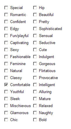
When I got to this checklist of "how does your bra makes you feel" (or somesuch), I was genuinely surprised. There are no negatives in here, and the word "supported" doesn't appear. I wonder what they can learn from this, apart from what they want to hear? The only way to avoid their positive bias is to check nothing, which I suspect will be tough for that helpfully-minded customer set that like to fill out surveys.

Previous to this question, they asked about other retailers you buy from. Now, if they had the usual sort of market research plan, I would expect to see an attempt at a basic SWOT analysis on the results: analysis of their strengths, weaknesses, opportunities, and threats.

How do you do that? Well, the logic is roughly this:

  1. Ask:Where do you buy your bras?
  2. Ask:What's important to you about your bra?
  3. Ask:What's your feeling about the bra you bought?
  4. Data analysis: For people who bought from us in (1), what's the difference between (2) and (3). If there's a big gap, that's our opportunity, going forward. (And roughly, strengths and weaknesses, when you compare against people who bought from Sears and Macy's and Frederick's of Hollywood on the same dimensions.)
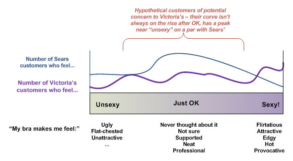
If they're going after pure brand image and evaluation of their own success at achieving it, I think they still screwed up. Or at least they lost a serious opportunity in their data collection. They know where I shop (or where I said I shop, where I remembered I shopped), and they didn't have any adjectives that don't seem to be their personal target brand image in the list.

With the right vocabulary choices, including negatives and neutrals, they could have done some interesting segmentation based on where their own customers fall in "feeling" versus the other retailers' customers. Something like this:

They can always conclude from their data that some of their customers aren't that interesting to them from a marketing perspective (e.g., the people who shop at Sears, like their stuff a lot, and only occasionally go into a VS store -- because they'll be hard to capture if they're not dissatisfied enough with Sears).

In any case, some other common mistakes I see in market research via survey:

  • You try to collect too much in one survey, and can't do the analysis (plus you irritate the people who filled it out). You can always get more data later in other forms.
  • You don't know what you're trying to get out of it, so you can't construct the instrument well to get anything at all.
  • You set it up to learn what you want to hear (which is what I think was going on with VS -- I won't even tell you about the underwear questions), so you learn nothing and waste time, money, and your customers' patience.
  • You collect the data, then don't know what to do with it. You either don't do much, because of lack of skills in data analysis (clustering, mining, etc), or worse, you do nothing. You have it, but didn't take advantage of it. (This makes me quite uptight when I run into it. Good data is gold. My consulting tagline is "data-driven" for a reason.)
  • You solicit data from the wrong people, but don't even know it, because your survey didn't check on their credentials for answering and providing input. So you can't toss out any of the responses to clean the rest of the data.
End data rant of the week... I think I'm going to Sears now.