Saturday, March 31, 2007

Visualizing Poetry

April may be the cruelest month, but it's also the month of poetry, and Knopf does an annual poem-a-day mailing list, which I highly recommend. Thanks to my friend Tina in Seattle, I've been on this list for the last 3 years and loved every day of April.

Nine years ago we began a Knopf tradition. To celebrate National Poetry Month, we sent a poem a day by e-mail for 30 days to anyone who asked to receive them. Now, with over 25,000 subscribers, we are proud to continue with a whole new series of daily poems. Each day during the month of April you will receive a poem from some of the best poets in the world including Mark Strand, Sharon Olds, and Laurie Sheck, as well as classics from Langston Hughes, Robert Burns and more. If you know of someone who might like to join the poem-a-day party, they may visit http://www.randomhouse.com/knopf/poetry/poemaday/ to sign up.

In honor of poetry visual and written, here are some samples of Boris Muller's visualizations of poems for the annual Poetry on the Road conference in Germany.

And see the great summary of other notable vis work in Ping Mag's article on beautiful data visualizations, based around an interview with the editor of the popular Infosthetics blog. (Thanks for the pointer, MJ.)

Thursday, March 29, 2007

Engineering Rewrites and Old Code

Closely related to my Balls o' Mud post about old code bases, the latest Silicon Valley Product Group blog posting is about the necessity of engineering "headroom" for code maintenance during product lifecycles. And about inevitable rewrites to scale, perform, and I'd say, accommodate design of new features, although the article doesn't focus on that issue per se.

I knew ebay had gone through growing pains, but the article suggests some absolute heroics in the form of two mid-growth rewrites of their code that barely touched their business performance. I know of some (plenty) UI designers who've left ebay because of their unwillingness to touch their UI (it sadly needs it), but I do applaud their engineers for their effectiveness at communicating the need to do code work to survive. From the SVPG article:

The deal with engineering goes like this. Product management takes 20% of the capacity right off the top and gives this to engineering to spend as they see fit – they might use it to rewrite, rearchitect or refactor problematic parts of the code base, or to swap out data base systems, improve system performance – whatever they believe is necessary to avoid ever having to come to the team and say “we need to stop and rewrite.” If you’re in really bad shape today, you might need to make this 30% or even more of the resources. I get nervous when I find teams that think they can get away with much less than 20%.

If you are currently in this situation, the truth is that your company may not survive this. But if you are to have a chance of pulling through, you’ll need to first do a realistic schedule and timeline for making the necessary changes that engineering identifies.

If your product is slow, hard to modify, and your code base is really old and hard to understand by your own developers, you should be worrying about your future in the business. Can the people you want to modify your product succeed in actually modifying the product without total internal collapse, at version N? Here's another pointer to that ball of mud article on software architecture growth issues.

Wednesday, March 28, 2007

Owl and Bear

At the Worcester Ecotarium they have some nice animals. I especially enjoyed the polar bear and the porcupine. Unfortunately, the latter was hard to photograph as he was very busy running in and out of his cubby hole. (But there is a very relaxed and lazy one sleeping on a tree in my animal photos from Nova Scotia here.)

This little screech owl is moulting.

The polar bear likes to play and scare the guests. Expect more of her...

Saturday, March 24, 2007

Web Infovis: Crispyshop.com review

Found on Information Aesthetics, a regular read for me...

Crispyshop.com is a fascinating blend of data and shopping results that, sadly, doesn't quite work for me on grounds of overall design usability. I love to play with it, but I can't figure out how to use it to pick the GPS device I'm looking for. It has some very basic issues, which in this era of "user experience" shouldn't be happening! (Hey, I know, hire me to consult for you, guys!)

The main display is this very fluid graph showing price on the Y axis, and the dots represent products. The green dots are a great idea, but don't work in practice: you see one suggesting it's a better "deal" (by some number of unknown factors) and you head for it, and it disappears. The UI is simply too fluid. Also, you should never get an error for a simple search like the one I just got:

Whatever you do, you've gotta return results from any search done. Not an error and not a "not found" page. Finally, once I did find a product I wanted to look at, I did the usual thing -- clicked off to a merchant site to look at the details there to make sure it's what I was expecting. And an annoying popup error kept grabbing me back to the crispy page: "A script on this page is causing Mozilla to run slowly. Abort it?"

One last bash: the passion here is in the beautifully fluid graph details, clearly. To the left of it is a disappointingly "normal" set of filters that most people just don't use when searching, because they pose various cognitive problems when you're just browsing around and trying to educate yourself about a product space. These ones are particularly poor, in that the pulldown menus don't show the number of results associated with each choice (for instance, if I filter by "10% off and More" will any show up, or will I be wasting a click?). The way Kayak.com handles this is inspirational, of course, in that you get lots of information to help you manage your filters, including some little graphs showing ranges. Wine.molecular.com's demo app is a nice one too, but only works in IE for me. They show a small barchart, but only when you mouseover the slider:

Search is hard to design well: it's all about successful data reduction, for the end-user. People don't scroll through pages of results. But I'm always disappointed by cool ideas partly executed. Is the Crispyshop site intended to support a common task, or just showcase the author's brilliance in one domain (and I admit, he's pretty brilliant at that)? Is it meant to be done, or is it another beta like the endless Google beta empire?

This sadly reminds me of the conversation I had with a spokesperson for Tableausoftware at last year's Infovis conference: There was no usability testing done for that product during design, and it shows in use. I needed an in-person tutorial to get anywhere with it after having downloaded the demo version already. The functionality is excellent, but for a new user making a purchase decision, that's unfortunate in today's software world. Old software products, I will cut them some slack -- but a new product? Even just a professional once-over by someone like me can help catch a lot with the basics.

Wednesday, March 21, 2007

Past and Current Employees and Your Reputation

As my current contract winds down, and a friend quits a job I once quit too, I've been thinking about how employees can affect your company "word of mouth." Just in time, Scott Berkun posted about why you should treat your contractors and temps well :-) Not that I have in any way had a bad time of any contract, but that's relevant to the overall topic here. Manage your reputation by taking care with your own staff.

Scott makes the point that interns and temps are potential future employees, are sources of networking for your future hires, and may be top notch in the idea department, especially since they bring in fresh perspectives. "Treat them like idiots in a box, and you’ll get idiots in a box. But give them a chance to outperform your expectations and your next star recruit might already be in your office." This is a regularly delivered message on Joel Spolsky's blog too.

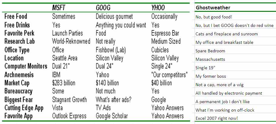
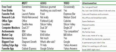
Don't miss the terrific post from the guy who interned at Google, Microsoft, and Yahoo, and compared the three in a blog post with a small chart. :-) (He ended up taking a job at Yahoo.) Here's how my situation compares in an added column on the right:

Another subject of relevance is what I call the "Departure Story," or how you mutually end it with someone who is not happy working for you. My advice is not to let anyone leave suddenly, especially someone in contact with your customers; not because they will badmouth you, but because it will cause a crack in your coherence as a place that can be depended on to handle customers carefully. Imagine how that customer feels when their email to the old account bounces, and they had no warning that their contact was leaving for other pursuits? Redirecting their email to another account where someone else gets it is probably even worse; if there's any indication to that customer that the person they were in touch with had any issues at the company, this will be damaging to the company.

Sudden departures also affect the morale of other employees, just like a big riff will; they'll wonder what happened, how safe their position is, how much of an asshole you were or the boss was. Rumors and stories will inevitably get passed around. Regardless of whether the departee signs confidentiality exit papers, this is still going to happen. So is the conversation they have with their professional industry colleagues at the next conference about whether that's a good place to work or not.

Finally, if you treat a departing employee as if they're a risk, they're more likely to become one. Just like idiots in boxes.

While I was interviewing with a local company that had gone through some troubled times with lots of layoffs, I talked with current and former staff and heard an earful about their last year. It was all on condition of anonymity, and I was grateful to hear it. It made me a bit wary, I will say, and played a role in my decision process. As a manager, you need to know this is going to happen and it isn't something you can "discipline" or "threaten" out of your staff and contractors. Equally likely is the good rep and good word of mouth, if you handle them all well.

A lot of managers moan about how hard it is to hire good people. Sometimes the problem isn't the market, it's you. Checking your street reputation due to former employees and contractors might be a good idea. Someone might like you enough to tell you the truth. Then you can go about figuring out how to change your practices and image.

The current issue of Harvard Business Review has a thought-provoking piece on how companies can't be all things to all employees, but knowing what they are and capitalizing on that is a starting point in attracting the right people for your culture who won't end up telling friends, "It wasn't like it was described in the job ad, that's for sure!"

Sunday, March 18, 2007

Tuesday, March 13, 2007

Organizing for Product Design and Production

I had an interesting chat yesterday with a manager in a large international company that is restructuring to support better innovative product creation. He asked my opinion on a number of topics, relevant to their effort:
  • Matrix organization of cross-disciplinary teams: marketing, engineering, and operations, for instance. I suggested that at the innovation phase before product development, the team might look different and have different skills, such as design!
  • Does long-distance collaboration really work during product design? I said it can, and that although video gets a bad rap, we used it effectively at Adobe in the same time zone. I am less sanguine about major timezone differences, and still a firm believer in regular face-to-face, especially at the start and during times of tension, for defusing it over a drink or meal. For designers, there's more artifact production to communicate ideas long-distance; and the whiteboard collaboration hasn't really been adequately replaced by any conference tools I've seen, but I'd love to be wrong if someone has a suggestion.
  • Quality of product: Get it out or get it right? I said this depends on ability to absorb risk in a brand, and first to market vs. competitor situation. A first-to-market product can get a few things wrong, and still have the advantage. Not if they got the major things wrong, though, and destroyed their own business and can't absorb the hit. Soft launches and long betas are another tried and true method. Google seems to live on eternal betas -- but of course they did get search pretty much right, first, as far as state of that art goes now.
  • Outsource concept design or do it inhouse: I said this depends on how much product innovation is meant to be a core competency. I think it should live in-house if it's meant to be core, because it's a risk to outsource all good idea creation. Also expensive.
It wasn't a specific question, but I pushed for the value of ethnograhic research for identifying new product areas and gaps in markets; and the value of design of both the industrial variety (closer and closer to home for software now) and the usability/interaction variety. The need to reward and remember failures is important here to encourage iteration and re-application of old ideas in new ways.

Tuesday, March 06, 2007

Pretty Visual Generators

I've been looking at online generators for the last few days (a recurrent interest) and was reminded of these pretty visual ones. Worth checking out.

Jared Tarbell's beautiful I'Ching interactive display. Hard to describe, and a little mysterious in practice, as it should be.

The Walking Insect Generator, which is also beautiful, but funnier. Seriously, do click and marvel.

A scribbler art project -- this one is fun to watch, like a lot of these visual noise generators. It tends to fuzz up your drawing.

Sunday, March 04, 2007

Test Your Psychic Powers

Participate in an online study of psychic powers run at Psi Experiments. Their first experiment is up, and all you have to do is guess (or divine) which cup the ring is hidden under. No, it's not a street hustle. You can sign up for the results, too.

Experiment One: "In Which Box is the Ring?"

Saturday, March 03, 2007

Product Idea Generator

This is addictive, like any good generator. It's especially well-done. Too bad the reload link is so tiny, but you won't miss it. Samples I got:
  • It's a rubber fish that shouts 'WARNING!' at the first sign of danger! It sounds better than it looks and mimics the movements of a lizard.
  • It's a blow-up doll that's inflammable! It kills weeds down to the root and talks.
  • It's a video recorder that scares dogs and stays exactly where you leave it.
  • It's like a normal shoelace, but it runs on six little wheels.
  • It's an aquarium that keeps track of your personal calendar!
  • It's a trouser press that flies like a rocket! It doesn't need batteries and may cause drowsiness.

Web Log Analysis: Site Flow Charts

I've been working a bit on web log analysis recently (see my contracting info), and while I didn't deliver this for a client, I did spend a little time seeing if it would be worthwhile to do in the future. After doing the usual freqencies of referrers and requests and such, I also looked at median page views per visitor.

I then did a small sample extraction of page views of the users matching the median page view profile, and generated arcs corresponding to what page types they went from and to. I overlaid them on a site map I threw together, done by hand in Illustrator (and here anonymized): the width in pixels of the line directly corresponds to how many arcs there are between each node (or page type). Blue lines are going into the "purchase" process, while green are just the rest of the traffic patterns. It's a little more suggestive than the simple frequency counts that don't show actual paths; because in this I can see how few people in my sample subset go from, for instance, the "not found" search results to searching again. And it's quite obvious how relatively many people in these logs were buying products while browsing rather than after searching. It's probably worth doing this a larger scale and figuring out a good algorithm to automate the drawing, but I ran out of time on this contract project. If anyone else wants to pay me to do this for their site, drop me a note. :-)

Friday, March 02, 2007

Big Ball o' Mud: Code Tangles and Organizations

A friend pointed me to this a month ago, and I'm only getting around to this now: Foote and Yoder's Big Ball of Mud, on legacy code that no one can understand or modify without risk to, well, sanity and schedule.

They illustrate their points with physical world architectural examples, a lot coming from Stewart Brand's How Buildings Learn, because design in other domains and design of software aren't so different when you look closely.  I was, of course, thinking about interface design and organizational design while I was reading it, and about the book Architecture Without Architects, which I really like in both concept and fact after meeting a few (I'm kidding--mostly).  Foote and Yoder's interest in XP (extreme programming) is in part because of the need to accommodate changes in user requirements, but they don't talk a lot about UI design and the difficulties with keeping UI code flexible and modifiable.  (I still think it's a shame that agile and XP communities don't connect and work better with UI/UX/UE folks -- apart from the active agile-usability mailing list, of course.  The goal of a good designer is to get the right decisions made right and executed well; these goals are the same for both UI designers and code designers, and should be the goals of managers and executives who support them.  But.)

Selections from the Ball of Mud article:

  • One reason that software architectures are so often mediocre is that architecture frequently takes a back seat to more mundane concerns such as cost, time-to-market, and programmer skill. ... Architecture is a long-term concern. The concerns above have to be addressed if a product is not to be stillborn in the marketplace, while the benefits of good architecture are realized later in the lifecycle, as frameworks mature, and reusable black-box components emerge [Foote & Opdyke 1995].
  • In other words, the software is ugly because the problem is ugly, or at least not well understood. Frequently, the organization of the system reflects the sprawl and history of the organization that built it (as per CONWAY’S LAW [Coplien 1995]) and the compromises that were made along the way. Renegotiating these relationships is often difficult once the basic boundaries among system elements are drawn. These relationships can take on the immutable character of "site" boundaries that Brand [Brand 1994] observed in real cities. Big problems can arises when the needs of the applications force unrestrained communication across these boundaries. The system becomes a tangled mess, and what little structure is there can erode further.
  • Architecture and code quality may strike management as frills that have only an indirect impact on their bottom lines.

The same can be said of usability and design excellence, of course.  It's a special organization that doesn't erode the desire of people to produce quality work by saying "it's good enough to make us money right now."

A good closing quote: Alan Kay, during an invited talk at OOPSLA '86 observed that "good ideas don't always scale." That observation prompted Henry Lieberman to inquire "so what do we do, just scale the bad ones?"

Pretty often, both on the idea itself and the execution. In the short term, the prototype code works well enough, and the design is okay unless you look closer or start trying to add onto it. Same happens with UI design, without enough iteration, and tacking on new features without refactoring is like adding dirt and grass to a ball of UI mud.

I'm now using the new Office 2007 products, and I regret not seeing more refactoring of the UI, despite the famous ribbon. If you're going to start doing a UI refactor, you may as well go all the way once you've disoriented your users a little bit; for instance, why keep Word's header and footer commands under the "view" tab now, and I have to question whether "home" means anything real to anyone except on a website. Some of the changes are a great improvement, but I think a little card sorting might have helped them out a bit, too, and I find some of these choices surprising.