The slides are here:
The IPython notebook with some useful code samples is here.If you want some sample data files, email me and ask? I'm concerned about rights with respect to the fiction files.
The slides are here:
The IPython notebook with some useful code samples is here.If you want some sample data files, email me and ask? I'm concerned about rights with respect to the fiction files.


How do Dan Brown and Stephanie Meyer do it? Most text visualization focuses on word counts: in this talk, Lynn will illuminate how fiction "looks" at a meta level, using a combination of meta-linguistic analysis and simple machine learning. Beyond just words, long texts are composed of sentences, paragraphs, and chapters, and the pacing and theme are reflected in these as well as word choice. With a little finesse, we can detect and graph the famous story arcs that screenwriters and fiction teachers are always talking about. With a little more finesse, we can write an action scene detector or a sex scene spotter and visualize how exciting a novel is — in all senses.
A week ago, I gave a talk at Strata NYC on network visualization ("Beyond the Hairball"). The talk had many technical issues (I'm new to using a MBP and Keynote to present), but the slides seem to have had some kind of life on Twitter. So here's the rather large and slightly academic deck:
I was gratified to get so many RT's, email, and favorites from people including Gilad Lotan, Steven Strogatz, and Ben Shneiderman.
Strata itself baffled me a little due to size and "big data" hype factor -- I got a little tired of overhearing businessmen on their phones talking about "monetizing social." (Why did "social" have to become a despicable noun?) My favorite moments were certainly social more than technical: getting to meet Noah Iliinsky and Kim Rees, seeing Danyel Fisher from MSR and his game analyst partner Kim Stedman, Wes McKinney (with his new book, Python for Data Analysis), and Jon Peltier and Naomi Robbins. These folks made for a very nice data vis and python slice of the big data conference.
All in all, Pydata was a good couple of days, well worth the trip! They could stand to get a few women to speak at the next event, though. (No, I'm not volunteering!)


"I somehow managed to get CAPTAIN AMERICA doing the horizontal mambo. Fuck you all, I win. I win everything."
 |
| Wind map detail (Viegas and Wattenberg) |
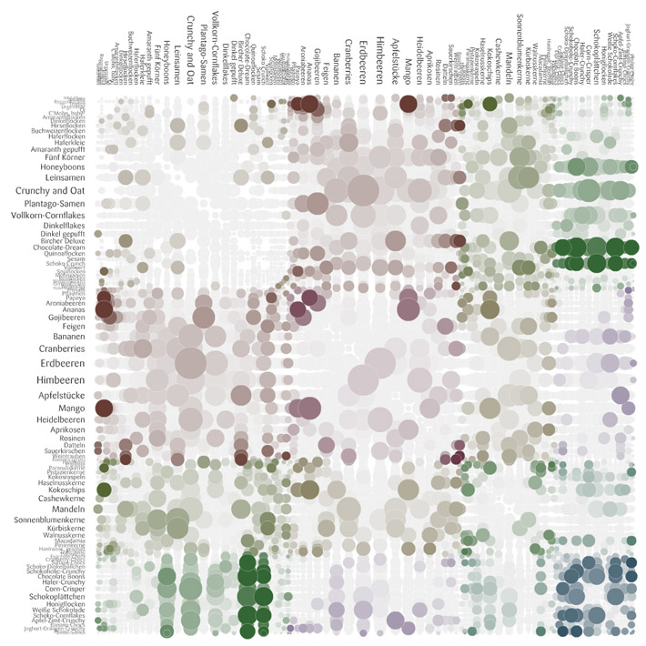 |
| Stefaner's rejected "fungi" visual of muesli |
 |
| Tyne Floating Mill (Source of stats for the beautiful Tyne Flowmill visualization) |
 |
| Tyne Flowmill visualization details |
 |
| London Riot Rumors on Twitter from the Guardian |
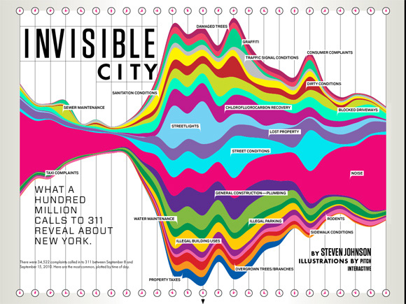 |
| Pitch Interactive for Wired |
I recognize that I can make some great looking work, and I am proud of this fact. But as soon as I am engaged in a code-related conversation with someone who knows C++, someone who knows proper code design, someone who knows how to explain the difference between a pointer and a reference, someone who polymorphs without hesitation, the bloom falls from the rose and I end up looking like an idiot. Or even worse, a fraud.

I put that animation with the arrow in there on purpose, because when I presented it, I had to point out the skinny line on the top. More graphs than you'd expect come with a "performance" part and in some contexts, I think this is just fine. Afterwards, one exec at the company referred to it often as "that chart with the one pixel line." (Okay, technically it had about 2 or 3 pixels. Not as punchy if you refer to it as "that chart with the 3 pixel line" or "that chart with the thin red line.")
I'm sure there are other, better, ways to present this red-and-orange tower. The point is: It was remembered. It had an impact. This graph led to more graphs being created! Roughly, we saw these steps:
It's an old analytics saw that you can't improve what you don't measure. Well, I think you won't improve what you don't measure meaningfully and then pay attention to. The client had collected the data, but then did nothing with it, because no one had made understanding it a priority. Data for data's sake is pointless and will be ignored. At the time of my one-pixel bar, an analytics cheerleader in the company described our primary data system as "buggy, opaque, brittle, esoteric, confusing." I'd add, "understaffed," and as a result of all that, usually ignored, which is how the one pixel red line came to be.
We took a brief detour in which we considered "outsourcing" the data problem to another company to do the top-level reporting for us, but our (mostly my) investigations suggested we couldn't do the fine-grained, raw-to-dashboard (ETL) reporting and analysis we needed without owning the entire pipeline ourselves. Because in all these organizational, data-driven settings, the reasoning goes like this:
Our ultimate data team was a cross-company, somewhat ad hoc group of people who cared about the same thing, but didn't report together anywhere: Customer Support, UI development management, directors of development and the API team, a couple of database gurus. Oh yeah, let's not forget the database gurus: I couldn't have even made that bar chart without badgering the database guys for info on their tables, so I could do some SQL on it.
In a year, we had achieved measurable significant improvements, via that cross-disciplinary team, and without out-sourcing our important data in any way. The short-term tools paid off almost immediately, and I hope the long-term ones are still evolving. One of the team members won an award for the tool he developed for exploring important raw data (and I did contribute to the design). None of this was done under official reporting structures. But the organization was flexible enough to support the networking, collaboration, and skills needed.
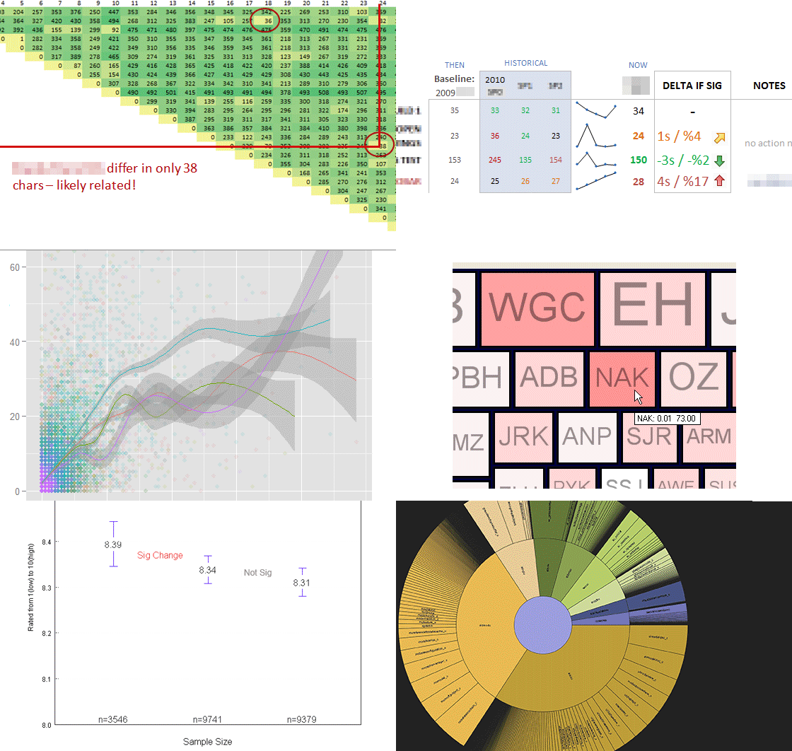
Since that graph is so silly, here's a little montage of other exploratory data and design work I did while I was with that client. Lots of tools were involved, from R to Tableau to Flex to Python to Excel to Illustrator. Vive la toolset!
For Boston's Predictive Analytics Meetup in February, I gave a short talk on using the python library NetworkX to analyze social network link data, illustrated with some simple D3.js visuals of the results. I've since spruced up the slides to stand on their own a bit better, extended a few of the examples, and moved it all online.
Here's a link to the zip file of the ppt, heavily commented code samples, and the network edgelist I used (from Moritz Stefaner's and my previous look at Twitter Infovis folks in mid-2011). Or you can browse the slides below (the links should work fine).
A few comments, if you made it through the deck... The network stats are doubtless out of data, since I know there has been some movement in who-follows-whom among the Infovis crowd on Twitter. The overall workflow proposal is this:
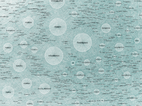
In my previous post using Gephi to analyse the infovis network, I labelled one subcommunity "The Processing" crowd, another one "The Researchers" and another one "The Authorities." In my current analysis, where I find 6 subcommunities (or "partitions"), you can see them as roughly the green partition (Processing folks and infovis artists), the orange partition (the research/analytics group), and the blue partition (with high-degree authorities like infosthetics and flowingdata).

The different demos make different things clear about this data, as you might expect!


Once you get started making these visuals, you want to tinker forever... I hope the code samples and comments help you get started, if you want to try to do something in this line! Once again, talk slides plus source are in this zip file. Be sure to note my warnings and gotchas if you tinker yourself.
For a recent and different analysis of talk among the Twitter Infovis crowd, visit @JeffClark's posts here and here and here. (He's an orange, top N member in my graphs.) He identifies "red" and "blue" groups based on their interactions and words used. His two primary groups seem to correspond to the processing/artists (green) and researchers/analytics (orange) distinctions I found in this older data.




| Label | NetworkX Community | Gephi Class | Degree | Closeness Centrality | Betweenness Centrality |
|---|---|---|---|---|---|
| flowingdata | 0 | D | 1394 | 0.446930423 | 0.043313537 |
| datavis | 0 | A | 1376 | 0.482190168 | 0.072294856 |
| infosthetics | 0 | A | 1362 | 0.435290991 | 0.034115345 |
| infobeautiful | 0 | D | 1074 | 0.391210891 | 0.007498017 |
| blprnt | 2 | B | 932 | 0.410115173 | 0.02337346 |
| ben_fry | 2 | B | 882 | 0.365625 | 0.006936445 |
| moritz_stefaner | 0 | B | 870 | 0.452361226 | 0.028942168 |
| eagereyes | 1 | C | 861 | 0.455126424 | 0.031837862 |
| mslima | 4 | A | 828 | 0.433448002 | 0.014404322 |
| VizWorld | 4 | A | 828 | 0.524495677 | 0.08984938 |

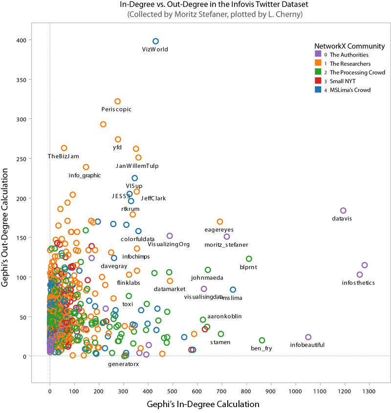

 |
| community 0, The Authorities |
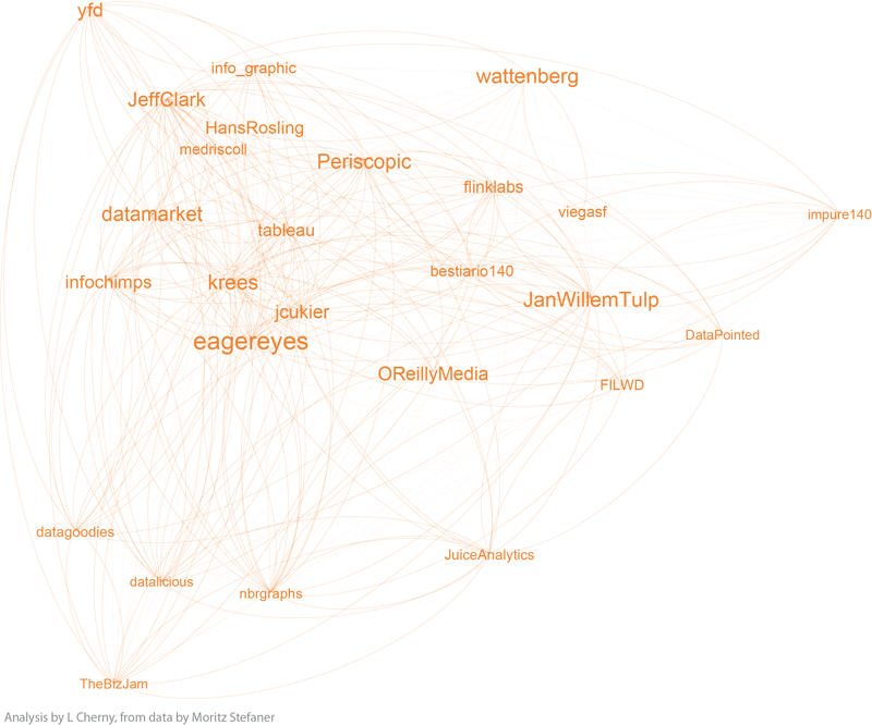 |
| community 1, the Researchers |
 |
| community 2, the Processing Crowd |
 |
| community 3, the small NYT group |
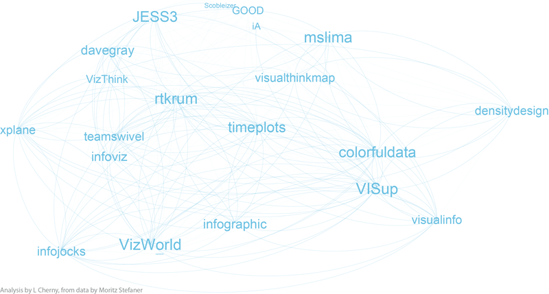 |
| community 4, MSLima's crowd |


