Sunday, March 23, 2014

Implied Stories (and Data Vis)


At the excellent Tapestry Conference in February in Annapolis, Emma Coats (@lawnrocket) spoke about storytelling, the theme of the conference. Her talk was based on her internet-famous 22 Rules of Storytelling developed while she was at Pixar.

Lacking the video of her talk ([ETA: here it is!]), I cracked open the ebook based on her principles by Stephan Bugaj, Pixar’s 22 Rules of Story (That Aren’t Really Pixar’s) (— which, incidentally, Emma says was written without her permission and none of her involvement. Caveat Lector).

Pixar Rule 4:

Once upon a time there was a ______. Every day, ________. One day ________. Because of that, _______. Because of that, _______. Until finally ________.

Bugaj points out this is a summary of a basic plotting structure, the “story spine,” suggested in many books on writing fiction: setup, change through conflict, resolution. The details make it a good story, of course (character, context, conflict…).

Emma talked about confounding the expectations of an audience: The ghost of what they expected should remain at the end, but your story arc should win (and convincingly). Related was an important point: the implied story line. You suggest a shape to what will or might happen (or has happened), and the audience fills it in. Her pithy example was Hemingway’s “shortest story every told”, a 6-worder:

“For sale: baby shoes, never worn.”

There are lots of ways the story here can be filled in, all of them sad. The reader brings the detail and does most of the work, but the author set it up very well to allow this.

Another Short Story


I’d like to offer another example, a very short story deconstructed in a series of lectures by sociologist Harvey Sacks (Lectures on Conversation) — which coincidentally also features a baby:

“The baby cried. The mommy picked it up.”

Maybe it’s not as GOOD a story as Hemingway’s, but Sacks argues it’s a story, based on having a recognisable beginning and end, the way stories do. There’s a dramatic moment, and a resolution. And while you may think we can read less into the plot than into Hemingway’s, Sacks spends 2 lectures (plus book appendices) on this story and how we understand it the way we do.

Ok, let's accept it’s a story. Secondly, we infer that the baby and mommy may be related: it’s the baby’s mommy. “Characters appear on cue” in stories, he says; the Mommy is not a surprise in the normal setting conjured in our head; it doesn’t feel deus ex machina, like cheating.

Notice the story didn’t say “his mommy” or “her mommy” or “the baby’s mommy.” Juxtaposition of category terms often used in family contexts helps us infer this, Sacks argues. It’s clearly possible the baby was abandoned outside a supermarket and someone else’s mother picked it up to comfort it, as I hope one would! It’s not the simplest reading, though. Notice that we also assume they are humans, not apes or cats. Our human context draws that story, an Occam’s Razor kind of principle to reading.

Thirdly, Sacks notes we read the story as having cause and effect. Again, this is related to the juxtaposition and assumptions of normal family roles. That’s partly the expected story spine at work, too: conflict, resolution! Cause, effect, NOT just correlation.

Fourthly: the action in this story is believable, interpretable, unlike “colorless green ideas sleep furiously.” (That’s an old linguistics chestnut.) Babies cry; babies who cry should probably be picked up. Sacks notes that a mother can say plausibly, “You may be 40 years old but you’re still my baby.” In that case we don’t expect the crying 40-year old to be picked up, even if he’s “acting like a baby.” We fill in the blanks in this story in the most consistent way possible for the details we’ve been given, which means a lot of assumptions based on what we know and expect about social and human behavior.

Surprise!


A thing I didn’t tell you right away is that this story is a story by a 2 year old, that Sacks got from a book called Children Tell Stories. Sacks spends a certain amount of words on why this is a story because it comes from a child: the drama is a child’s, the resolution is a child’s happy ending. Sacks suggests that children, as speakers, might start a story with a dramatic moment, as a method of getting the floor. He says the dramatic problem here is a valid child’s talk opener, like “Hey, did you notice your computer is smoking?” would be for a stranger addressing you in a coffee shop while you’re getting a napkin. The ending is a valid ending, because for a child being picked up is a resolution. For this story to have a tidy ending, we infer that being picked up results in a non-crying child, or at least a happy child. But the actual non-crying denouement is implied here because of Mommy doing something expected.

The child’s story is arguably less sophisticated than Hemingway’s story, but notice that it’s more of a classic, plotted story in that 2 events occur, the crisis and the resolution. I hope I’ve convinced you that’s it’s still quite sophisticated in terms of the amount we bring to it when we read it, and how it successfully carries us along despite being terse. Hemingway’s is a suggestion of events behind a public for-sale ad, and all the action and characters and emotion occur in your head.

Story, Discourse, Visuals


What does this have to do with data visualization? Emma Coats wasn’t quite sure how to relate her story telling principles to vis design, but left it to us as adult vis creators to make that connection. I’m going to spell out some of what I take from the Pixar and Sacks points, as well as a little more storytelling thinking.

First one useful distinction in terms from Dino Felluga's General Introduction to Narratology:

"Story" refers to the actual chronology of events in a narrative; discourse refers to the manipulation of that story in the presentation of the narrative. [...] Story refers, in most cases, only to what has to be reconstructed from a narrative; the chronological sequence of events as they actually occurred in the time-space ... universe of the narrative being read.

(This isn't necessarily the way a linguist would define discourse, but it'll do for now.) Discourse encompasses all the similes, metaphors, style devices used to convey the story, and in a film, all the cutting, blocking, music, etc. The story is what is conveyed through these devices when the discourse has succeeded. (So, for Felluga, telling "non-linear" stories is an attribute of the discourse, not the story itself.)

Hemingway's short story's discourse structure is very different from a two-year old's discourse structure. The artistry lies in the discourse choices as well as in the stories they picked to tell.

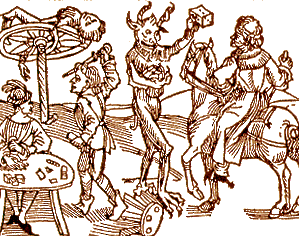
Felluga illustrates how stories can be told in a visual discourse form with a Dürer woodcut:

(Woodcut to Wie der Würffel auff ist Kumen (Nuremberg: Max Ayrer, 1489). Reprinted in and courtesy of The Complete Woodcuts of Albrecht Dürer, ed. Willi Kurth (New York: Dover, 1963)

The story goes something like this: 1) The first "frame" of the sequence is the right-hand half of the image, in which a travelling knight is stopped by the devil, who holds up a die to tempt the knight to gamble; 2) the second "frame" is the bottom-left-hand corner of the image, where a quarrel breaks out at the gambling table; 3) the third "frame" is the top-left-hand corner of the image, where the knight is punished by death on the wheel. By having the entire sequence in a single two-dimensional space, the image comments on the fact that narrative, unlike life, is never a gamble but always stacks the deck towards some fulfilling structural closure. (A similar statement is made in the Star Trek episode I analyze under Lesson Plans.) [Note from Lynn: Love this guy.]

George Kampis took out these lessons from this example, for his own introductory course:

  • Narratives can be visual
  • Time is Space here
  • Actions and events are consequences (causation), not just occurring in a sequence.
  • Narrative is therefore offering "explanation" — why did things happen?
  • But order has been imposed.

I would not argue that the woodcut is easy to read, at least for most of us. Reading this story requires background in themes and socio-cultural contexts that a lot of modern viewers don't have anymore. It's not as simple as "the baby cried" or even the Hemingway "for-sale" discourse format.

Causation in Vis

We look for cause and effect in sequences of events, which is why I suspect there’s so much confusion over correlation and causation in data reporting. Charlotte Linde, in Life Stories, talks about this as "narrative presupposition." She offers us the following two examples, which we read differently:

1. I got flustered and I backed the car into a tree. 2. I backed the car into a tree and I got flustered.
Linde toys with the idea that this is related to cognition, but falls back to suggesting it's a fact about English (and possibly related languages') story telling discourse and morphology. Regardless, it is a "bias" of interpretation we bring to bear on how we interpret sparse details juxtaposed. If a data reporter chooses details that juxtapose the rise of one thing with the rise (or fall) of another, the average reader will assume causation is implied by the reporter.

What's an example of a simple causation story in data vis? A timeseries of measures might be a good example. But without added context, it’s often just "X, then Y". Filling in some explanatory context on timelines has become standard, at least in journalism. The labels here help us contextualize the data, and arguably to infer some causation:

(Image by Ritchie King in a Quartz article.)

Here the designer has imposed order by suggesting causation or at least relevant correlations behind the measures shown over time and the labeling of events. Some of the labels may be just "informational," like the recent presidencies. For readers who know about the Clinton era economy vs. Reagan and Bush economies, the annotations carry more meaning. Regardless, by choosing to annotate in this way, the reporter suggests relationships in the minds of the reader, very deliberately. Less clearly related events also happened on those labelled time periods — births, deaths, scientific discoveries — and yet their relevance wouldn't be so "obvious" and so easy to glance over as reasonable. Economy and war go together like babies and mommies.

Because readers assume the author has juxtaposed items on purpose, suggesting odd relationships in your discourse automatically evokes weird stories in your reader's heads. These might be entertaining from an artistic perspective, of course...

(A super example from this paper on fallacy summarized on Steve's Politics Blog.

It's a little unlikely that lemon imports over time have a direct causal relation to accident rate, although we immediately want to figure out how they could!

Artistic &/or Journalistic

Is journalism better served by 2-year old storytelling with simple discourse forms ("X, then Y")? Maybe, for some purposes. Even so, there are a lot of unwritten implications behind every chart, from what's reported to how it's reported. It's easy to classify some work as simple propoganda — see Media Matters History of Dishonest Fox Charts for a lot of examples of apparent intentional misleading by implication.

Periscopic’s Stolen Lives gun deaths visualization was criticized by some for being un-journalistic, and yet, it makes its implications quite explicit and well-marked in the discourse (gray lines). The visualization walks the viewer through the interpretation with a slow intro, to show exactly where the artistic license begins to deviate from the data source.

(Visual from Periscopic's work.)

This work may be be more like Hemingway's for-sale story than a 2-year old's story, although in fact it leaves less to the imagination while it veers further from traditional journalism as it does so. Yet this is still data visualization taking an artistic narrative risk, for the sake of activism.

Wrapping Up (So I Can Watch TV)

Even very simple stories, whatever the discourse form, rely on the reader filling in a lot of invisible holes. Some of the interpretation we do is so "obvious" that only sociologists or cognitive scientists can make explicit the jumps we don't notice we're wired to make. Choice of structure, of juxtaposition, of annotation, of what's implied versus made explicit: these are discourse maneuvers that can clarify, mislead, open up possibilities, or even evoke emotion in surprising ways.

A willingness to borrow insights from other disciplines' thinking about these subjects was one of the reasons I liked Tapestry's programming. Emma Coats made me get out some old books, and writing this up helped tune my thinking a little bit. Good conference, and hopefully a thought-provoking post for a few readers.


Incidentally, some recent related articles: Periscopic's A Framework for Talking About Data Narration and Jen Christiansen's article "Don't Just Visualize Data — Visceralize It." [ETA: Also, a followup to this post by Robert Kosara at eagereyes.]

Saturday, November 16, 2013

Data Vis Consulting: Advice for Newbies


Every time I give a talk or introduce myself at a conference, someone gets really interested in what I do. When I think I’ve scored a potential client, it turns out they just want to know if they could do what I do. Some folks are direct: One woman at a Python Data Science conference said, “So, you know that job ad list you run for data-vis jobs? How do I get one of those jobs?”

Backing up a tick, in case you didn’t know, I curate a low-traffic list for job ads in data-vis (short for “data visualization”). I think she knew about it from me on Twitter. If you don’t follow me on Twitter, you might think about it, I share a lot of links related to data science and visualization: @arnicas.

This post is about getting yourself to a place to get those jobs, plus money and client issues. I’m not the poster child for successful consulting, but I have been doing it a few years now and I am living off it. I work as an individual contributor, writing code for data analysis and creating interactive visualizations. To balance out my own skew on things, I asked for input from some fairly famous names, mostly folks I know via Twitter (see People Resources).

Note: I’m not talking in this post about skills needed or training resources--there are books, MOOCs, and plenty of ways to find that stuff by now; see especially Andy Kirk’s site Visualising Data.

The Kinds of Data Vis Work Out There

In my experience, there are a few key varieties of work deliverable types for freelancers in data visualization:

  • "Cool data set" visualization: Client wants someone to explore a data set and produce a static or interactive graphic they can feature as a PR move, as part of a news story or article, or for an internal business report. This work is probably most well-known, since it’s the core of the most famous/artistic vis work.
  • Dashboards: A lot of organizations want analytics (or consumer) dashboards reporting multiple key metrics in an attractive and useful display. They seek help determining those metrics and the best way to present them. (I’m putting these between the “cool data set” and “tools” because as a problem, they combine aspects of both. Make sure you read the Red Flag section for this work!)
  • Tool building: Client is building tools for users (internal or external) to view data of some kind, which means they and you are not starting from a specific data set, but an idealized version of one; and you are helping design/create infrastructure for data exploration.
  • Teaching: Teach principles of design, visualization, how to produce graphics and interactives, basic or advanced stats; usually in workshops.

Work roles range from part-time as-they-need-it work, sub-contracting for big names or projects, contract-to-hire gigs, single project work, retainer work for regular needs; and these jobs often entail some mix of design and development. I myself maintain a mix of these roles and work types so that I keep busy. (However, I charge slightly differently depending on whether I’m doing primarily design or development. I consider UX design to be “harder” and more painful due to the people-politics involved.)

Usually print work doesn’t pay well, but can be excellent for PR and the portfolio. Most of the “famous” artistic vis folks do some percentage of print work and win awards for it, even the ones who also do interactive work.

In general, a lot of us (in my People Resources) started doing freelancing in other areas, before getting more focused on the data visualization field. I was a UX designer for many years at (too) many companies before I went independent. Through some lucky breaks, I was able to do more and more data-related projects in my UX work, until I switched entirely to data work a few years ago. Others from whom I solicited input said they started in general web design or development contract work before moving into 100% data work.

Client (Mis)Understandings About What We Do

I’m hearing more often from start-ups and funded research groups (in universities and companies) that they have plenty of back-end data analytics people, but are in need of front-end folks for data in particular. Front-end people have always been in short supply, and ones who can do good work in the latest visualization tools are even scarcer. But beware, “front-end” for a data shop or an un-savvy product manager may mean any or all of: UI designer, website builder (all of it, from scratch, including login modules, preferences, menus, etc), interactive or static data visualization builder (e.g., d3, or just ordinary charts/graphs). Also, sometimes database janitor and stats person, depending on who else is on staff.

I try to explain that I’m no longer a broad UX designer for site architectures/workflows, that I’m working in the data area only now. Here’s a chart from Alberto Cairo’s book The Functional Art that broadly captures the data design specialization, although it doesn’t try to capture skills, overlaps, and tools at all:

Given the excitement over big data's promises and analytics-driven business goals, the popularity of infographics, and the excellence of today's interactive data journalism (at places like The New York Times and The Guardian), data visualization is hot for consulting right now. Unfortunately, there can be a lot of noise amidst the signal from legitimate clients. Sometimes I can't tell if I'm reading a spam broadcast or a real email, to whit, today: "Mr. [Redacted] is requesting contact information for anyone/company with experience in store cluster analysis, at a reasonable price."

Kim Rees says to beware of the client saying, “We’re really excited to do some datavis! But we’re not sure how to get started.” “These people have no idea what datavis is. Conversations will be confusing, nebulous, and full of far more questions than answers. Tell them to get back to you when they have a project in mind that involves data. Or give them a budget just to explore ideas with them. The only deliverable of that phase will be: Project Idea write-up no longer than one page.” Likewise, coming up with a visualization appropriate for the data and users IS the job, and doing pre-contract work to determine what you will build is not workable for a sustainable consulting business.

"These people have no idea what datavis is."
(Kim Rees)

Tiffany Farrant-Gonzalez notes that “lots of clients are attracted to heavily visual infographics that have become popular, and it’s sometimes hard work to educate them about good visualization practices.” She says, they sometimes want you to “simply make their data ‘look cool’ or ‘more interesting’ without really understanding what this means or the process involved.” Certainly even in development jobs, I have to explain that there is a data exploration, analysis, and design phase BEFORE the building starts -- just as in other design spaces.

Moritz, who most frequently works on what I'd class as "cool data set vis" projects, tells me he usually requests a data sample and some answers to a few questions clarifying the context and basic motivation of the project before starting:

  • Why are we doing this?
  • What are you hoping to achieve?
  • Who are we targeting?
  • How is the end product going to be used?
  • How are we publishing?
  • What data do we have available?
  • Which other existing materials should we take into account?
  • Which constraints do we have?
  • Who is responsible for what?
  • Who else is doing something similar?

For Moritz, answers to these questions help him understand why the client thinks a data visualization is important, and also help define success criteria for the project. He says, “Often, both the client and I realize that half of these questions cannot be answered yet, but that's fine, as long as we make sure to answer them along the way.”

Moritz shares a workflow diagram he uses with clients to illustrate the process and iterative stages of the work:


Moritz Stefaner noted in his excellent interview on FILWD that you need to educate a client to move along with you, so they see the value and thought process, the pros and cons of various design approaches. All design involves tradeoffs, and you need to illuminate these to help the client evolve their own thinking about what’s important to show. Designers of work other than data vis need to do this as well, of course. Remember this impacts your billable hours: producing presentations or documentation materials around your work is time-consuming.

For work that is closer to tool-building, I would also suggest these kinds of questions, at least for solo
consultants like me:

"Do you actually get any say over the presentation and design?"
(Me, wondering)
  • Do they want you to build it all? Try to get some notion of what "all" means for them.
  • Do they have others who can do the generic site code around the visualization piece? Building a whole site to host a vis project is usually non-trivial work!
  • Do they have a designer on staff now who does CSS/visual design (useful if you aren’t superb at this; or problematic if you are and they’re not, or they aren't clueful about the visuals in visualization)
  • Do you get to touch any of the data yourself (because you need to understand it to build something smart)? Who has the data, how can you get to it? (SQL, API call, samples available as CSV...)
  • Do you actually get any say over the presentation and design, or are you a code monkey in their eyes?
  • Are they looking for work "like" anything in particular? (They usually have an inspiration, whether something in the paper or a tool they use or a competitor.)
  • Do they need anything as fancy as d3.js or advanced charts, or would Highcharts and/or a general javascript person be good enough for them?

Early on in your consulting days, you may need to take more jobs that involve some unpleasantness or non-specialist work, but as you get more successful, you can be more choosey.

Getting Started: Do the Work

Suppose you aren't even at the point of talking to clients about doing data vis work, and you're wondering how to transition into it.

As Bill Shander says, you have to “Do the work.” Scott Murray suggests, “Find data stories that are interesting to you, and create them.” (If you have trouble finding data stories you’re interested in, rethink this as a career path, perhaps?) Get a fun data set, analyze it, do some visualization, post about it on a blog. Create the kinds of things you’d like to get paid for. There’s remarkable correlation of opinion across the folks I asked for input: Do projects, even (or especially) for free, that set an example of what you can do and would like to do. Then publicize them on Twitter, on your blog, in a presentation or talk (such as at a local tech Meetup or conference).

“Make, make, make, make.” (Jer Thorp)

Entering visualization contests is another good way to get some experience and attention, although the bar can be quite high for winning. Visualising.Org has some nice challenges with significant prize money. Bill Shander’s entry in a recent Visualising.org contest was picked up in reporting coverage of the contest and got him client leads. Jan Willem Tulp also praises contests, and offers: “A nice side-effect is that you're actually practicing creating data visualizations for a fictional client. Additionally, you’re already building on your portfolio this way!”

Jer Thorp says, “Make, make, make, make. Reduce the preciousness of your work so that you can make more of it and get further faster.” Amen.

The Required Portfolio

Having a portfolio is critical. You always need something you can show, that you yourself made, because every single client will look for evidence that you can do the work. Note that, unfortunately, a lot of jobs don’t produce work that can be shown in public (whether for NDA reasons, or because it was for an internal tool or demo). I myself have a hidden portfolio that I produce on request, because I’m still tuning my self-presentation and collecting items that can be made public.

Anna Powell-Smith says, “The most effective thing people can do to get hired is to create good projects by themselves. Clients love to see that you can both come up with a good idea, and execute it. And if it's all your own code, they know exactly how good you are.” Put aside long weekends or the Christmas break!

"Be selective in constructing your portfolio." (Everyone)

Jeff Clark says his website projects have gotten him valuable input and forced him to think about a personal work brand. “I think almost every project I've done for pay has started with someone seeing some work I've done on my website and they have contacted me through email.”

Dominik Baur suggests doing visually interesting projects that appeal at first sight, to get you a second, closer glance. The power of the visual can help, and might get you PR from other folks (on Pinterest, for example).

Both Moritz and Jan Willem advise being very selective in your portfolio choices. Most vis folks don’t put all their work in their portfolio, and tune it regularly. Jan Willem says, “Make sure that you show the work that you want to do more of. Don't show everything, don't show that you are also good at many other things, unless you want to get work in that direction as well. It might therefore be better to show only 3 really good projects in your portfolio that represent the kind of projects you would like to do rather than showing everything you've done so far.”

Tiffany echoed this, “Take out work that isn’t work you want to be producing, or suggesting you can produce (especially if it was joint work with others). … It's tempting to list out all of your skills (no matter how strong you are at them) and display all of your previous work on your site or resume, but it really helps if you narrow down to the core services that you want to provide, and hopefully this will help you get the work best suited to you.”

General Self-Promotion: Twitter, Tutorials, Teaching

As Jan Willem Tulp says, “People have to know you exist, that you do data visualization, and that you’re good.” It’s critical to have a web site with your portfolio, a presence on LinkedIn, and possibly a blog too. Being active on Twitter can help too. Jeff Clark suggests curating good work “in public” such as on Twitter, Pinterest, or a blog, and mixing in your own work occasionally.

I do get work via Twitter connections, but I also put a lot of work into Twitter. I get a lot of professional value out of it. Twitter is where I find out what other people think is good work (I save links to delicious and Pinterest), listen to arguments/discussions among experts, hear about good blog posts, find out about conferences where I can meet people who are doing good work and learn new things.

Kim Rees also values Twitter for network connections. She says one way to get her notice is to follow her on Twitter (she reads all follower bios which admittedly not everyone does, ahem), say interesting things about data, visualization or design, and post an insightful comment on one of the Periscopic blog posts. Also, she loves to get paper mail presents. (Hint!)

"Prepping talks takes time, usually unpaid." (Me, after a lot)

Give talks in which you show your work and tell people you do consulting. However, take care: prepping talks takes time, which is usually unpaid work. Make sure you talk in places that can benefit you, and try to keep track of “leads” after each one, to better assess which audiences are good for your business. Don’t forget that giving talks at conferences is also about the networking, though; the benefit of a drink at the bar with someone is often as high as the value of the talk you give (and costs less). Post your slides later, with full contact details (and your website link) in them!

Writing tutorials and teaching can be a good way to get business; Jim Vallandingham got several contract jobs from online tutorials he did, including on the popular Flowingdata.com site. They can also help you make your own knowledge more concrete: Teaching is a great way to learn. A couple of popular D3 sites and self-published books have been started by people learning as they produce materials that they take payment or donation for (see, e.g., this interesting post by D3 Noob about sales and PR effect of his book). Teaching workshops can also lead to consulting follow-ups, as Andy Kirk notes.

When you do gigs in person, always carry a lot of cards. My business cards say what I do, not just my business name and email. I like to think having a fuller business card will help people remember later why they’ve got it.

Red Flags, or Gigs to Think Twice About

Gigs with no data should be avoided. Yet, they are surprisingly common. Sometimes the client has none yet, or they can't get it to you for various reasons that are themselves red flags. Why is this bad? Because you can’t produce a good design without data investigation first, and it’s a mistake to start without. One of my clients had me drawing fake dashboards in Illustrator for a couple months before we mutually parted ways. It stopped feeling "creative" to be "making it up" pretty damn fast.

Another client had problems getting me both the real data and any design input. When the design input finally came it consisted of a mockup that had been created without any data investigatory work at all. When I looked at the real data, I discovered some large percent of one data field was full of garbage, and of course the design had to change when we realized it was unusable. This data investigation is a crucial step in the design process that can’t be short-cutted. Ideally you are involved in both the data investigation and design stages.

Tool development is often hard because you may be responsible for finding or developing your own test data sets, which takes solid time. I ultimately had to let one project go for a start-up that was taking more time than estimated; it was the perfect storm of debugging and improving someone's very difficult algorithm, plugging into a complicated dev environment (a weekend lost to Git merge despair), and data set collection/creation/testing. I still have nightmares of #Fail from this one.

"I still have nightmares of #Fail from this one." (Me, with regrets)

Other gigs to be wary of: Debugging other people’s code. Just don’t take them. You’ll spend a huge amount of time that isn’t visible as “producing” something, and it will be frustrating to you and the client.

Anna Powell-Smith says talk carefully with clients who want “something amazing,” but aren't more specific. “It's so dependent on how interesting your data is.” She points people to ">this awesome Quora thread about data analysis on the OK Cupid blog:

“OkCupid's blog worked because we had sexy data. [And] we had Christian Rudder writing the blog. … His posts were great because he's such an amazing writer, not because he's awesome at math. (He's certainly the best writer I know.) The posts each took 4-8 weeks of full-time work for him to write. Plus another 2-4 weeks of dedicated programming time from someone else on the team. It's easy to look at an OkTrends post, with all its simple graphs and casual writing style and think someone just threw it together, but it probably had 50 serious revisions. And we threw out a lot of research that didn't turn into good posts. Your start-up probably can't afford to do this. It shouldn't waste like 10 man weeks of effort/focus/money on writing a blog post.”

--Chris Coyne on Quora: “How Important Was Blogging to OKCupid’s Success”

Which brings me to another red flag client type: The start-up that wants to hire someone to do some “viral” datavis posts for their blog, but haven’t read Chris Coyne’s post or know how much work goes into a good data dive and report. I did a “sample post” for one once with no brief on content, spent about 3 times as long as they were really paying for; and they still didn’t think it was punchy enough. (In my defense, I was given a data set of developer questions, not dating preferences.)

Some clients want eye-candy in the “cool” category, either data art or lots of bubbles with animations. I'm not saying don't do these jobs, just be sure you and they know what they want! One client wanted both a salesy "eye-candy" cool piece and a serious dashboard tool for concrete internal business problems; in practice this turned into two projects, unsurprisingly. (No, I didn't work on both.)

Kim Rees suggests that start-ups attracted to data visualization should be avoided, unless they want make you a co-founding partner. Visualization isn’t usually an add-on, it’s a core fundamental. These can be similar to the “make something cool” clients, and their pivots and lack of money usually make for dangerous work relations.

"Dashboard design can be a pit of political misery." (Me)

A special red flag callout for dashboard design jobs: Like a lot of fundamental UX work, dashboard design can be a pit of political misery. Your role often ends up as an analytics counselor for a company that usually hasn’t settled on simple key metrics, which need to be determined before you can produce an attractive and useful design. You iterate quickly on ugly mockup after ugly mockup, trying to help them get internal agreement on their business goals and how to measure them via design artifacts. Highly stressful for you and the client stakeholders! (I tend to charge more for these political wrangling jobs, based on sad experience.) I should clarify that I do like dashboard work, but I now structure the project timing and money to take the politics and analytics discussions into account.

Wes Grubbs says bluntly, “Don't get stuck doing shit you don't enjoy.” Moritz advises avoiding boring or painful jobs for low pay. It might sound obvious, but we’ve all had them. Figure in a “pain coefficient” in calculating your rate for a job (range, upper limit, etc). Calculate your rate by estimating time and value to you -- learning something new, liking the client or the data subject, possibility of portfolio material at the end of it.

“Don't get stuck doing shit you don't enjoy.” (Wes Grubbs)

Wes Grubbs suggests your contract terms allows you to drop a job if you get uncomfortable with the data or client requests.

Real Billable Time

Moritz Stefaner tracks time carefully and reports that one year he found himself having done only 18 hours billable work a week, averaged out. As he says, consulting requires a lot of administration (business calls/email, book-keeping), PR work, learning, and keeping up with tools and the industry.

Please be aware: Freelance sites like Odesk show a world of work being done by kids without mortgages and health insurance, or folks in countries with lower costs of living. The rates offered and accepted on those sites aren’t realistic views of what this work normally pays and what a consultant requires to stay in business long-term.

I prefer to work hourly because project pricing almost always under-represents the true time to successful completion, especially when development is involved. When I track time on project pieces, I find that often up to 50% of dev projects involves just plugging into someone else’s dev process and environment, and it’s not unheard of for 30-40% of the time to be taken up with design alternatives and analysis stages. This doesn’t leave a lot of time for the core development work!

Red flag for project coordination: As Jim Vallandingham notes from one painful project, if there’s a separate person doing the data and a separate person doing the design and you’re doing the coding, it’s hard to sync up. This is time-consuming and potentially impacts quality and pain-coefficient for the work. Also, when you work remotely and do a lot of handing-off, you lose the opportunity to hear client discussions and critique in person. You’re at greater risk of being given a possibly foolish directive rather than being part of the process of coming up with a new design solution.

As Jérôme Cukier notes: “There is always a problem with the data and multiple feedback loops that can increase the time up to ten fold.” This should be built into your timing and estimates, realistically.

Cash Flow and Some Nitty Gritty

Get a financial adviser, or advice from someone who knows about money and small businesses. Both for taxes and for planning savings, you need professional input. I had to take an evening accounting class early on, because I had no idea what to do, even in QuickBooks “SimpleStart.” My tax accountant helps me understand when I’m likely to be writing off too much (conference travel, software, machines, books…) and raise red flags at the IRS.

Bill your clients with Net-15 terms (don’t let them talk you out of it; I did, and ended up with a bureaucratic client owing me $17K for a couple months before they processed the paperwork). “Net-15” means payment is due 15 days after you submit an invoice. (Ideally, you attach a clause saying they will be penalized for delay after the due date, but I have no idea how you realistically enforce this.)

From a billing perspective, I’ve had better luck being paid on time by mid-sized or small companies; giant corporations with paperwork complexity can delay your pay cycle by months, and this is serious to a cash-flow-driven business like consulting. Always bill sooner rather than later. Some people tell me they require part payment in advance, to mitigate these possible delays. I don't (yet) have the balls for this myself.

"Taking a part-time long-term gig will help tremendously with cash flow." (Me)

Taking a part-time long-term gig will help tremendously with cash flow and reduce your anxiety over finding work in dry periods. To do this, try remaining with a client on retainer or hourly basis for a couple days a week after doing significant project work for them; or start with one client for a long-term period and scale back later. I have a part-time retainer job with a local university, and although the pay is lower than most client work, the flexibility in hours, as well as the chance to learn new things on the job, make it a reliable gem for me. Teaching workshops is another way to pick up income, especially if you re-use materials. (If you don’t re-use, it’s a lousy way to pick up income. Trust me.)

Other mythical options for cash flow are passive income sources from writing a best-selling app, or a best-selling book, or maybe winning the lottery. If you write an app, remember you have to do support and field customer requests (cf. Moritz’s interview on FILWD). I’m not really serious about the book: I have no great evidence that one can count on royalties or gigs coming from them, and the work required is enormous.

A grim reminder from Jérôme Cukier: Don’t count on the “sure things” in your inbox. Any one of them call fall through and leave you with nothing incoming.

"Don't count on 'sure things' in your inbox." (Jérôme Cukier)

Keep an eye on your bank balance at all times: It’s possible to stay busy working on talks, contests, your web site, favors for friends, learning new tools -- and forget about the need for billable hours entirely. Especially when you’re self-motivated, and not just employer-motivated, and you’ve got zillions of “personal projects” you want to be doing as well!

A Few Pros and Cons of Consulting

Several friends of mine have quit consulting and taken full-time jobs. The uncertainty of the income and the need to do business development, book-keeping, and administration wear some people down. Also, the loneliness can be bad; or just the lack of team and occasional inability to see a project all the way through, if you're a cog in a bigger effort.

Once I delivered some super code to a start-up, they paid me, and I never heard from them again. That’s normal, for a consultant. But later I went looking for an example in that code I’d sent them, and realized I had forgotten to attach the file! Now that’s depressing. No one works for just the money. If you’re in a company, you get to make sure your stuff is passed on to the right people and can advocate for it seeing the light of day when no one else cares as much.

But the pros of consulting for me outweigh the downsides pretty dramatically:

  • Not being in an office/commute 5 days a week (I get a lot more done when I write code from home; UX work, however, is much harder without face-time all the time).
  • Paid hourly most of the time, so long weekends aren’t “free” work like they were at my full-time salaried jobs
  • I’m in charge of my own conference/training decisions: where I send myself and what to learn are HUGE issues for my career, and never were for employers
  • Vacation time is mine to determine (after living in Europe, I can’t do without serious time off)

If you’re a consultant, you’re in charge of your career. No one else is!

Wrapping up: I hope this whole post didn't sound too negative. I admit I have never worked so hard for so little money as I did in 2013, due to many of the red flags and unwise gigs. But I also had loads of fun, met a lot of great folks in the same field, and had some amazing clients and data projects. I'd probably do most of it again.

Resources: Places to Find Data Vis Jobs

People Resources

With email or bar chat input from (in no order):

Also, some recommended posts/threads:


Thursday, August 15, 2013

PyData Boston 2013: More On Fiction Analysis

For PyData Boston, I did a recap of parts of my OpenVisConf talk, with some more technical details added, including an IPython notebook of some useful code.

The slides are here:


The IPython notebook with some useful code samples is here.If you want some sample data files, email me and ask? I'm concerned about rights with respect to the fiction files.

Sunday, June 16, 2013

Analysis of Fiction (My OpenvisConf Talk)


Here are the slides from my talk at OpenVisConf in Boston in May!


And here is the link to the video (30 mins), which might be funnier than the slides: http://www.youtube.com/watch?v=f41U936WqPM.

Finally, I did put most of my visualization tool demos online, which are linked from the talk itself. (These are visualizations I threw together in D3 to make it easier to interpret the output of my machine learning and stats analysis, since I was dealing with long text -- I needed to be able to browse the results and see the text on demand, too.)

I'll update this post with those links too, later, and maybe say a few words about my process, too. I'll be giving another talk specifically on visualizing LDA Topic Analysis in July at PyData Boston, building from some of this work.


Wednesday, March 27, 2013

Data Visualization with Nodebox

For PyData 2013, I put together a talk on using Nodebox OpenGL for data visualization. My goal was to expose the data science audience to a flexible tool similar to Processing, but that allows one to write in Python and use Python data libraries. (The java-esqueness of Processing has always put me off reaching for it when I'm working, despite a general fondness for it. I still own every single (English) book on Processing, AFAIK.)


ETA: Web video of my talk is here on the Pydata vimeo site.

My talk was generally well-received, although I think I flummoxed the stats graphics people a little bit who probably weren't expecting something so "sketchy" from me. Hey, I love those other tools too, and use Matplotlib (and d3 too!) regularly.

A few quick comments on the Nodebox eco-system: The current focus of the team in Leuven is on Nodebox 3, a block-diagram visual programming tool, not the 2 variants I talked about (Nodebox 1 and Nodebox OpenGL). I think NB3 veers away from usefulness for the data science crowd that might benefit from a Python alternative to Processing. If the enormous success of the java-based Processing is anything to go by, I'm not crazy in thinking a Python tool like it should be huge! After all, it's cuddly Python! So at the end of my talk, someone actually asked me why he should have sat there for 45 minutes if I was not talking about thriving open source code with a huge community behind it. My response was, more or less, "It's already super useful which I hope I showed, and more people could be working on it than just the original authors." That's how open source works, right? (By the way: That guy apologized to me later, but I didn't take it badly when he said it.)

A couple more comments on my slides: My own data experiments in the deck weren't incredibly successful, largely due to issues with the database I used. I wanted to explore Shane Bergsma's gender-of-nouns database collected off Google news, and what I found was that it thinks everything is really "male." Cuz most news articles are about men, probably. (Also, it proved less useful on older Gutenberg books, because old-fashioned vernacular nouns don't appear in the db, like "momma." So out went Pride and Prejudice and out came my credit card for Kindle books.) Hence, all my fiction gender plots look kind of like these, with heavy weights towards male and neutral nouns:


The pdf of my slides is here and the code zip file is here. Do check my appendices: I figured out a bunch of issues related to paths in Nodebox 1, running NB 1 from the command line, and the like.

A couple nice post-conference mentions: Jake Vanderplas's take on Matplotlib history and visualization in Python, which has some interesting comments. I spent a while talking to Ben Lorica (@bigdata) at PyData, and he nicely mentioned Nodebox in his well-RT'ed article on how Python Data Tools Just Keep Getting Better.

Also, before the conference, I was interviewed for a podcast about data vis skills. I didn't advertise this very broadly because of a few mistakes in the initial post (one in particular that claimed I hated d3, which is certainly not true at all -- I said it had a learning curve, you can listen yourself!).


Friday, February 15, 2013

My Upcoming Talks, Spring 2013

I've got a busy few months ahead! Here's where I'll be speaking...

PyData SV 2013 in March


Peter Wang from Continuum.io asked if I'd submit something to PyData SV, perhaps after I noted the lack of women speakers at the last 2 events. :-) This small conference is the best place for python data science talks -- I've enjoyed and learned a lot at both previous ones. I'm happy to be talking about using the Pythonic versions of Nodebox as tools for data visualization.


Lean UX NYC in April


In April, thanks to Will Evans, I'll be giving a workshop on quantitative skills and analytics for product designers at Lean UX NYC. Here's an interview with me on their website, talking about becoming quantitative and lean data organizations. I'm still toying with the final content, but I expect to cover some advanced Excel maneuvers, a little bit of Google Analytics analysis, and some stats of use in UX work.

OpenVis Conf in May


It's a new visualization and data conference, the OpenVis Conf! Bocoup.com and @ireneros are running a great new event in Boston, and I'll be speaking too! Here's my talk plan (titled "The Bones of a Bestseller"):

How do Dan Brown and Stephanie Meyer do it? Most text visualization focuses on word counts: in this talk, Lynn will illuminate how fiction "looks" at a meta level, using a combination of meta-linguistic analysis and simple machine learning. Beyond just words, long texts are composed of sentences, paragraphs, and chapters, and the pacing and theme are reflected in these as well as word choice. With a little finesse, we can detect and graph the famous story arcs that screenwriters and fiction teachers are always talking about. With a little more finesse, we can write an action scene detector or a sex scene spotter and visualize how exciting a novel is — in all senses.

I know a bunch of Twitter friends are coming to all 3 of these conferences... I can't wait to see you all!

Sunday, November 04, 2012

Strata NYC 2012 and PyData

A week ago, I gave a talk at Strata NYC on network visualization ("Beyond the Hairball"). The talk had many technical issues (I'm new to using a MBP and Keynote to present), but the slides seem to have had some kind of life on Twitter. So here's the rather large and slightly academic deck:


I was gratified to get so many RT's, email, and favorites from people including Gilad Lotan, Steven Strogatz, and Ben Shneiderman.

Strata itself baffled me a little due to size and "big data" hype factor -- I got a little tired of overhearing businessmen on their phones talking about "monetizing social." (Why did "social" have to become a despicable noun?) My favorite moments were certainly social more than technical: getting to meet Noah Iliinsky and Kim Rees, seeing Danyel Fisher from MSR and his game analyst partner Kim Stedman, Wes McKinney (with his new book, Python for Data Analysis), and Jon Peltier and Naomi Robbins. These folks made for a very nice data vis and python slice of the big data conference.

Then There Was PyData!


I love it when a technical conference isn't afraid to show code, and make code available. That was PyData! Here were some highlights for me (with two tracks, I missed half of it!):

I was sad not to see any updates on D3.py or bokeh, the ggplot2-style library for Python that Continuum Analytics and Peter Wang are working on; Peter did tell me that he's going back to it now that he's got a grant to work on it, and it will be using canvas, rather than D3.js/SVG to draw to the browser. (This was a performance and complexity decision. I fear it will reduce a lot of interactive vis design opportunities for folks like me, but I'll suspend judgment till I play with it.)

All in all, Pydata was a good couple of days, well worth the trip! They could stand to get a few women to speak at the next event, though. (No, I'm not volunteering!)

Saturday, August 18, 2012

UK Bestsellers: Remash By Genre and Gender

You know how you have a giant collection of datasets saved, but you never seem to get to them? The Guardian Datablog posted one that moved me from my usual weekend lethargy. Not about some world injustice, a critical healthcare issue, or anything Genuinely Important -- but UK book sales data, checking into whether Fifty Shades of Grey is really the UK's bestselling book of all time.

I grabbed it and had a poke around. My curiosity was less about EL James (although mad props to a fanfic writer for making the big time) than about general genre and gender distributions. At a base line, when I did some hasty labeling, I saw that as expected, fiction overwhelms, and women are writing more of it:


Then I threw in some data analysis, just to see if there were any trends there. Okay, EL James finally pops up. Maybe there is a mild trend towards women selling more here?


Then I looked at publishing houses. I wondered if any of them were perhaps making more money off women than off men, and which ones?


This one suprised me a little more than I expected. Bloomsbury publishes JK Rowling, of course (and Khaled Hosseini, who incidentally lives in the USA). The rather macho-looking Transworld has Dan Brown, Bill Bryson, Richard Dawkins (and also Joanne Harris with Chocolat).

But the quickie plot that got me really motivated to spend my Saturday on graphs was this one:


My first thought was "How very irritating: the women bestsellers are all labelled as writing for children, even though they dominate the list. And what is up with the science fiction and fantasy group there?" It seems that one of JK Rowling's oeuvre was a top seller in its "adult" edition too. The one male author in SF&F is Tolkien (for Lord of the Rings, all of them, I suppose). Which means that no actual "science fiction" is on this list, it's all fantasy, if you're tracking genre like I do. Other big names for kids are the Twilight series and Hunger Games series, also stuffed into "Young Adult." EL James is classified in "Romance & Sagas." I guess there's no "Porn" category, or "Adult," like there is for movies, which I think is a real prudish shame.

I regrouped a bit; I put the fantasy books together, whether they are for "kids" or not. That includes Philip Pullman, Stephanie Meyer, Suzanne Collins. Most adult women I know have read JK Rowling, Stephanie Meyer, and Suzanne Collins. I actually find it disgusting that publishers would trivialize these authors as writing "for kids," especially given what's in them -- but that's a gender genre rant for another day. I left Time Traveler's Wife in General Fic, although it could go in Romance or Fantasy, I suppose. I put the two Bridget Jones in with Romance, although I feel the Romance vs. General Fic to be a rather slippery slope. I did not put Chocolat in Romance. I grouped the Biography and Autobiography together. The food and diet related items seemed most interesting as a meta-group. Here's my remash of the genre and gender stats:


Men are represented in more genres, even with my regrouping. But why are there no women in Crime, Thrillers and Adventure on this list? Where are the women mystery writers? (Did I perhaps miss one I should have categorized as genre?) Likewise, there are no male Romance & Saga writers shown here. Yeah, I think the jokes about male "sagas" really are due at this point. (Note a couple links from a recent Twitter exchange on long books by men: "The Exasperating Maleness of Long Novels" and "Why Don't Women Write Long Novels?".)

Finally, I did one arranged by author, just to see, and of course JK Rowling rules the list. Male and female authors are pretty evenly distributed throughout, as well.


What's most interesting here is that the very last one listed is Suzanne Collins, despite the recent Amazon announcement that the Hunger Games books have now outsold Harry Potter on their site. Curious! A US/UK difference? Ebooks not accounted for in the Neilsen data?

Just in time, the Hunger Games DVD is out, and I know what I'm watching tonight. It's also high time I gave Fifty Shades of Grey a shot, even if it's not SF & Fantasy. If you want to check my recodes and the original data, I uploaded the spreadsheet with my new columns here. Please let me know if you think I made any mistakes in recategorizing (or especially gender labels).

PS. I screened out the weird Beano entry, which has no author listed. So this is really about the top 99 books.

PPS. At Readercon recently, a bunch of SF&F writers on a panel said the way to publishing success was to "write a boring thriller." (Me: "I could totally do that!") Now I think it's: Write a great fantasy with teen heros that a publisher will buy from a woman, that in a great act of resistance against age-ist stereotyping by The Man, adult women everywhere download and enjoy shamelessly and tell each other about where male publishers can't hear.

Wednesday, July 04, 2012

Captain America is Getting Some (In the Fanfic)


What could be more appropriate for July 4th than Captain America?

If you've seen the movies a lot already, and you're wanting more, there's always the fan fiction. Of which there is a lot. I admit, I read it. And I got a little data curious over the weekend.* WARNING: Look away now if the idea of hot boy-on-boy superhero action makes you queasy, because there's a lot of such hotness in the fiction. (Also hot girl-on-girl, and girl-on-boy, and girl-on-boy-on-girl, and god-on-HULK-on-brother, etc, cuz it's ALL there.)

Surprisingly, the dreamy super-soldier Captain Rogers is not getting quite as much action as Tony Stark is. And there are a few other surprises in there, if you click around on this little chart.

Who's Sleeping With Whom?
Select an Avenger's bar to see who they are getting it on with in the fanfic by story count...
Count of Stories by Pair (Gray With Red)


Yes, that's right, even DEAD people are getting it on in these stories. Try clicking on Phil Coulson. If you were (like me) blind to suits over spandex, he's "Agent Phil" with the tie. His favorite bunk buddy is "Hawkeye" Clint Barton! I wasn't sure they ever even talked to each other until I rewatched Thor last night (Coulson stops Clint from shooting Thor when he #fails with the hammer in the plastic building; they seemed to be on a purely last-name basis, but what do I know!).

Thor and Loki seem to have it hot and heavy too, family issues aside -- hey, they're gods, they both make and break the rules.

I'm personally a little disappointed not to see more girls getting action here, but I am definitely down with the allure of Tony Stark and Steve Rogers. All those muscles, all that antagonism to overcome! But there is surprisingly little lesbian romance in the archive. (Hang on, is there a "no two red heads" rule? Aren't they both red heads?)


But back to Tony and Steve... I dug a little further and discovered that their sexy love stories were pouring in well before the movie, as early as 2008. With the release of the movie, some new pairs got steamy, like Tony and Bruce, who really were so adorable playing with radiation together and poking each other (snicker). And there must be something in the comics about Phil Coulson and Clint Barton? It might get expensive to look into it. Perhaps I need to visit Jer Thorp('s comics collection).


But let's go back to Tony (again). He gets all the action, even if he doesn't wear spandex and look like a Norse god. And despite that unfortunate facial hair! Captain America has no serious contender for SO apart from Stark. Tony's a reformed weapons dealer, "genius, playboy, billionaire, philanthropist," who engineered his own superheroness, without any magic, medicine, or lab incidents. It's no surprise to me that men AND women love him, and he gets the bulk of the fan fiction. He's on top of the world, so of course he's on top of Steve Rogers! Tony Stark is a self-made superhero, and that's why he gets laid the most. In one of the best Tony lines ever, scifigrl47 has him saying:

"I somehow managed to get CAPTAIN AMERICA doing the horizontal mambo. Fuck you all, I win. I win everything."

And that's pretty much a real American hero talking.

*PS. I am not telling you where the stories live. The fiction database is suffering greatly from the load of Tony's authors and fans hitting it, and it keeps falling over. All this data was collected fairly manually at weird hours, and I had to squash hard my urge to crawl it properly and verify many hypotheses. Please don't try this yourself.


Friday, June 15, 2012

Eyeo 2012: Processing My Data Vis PTSD


As an ex-researchy type, I'm used to the papers and speakers at conferences like Infovis, the academic visualization conference that meets during IEEE Visweek; but last week's Eyeo Festival was... different.  In the past few years, I've been to a handful of the former-Flash-community's digital art conferences (such as Geeky By Nature and Flashbelt).  They inspired me, made me think about the value of personal digital art projects; but as someone who wants to work in data visualization, Eyeo was more challenging to me.  In a good way!

Who Was There


The audience was itself pretty amazing - you could tell by the Ignite-style talks on the first evening, which blew me away, including pal Jen Lowe (@datatelling)'s talk on the human in the data deluge, feisty Rachel Binx on animated gifs, Sarah Slobin (@sarahslo) from the Wall Street Journal, CSS artist Val Head  (@vlh), Bryan Connor of The Why Axis, Sha Hwang's (@shashashasha) dry awesomeness... The non-speaking audience turned out to be pretty astounding as well, including Jesse Thomas of JESS3, Jeff Clark of Neoformix, Mike Bostock (@mbostock) who created D3.js, JanWillem Tulp, some dude from a strategy firm advising the British Government on technology, folks from MOMA and the NYPL and the Met, and, well, really pretty much everyone I talked to was intellectually interesting in some compelling way.

"Luck is chance that matters." (Kevin Slavin)

The chance of having a randomly interesting conversation was extremely high -- for example, it turned out that a guy I got to chatting with as we crossed the street lives in my area and had been intending to email me about his startup after hearing about a talk I did locally.

Who Wasn't There


There were not many people I associate with the academic "infovis" scene, and a couple of us wondered about that. Likewise, at the Infovis conference last year, the data artists and vis consultants of Eyeo were not present either, see my post moaning about that here. I put it down to a handful of things: the Eurovis conference was the same week (super awkward if you wanted to follow the hashtag and had bad wifi/phone as I did), and the tickets to Eyeo sold out in less than a day, so if you weren't paying attention, you weren't in that audience.
"I have not yet mentioned other people's good ideas. They exist." (Moritz Stefaner being hilarious)
Since those tickets were mostly broadcast on Twitter, if you aren't following the "artistic" infovis crowd, you weren't in the running. (Check my posts here and here about the subcommunities of infovis folks on Twitter, with thanks again to Moritz Stefaner whose hairball I picked on initially, but make sure you read his awesome Eyeo slides on networks as well.)

Since Visweek this year wants to get practitioners in the mix, I think there are some things the organizers might learn from Eyeo, given how much data visualization was there: are you spending time understanding what practitioners are inspired by, what tools they use, what they're trying to learn, what they want to work on, who they want to talk to or get advice from? Academic conferences result in papers that can be read, which hopefully contributes to the evolution of the discipline (if they are accessible afterwards -- Eurovis papers do not seem to be!), but this means it's easy to justify not attending in person if you're a practitioner. A conference must have value outside the papers for the non-academics, like provocative panels, tutorials for skill building, networking options with a great audience, drinking... otherwise, we can all just read it later.

Eyeo was definitely a conference to be AT -- not to escape to go hack in your room during sessions, and not to read about later. Watching the recorded videos will give you a flavor, but it's not a replacement for the serendipitous goodness.

The Eyeo speakers who "overlap" these two communities the most in content seemed to be Amanda Cox of the NYT Graphics team, Fernanda Viegas and Martin Wattenberg, and Moritz Stefaner.  Amanda Cox was capstone presenter at Visweek last year, and was a highlight of that conference for me, because of how much she made the newspaper vis problem a design problem, even confronted with a lot of data in R. (Amateur tip: Don't tell her you have a crush on her, it won't end well.)
"+1 newspaper graphics for having a conference named for a bipolar anarchist" - (Amanda Cox re Malofiej)
Viegas and Wattenberg usually review for and publish and present at Infovis, although their talk at Eyeo was much more personal and "design" focused. Moritz Stefaner cited Infovis work in his talk on network design, including Wattenberg's Pivotgraphs and Holten's hierarchical edge bundling technique, a technique used in many circular node layouts now.

These folks bridged the two conferences a little bit, but the gap still feels overly large to me. I hope to see more discussion of artistic design aesthetics and process at Infovis one of these years!


More On How the Sausage Was Made


A deeply valuable aspect of many talks was that superstars showed us how the sausage was made, with really funny commentary about the mistakes along the way.  This is something I rarely get out of academic conferences, which would help me learn and would help my morale, I have to admit.

Martin and Fernanda actually showed their Java project in eclipse, used to sketch the pre-final wind flow map. Their intermediate stages were shockingly terrible ("look away if you're epileptic"), until they stumbled on the right direction with gradient arrows.  So reassuring to see the guts and thought process re-enacted!  The final solution is brilliant in its simplicity, but it took a while to get there.

Wind map detail (Viegas and Wattenberg)

Felton's process for his annual report design was wonderfully self-deprecating and revealing: 15 days of a mostly blank page, feeling "like a mouse in a bathtub" with no traction, until he started making structural decisions for the framing of the latest annual report.   And watching him edit his slides over his shoulder before his talk was an education in itself (he uses InDesign and Illustrator).

"What are those particles? Magic dust; that's a newbie question." (Moritz Stefaner)

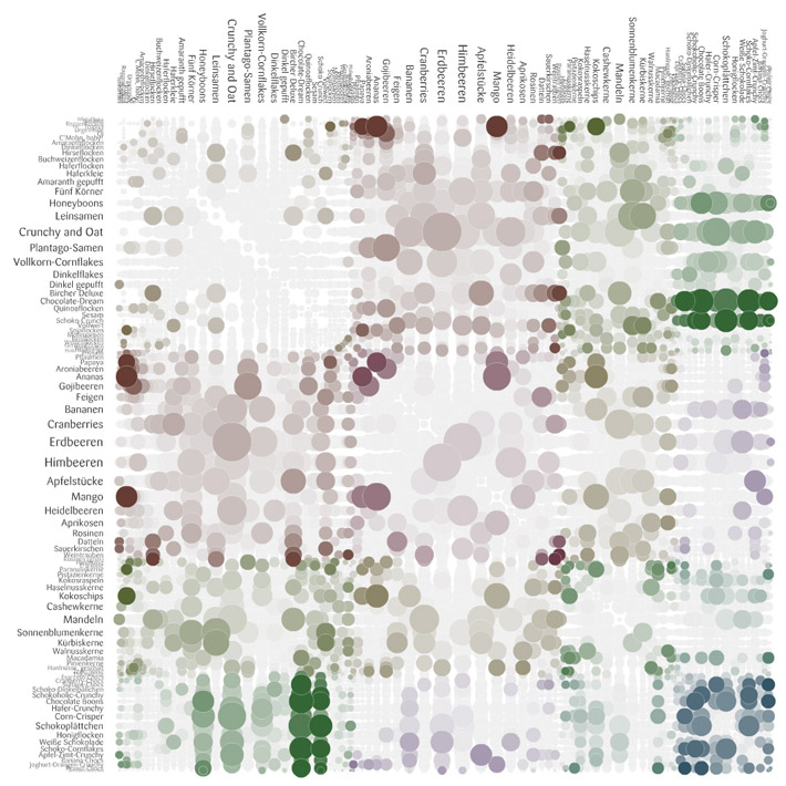
Moritz Stefaner showed his designs for the recent meusli project; he chose the chord diagram over the possibly-more revealing matrix design because the matrix doesn't look "tasty" and "meusli shouldn't look like fungi."

Stefaner's rejected "fungi" visual of muesli

Moritz was also very thoughtful in his explanation of why they deliberately avoided axes labels and the addition of the purely ornamental role of the particles in the Max Planck Research Networks.

A slightly random aside about one of Moritz's projects with Nand.io -- but if like me you wondered what that floating mill on the River Tyne looks like:

Tyne Floating Mill (Source of stats for the beautiful Tyne Flowmill visualization)

And here's a snap from the beautiful Tyne Flowmill project image archive:

Tyne Flowmill visualization details


You can find this same vein of honesty about process (and failures on the way) in the excellent and often funny Chartsnthings blog of the NYT Graphics team process, run by Kevin Quealey (@KevinQ).  Kevin was there too and took the news of my crush on Amanda much better than she did.  I was told that the NYT has no budget for travel -- yet there was a sizable contingent from their Research Labs and the Graphics Team.  I guess that's the best indicator of a conference that's a successful destination event:  People will pay their own way to attend.

Tool Use


Repeating yet again, I got really interested in that process stuff.  So, here are some of the sketching/intermediate tools used before the final versions that I heard or inferred:

  • Hand-written calculations and paper highlights (Stefanie Posavec)
  • Java (Martin Wattenberg and Fernanda Viegas) 
  • Processing and MySQL, pdf exported into Illustrator and InDesign (Felton)
  • Tableau and Excel and Gephi and Processing and Photoshop (Moritz Stefaner)
  • R (Amanda Cox) [I know this from the Chartsnthings blog and a previous talk; although the NYT Graphics team uses many other visual design and development tools as a group]
  • Processing (Ben Fry, Wes Grubbs, Jer Thorp)
  • Dat.GUI (Koblin)

Did I miss any, anyone know?


Worthwhile Career Risks


It's risky enough to be an independent consultant these days without sophisticated insurance, but it's even riskier to try to do artistic information visualization that is stays honest and solidly grounded in the data -- there are only so many gigs with Wired or GE or Popular Science out there. The people I admire seem to have them pretty well covered. Getting a business informatics gig is a lot easier, given the millions of startups and companies rolling in data right now.

"Here Are Some Words; We Hope You Find Something (and if you do, would you mind tweeting about it)" (Amanda Cox)

Even more risky is trying to limit your work to visualizing "data for good," the motto of Periscopic (represented at the conference by Kim Rees (@krees) and Dino Citraro), echoed by Jake Porway with his new DataKind project and Code for America,  represented by the very articulate Jennifer Pahlka. As Jer Thorp asked of the panel he organized, "How do you do this kind of socially conscious work, and still pay rent in New York?"

Luckily we're not all in NYC, but the same question holds in some form for most independents: turning down work based on ethical questions about the client or the data message is a luxury not all of us can afford. When "brands" come knocking, it's tough to say no, especially if they're rich and you're not.  Jake, at least, suggested a path to being involved as a part-time volunteer (see his "I'm a data scientist" signup page). Incidentally, Porway's example of a visualization that "does good" was the animated timeline that illustrated the spread of London Riot rumors--and their corrections--from the Guardian:

London Riot Rumors on Twitter from the Guardian

I found this theme of "doing good with data" an inspiring reminder, and I'm glad to see it playing a part in this kind of high-touch, high-concept conference. Enormous thanks to the organizers for this, and to the Ford Foundation sponsorship for enabling them.

Insecurity Admitted, Hilariously (and Inspiringly)


Why were so many of the speakers so funny?  No one is funny at academic conferences, unless they've had a lot to drink and you're no threat to their tenure process.  Robert Hodgin (@flight404) is basically an artistic standup comedian. Or a comedian who does digital art, I'm not sure. And he's like that every time I see him, with whatever material, so it's not like this was super-practiced.

I almost hurt myself laughing when Jer Thorp described some of the weirder Avengers from his massive comic collection (Whizzer, Starfox who "stimulates the pleasure centers of the brain" and was therefore brought up on charges for sexual harassment at one point?!).
Google "pugs in costume," it'll change your life. (Wes Grubbs)

And you too can enjoy Ben Fry's recap of the critic who accused him of having a Degree in Useless Plots from Superficial Analysis School in his "I Think Somebody Needs a Hug" post.  But I'm still waiting for the post of the very funny Famous Writers drinking saga by Ben's colleague at Fathom.

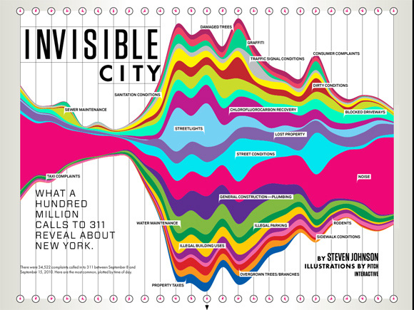
There was a lot of wry humility, too -- Wes Grubbs recounted how proud they were of the spread of their Wired piece for 311 calls, and then found out that it was in an issue with cleavage on the front.  Regardless, Tim O'Reilly used it in a TedX talk and it got a slot in the MOMA Talk To Me exhibit, so I think it had legs even without the cover boobs.


Pitch Interactive for Wired


Speaking of humility, a few days after the conference, Robert Hodgin posted his astounding talk code on Github with an awesome, hilarious, apologetic README that should be required reading for anyone trying to learn creative coding without a computer science degree:

I recognize that I can make some great looking work, and I am proud of this fact. But as soon as I am engaged in a code-related conversation with someone who knows C++, someone who knows proper code design, someone who knows how to explain the difference between a pointer and a reference, someone who polymorphs without hesitation, the bloom falls from the rose and I end up looking like an idiot. Or even worse, a fraud.

If Robert Hodgin and Jer Thorp can feel like hacks or frauds, then maybe it's okay if I have imposter syndrome too; and if I want to make an interactive vis project of Avengers' penis sizes for charity, I should probably just own that desire and run with it.  And if you made it this far and now you don't want to hire me for anything, so be it! Everyone needs to pursue their dreams.

Sunday, May 13, 2012

My Most Influential One Pixel Line


I thought I'd contribute one story to the "telling stories with data" genre, even if it's a silly one. It's silly 'cuz it features such a silly graph, which I shoved into an appendix of a presentation for a client a few years ago. Here's an anonymized version:


I put that animation with the arrow in there on purpose, because when I presented it, I had to point out the skinny line on the top. More graphs than you'd expect come with a "performance" part and in some contexts, I think this is just fine. Afterwards, one exec at the company referred to it often as "that chart with the one pixel line." (Okay, technically it had about 2 or 3 pixels. Not as punchy if you refer to it as "that chart with the 3 pixel line" or "that chart with the thin red line.")

I'm sure there are other, better, ways to present this red-and-orange tower. The point is: It was remembered. It had an impact. This graph led to more graphs being created! Roughly, we saw these steps:

  1. Acknowledged and admitted: The one pixel red line was considered to be a problem (or rather, the un-analyzed orange bar was).
  2. More descriptive graphs were made: This is key &emdash; an influential graph/chart always leads to more data investigation, with more graphs. Describe the size of the problem, delve further. The giant orange segment was tackled: How could it be made manageable? What patterns existed inside it?
  3. Sensemaking/iterpretation: What could we do, what couldn't we do? What should we prioritize or safely ignore? What tools were needed? Who owned what parts of this orange bar?
  4. Data tools sprouted: A series of ad hoc and then longer term tools were built: Excel reports with perl/python/VBA, then a Flex tool for intermediate data dives, then a dashboard in Flex for tracking larger picture trends.

Do It Well, and Do It "In-House"

It's an old analytics saw that you can't improve what you don't measure. Well, I think you won't improve what you don't measure meaningfully and then pay attention to. The client had collected the data, but then did nothing with it, because no one had made understanding it a priority. Data for data's sake is pointless and will be ignored. At the time of my one-pixel bar, an analytics cheerleader in the company described our primary data system as "buggy, opaque, brittle, esoteric, confusing." I'd add, "understaffed," and as a result of all that, usually ignored, which is how the one pixel red line came to be.

We took a brief detour in which we considered "outsourcing" the data problem to another company to do the top-level reporting for us, but our (mostly my) investigations suggested we couldn't do the fine-grained, raw-to-dashboard (ETL) reporting and analysis we needed without owning the entire pipeline ourselves. Because in all these organizational, data-driven settings, the reasoning goes like this:

  • What's going on? Now, and as a result of previous behaviors/changes. Do we have the right data? Trends, alerts, important KPIs.
  • Why is that going on? Drill in. Question if we have the right data and instruments to diagnose. A deep dive occurs, often all the way back to RAW data. This is normal! And this is necessary.
  • How might we change the bad things? This is a complicated question, never simple and often not just quantitative. This is where the profound thinking happens, when the cross-disciplinary methods and teams pull together to interpret and chop data. Sense-making and interpretation require lots of checks on data, reasoning, and context.

Cross-Disciplinary Success

Our ultimate data team was a cross-company, somewhat ad hoc group of people who cared about the same thing, but didn't report together anywhere: Customer Support, UI development management, directors of development and the API team, a couple of database gurus. Oh yeah, let's not forget the database gurus: I couldn't have even made that bar chart without badgering the database guys for info on their tables, so I could do some SQL on it.

In a year, we had achieved measurable significant improvements, via that cross-disciplinary team, and without out-sourcing our important data in any way. The short-term tools paid off almost immediately, and I hope the long-term ones are still evolving. One of the team members won an award for the tool he developed for exploring important raw data (and I did contribute to the design). None of this was done under official reporting structures. But the organization was flexible enough to support the networking, collaboration, and skills needed.

I Did Other Stuff, Too...

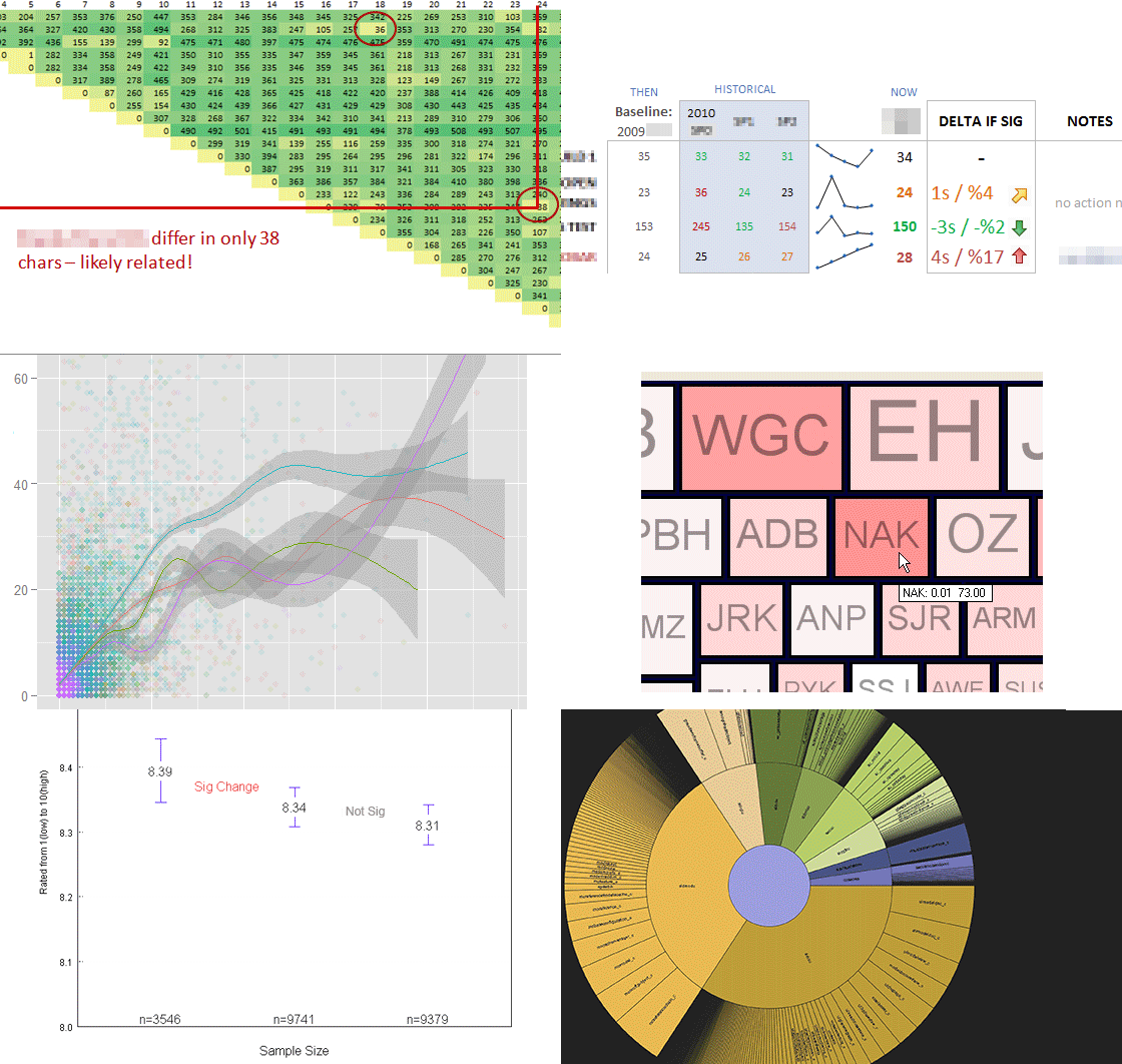
Since that graph is so silly, here's a little montage of other exploratory data and design work I did while I was with that client. Lots of tools were involved, from R to Tableau to Flex to Python to Excel to Illustrator. Vive la toolset!