Saturday, December 06, 2008

My (Renewed) Love Affair With Amazon: Video and Kindle Books

I remember when people sniffed at the idea of Amazon being more than books. When Jeff Bezos reinvested all his profit into opening up other shops, people said, "Diluting the brand?" and other naive things--I might have been one of them.

This week, I looked at my credit card statement and realized they were getting a bunch of my money. More than the usual regular book purchases for work and play. And I wasn't unhappy about it. I had a warm glow when I reviewed my charges for movies and other digital downloads. Amazon has become my main digital content provider. Other people are buying from iTunes more, but I'm a movie/TV/book girl, and Amazon has me covered right now!

I got two pieces of gadgetry this year that reinvigorated my love affair. The first is the Tivo Series 3 (HD), gotten in expanded and discounted form from WeaKnees.com. (Another highly recommended company with good service, by the way!) As you may know, I was a TiVo UI designer way back whenever (version 2) and still own stock and love for most things TiVo. The Series 3 works nicely with my Verizon FIOS which feeds me good bandwidth and HD TV.

Back to Amazon. The other day my cat unplugged one of my TiVos and I missed an episode of Chuck. Remember the days of looking for friends who recorded stuff? I could've found it online in various ways for free, but it was convenient to just browse for it on Amazon Unbox via the TiVo, from my couch, and order that missing episode just like that. Worth the $2 for savings for my time and hassle.
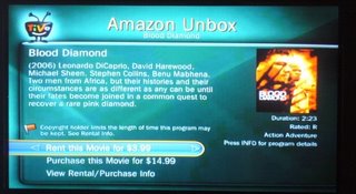
Early in the year, I cancelled my Netflix subscription which I was never using, because of Amazon Unbox. I don't want to watch video on my PC, either. Now that Netflix and TiVo finally get their act together on streaming, I'll probably check that out over the holidays and see what it's like in terms of content amount and quality of streaming experience.

Gadget Two: This year I also got the Kindle, Amazon's ebook reader. In a year in which I got a new GPS, a Wii, an Ipod Touch, an eeePC, a new laptop from Dell, and a treadmill - this is hands-down my favorite new toy. Especially since I did a lot of international travel this year. I love that I can bump up the font, and read it in bed one-handed. The physical industrial design has gotten a lot of internet flack, but it does what it needs to do just fine. The book and blog experience are terrific, especially for fiction and feeds without too many pictures and long articles. (Pictures don't render fast or well on the b&w e-ink display.)

A typical Kindle set of experiences, which I can personally vouch for:

  • A list of Best Books of 2008 from Amazon editors' top picks -- I'm not so convinced by some of the capsule reviews, but hey, I'll send free initial chapters to my Kindle to check out! In a couple clicks, I've got 8 books to try out.
  • I read and like the first few chapters of one, so when I get to the last Kindle page, I click on "Order this book now." It checks that I'm not making a mistaken click, I confirm, and it downloads in seconds. Hooray! No regrets.
  • Make to Stick keeps getting good press among recent business books. I'm not willing to take up room on my increasingly groaning shelves if I can get this by Kindle - and yep, I can! Sample checks out as actually interesting, I can now read it as one of my background non-fic reads.
  • A friend recommended the Dresden Files books; earlier this fall I got hooked on the bad but addictive Twilight series. These literary wonders-- and more importantly, their sequels-- can be had by Kindle without driving to a store or waiting for mail to come. One click from a late night bed and I can keep reading.
  • I owned The Diamond Age in paper form but did get around to reading it. It's long and the font is small. You know what -- I read it by Kindle instead, since the font can be jacked up to a more reasonable size and carrying it doesn't require muscles. I also own the wonderful Jonathan Strange and Mr Norrell in hardcover, all 1000 pages of it. I will not have to carry THAT around again, I'll be able to read it on the Kindle next time. Er, no, it seems I can't yet - so I'm clicking that link on the left side of the page requesting it be made available by Kindle format. Same for Foucault's Pendulum!
  • I can't keep up with long blogs, or most blogs anymore. But I sure can read Cognitive Daily and MIT Tech Review and a few others by Kindle, when I have a spare minute for the short stuff.
  • Cory Doctorow and a number of other writers are making free ebooks available for their stuff. Cory's "Little Brother" got raves this year. I loaded it on my Kindle by USB cable.
  • Fanfiction - in a moment of weakness on a business trip, I started reading fanfic again, after a few years off. I can send PDF's and Word docs to my personal Kindle address, without having to even plug it into my computer. Yeah, I suppose you could use that feature for something worklike, too. It's unfortunately convenient. There is a LiveJournal community all about this fanfic-on-Kindle habit.
  • I like switching between genres and books and being able to bookmark pages, save clippings for later blogging, etc. I used the "lookup word" function a ridiculous number of times while reading The Diamond Age. It was all that Victorian English.
  • I don't love the web browser "experimental" functionality - it's slow by phone WhisperNet, but it will do in a pinch! I can read my twitter feed on it. I once settled a discussion of what the male version of "ballerina" is using my Kindle from a wireless-free zone of Northern Maine on a bird watching trip.
  • Tom Disch, a poet I liked reading on LiveJournal, killed himself this year. In a sad weekend, I copied and saved all his journal poems into a Word document and loaded it onto my Kindle. Now I can kind of keep him around.
  • Free ebooks... Manybooks is one site, and if you load this Feedbooks guide, when you click on any of the contained book title links, it will automatically download the whole thing to your Kindle. I got myself a bunch of old Rafael Sabatini adventure novels for one trip this way.

I could go on. The Kindle has something to do with me starting to read a lot again, like I used to as a kid. There are some minor negatives, like slow page turning (I would NOT use it for holding reference books), but nothing that overwhelms the good. I still order paper books, and always will; but I have a house busting at the seams with bookcases, and carrying them around isn't always convenient.

The combination of a very long battery life, and small form factor, WhisperNet with excellent Amazon shop experience and sample chapters, make the Kindle way more than the piece of white plastic a lot of people dismiss rather easily. I wouldn't get a Kindle if you expect great web connectivity, a multi-app computer experience, or a backlight... but get it if you read a lot of popular books, and especially if you travel a lot.

In sum, Amazon can take my money, for books and movies. Thanks, Amazon!

Friday, November 28, 2008

Jobs for a Stressed Economy: Smashing Stuff, and Psychics

What do you do when you're stressed? You can pay to throw things, at Sarah's SmashShack in San Diego. Sarah's site says you can come alone or in groups, and throw crockery and other nice breakables in her special smashing rooms. Along with whatever soundtrack you prefer.
Celebrate that break up...good riddance! Celebrate dumping that job you hated anyway! Celebrate that promotion you darn well deserved! You can write on the things you break -- we've got lots of markers for you to use. ... We don't use any "weapons" here...no hammers, sledgehammers, baseball bats, golf clubs, flame throwers (come on!), bb guns, etc. It's all YOU.
According to one article, business is really great right now, since people are understandably super stressed by the economy.

The "menu" is kind of - funny while still a little disturbing? smash shack menu excerpt

Women seem to have written the bulk of the testimonials. I find this rather interesting.

"The best cathartic release around (besides bashing a pole w/a bat). Peaceful angry destruction is very centering. :)" ...Vanessa

"I was a little trepidatious at first, but I loved it! I especially loved writing things on the plates and smashing the bad things. Terrific stress-relief for this stress-filled stay-at-home mom." ...Rachel R

Sarah is clearly a business genius. In another booming business, psychics are doing very well, and more and more men in business are using them, according to this NYT article: "Love, Jobs, and 401k's."

“Your mortgage agents, your realtors, your bankers, you can’t go to these people anymore,” said Tori Hartman, a psychic in Los Angeles. “...People are sensing that the traditional avenues have not worked, that all of a sudden this so-called security that they’ve built up isn’t there anymore. They come to a psychic for a different perspective.” ... Their clients, who include a growing number of men, are often professional advice-givers themselves, in fields like real estate and investments, and they typically hand over anywhere from $75 to $1,000 an hour for this form of insight.

“My Web traffic is up and up and up,” said Aurora Tower, a New Yorker who constructs spidery star charts for her growing clientele. “People will entertain the irrational when what they consider rational collapses.”

The fellow who runs LivePerson.com, a very cool site offering person-to-person consulting on any number of subjects, tracks the rise in his psychic experts' business against the economy. LivePerson.com offers technology and business consultants, home repair consultants, almost anything, and yet...

Live Person earned revenues of $30 million this year, about 70 percent derived from spiritual readers, Mr. LoCasio said. "In this day and age, a spiritual guide is an everyday therapist — that’s what the business has become," he said.

That's what good business sense is all about - staying tuned into what people will still pay for when times are tough. Or, in the case of smashing crockery, offer them things they didn't even know they wanted and could pay for!

Tuesday, November 18, 2008

Women in Computer Science and Tech Jobs: It's Getting Worse

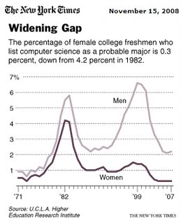
Two recent reports of women in tech careers that are not encouraging. First a link to a NY Times article, "What Has Driven Women Out of Computer Science?" (Thanks to @joandimicco from IBM Research for the link via twitter!) Women have actively declined in computer science programs over the last few years, shown in their chart: Women in other technical and engineering disciplines have increased, but not computer science. Why not? The article recaps theories including lack of computer games for women; "nerds" not being who girls want to be (hey, Willow on Buffy and Mac on Veronica Mars made girl nerds look just fine, if you ask me); and women going into interface design rather than programming - via other college programs rather than computer science. And a possible perception that there aren't jobs for women who major in computer science.

The Stanford Clayman Institute for Gender Research recently published the report "Climbing the Technical Ladder: Obstacles and Solutions for Mid-Level Women in Technology," based on study of Silicon Valley companies. The findings aren't unsurprising for any woman who's been working in computer companies for the last 10 years, even outside Silicon Valley. Some of the observations that rang true for me:

  • "Women are more likely than men to perceive workplace culture as competitive. They do not see their workplaces as true meritocracies; rather, they see cultures that require connections to power and influence in order to advance."
  • "Consistent with prevailing gender stereotypes about women’s abilities, women in management positions are perceived as less technically competent than are their male counterparts. This can create an environment where women are viewed (and can view themselves) as “not fitting in” with the company culture."
  • "Survey results show that mid-level men and women strongly value teamwork. Further, men and women perceive that collaboration is key to success in technology. However, mid-level women see a sharp divide between cooperation and competition at their companies. Mid-level women describe this gap as being especially acute during the promotion-review process, where they find existing promotion and evaluation practices reward competition instead of collaboration."
  • "Mid-level women are more likely than mid-level men to suffer poor health as a result of work demands."
  • Family responsibilities remain a significant problem for women - staying late and flex-time are necessary and often difficult for women to arrange. Women are far less likely to have a partner at home who can manage the family life for them than men are. Men also perceive a "family penalty" in the competitive workplace.
One of the recommendations is to provide opportunity for ongoing technical for all mid-level staff, to allow men and women to retain and sharpen their technical skills, and as a side-effect, give them more networking opportunities. I would agree whole-heartedly; most companies don't invest enough in ongoing skills maintenance and new skill development, for male or female staff. (As a consultant, I'm responsible for my own development, and I've found it amazingly liberating not to have to ask if I can take a course or go to a conference!)

And then there's the supposedly obvious, but rarely acted on: Provide a workplace that shows it values teamwork, rather than competition (most company performance evals and bonuses are handled competitively). Cultivate a workplace with flextime and reasonable hours. Have a diverse executive staff and board (not just a female VP of HR), to signal respect for diversity and also help change the culture from the top down.

At a lot of companies where I've worked, it was well-known at the mid- and sometimes ground level that executives didn't "get along," that there were power games and competitions rather than cooperation and teamwork at higher levels in the company; that long hours were an unspoken rule for success on impossibly demanding jobs.

Most of the time, I just think women are smarter in opting out of the whole tech management game. So why is there any mystery about lack of women in technical management? And in computer science departments?

Sunday, October 26, 2008

UI13 and "Don't Build a Department" for Design

UIE's UI13 conference was fun, even for a volunteer up at 5am every day. A few of the talks really got the adrenaline flowing, including Peter Merholz's "16 (Mostly) Difficult Steps to Becoming a Customer-Experience-Based Organization", and Scott Berkun's talk on "Why Designers Fail".

Merholz's talk outlined a number of points describing successful user experience orgs, including some wise ones I've heard in other similar talks:

  • Execute a quick win [to show your value to the company].
  • Have an executive sponsor.
  • Move up the product planning food chain [i.e., be involved earlier, not just down stream].
  • Have an experience strategy [for the company/products/team].
  • Think systems, not artifacts [a point also made in a recent talk by Don Norman on operations and services, over here].

His final bullet was the admittedly controversial: "Do not become a department." I thought I heard similar sentiments from Jared Spool too, and I have heard this in different flavors from people who cite Amazon's success in building a business based on A/B volume testing of page designs by marketers without usability or interface designers on staff ("let the customers just tell us which one works"), ebay's early success without an empowered design org, etc. The gist of this argument seems to be: Executive mandate for good user experience trumps individuals in the trenches, and good execution requires everyone to play, not just designers. So, have a design-oriented company, not a bunch of designers trying to change a company.

While I agree we want holistic design-oriented companies for better customer experience, I think designers play an important role, if good design matters. Anything that requires skill, training, and practice to do well should be a job in itself, and therefore be a hired position, not a sideline role for someone who is paid to do something else.

Additionally, if you're talking about companies that succeeded despite not having a staff of interaction designers, you might be talking about companies that (1) might have done it faster or more cheaply WITH a staff of designers, or (2) had talented people who were doing design without that job title - have they checked into how they succeeded?, or (3) companies that won as first movers, but could lose in a crowded space with better design and real usability from their competitors. Yes, design isn't the whole story in business success, but it's often important, depending on the competition. And to me it's a moral requirement for a customer-oriented business.

Scott Berkun's pre-conference survey on reasons for designer failure found that the top 2 reasons were agreed to be "People in non-design roles [are] making design decisions," and the related and subsumed "Managers [are] making design decisions without design training." I believe that if you haven't got a strong design department with a recognized skillset and/or haven't empowered your designers in the org, you'll get a committee effect, and design outputs will be worse as a result. (See also Scott's excellent article "The List of Reasons Why Ease of Use Doesn't Happen on Engineering Projects.") Berkun's audience of designers, managers, project managers, and developers also seems to believe this, contrary to Merholz's last point. (Caveat: It's possible that Merholz's position was "hire designers but don't have them grouped in a department, have them spread throughout the company." But a department makes it possible to argue for headcount, achieve hiring and management consistency, enable organizational empowerment, and accountability; NOT having a department makes these things harder and really kind of a crapshoot long-term.)

Another broad theme of many of the UI13 talks was the importance of the strategic role of design in defining the right projects and requirements before design processes start in earnest. While it was valuable to see how many consultants and design agencies do this--often playing a "facilitation" role with their clients' ideas--the reality of most software companies is that product managers (or their equivalent) are making these decisions, and designers live further downstream. The ideal is otherwise, but that's how it often is.

Sunday, October 05, 2008

Pixar on Successful Creative Teams

I've seen this on a number of sites now, but it's rich enough to keep passing on. Requiring payment from HBR, the article is How Pixar Fosters Collective Creativity, by Ed Catmull. Some of his points are business management truisms or even cliches, but as with most management-related things, it's not the concept that's tough, it's execution that's tough. Especially in a creative environment.

On People. Most of his points here are about handling diversity and collecting lots of input from lots of sources. Less dictatorial hierarchy, more feedback and empowerment of teams to decide how to handle the feedback. Some good quotes:

  • "If you want to be original, you have to accept the uncertainty, even when it’s uncomfortable, and have the capability to recover when your organization takes a big risk and fails. What’s the key to being able to recover? Talented people!"
  • Creativity isn't about finding one big good idea. "However, in film making and many other kinds of complex product development, creativity involves a large number of people from different disciplines working effectively together to solve a great many problems."
  • And yet, talent isn't evenly distributed, he acknowledges. But this does not mean anyone tells anyone else what to do - a creative team gets input and makes its own decisions about what to do with it. A "brain trust" of the truly excellent people with track records can be called on for input when teams need help, but they don't dictate anything. Ironically, this frees everyone up to talk and listen more effectively.
  • Having talent on staff isn't enough. "What’s equally tough, of course, is getting talented people to work effectively with one another.That takes trust and respect, which we as managers can’t mandate; they must be earned over time." If people trust each other, they can be less polite in meetings, apparently. Ideas are under discussion, not personal status and power.
  • "An important lesson about the primacy of people over ideas: If you give a good idea to a mediocre team, they will screw it up; if you give a mediocre idea to a great team, they will either fix it or throw it away and come up with something that works." I note, they can only do the latter if they are given the freedom and authority to do something radical.
  • Pixar's "small incubation teams" that consist of a director, a writer, an artist, and storyboard folks. Whereas in my experience most software incubation project teams are weak on the creative staffing and very heavy on the implementation side, not a good balance of skills for the stages of creation.
  • It's critical for an incubation team to function well internally: "During this incubation stage, you can’t judge teams by the material they’re producing because it’s so rough—there are many problems and open questions. But you can assess whether the teams’ social dynamics are healthy and whether the teams are solving problems and making progress. Both the senior management and the development department are responsible for seeing to it that the teams function well." I note: presumably there are non-subjective, non-gossipy ways to evaluate social dynamics. I've seen this rhetoric applied to very bad ends at one company.
  • Catmull says, "Treating one another as peers is just as important as getting people within disciplines to do so. But it’s much harder. Barriers include the natural class structures that arise in organizations: There always seems to be one function that considers itself and is perceived by others to be the one the organization values the most." Overcoming that is a huge management and process challenge... Catmull seems to be saying that time together helps, but I think the deliberate creation of well-rounded incubation teams is a big aid in changing these biases. None of this "we'll add a user interface designer later" stuff, like you hear from the software company incubation teams!
  • Newcomers to an organization can be threatening, because of the "not invented here" syndrome that they may cause with their new ideas. But constant change, not taking success for granted, and acknowledgment of mistakes made can make newcomers less threatening to current employees, he says.

On Processes. So they've got a good staff who encompass both technical and creative backgrounds, now how do they keep it all working and on track?

  • Dailies are watched, by lots of people (the animation industry version of footage of the day). Sharing unfinished work and inviting comment helps creatives get over the fear of showing the incomplete, and that in turn means work isn't wasted if it's on the wrong track. I note, a healthy culture of regular software design critique does not exist in most software companies (barriers to this are a political subject for another time). Agile development processes seem to be better off in this regard than waterfall-like models of development: producing and showing in-progress work is critical in that methodology.
  • Input on work-in-progress is collected widely, because the work needs to be great before release to the real world. TiVo executed on this principle when I worked there, too; employees all used the beta software at home and we had to like it, too.
  • Post-mortems are done regularly. Rather than just "what went well and what didn't go well," his suggestions include having groups list the top 5 things they'd do again, and the top 5 they wouldn't do again. Now, in a creative environment, people often assume that you can't evaluate the creative process. But Pixar uses data to ground the post-mortems (making me wonder how they track it, who does the analysis, etc). "Most of our processes involve activities and deliverables that can be quantified. We keep track of the rates at which things happen, how often something has to be reworked, whether a piece of work was completely finished or not when it was sent to another department, and so on. Data can show things in a neutral way, which can stimulate discussion and challenge assumptions arising from personal impressions." The fact of being "neutral" prior to interpretation is important, from my perspective. Using data in a post-mortem shouldn't lead to finger-pointing so much as conversation about root causes for data peaks and valleys.
  • Management challenge for their corporate processes: "Clear values, constant communication [across and around hierarchy], routine postmortems, and the regular injection of outsiders who will challenge the status quo aren’t enough. Strong leadership is also essential—to make sure people don’t pay lip service to the values, tune out the communications, game the processes, and automatically discount newcomers’ observations and suggestions." And I say: Easier to say than to execute. Leadership is so rarely evaluated well, at any company.
  • Catmull says they keep up with academic research. Being cutting edge means staying on the bleeding edge, and being able to attract people who want to work on that edge, too. Why do so many companies sneer at research and research conferences?

It's a good article, and I think worth the $6 cost. It does leave a few questions I had unanswered, like how they handled the massive overtime and repetitive stress injuries he describes during one "failure recovery" period.

As a final point, something I've said here before: Post mortems may be unpleasant, but understanding how a team was successful is just as important, or more so, than understanding how it made mistakes. I don't think most companies use the positive particularly well in setting up their downstream teams. I think Pixar probably does, to have such a string of successes.

Thursday, October 02, 2008

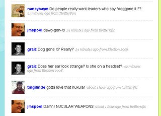
My Twitter on the VP Debate

I couldn't watch it all, and made a mistake in not having my twitter in front of me while I did. But here's, in a glance, a big reason I love twitter. There's a slim chance that 2 of these people know each other, but I don't think the others do, although I bet they'd like each other if they met. (Assuming they won't mind: tingilinde whom I know from Bell Labs/AT&T, Nancy Baym from grad school mentorship days, Jared Spool from being, well, Jared, and Greg Raiz, a colleague from Boston.)

Monday, September 29, 2008

Otters in the Peak District

Otters at the Chestnut Centre for Otters and Owls, in the Peak District, UK:

Saturday, September 06, 2008

Task Failure in a Digital Frame Design

I shouldn't look a gift digital frame in the interface, but it contributed to a badly spent Labor Day, so I will: the Philips 7FF2M4. In February I posted a link to David Pogue's review of other digital frame designs that mostly got it all wrong; consider this a detailed sequel from yours truly.

This frame is not wifi or bluetooth enabled - so no home networking to connect to etc. Good, because I don't leave my PC with my photos on all the time. And I wanted to take this to the office. My gift-giver kindly included a 2GB card with it, too. My naive, starting assumptions for how this works, without having looked into digital frames much previously:

  1. I will be able to put photos on the card, or use one from a camera as is
  2. I will put it in the slot on the frame
  3. It will play a slideshow of all the pictures on the card.

The end. I expected to stick in the card and have it cycle through them, maybe with a nice dissolve between them. That's the task that I'd assume as designer, and design to support. But the difficulty for consumer electronics design seems to be keeping the product focused on the core task, and not getting lost in the options possible to throw in there. (I think most of these companies don't have UI designers on staff, honestly. Apple taught us about the importance of industrial design, but the UI part didn't come across so clearly to the world.)

Physically it's a nice frame, with a solid plugin foot that's heavy enough to hurt someone. I think it's a 7x5" display, although that's a bit vague on the box. It claims to do auto-rotation, to landscape or horizontal, which is nice - I remember that my smarter cameras know to rotate pics, but not all do, so my cards from my cameras might not work well "as is." Okay, I'm not averse to dragging pics onto the card from a computer.

Which I do, and then stick it in the frame. It does not play anything automatically except its own menu - and when I find the slideshow button (I do like the physical controls on the back) I try to play it. But it plays some generic Philips ads, not my pictures. What?

It turns out that you have to navigate through a menu to reach your card, and then into the directory on the card itself, and then it gets really complicated - you get the option of making "albums" there and other things. It's hard to get it to play a damned slide show! (Or find your pics, if you aren't familiar with your directory structure on your camera card.)

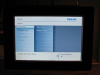
Eventually I managed to get an album and get a slideshow to play (you can see my abortive attempts called "1" and "Empty" and "Excerpted" above; my path involved debugging my card's directory issues with their provided software for creating "albums" on my card or frame, which I don't get much benefit from, I just want to play the contents of the directory!). The slideshow has some oddities; it has bad transitions, and a weird too-many-pictures-at-once display mode. It turns out this is a "collage" option on by default, which squeezes in 6 pictures into the 5x7" frame size, way too many for them to look good. You'll also notice it regularly uses two of the same one, an odd programming choice (is it meant to look good that way?):

I find the settings to choose another collage and it sure has a lot of them. Sheesh. The only one I really would consider using in a small frame size is 2-up, a split screen of 2 images, and that setting is NOT offered.

But then, there are lots and lots of settings...

But the kicker is this: None of my choices stick. When I power down and restart it next morning, it's back to playing the Philips internal frame memory, and using a collage of 5 pictures. What the heck? With all those menus to go through, it requires some real work to get it into a state without too much setup time. I managed to erase the Philips frame pictures so when I hit slideshow it finds mine, but have not figured out how to get it to remember the collage style I prefer.

I realize the market is crowded with digital frames, but I suspect we are not really ready for complex feature wars yet. Ease of use out of the box seems like the most important aspect here. The task of playing photos (with simple defaults - dissolve and no collage mode, remember last directory played from) is not rocket science. Okay, there may be some clever design required for cases with multiple directories of photos embedded in a frame, but some code that FINDS THE PHOTOS instead of requiring the user to navigate through strange DCAM directories would seem doable. A very simple startup option in the case of multiple directories would seem doable too - which one do you want to play now? Let's assume for jollies that it's probably the card contents that should be the default, not the internal frame's limited memory.

    There are multiple photo directories. What do you want to see?
  • Play all my CARD photos (280 photos, Jan 2008)
  • Play CARD DIR1 (245 photos, 15 Jan 2008)
  • Play CARD DIR2 (35 photos, 16 Jan 2008)
  • Play FRAME photos (4 photos, 7 Jun 2007)

It wouldn't surface multiple card directories if they were just the automatic camera directories, only if they were made by a user in a non-camera manner. So the simplest case is just look for images and play them - card first. They can keep their buttons for getting to more interesting settings if they want, but any of that is advanced gravy. Plus, remember the damned last power-on choice! How often do I want to be fiddling with this thing? (Not ever.)

One Philips frame review at CNET says the next model is an improvement for ease of use.

Our biggest complaint about the 7FF was that the unit wasn't a little more intuitive to navigate right out of the box. Although it didn't take us that long to figure things out, the unit's internal GUI (graphical user interface) could have been a little more user-friendly. Philips seems to have gone out of its way to fix that problem in this next-generation model with a totally redesigned interface.

I sure hope so. I admit I doubt they get as close as my suggestion above... but I'd be pleasantly surprised if so.

Saturday, August 30, 2008

Google Earth: Stone Circles, Crop Circles, White Horses

Whilst planning a trip to the UK, I turned on satellite view to find myself a nice green village in the midlands for an overnight - and spotted the remains of a hill fort or stone age earthworks in a field. Nice!

I poked around and found this cool site, GoogleSightSeeing.com, tagline "Why bother seeing the world for real?" They have some nice references, although I find it slightly frustrating that they don't let you load the coordinates into Google Maps yourself from their site - maybe this is a Google Maps API UI issue, though?

Here's the White Horse of Uffington (about it here), a chalk horse on the hill near Uffington, not far from Oxford:


View Larger Map

Another chalk figure is at the Long Man of Wilmington, and in Mexico there is a surprisingly similar Juarez White Horse (I wonder if that one is a hoax).

The Alton Barnes one is from the 1800's and is kept in good modern horse condition:


View Larger Map

There are some fun crop circles, like the one near Doncaster (hey, I'll be quite close to this next month...):


View Larger Map

And here are more crop circles near the M1.

Stone circles don't all turn out so well... I'm disappointed that Avebury is hard to make out, and the Callanish stones in Lewis aren't very visible. Stonehenge is acceptable:


View Larger Map

Another circle in the Lake District is only visible as a ring on earth, at GoogleEarthHacks. I also enjoyed on that site the link to Peru's 13 Stone Towers, an observatory structure - but the massive earthwork remains to the upper left of it are much more impressive to inspect by air.

Ireland's passage graves are very visible, too. Here's Knowth, part of the amazing Boyne Valley collection of sites (where Newgrange is, with other stone age mysteries that are really worth a visit):

Not just for aerial tourism, of course - I was reminded of the folks who've used Google Earth/Maps to find new archaeological remains. A couple years ago, a computer programmer made some important Roman discoveries. Archaelogists are using Google Earth fairly regularly, and some recent Afghanistan sites are due to Google Earth usage by a Ph.D. student.

Sunday, August 10, 2008

Good UX from Happy Employees?

More on creating good user experience from good organizations: a short blog post by Adam Richardson at CNET entitled "Good user experience comes from good employee experience." He points out comments from airlines with happy employees who convey happiness to their customers, like SouthWest and JetBlue, as opposed to American and other airlines with rather surly, unhappy employees.

Over the years, whenever reporters would ask him the secret to Southwest's success, Mr. Kelleher had a stock response. "You have to treat your employees like customers," he told Fortune in 2001. "When you treat them right, then they will treat your outside customers right. That has been a powerful competitive weapon for us."...

"There isn't any customer satisfaction without employee satisfaction," said Gordon Bethune, the former chief executive of Continental Airlines, and an old friend of Mr. Kelleher's. "He recognized that good employee relations would affect the bottom line. He knew that having employees who wanted to do a good job would drive revenue and lower costs."

I've worked at more than my share of offices in the past dozen years, and I think there may be something in this. Watch out if you've got customer-facing employees who don't answer internal colleague emails, are rude or curt to peers in their organization, promise stuff but don't deliver, hold onto information for their own advancement rather than the sake of the team. You probably also have a customer relations problem at the very least. Is this person answering customer email or calls politely? Sharing customer problems with other people who can help? Looking for help in solving the problems that the customer has?

Then look at the tools your employees have to use... if you find crappy tools in use internally, then double check that this isn't exposed to customers in some form. The MathWorks has an internal usability group that works on design and development processes for corporate tools. I think it pays off in many ways, not all of them related to internal efficiency. It's a sign of respect for your staff to give them the best tools to work with.

If you hire well, trust your employees, and give them a reasonable job to do, they can be your strongest advocates for hiring, referrals, and posting nicely about you in their blogs! And they'll go the extra mile on the job. Besides, a lot of your employees, past and future, are customers too.

Sunday, August 03, 2008

Staffing for User Experience: What Can Go Wrong

You decided to hire a bunch of interaction designers and "user experience" people to improve your product, service, or general business from a customer-focused design perspective. You were lucky enough to find some experienced folks, who've proven their worth at other companies.

It may not be obvious, even if you hired evangelists to help convince the rest of the company of their value, how many ways you can still get it wrong AFTER the hiring. It takes more than headcount! Your new people need to be empowered to make a difference on the product. The issues below amount to (a) cultural and process openness around adding more design into the team software mix, (b) how the dynamics of decision making in your company can impact design for evil rather than improvement.

  1. Did you hire the right people? Let's assume you did, but a couple reminders here: Your biases and your interviewer biases may be some of the problem you are actually hoping to solve. Did you hire looking for collaborative people who get along with everyone (and cave in an argument, in order to preserve the peace?). Did you hire people who do evaluation of other people's designs, or did you hire designers? Did you hire GOOD designers? (Would you know how to evaluate their design skills?) What kind of power dynamics are going on with the interviewers you lined up: Are any of them threatened by the whole idea of outside new people influencing the product? Are they looking for "yes" people or new ideas? Remember they may say something quite different from what they really secretly feel after 3 beers.
  2. Does anyone other than development or product management get a say in how things turn out? How much will these expert new hires be heard? A development manager who is used to being in control may not like having to invite someone new to his planning meetings; a product manager may be unhappy if your new hire questions her market research based on usability data. How much of the time will your new staff be looking for data and ways to convince people to listen, versus actually making an impact on the product? If you had to hire evangelists, you're set up for this problem from the start - expect a lot less productive impact on the product from your new hires, and a lot more organizational time suckage.
  3. Do you have ugly cultural problems you don't know about: Prejudice against non-"technical" input, assumptions that women aren't as smart or good at software or technical decisions. Women are more likely in UX/design than they are in engineering jobs, even if they started in development positions. Check out the dynamics at the whiteboard here, a scene I've watched many times...
  4. Will other people take UX team work as optional input to modify, redo, ignore? Does someone else secretly want their job; not realize it's a separate real job in the process; or actually HAVE their job on the project. I've seen teams where two people were meant to be the customer design input, and didn't agree, and it led to time-wasting fights for the whole group around them, with people taking sides on issues and duplicate work being done. I've seen plenty of QA teams forgetting about the spec, developers not reading or forgetting about the details, and other errors of omission that prevent design from being fully effective.
  5. Do you have decision processes that are functional in your company - or do you regularly have meetings that bog down with "votes" or too many inputs, and open more issues than they close on a regular basis? This environment won't scale well to adding players especially in design discussions. (If your team is arguing with the designer about whether to use radio buttons or checkboxes, you have a dysfunctional decision process which means you are wasting resources and time.)
  6. Is there enough time in your shipping cycle to actually add design as a separate process? Not a trivial question to laugh off; mistakes made early, in requirements and design, are much easier to fix than anything after some code has been written, assuming you have processes in place to catch them before you get too far. This well-known fact doesn't make most companies happier to slow down. I think it has something to do with what's seen as "progress" and "work" in the development cycle, and the glorification of risk-taking that exists in so many software companies that have money to burn.
  7. Does your company regularly bite off bigger projects than it can deliver in a release cycle? These giant projects are unlikely to be high quality when they ship after all the cuts and compromises are made to squeeze them in. Partial functionality is usually worse than no functionality because your company looks like it just didn't get what the customers were asking for. No UX person can entirely save you from this, but a good one consulted and involved in the process from the start might keep you focused on the must-haves for minimal usefulness.
  8. Have you got project management to track team issues and milestones and make sure things aren't grinding down to a halt, or loaded with bugs and unresolved issues. Are they also concerned about tracking design stages, and blocks to those deliverables, rather than just safeguarding developer efforts? (Before you say "of course," maybe you should check with the designers.) These things can add up and make everyone less useful in the end; software is a team effort.
  9. What will you do with the designs your designers produce -- they can make mockups till the cows of management come home from their offsite, but that doesn't mean it's useful in your process.
  10. Do you have your new UX people spread too thinly to be effective -- with an average of 20 developers to one designer (who is shared over multiple projects), there will be a large number of meetings they miss; bugs they don't have time to provide input on; bugs they don't have time to file; builds or releases they didn't get to see closely enough to catch last minute errors; bug review sessions they weren't at to push for the usability/experience bugs; doc they didn't look at to see if it covers the main use cases and important details; customers they didn't have time to call or visit. And spec modifications they couldn't keep up to date. Their morale will suffer proportionally to the things they don't have time to do that decrease their effectiveness.
  11. Is the UX person involved early enough to be (a) able to influence the crucial early decisions (b) and to be a true team player in the project, rather than an end-game consultant check-mark on your process? It's often in an overloaded (dysfunctional) environment that the designer or usability specialist is involved only at the end of the cycle to "review" and "bless" things. If you're tired of hearing from your new hires that they didn't know something had been decided, or that they wish they'd been consulted earlier, then you've got this problem headed your way. Remember it's much harder to effect change after code is written! And they want to be able to make an impact, otherwise they will be wasting their skills.
There are lots of ways to miss, even with good staff. I've been in good teams and bad teams for design process, but seen a lot of these failure modes. I'm keeping score of how many companies have teams that argue with their designer about radio buttons versus checkboxes, wasting valuable time in their cycle. The stats aren't looking good. But if you take care of your processes and oversee design as a separate stage and responsibility, your company can be better than that.

Wordle on Ghostweather

Playing with Jonathan Feinberg's artistic tag cloud generator Wordle, I plugged myself in (of course) and got this one (this is the "ghostly" color scheme):

Randomness is a powerful toy in design - it helps you discover things you wouldn't have seen with a purely organized eye. It's inspirational. It's fun.

Sunday, July 27, 2008

Some Fun Entries in the Create the Future Design Contest

Now that the Create the Future Design Contest is open and collecting entries, it's time to point out some of the reasons I love this contest. Before I do, I should say that although I help with the site design and administration, I have nothing whatever to do with judging, which is done by a panel of engineering and research experts recruited by NASA Tech Briefs. And my opinions won't mean anything to them!

One thing that makes this contest fun are the wacky ideas - the napkin sketches, the weird diagrams, the mad scientist schemes. Some of them just sound funny at first, but are actually quite earnest. Take, for example, the "Thumbtack Remover." Or the "Personal Transport Pod" (I especially like the solar panels). (Be sure to check out the scheme for the "Personal Safety Belt" by the same inventor, which slightly resembles a super hero's costume.) And then there's the eSpider, a recyclables pre-sorter with a hand that looks like a spider.

Some of the entries have terrific images, rendered with high-end tools like Rhino and SolidWorks. Here's a student entry using Rhino to illustrate a convertible boat. Another student entry uses Rhino to diagram a medical self-diagnosis unit, called Sintomatico. And there's a student design for a vertical bike rack, using SolidWorks, which makes any design look very professional. Here's a part of a SolidWorks entry for an electromagnetic rail motor:

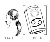
Some have surprising descriptions - this one for a breast exam device features a quote from a famous columnist that I didn't expect, but supports the case! This one is for handling hair-oil storage, which makes me flash back on Clooney's hair treatments in "O Brother." In another odd hair-related device, you've got to check out the Bowman, which I find hilarious. He submitted pdfs, so be sure to open them up! Bowman entry on www.CreateTheFutureContest.com Some also have funny names, like the A.T.E.A.M, for the "ANTI-TERRORIST ECM-AUDIO MECHANISM."

A few words about the site and contest: While we are showing page view counts, there is no prize for page views this year. It was too much trouble to police last year. I will probably review and reset them any case, to keep them more or less believable. Please check out the entries with fewer page views right now, they are very deserving of eyeballs. There will be some form of public rating mechanism in October for another popular vote prize - development resources willing. Finally, if you like the home page, the flash banner of the Wright Brothers' plane with jet engines was done by an intern at SolidWorks, game design student from WPI Alex Schwartz. Awesome addition to the site.

If you have a blog and you post about the contest, I'll put your post link up on the site's press page.

Sunday, July 20, 2008

Designing the Stop Sign (the Agency Experience)

Having just given a workshop on setting yourself up as a consultant with some warnings about client types, this video is especially apropos. What if a corporation asked you to design a stop sign?

In the Freelanceswitch.com list of client types, I think they missed the Appreciative Hands-On Committee of Passive Aggressive Cheerleaders client. Who test your design on their 6 year olds!

Thanks for the timely pointer to Steve at Tingilinde...

Sunday, July 13, 2008

Cognitive Daily Roundup: Reputation, Gossip, Educating Children in Math

I've been subscribed to Cognitive Daily via the Kindle, and it's been a great feed on that device. [Secrets to a good Kindle feed: Full text that's well-written, not too many links because following links is slow via Whispernet, and regular updates. Ars Technica used to be a great Kindle read, until they changed their Kindle format to just a capsule intro plus link to "more." Me and a zillion others unsubbed and gave it a bad Amazon review for this. I hope it comes back as it was.]

The Kindle lets you save pages as Clippings, which makes blogging about stuff a bit easier. It's not as good as having del.icio.us, which I usually use to track things, but it's not bad.

So here's a few interesting recent Cog Sci research recaps.

How Do You Make a Reputation for Yourself? This study of business school students over time produces an unhappy conclusion. Actual cooperative behavior yields far less payoff in an impression on people than one's starting reputation and popularity. If someone starts out with a good reputation and popularity, then cooperative behavior pays off. Cog Sci Daily chart of popularity vs. cooperativeness

It turns out that your reputation for cooperativeness is only affected by your behavior if you're already popular. If you're not popular, it appears that no one takes notice of your behavior, so it has no impact on your reputation. People with lots of social connections can build a good reputation -- or a bad one -- with much more ease than people with few social connections.

This is not good news for the average workplace and the hope of objective performance evaluation. This study doesn't get at some of the root causes for reputation and popularity independent of behavior, so there's more work to be done here.

Related albeit indirectly, The Economic Value of Gossip, recapping a NY Times article, "Five Facts Prove No Match for Gossip, It Seems." People are more willing to believe others than their own eyes.

The donor was told that the source of the gossip didn't have any extra information beyond what the donor could already see for himself. Yet the gossip, whether positive or negative, still had a big influence on the donors' decisions, and it didn't even matter if the source of the gossip had a good reputation himself. On average, cooperation increased by about 20 percent if the gossip was good, and fell by 20 percent if the gossip was negative.

Now for something completely different. My brother just had a baby girl. As a woman in technology, I've spent a certain amount of time annoyed by my educational past and stereotypes about women in math and science. I'm tired of hearing about how girls aren't good at spatial and 3D tasks. (Especially since I've been working in the CAD industry for the past few years.) There's some interesting hope for new kids out there, now.

Video Games May Reduce Gender Gap in Spatial Ability, and spatial ability is key to many important math and science skills. Apparently after a few months playing Medal of Honor (but not after playing a non-combat game), both girls and boys improve in their spatial reasoning ability. The improvement lasts after game play stops, too.

Also, Children Learn and Retain Math Better Using Manipulables. Giving them blocks to count and do multiplication with helps them understand the reasoning, not just do memorization. But parents and schools need to invest in these kinds of toys.

Sunday, June 22, 2008

Puffins!

From a recent trip to Maine (gallery now posted here)...

Sunday, June 15, 2008

Let Your Designers Design!

We all know now that good design is a crucial element in a crowded market. But just because people in your company have strong feelings about design, doesn't make them good at it. Some of their ideas may be good, but that doesn't make them good at executing either. In the worst cases, they both think they have good ideas and think they can execute, and they can do neither. (Remember, incompetent people don't know they are incompetent.)

Signs of the problem in your org:

  1. You have designers on staff, but they're demoralized and frustrated. Designers are a special breed of person, more likely to leave when they can't accomplish what makes them tick than many others; they're driven by their skills and talents more than promotion opportunity inside a company or a domain in which they work.
  2. Consensus-driven culture has ground projects to a halt. You can't break out of decision-making meetings with a clear goal, and there are too many cooks involved. Because the designers aren't empowered to make the final design decision, and other (incompetent) people are weighing in or fighting with them. (See Scott Berkun's recent take on this, and an old take on why products don't end up usable that covers all this organizational stuff too.)
  3. You may have a lipservice executive level belief in design as important (ever since Apple made it profitable), but you have no headcount for it, and no org process for it. There are no goals in the marketing pipeline that focus on it, there are no metrics to measure it, and it's no one department or person's job. It's handled diffusely, and not managed effectively.
  4. Secretly, you or other middle-level managers think design is a technical thing, or the "fun" part for the technical folks, and it's best handled by developers as a kind of prize for the good ones. Don't bother trying to hire in this climate!
  5. Final decisions about what gets in the product and what's shippable are based on criteria or opinions that don't know much about how customers respond to your stuff. Bugs that in a one-in-a-million system configuration cause a crash are prioritized about correcting a layout problem that makes you look amateurish, or a typo that makes you look like a busload of idiots.
  6. You think it's all about the documentation - the customers just need to read more.
  7. You outsource all of your visual design, and that's what you mean by "design" anyway.
  8. You didn't realize people get degrees today in usability, human factors, interface design, interactive design, etc. In these degree programs they learn the correct ways to collect and interpret data, deliverables that communicate at different levels of fidelity, how to go from abstract to concrete, how to validate designs, and how to prototype. Corollary: You also think design is work that's "obvious" and easy, probably also because it doesn't involve writing (much) code.
  9. You don't have actual project managers on your staff. You make it someone else's job, usually a development manager's; this means design as a phase and design deliverables are not scheduled and monitored in the way that code production is. Instead, it's all "where's that damn spec, we need to start making this thing."
  10. Your designers are actually trying to steal the project management, so they can get some control over the process, but this is leaving them too busy to actually do design. They schedule meetings to get stakeholders together, they try to get the PM's to articulate what the heck the requirements are, they hire visual designers, they call customers... they never actually get to design, except after hours.
  11. You've got innovation projects going on in your company, but there aren't any designers working on getting things right from the start. (Chances are, they are too busy with 9 and 10 to be contributing even if invited.) But basically you feel that design is "icing" to make it look pretty after the big ideas are implemented. You think the real breakthroughs come from technical ideas, not ideas that come from watching people work or new interaction techniques or novel workflows. Never mind how expensive it is to get requirements wrong up front and have to "fix" things later. (There are any number of software studies on this, drop me a note if you want refs. I've seen startups go under from this, before they even got out the door with their product.)
  12. You've got internal folks like usability testers who are told they "facilitate" group processes but aren't empowered or able to make overruling design decisions. This is explicit support for consensus design or committee design, dangerous when everyone else is opinionated but incompetent.
Okay, I admit it felt good to get this list off my chest today. It's not the last time you'll see the subject cross this page. Let's hear it for design moving up the org chart; and for middle management and technical management understanding there are skills that might help with product big picture and end-game success!

Saturday, June 07, 2008

Photos of Venice, April 08

I am finally getting these together - a sample from the week in Venice in April. There are a few unusual or creepy ones, because Venice can be rather weird, as well as the more typically touristy shots. Also notice how much laundry - why is it prettier in other countries?

Sunday, June 01, 2008

Consulting References (How-To and Advice)

Having just finished a talk at the Boston MiniUPA conference on setting up as a consultant (an honest tell-all), I have collected a handful of references I wanted to share here. They're not necessarily the obvious books/links on consulting, but they informed me in one way or another. Finally, I've put my own slides up: "So You're Thinking About Consulting?" (pdf). They won't necessarily make full sense without the talking parts, but I'll be running a half-day workshop on how to get started in consulting co-taught with Greg Raiz of Raizlabs this summer. Stay tuned!

Saturday, May 31, 2008

Mandatory Post on Twitter: A new form of MUDding?

Everyone else is doing it, so I'm posting about Twitter too. I admit I've been enjoying it, probably more so since I have less time than I used to for blogging, Bloglines, and keeping up with friends on LiveJournal.

Everyone who writes about Twitter has to compare it to other things. For me, it's most like what we did in MUDs when I used to hang out there (a kind of chat world, see MUDs and MOOs on wikipedia, and my book about one). We used to connect while working, and "idle" much of the day, but "wake up" to post links to things we thought were interesting, or to say what we were doing "in real life." We even watched TV together in a MUD group. In a MOO, you had to do something special to direct comments to someone, just like you do in Twitter (where you prepend "@name"). Voila, c'est Twitter; except that in a MUD you had to go somewhere to be in the space by connecting specially, it was less public, and a lot more synchronous. Plus not searchable from "outside" the MUD client. So, okay, it had some differences.

Other things it's like: How people change their "status" message in a chat client, and sometimes riff off other people's status messages. That's not archived in the way Twitter history is, though. And it's like SMS, in that's it's terse, but for a party. And it's like a very slow chat room, where no one really knows who's listening in or who might look at what you said later. (Watch out.)

Brief geeky research aside: There's an old paper by Clark and Brennan (1991) that's a goodie among people who study CMC (computer-mediated communication) that describes potential aspects of communication media, including whether they offer co-presence, visibility, co-temporality, and sequentiality of messages. To really consider how Twitter stacks up, you would also want to consider system features that characterize rich Internet communication tools, such as the potential for users to have private one-to-one and multi-party conversations that aren't recorded, what kind of message size is possible, availability of threading/sorting/filtering tools, ability to archive exchanges and/or prevent it, possibility of editing posts after they are made, ability to block messages from certain people.

Twitter is less synchronous so less co-temporaneous than internet chat or face-to-face or phone talk, the reviewability is possible but only fair in practice (in that you have to do some work to go back in a history to check what you missed), and interruptions between two-person exchanges are common. Threads are possibly even impolite. Private messaging is possible depending on the client used. Editing isn't possible after posting, but deletion is. The message length constraint strongly restricts the type of exchange that can happen, by design. Blocking of a kind is possible. You can filter your list of followed people to a "favorites" list if you want.

Which reminds me - all communication media allow for genres or registers of speech/writing, in which the style and topics can differ tremendously across groups of users and occasions of use. Generalizations about how people use Twitter will only be applicable to local groups of followers and their following. So I won't try. Give a look in and see what you think.

Because of the very public nature of Twitter, we get the possibility of search tools like Summize. Which means you can look up keywords or people and find out what's up with them. You can even subscribe to these searches by RSS, so thatt you can follow public chat that mentions your favorite product or TV show. (When I mentioned FIOS once, someone who works at Verizon started "following" my comments on Twitter.)

Summize also allows for interesting meta-search applications like Twitter Spectrum, allowing you to contrast word environments for two terms. Just for fun, here's a few charts of contrasts I find interesting. You can see who's talking more about what here.

Anywho, I'm enjoying Tweeting, although I still miss ElseMOO after all these years.

Sunday, May 18, 2008

CHI 2008 Conf: Usability Considered Harmful

The premier human-computer interaction conference, aka CHI 2008 (pronounced "kai" not "chee") was in Florence, Italy this year. After missing last year's in Silicon Valley, I went despite the ruinous exchange rate. (Other local colleagues went to Italy for the conference, but blew it off to go skiing instead!) One of the more interesting and crowd-drawing sessions was the paper by Saul Greenberg and Bill Buxton, "Usability Evaluation Considered Harmful... Some of the Time." Following it was commentary by Bonnie John, Tom Rodden, Dan Olsen and the ever-sharp CHI attending audience. Here's Saul and Bill listening to the commentary: Buxton and Greenberg

An initial note: CHI as a conference has a huge percentage of academic and research attendees. How to make it "relevant" to the "practitioner" audience is a regular concern of the conference committee. Why research isn't necessarily relevant is one of the reasons for their paper, I think. (And for things I've spoken and written about in the past, too.)

The main argument was...

...We too often perceive … an unquestioning adoption of the doctrine of usability evaluation by interface researchers and practitioners. Usability evaluation is not a universal panacea. It does not guarantee user-centered design. It will not always validate a research interface. It does not always lead to a scientific outcome.
Their supporting arguments were these:
  • CHI reviewers require evaluation, and usually quantitative (lab study) testing results, as a part of a submitted paper (reflected in the submissions guidelines)
  • Quantitative usability studies are often the wrong type of study for certain kinds of design: such as inventions in prototype stage; other types of user study may be more correct for these.
  • In an argument familiar from Buxton's book Sketching User Experiences, a focus on usability evaluation too early in a development cycle produces poorer final results than will experimenting with more design concepts (or "sketches")
  • Early-stage technical innovations that are disruptive or paradigm changing may produce poor or ambiguous user testing results, which may prematurely kill them off as research topics -- when long-term these ideas might find audiences and produce large-scale social or practice change after adoption.

Greenberg and Buxton argue that CHI has too great a focus on scientific results (and poor ones at that), rather than on supporting good design and invention.

“Science has one methodology, art and design have another. Are we surprised that art and design are remarkable for their creativity and innovation? While we pride our rigorous stance, we also bemoan the lack of design and innovation. Could there be a correlation between methodology and results?”
Tom Rodden at CHI

Comments ran the gamut from polite disagreement about the counts of types of papers accepted at the conference, to observations that publication-treadmills don't allow time for disruptive risky innovation that can be studied longitudinally, especially for students in grad school. Saul asked the CHI audience to review papers differently -- after all, the audience there constitutes what gets in, and what's considered good work. What constitutes good work worthy of acceptance is in the hands of the reviewers in the room! Finally, it was noted that different, "riskier" work of a design or featuring ethnographic evaluation instead of user testing is regularly accepted at other conferences in the same ACM family: DIS, DUX, CSCW, even Ubicomp and UIST.

Most difficult, for me, is the idea that the CHI reviewing audience has the credibility and experience to review riskier design work that doesn't come along with (the right kind of) user study. With mostly academics and researchers on the reviewer list, I question whether this audience has the depth of practical design experience and credentials required to recognize and talk about "good design" with credibility. What do I require for credibility: having done a lot of real-world design, and having evaluated a lot of products from a customer-centric perspective. When I say "real world" I don't mean academic design - where it's notoriously easy to go wild and crazy. In the context of a business or large organization, the kinds of compromises that designers face are what separate the real good from the mediocre.

I would like to repeat that human computer interaction is not fully represented at CHI. The conference is just one forum. While it's true that CHI publication counts more than most others to researchers in this field, it doesn't necessarily represent the full range of activities and professional expertise in the broader field of interaction design.

Tuesday, May 06, 2008

Mini-UPA conference in Boston

Boston's mini-Usability conference is coming up on May 28 at Bentley. This is a reasonably priced one-day event that attracts quite a local crowd, and not a few non-locals. I had a good time at this last year, when I was a speaker on online community design. This year I am speaking about life as a consultant, and mistakes I made in my first year. Here's my abstract:
One year ago, I quit my job and started consulting full-time, after 10 years of industrial wage slavery. I was financially successful in this year, but made a lot of mistakes. I managed to fall into bad headhunter relationships, make mistakes in my accounting that required a 101 class to fix, became thoroughly confused about whether to be incorporated or not, and generally made a lot of newbie mistakes with a handful of clients ranging from garage startups to established software firms. Other local consultants gave me advice and I learned from my mistakes. I can tell you how I did it and what I could have done better; and how it compares to what other local consultants say. I will cover:
  • Your use of the internet to advertise yourself (search engine optimization, job sites, Linked In, blogs, etc.)
  • Portfolio work
  • Branding (logo, name, etc.)
  • Proposals
  • What to charge (the many factors and equations; plus: "they're charging WHAT and someone is really paying it??")
  • Headhunters and job offer pressures
  • Basic accounting and expenses to track
  • ... And other things I learned the very, very hard way, like the portable office equipment it might be nice to own because the client site is a cave with rocks to sit on.
You'll get a handout with the Top 10 Most Important Consulting Considerations in case you too want to do this!

BIO:Lynn Cherny has a Ph.D. from Stanford that she hasn't used in years, except for some statistical skills. She has 12 years of experience working at and/or managing interface design at companies including TiVo, Excite, Adobe, The MathWorks, and AT&T Labs. Her current consulting identity is Ghostweather Research & Design, LLC. She can be reached at lynn@ghostweather.com.

There are interesting names on the list of speakers, including Jared Spool and Chauncey Wilson, Beth Loring and Joe Dumas, plus a host of other local employers. The talks range from research methods to design case studies, with a bit of business thrown in (thankfully, for some of us!). It's even multi-track, reflecting how many submissions they get. And their cocktail hour is fun and well-stocked.

Sunday, April 27, 2008

NASA Tech Briefs: Create the Future Contest Awards in NYC

New York City, April 2008: In New York last week, the Create the Future Contest award winners were honored in a nice ceremony. The awards were presented over a swanky dinner and drinks at the Water Club in NYC. (Good thing I changed when I got there: a classic NYC taxi driver let me off early saying, "I can't turn right here. You have to cross there and go under that overpass, past the helicopter landing, and then it's on your left.")

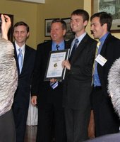
While I was pleased for all the qualified entrants-- almost 1000 this year, a record probably due to having a website -- I was most happy about the two student category winners. Jeremy Connell, a junior in Virginia, actually used SolidWorks for his cargo carrier design. Here he is holding the paper edition of NASA Tech Briefs, which features his winning design on the front cover! Jeremy Connell at NTB Contest Jeremy would like to get a job designing boats. I'm also hoping he'll intern at SolidWorks if he's available and we can work out the details.

The winner for the Transportation design category was student Corban Tillman-Dick, who is actually an economics major at Johns Hopkins. He's the designer of a more efficient engine, the Internally Radiating Impulse Engine. His brothers were all present for the award; they are trying to get funding to base a company on this design. Sadly, their father, who helped with the design, died suddenly in a car accident a few weeks earlier and could not attend with them. Here is Corban and a brother with Jeff Ray, CEO of SolidWorks: Corban Tillman-Dick

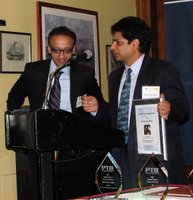
A few other winners -- Joseph Hollman designed a beacon locator for mine workers, shortly after a serious mining disaster last year. Here is Joseph receiving his award: Joseph Hollman with award

And Dr. Ajay Mahajan and colleagues were there to receive their Medical category prize for a 3D ultrasonic neuronavigation system for realtime image guided brain surgery. Ajay Mahajan

I'm afraid my camera batteries, bought for €1 in a Venice shop, did not hold out long enough for everyone's prize.

As you may recall, I was the consultant that designed and project managed the contest site for SolidWorks. This was the first year that SolidWorks was a major sponsor, as well as the first year there was any website featuring visible entries (and featuring a frenetic, viral "page view contest" which galvanized many students, not to mention bots). Jeff Ray also accepted the SolidWorks award for "Product of the Year" given by readers of NASA Tech Briefs, entirely coincidental with the co-sponsorship of the Create the Future Design Contest. (Obviously the contest was not judged based on software used by any entrant, and SolidWorks did not participate in the judging in any way.) Instead of a boring talking shot of Jeff Ray, I like this pic of him talking over drinks to our student winner who used SolidWorks.

Apart from the chance to see the sometimes wacky but always creative inventions, I got a lot out of seeing young designers do so well in the contest up against professional engineers. And in general, there were a lot of ideas that could make the world a better place with the right exposure and funding. Providing webspace for inventions and inventors is a good thing for us to do. We'll (and I'll) be doing the site and contest again this year! Stay tuned for another June launch.

Wednesday, April 23, 2008

Punitive Luxury at the Marriott Marquis

I just got back from an overnight work trip to NYC, where I was booked into the Marriott Marquis at Times Square. I disliked this experience, in oh so many ways.

How about this example of a nasty use of technology? Here's a $7 bottle of Fiji water that's on a weight-sensitive stand, the kind you see in heist movies where Tom Cruise is rapelling in to help himself to something way more fun than water.

The note on this bottle says, "Your account will be charged when this bottle is off the stand for more than 30 seconds." There was dust on the stand, because even the maids are afraid to disturb this gem. [Updated to add: a friend tells me her father stayed in another Marriott in a large American city and ran into the same thing. As he was going into his room, a cleaning woman in the hall warned him, "Don't move the water, don't move the water!!"]

Note that this was a room I was paying $400 for a night. I don't know what I got for it, to be honest. The sink wouldn't drain. And they also wanted me to pay $4.99 for their "tv-on-demand" DVR episodes of "Medium." (My first response, oh so naive, was "Wow, this hotel has DVRs in their rooms, awesome! I guess it's about time since we've all got them at home!" Then I saw the price for everything on it. Give me a break. Where's that warm fuzzy -- oh yeah, this isn't a brand experience, it's a technology scam.)

I didn't bother to try the Internet. They had more neat technology where their elevator collection resided. So many floors and so many attractions in this hotel, that they had a special scheduling routine in place: you enter your floor number, and it tells you which elevator to go wait beside. Despite this clever system of crowd management, their elevators were so busy that staff were escorting the more upset customers (incl. me) to the freight elevators for more realistic timing on their people-mover service. freight elevator with big bag When I got home, I came up with a few "nice" and possibly more interesting uses for their weight sensitive technology, instead of threatening their fleeced guests.
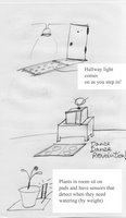
I know a lot of architects who love good hotel design -- but let me say, it's not just about architecture, it's about all the amenities and experience, including how they use their in-room technology. I'm still outraged!