This frame is not wifi or bluetooth enabled - so no home networking to connect to etc. Good, because I don't leave my PC with my photos on all the time. And I wanted to take this to the office. My gift-giver kindly included a 2GB card with it, too. My naive, starting assumptions for how this works, without having looked into digital frames much previously:
- I will be able to put photos on the card, or use one from a camera as is
- I will put it in the slot on the frame
- It will play a slideshow of all the pictures on the card.
The end. I expected to stick in the card and have it cycle through them, maybe with a nice dissolve between them. That's the task that I'd assume as designer, and design to support. But the difficulty for consumer electronics design seems to be keeping the product focused on the core task, and not getting lost in the options possible to throw in there. (I think most of these companies don't have UI designers on staff, honestly. Apple taught us about the importance of industrial design, but the UI part didn't come across so clearly to the world.)
Physically it's a nice frame, with a solid plugin foot that's heavy enough to hurt someone. I think it's a 7x5" display, although that's a bit vague on the box. It claims to do auto-rotation, to landscape or horizontal, which is nice - I remember that my smarter cameras know to rotate pics, but not all do, so my cards from my cameras might not work well "as is." Okay, I'm not averse to dragging pics onto the card from a computer.
Which I do, and then stick it in the frame. It does not play anything automatically except its own menu - and when I find the slideshow button (I do like the physical controls on the back) I try to play it. But it plays some generic Philips ads, not my pictures. What?
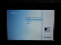
It turns out that you have to navigate through a menu to reach your card, and then into the directory on the card itself, and then it gets really complicated - you get the option of making "albums" there and other things. It's hard to get it to play a damned slide show! (Or find your pics, if you aren't familiar with your directory structure on your camera card.)
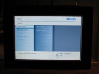
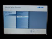
Eventually I managed to get an album and get a slideshow to play (you can see my abortive attempts called "1" and "Empty" and "Excerpted" above; my path involved debugging my card's directory issues with their provided software for creating "albums" on my card or frame, which I don't get much benefit from, I just want to play the contents of the directory!). The slideshow has some oddities; it has bad transitions, and a weird too-many-pictures-at-once display mode. It turns out this is a "collage" option on by default, which squeezes in 6 pictures into the 5x7" frame size, way too many for them to look good. You'll also notice it regularly uses two of the same one, an odd programming choice (is it meant to look good that way?):
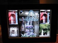
I find the settings to choose another collage and it sure has a lot of them. Sheesh. The only one I really would consider using in a small frame size is 2-up, a split screen of 2 images, and that setting is NOT offered.
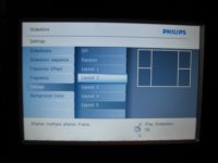
But then, there are lots and lots of settings...
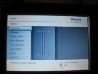
But the kicker is this: None of my choices stick. When I power down and restart it next morning, it's back to playing the Philips internal frame memory, and using a collage of 5 pictures. What the heck? With all those menus to go through, it requires some real work to get it into a state without too much setup time. I managed to erase the Philips frame pictures so when I hit slideshow it finds mine, but have not figured out how to get it to remember the collage style I prefer.
I realize the market is crowded with digital frames, but I suspect we are not really ready for complex feature wars yet. Ease of use out of the box seems like the most important aspect here. The task of playing photos (with simple defaults - dissolve and no collage mode, remember last directory played from) is not rocket science. Okay, there may be some clever design required for cases with multiple directories of photos embedded in a frame, but some code that FINDS THE PHOTOS instead of requiring the user to navigate through strange DCAM directories would seem doable. A very simple startup option in the case of multiple directories would seem doable too - which one do you want to play now? Let's assume for jollies that it's probably the card contents that should be the default, not the internal frame's limited memory.
-
There are multiple photo directories. What do you want to see?
- Play all my CARD photos (280 photos, Jan 2008)
- Play CARD DIR1 (245 photos, 15 Jan 2008)
- Play CARD DIR2 (35 photos, 16 Jan 2008)
- Play FRAME photos (4 photos, 7 Jun 2007)
It wouldn't surface multiple card directories if they were just the automatic camera directories, only if they were made by a user in a non-camera manner. So the simplest case is just look for images and play them - card first. They can keep their buttons for getting to more interesting settings if they want, but any of that is advanced gravy. Plus, remember the damned last power-on choice! How often do I want to be fiddling with this thing? (Not ever.)
One Philips frame review at CNET says the next model is an improvement for ease of use.
Our biggest complaint about the 7FF was that the unit wasn't a little more intuitive to navigate right out of the box. Although it didn't take us that long to figure things out, the unit's internal GUI (graphical user interface) could have been a little more user-friendly. Philips seems to have gone out of its way to fix that problem in this next-generation model with a totally redesigned interface.
I sure hope so. I admit I doubt they get as close as my suggestion above... but I'd be pleasantly surprised if so.
No comments :
Post a Comment