 In a non-graphic designery vocabulary, I myself note a lot of blue and orange, more "soft" rounded fonts rather than angular in this selection, and greys and gradients.
Thursday, April 12, 2007
Logos of Web 2.0
In case you haven't seen this -- at FontFeed, there was a nice deconstruction of the look of web 2.0 company logos. (Thanks to a graphic designer I worked with recently for the link. Same could be done on the websites with probably similar results; I feel like I've seen the 37signals look all over the place in the last couple years.)
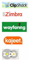 In a non-graphic designery vocabulary, I myself note a lot of blue and orange, more "soft" rounded fonts rather than angular in this selection, and greys and gradients.
In a non-graphic designery vocabulary, I myself note a lot of blue and orange, more "soft" rounded fonts rather than angular in this selection, and greys and gradients.
Subscribe to:
Post Comments
(
Atom
)
No comments :
Post a Comment