
The goal of this original design was to provide enormous flexibility in how printing is accomplished with respect to color handling. Color "management" is a hard science topic that is not for everyone, and barely understood even by most creative professionals in the print industry. The average Jane trying to print her photos in Photoshop (or even the average consumer pro photographer) was tripped up by this dialog all the time. What does it mean, "same as source?" When should I choose something different? What combinations are good and which are bad, and for what??
The short story of color handling is that there are conversions going on all over the place -- an image viewed on the screen looks one way, because it has been interpreted by your OS and screen settings to be seen as you see it. It may not be seen the same on anyone else's screen. A common complaint from the common user of Photoshop is "I printed and it looked different." It will always look different, because you are now converting to what your printer can print, not what your screen can display.
"Profiles" are descriptions of how the colors in a file should be handled in conversion, more or less. One of the strengths of Photoshop is that it lets you simulate ("proof") how something will look on another device. You can even use your printer to simulate another printer. But you have to pick all the right combinations of profiles, and have good ones so you get accurate previews.
Photoshop has an excellent conversion engine. Some printers do too, and some consumer printers do, but you can't be sure. Every device will differ a little, and consumer profiles are batch produced. I grew up in my understanding of color handling at Adobe concluding that I'd never use my printer's color management because these consumer devices just won't be reliably good; I'd rather trust Adobe's world class color scientists, with whom I was then working!
Now, here's the shipping (CS2) version of the design I helped to produce to clarify your choices in Photoshop, showing the two crucial options for home printers:


We couldn't do much about the consumer printer drivers and in particular couldn't override their own color handling, so we relied on rollover help that I think ended up a little vague about what you need to do next. In my Canon printer dialog, the necessary place for enabling or disabling color management in the printer is buried in this "ICM" language:

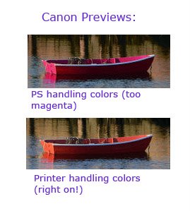
But now that I have the new Photoshop CS2 UI to experiment with, I've discovered (to my chagrin) that a color management problem I hadn't been able to diagnose is Photoshop's conversion's fault. At least, I get the best results from enabling color in my printer, instead. The preview my printer driver gives me before it prints is quite accurate, it turns out:
There's obviously a lot more to say about color management in printing (entire books have been written on it), but my reason for posting is to say: I hope we made the world of the Photoshop user a little simpler, at least as far as debugging their printing issues goes. I haven't heard any customer feedback on this myself, but it sure has helped me! (And I was privileged to have been able to work on this with the color management team at Adobe, including Lars Borg, Chris Cox, Russell Williams, and Matt Philips.)
4 comments :
color management across multiple devices ... shudders...
From 1998 to 2000 I was the digital editor for a small black women's fashion magazine. This was a very small house - I did my work as a volunteer and they probably thought I was worth the money.
It was an interesting time as workflows weren't entirely digital as none of the cameras were up to the task. We had to worry about calibrating drum scanners, monitors (mine, the real editor, the sponsoring ad company, and the press folks). All we had was a very buggy Color Synch from Apple to hold things together - that and proofs delivered by bicycle messengers.
The idea of consumers using Photoshop causes me some pause. I'm curious how and where the lines were drawn between it and the consumer product?
Last year I did a bit of work (called out of fashion retirement:-) for a fashion layout and a tv commercial. These days the workflows are completely digital, but color disasters are still common and can be very expensive.
I have finally moved to a calibrated LCD monitor - the gamut isn't as nice as my old CRT, but I could no longer justify the space for the old beast and I was able to fit into the workflows of a couple of projects with minimal pain.
What is interesting is that I've given up on printing myself. Some of the new ink jets are good enough, but I can't justify the cost. These days I go to a trusted printer - I think I'm saving money and know I'm less frustrated.
____
Sorry for the rambling note. As Lynn says color calibration is a very complex subject. Once it is part of a workflow people tiptoe carefully so as not to wake the beast. I'm always impressed when I see a beautiful photography book printed with a dozen or more colors or even a copy of Deusche Vogue. An amazing amount of work has gone into delivering the right image to your eyes.
And yes, the average user of Photoshop is simply trying to print photos on a home printer. And failing to get good results.
Our changes, aside from fleshing out some of the proofing options to be more full-featured and synched with the proofing controls elsewhere, were not actually large functionality changes. Just presentation changes, to surface What's Going On a bit better. It's still hard, because the subject is hard, and there aren't simple defaults in a multi-part problem that includes pieces beyond the software itself.
I'm finding many home users are giving up on printing ... walmart (shudders) offers 19 cent prints that are good enough and there is no dealing with expensive and old ink.
It would be good to be able to tune to walmart, kmart, ophoto or... printing (perhaps this is already done).
Thanks, Lynn. It's always nice to see the way that your UX skills do right by the customer.
You say that color management is a really hard subject, and I agree. Color software is part of my job, and the nuances still baffle me sometimes. But I think that there's still a lot of room for improvement in most aspects of how consumers and professionals encounter color management. The ICC and the folks who make color applications all know this and are working on multivendor "workflows" that might (might!) solve it.
I think you only have to look at the dozen or so options in Photoshop that you must understand to properly set up color management. Maybe these were okay back in the day when a color expert at a publishing house knew what they meant and then set up everyone's Photoshop the same way, but I was perplexed for the longest time.
Of course, the application I help develop is totally unmanaged when it comes to color. So I'm not saying that I know how to fix it. One day I will find out if we can do it better....
Post a Comment