
I dropped him a note wondering if he'd tried any social network analysis methods to simplify it, or otherwise break it down -- so he sent me the data and said "have a go!" If I had crawled twitter links myself, I might not have used his criteria or seed set, but I was curious if I could make any more sense of his data set as is. (So I've neither re-crawled, nor added any info such as frequency or content of tweets to this data set).
I compared some of the measures calculated by the python library NetworkX with measures calculated by Gephi. The two tools produce slightly different scores for some metrics, an interesting fact which I have not investigated deeply. I've made my spreadsheet of the calculated stats available for you on Google Docs. (Variables prefixed with "NX" are calculated with NetworkX and with "Gi" were calculated by Gephi.)
First, some overall stats on the network in Moritz's dataset:
- 1644 twitter id's are represented, and there are 145,382 edges, or links, between id's.
- Gephi reports the average path length is 2.5.
- Gephi and NetworkX say this is a connected graph; Gephi reports 1 weakly and 5 strongly connected components.
- The average degree is 89.9, but the median is 51. There is a long tail here, meaning that some nodes have very high degree (see below) but most do not.
Derek Green's excellent tutorial for NetworkX suggests doing community detection using another python library for the Louvain method. At superficial review, it's similar to the Gephi modularity class detection algorithm, but I got slightly different results from the two methods. [Update: The method is non-deterministic and results will vary depending on starting values used]. NetworkX generally finds 5 communities, and Gephi alternates between finding 4 or 5. Here is one confusion matrix, showing the differences between node allocations assigned by NetworkX and Gephi; in this chart, squares are sized according to number of nodes assigned to each group:

So, interpreting this: In one run, Gephi split up the folks who are in NetworkX's community 0 into Gephi's communities A, B, C, D. Gephi's community C mostly overlaps NetworkX's community 1.
For the rest of this post, I'll illustrate from NetworkX's community divisions, which I spent more time investigating. When I looked at the force-directed layouts and stats for the community members, I decided on these approximate group names, based on what I knew of the id's in each group:
- Group 0: The Authorities
- Group 1: The Researchers
- Group 2: The Processing Crowd
- Group 3: The Small NYT Group
- Group 4: MSLima's Crowd
To make sensible (i.e., less hairy) plots, I filtered for the top 5% by degree calculation. "Degree" corresponds to sum of in-degree and out-degree edges; in other words, how many people a node (or twitter id, in this case) is linked from and to by other nodes. High "in-degree" count usually implies someone is a perceived authority in the network. High "out-degree" might suggests a social media corporate type. Well, not necessarily - but it means they follow a lot of folks, and could themselves be a useful information source if they also have high centrality and share their information. (Like I said, I didn't look at who said what or how often they tweeted, which would be important measures of health in this network.)
Here's a plot of Gephi's authority calculation vs. degree, strongly correlated (you may see why I named Community 0 "The Authorities"):

Sorting by degree, the top players are these (pulled from the spreadsheet):
| Label | NetworkX Community | Gephi Class | Degree | Closeness Centrality | Betweenness Centrality |
|---|---|---|---|---|---|
| flowingdata | 0 | D | 1394 | 0.446930423 | 0.043313537 |
| datavis | 0 | A | 1376 | 0.482190168 | 0.072294856 |
| infosthetics | 0 | A | 1362 | 0.435290991 | 0.034115345 |
| infobeautiful | 0 | D | 1074 | 0.391210891 | 0.007498017 |
| blprnt | 2 | B | 932 | 0.410115173 | 0.02337346 |
| ben_fry | 2 | B | 882 | 0.365625 | 0.006936445 |
| moritz_stefaner | 0 | B | 870 | 0.452361226 | 0.028942168 |
| eagereyes | 1 | C | 861 | 0.455126424 | 0.031837862 |
| mslima | 4 | A | 828 | 0.433448002 | 0.014404322 |
| VizWorld | 4 | A | 828 | 0.524495677 | 0.08984938 |
Showing edges in hairball graphs makes things really complicated. For the following network graphs, I've limited the displayed nodes and edges to the top 5% by degree measure. Here's an animation of the difference between all edges visible vs. just community-internal edges (I know it's subtle, sorry; the id names are sized by relative degree):

Non-animated, larger versions: With All Edges, Only Intra-Community Edges
The largest names are purple, community 0, or "The Authorities" (a proxy for degree in this case).
Since I chose "degree" for relative sizing, it's worth seeing that in- and out-degree are not always correlated. Here you can see that some "true" authorities have much higher in-degree than out-degrees. In particular, VizWorld has very high out-degree but rather smaller in-degree. And by NetworkX's community assignment, he does not end up grouped with the purple community 0. (Click for larger view.)
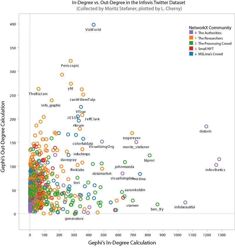
However, when we look at betweenness-centrality, VizWorld scores quite high. Betweenness-centrality (or centrality) roughly measures connectedness to components of the larger graph.

If you'd like to inspect the internal linkage structure corresponding to each community subgroup, click on the small images below to view. I've filtered out all but the top 5% by degree, to highlight the authorities in each sub-group. (Note that this was insufficient for community 3 -- so I expanded it a bit more.) The curved edges indicate "mutual" follow relations, while the straight edges indicate uni-directional, or one-way follow relations.
 |
| community 0, The Authorities |
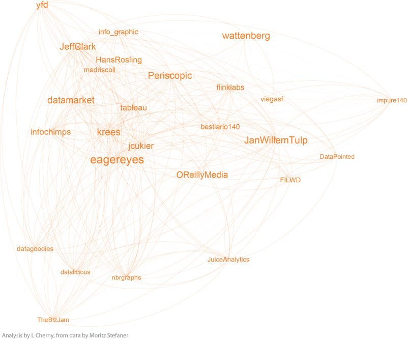 |
| community 1, the Researchers |
 |
| community 2, the Processing Crowd |
 |
| community 3, the small NYT group |
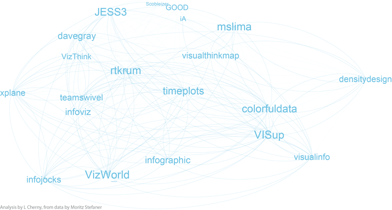 |
| community 4, MSLima's crowd |
Notice that community 0, the purple one, has a surprising number of unidirectional links, as does community 3. The others seem to be dominated by curved lines, a high degree of mutuality. (Hopefully I can explore this later!)
Depending on what you know about the players in these graphs, you will probably see things I don't see. I myself have very little familiarity with the names in communities 3 and 4, while I admit to being surprised or entertained by the links and organization in the other 3 graphs. For example, in community 0, the placement of Visually, and its straight line uni-directional links, is especially interesting to me. (Remember this graph represents the top 5% by degree-- so Visually at this time scored high on degree, and was classified as a member of the "Authorities" group 0 by the community algorithms, but was not itself closely followed by the others in this elite group.) Green community 2 is also interesting; certainly the artistic folks are there, including the founders, authors, and teachers of Processing courses (ben_fry, REAS, shiffman, blprnt, toxi, mariuswatz, ...); but this group also includes Brainpicker and well-known design firms like Stamen and PitchInteractiv.
Wrapping up, these are the tools I used for the analysis, charts, and graphs: Excel, Tableau (for scatterplots), Python, R (correlation plots which weren't shown here), Gephi, Google Docs, Illustrator and Photoshop. It took more time than I expected, in part because of Gephi's alpha status, and having to adjust a lot of the plots by hand in Illustrator! Hopefully the need for hand-tweaking will disappear as Gephi becomes more mature.
Postscript: While I was working on this, MS Lima's new book, Visual Complexity, shipped from Amazon. It's a beautiful collection of network visualizations.