Saturday, August 30, 2008

Google Earth: Stone Circles, Crop Circles, White Horses

Whilst planning a trip to the UK, I turned on satellite view to find myself a nice green village in the midlands for an overnight - and spotted the remains of a hill fort or stone age earthworks in a field. Nice!

I poked around and found this cool site, GoogleSightSeeing.com, tagline "Why bother seeing the world for real?" They have some nice references, although I find it slightly frustrating that they don't let you load the coordinates into Google Maps yourself from their site - maybe this is a Google Maps API UI issue, though?

Here's the White Horse of Uffington (about it here), a chalk horse on the hill near Uffington, not far from Oxford:


View Larger Map

Another chalk figure is at the Long Man of Wilmington, and in Mexico there is a surprisingly similar Juarez White Horse (I wonder if that one is a hoax).

The Alton Barnes one is from the 1800's and is kept in good modern horse condition:


View Larger Map

There are some fun crop circles, like the one near Doncaster (hey, I'll be quite close to this next month...):


View Larger Map

And here are more crop circles near the M1.

Stone circles don't all turn out so well... I'm disappointed that Avebury is hard to make out, and the Callanish stones in Lewis aren't very visible. Stonehenge is acceptable:


View Larger Map

Another circle in the Lake District is only visible as a ring on earth, at GoogleEarthHacks. I also enjoyed on that site the link to Peru's 13 Stone Towers, an observatory structure - but the massive earthwork remains to the upper left of it are much more impressive to inspect by air.

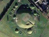
Ireland's passage graves are very visible, too. Here's Knowth, part of the amazing Boyne Valley collection of sites (where Newgrange is, with other stone age mysteries that are really worth a visit):
Not just for aerial tourism, of course - I was reminded of the folks who've used Google Earth/Maps to find new archaeological remains. A couple years ago, a computer programmer made some important Roman discoveries. Archaelogists are using Google Earth fairly regularly, and some recent Afghanistan sites are due to Google Earth usage by a Ph.D. student.

Sunday, August 10, 2008

Good UX from Happy Employees?

More on creating good user experience from good organizations: a short blog post by Adam Richardson at CNET entitled "Good user experience comes from good employee experience." He points out comments from airlines with happy employees who convey happiness to their customers, like SouthWest and JetBlue, as opposed to American and other airlines with rather surly, unhappy employees.

Over the years, whenever reporters would ask him the secret to Southwest's success, Mr. Kelleher had a stock response. "You have to treat your employees like customers," he told Fortune in 2001. "When you treat them right, then they will treat your outside customers right. That has been a powerful competitive weapon for us."...

"There isn't any customer satisfaction without employee satisfaction," said Gordon Bethune, the former chief executive of Continental Airlines, and an old friend of Mr. Kelleher's. "He recognized that good employee relations would affect the bottom line. He knew that having employees who wanted to do a good job would drive revenue and lower costs."

I've worked at more than my share of offices in the past dozen years, and I think there may be something in this. Watch out if you've got customer-facing employees who don't answer internal colleague emails, are rude or curt to peers in their organization, promise stuff but don't deliver, hold onto information for their own advancement rather than the sake of the team. You probably also have a customer relations problem at the very least. Is this person answering customer email or calls politely? Sharing customer problems with other people who can help? Looking for help in solving the problems that the customer has?

Then look at the tools your employees have to use... if you find crappy tools in use internally, then double check that this isn't exposed to customers in some form. The MathWorks has an internal usability group that works on design and development processes for corporate tools. I think it pays off in many ways, not all of them related to internal efficiency. It's a sign of respect for your staff to give them the best tools to work with.

If you hire well, trust your employees, and give them a reasonable job to do, they can be your strongest advocates for hiring, referrals, and posting nicely about you in their blogs! And they'll go the extra mile on the job. Besides, a lot of your employees, past and future, are customers too.

Sunday, August 03, 2008

Staffing for User Experience: What Can Go Wrong

You decided to hire a bunch of interaction designers and "user experience" people to improve your product, service, or general business from a customer-focused design perspective. You were lucky enough to find some experienced folks, who've proven their worth at other companies.

It may not be obvious, even if you hired evangelists to help convince the rest of the company of their value, how many ways you can still get it wrong AFTER the hiring. It takes more than headcount! Your new people need to be empowered to make a difference on the product. The issues below amount to (a) cultural and process openness around adding more design into the team software mix, (b) how the dynamics of decision making in your company can impact design for evil rather than improvement.

  1. Did you hire the right people? Let's assume you did, but a couple reminders here: Your biases and your interviewer biases may be some of the problem you are actually hoping to solve. Did you hire looking for collaborative people who get along with everyone (and cave in an argument, in order to preserve the peace?). Did you hire people who do evaluation of other people's designs, or did you hire designers? Did you hire GOOD designers? (Would you know how to evaluate their design skills?) What kind of power dynamics are going on with the interviewers you lined up: Are any of them threatened by the whole idea of outside new people influencing the product? Are they looking for "yes" people or new ideas? Remember they may say something quite different from what they really secretly feel after 3 beers.
  2. Does anyone other than development or product management get a say in how things turn out? How much will these expert new hires be heard? A development manager who is used to being in control may not like having to invite someone new to his planning meetings; a product manager may be unhappy if your new hire questions her market research based on usability data. How much of the time will your new staff be looking for data and ways to convince people to listen, versus actually making an impact on the product? If you had to hire evangelists, you're set up for this problem from the start - expect a lot less productive impact on the product from your new hires, and a lot more organizational time suckage.
  3. Do you have ugly cultural problems you don't know about: Prejudice against non-"technical" input, assumptions that women aren't as smart or good at software or technical decisions. Women are more likely in UX/design than they are in engineering jobs, even if they started in development positions. Check out the dynamics at the whiteboard here, a scene I've watched many times...
  4. Will other people take UX team work as optional input to modify, redo, ignore? Does someone else secretly want their job; not realize it's a separate real job in the process; or actually HAVE their job on the project. I've seen teams where two people were meant to be the customer design input, and didn't agree, and it led to time-wasting fights for the whole group around them, with people taking sides on issues and duplicate work being done. I've seen plenty of QA teams forgetting about the spec, developers not reading or forgetting about the details, and other errors of omission that prevent design from being fully effective.
  5. Do you have decision processes that are functional in your company - or do you regularly have meetings that bog down with "votes" or too many inputs, and open more issues than they close on a regular basis? This environment won't scale well to adding players especially in design discussions. (If your team is arguing with the designer about whether to use radio buttons or checkboxes, you have a dysfunctional decision process which means you are wasting resources and time.)
  6. Is there enough time in your shipping cycle to actually add design as a separate process? Not a trivial question to laugh off; mistakes made early, in requirements and design, are much easier to fix than anything after some code has been written, assuming you have processes in place to catch them before you get too far. This well-known fact doesn't make most companies happier to slow down. I think it has something to do with what's seen as "progress" and "work" in the development cycle, and the glorification of risk-taking that exists in so many software companies that have money to burn.
  7. Does your company regularly bite off bigger projects than it can deliver in a release cycle? These giant projects are unlikely to be high quality when they ship after all the cuts and compromises are made to squeeze them in. Partial functionality is usually worse than no functionality because your company looks like it just didn't get what the customers were asking for. No UX person can entirely save you from this, but a good one consulted and involved in the process from the start might keep you focused on the must-haves for minimal usefulness.
  8. Have you got project management to track team issues and milestones and make sure things aren't grinding down to a halt, or loaded with bugs and unresolved issues. Are they also concerned about tracking design stages, and blocks to those deliverables, rather than just safeguarding developer efforts? (Before you say "of course," maybe you should check with the designers.) These things can add up and make everyone less useful in the end; software is a team effort.
  9. What will you do with the designs your designers produce -- they can make mockups till the cows of management come home from their offsite, but that doesn't mean it's useful in your process.
  10. Do you have your new UX people spread too thinly to be effective -- with an average of 20 developers to one designer (who is shared over multiple projects), there will be a large number of meetings they miss; bugs they don't have time to provide input on; bugs they don't have time to file; builds or releases they didn't get to see closely enough to catch last minute errors; bug review sessions they weren't at to push for the usability/experience bugs; doc they didn't look at to see if it covers the main use cases and important details; customers they didn't have time to call or visit. And spec modifications they couldn't keep up to date. Their morale will suffer proportionally to the things they don't have time to do that decrease their effectiveness.
  11. Is the UX person involved early enough to be (a) able to influence the crucial early decisions (b) and to be a true team player in the project, rather than an end-game consultant check-mark on your process? It's often in an overloaded (dysfunctional) environment that the designer or usability specialist is involved only at the end of the cycle to "review" and "bless" things. If you're tired of hearing from your new hires that they didn't know something had been decided, or that they wish they'd been consulted earlier, then you've got this problem headed your way. Remember it's much harder to effect change after code is written! And they want to be able to make an impact, otherwise they will be wasting their skills.
There are lots of ways to miss, even with good staff. I've been in good teams and bad teams for design process, but seen a lot of these failure modes. I'm keeping score of how many companies have teams that argue with their designer about radio buttons versus checkboxes, wasting valuable time in their cycle. The stats aren't looking good. But if you take care of your processes and oversee design as a separate stage and responsibility, your company can be better than that.

Wordle on Ghostweather

Playing with Jonathan Feinberg's artistic tag cloud generator Wordle, I plugged myself in (of course) and got this one (this is the "ghostly" color scheme):

Randomness is a powerful toy in design - it helps you discover things you wouldn't have seen with a purely organized eye. It's inspirational. It's fun.