But the heart is a little sterile looking, in the design competition winners from designboom. I love looking at these anyway, since this type of design is so far from anything I do daily. The entries feature concept mockups in gorgeous detail, philosophical position statements, and detail illustrations of the idea at work.
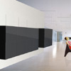
The weirdest winner is the 2001 monolith style kitchen in which the entire kitchen is encased in a black block. Trendy types lounge in front of the block in plastic orange chairs and sunglasses. They aren't talking to each other. (Geez, I talk to my cats, when I lack humans, in my American kitchen where the appliances sit on the counter. And we're all pretty happy about it.)
 The Black Block kitchen.
But all that said, the island design winner is pretty cool in concept. I just want to know why it all has to be chrome and black, instead of wood and bright paint.
kitchen is the heart of the home - designboom
 The Black Block kitchen.
 The Black Block kitchen.
2 comments :
Those aren't trendy people, they're mannequins. (You can tell from the broken-arm poses.) I assume they come installed with the kitchen. Also: "no handles, only one sucker".
Aren't they creepy? If they come with, I sure don't want it. Also, I just don't mind seeing my new KitchenAid. It's red and very pretty.
Post a Comment