Showing posts with label design. Show all posts

Sunday, March 23, 2014

Implied Stories (and Data Vis)


At the excellent Tapestry Conference in February in Annapolis, Emma Coats (@lawnrocket) spoke about storytelling, the theme of the conference. Her talk was based on her internet-famous 22 Rules of Storytelling developed while she was at Pixar.

Lacking the video of her talk ([ETA: here it is!]), I cracked open the ebook based on her principles by Stephan Bugaj, Pixar’s 22 Rules of Story (That Aren’t Really Pixar’s) (— which, incidentally, Emma says was written without her permission and none of her involvement. Caveat Lector).

Pixar Rule 4:

Once upon a time there was a ______. Every day, ________. One day ________. Because of that, _______. Because of that, _______. Until finally ________.

Bugaj points out this is a summary of a basic plotting structure, the “story spine,” suggested in many books on writing fiction: setup, change through conflict, resolution. The details make it a good story, of course (character, context, conflict…).

Emma talked about confounding the expectations of an audience: The ghost of what they expected should remain at the end, but your story arc should win (and convincingly). Related was an important point: the implied story line. You suggest a shape to what will or might happen (or has happened), and the audience fills it in. Her pithy example was Hemingway’s “shortest story every told”, a 6-worder:

“For sale: baby shoes, never worn.”

There are lots of ways the story here can be filled in, all of them sad. The reader brings the detail and does most of the work, but the author set it up very well to allow this.

Another Short Story


I’d like to offer another example, a very short story deconstructed in a series of lectures by sociologist Harvey Sacks (Lectures on Conversation) — which coincidentally also features a baby:

“The baby cried. The mommy picked it up.”

Maybe it’s not as GOOD a story as Hemingway’s, but Sacks argues it’s a story, based on having a recognisable beginning and end, the way stories do. There’s a dramatic moment, and a resolution. And while you may think we can read less into the plot than into Hemingway’s, Sacks spends 2 lectures (plus book appendices) on this story and how we understand it the way we do.

Ok, let's accept it’s a story. Secondly, we infer that the baby and mommy may be related: it’s the baby’s mommy. “Characters appear on cue” in stories, he says; the Mommy is not a surprise in the normal setting conjured in our head; it doesn’t feel deus ex machina, like cheating.

Notice the story didn’t say “his mommy” or “her mommy” or “the baby’s mommy.” Juxtaposition of category terms often used in family contexts helps us infer this, Sacks argues. It’s clearly possible the baby was abandoned outside a supermarket and someone else’s mother picked it up to comfort it, as I hope one would! It’s not the simplest reading, though. Notice that we also assume they are humans, not apes or cats. Our human context draws that story, an Occam’s Razor kind of principle to reading.

Thirdly, Sacks notes we read the story as having cause and effect. Again, this is related to the juxtaposition and assumptions of normal family roles. That’s partly the expected story spine at work, too: conflict, resolution! Cause, effect, NOT just correlation.

Fourthly: the action in this story is believable, interpretable, unlike “colorless green ideas sleep furiously.” (That’s an old linguistics chestnut.) Babies cry; babies who cry should probably be picked up. Sacks notes that a mother can say plausibly, “You may be 40 years old but you’re still my baby.” In that case we don’t expect the crying 40-year old to be picked up, even if he’s “acting like a baby.” We fill in the blanks in this story in the most consistent way possible for the details we’ve been given, which means a lot of assumptions based on what we know and expect about social and human behavior.

Surprise!


A thing I didn’t tell you right away is that this story is a story by a 2 year old, that Sacks got from a book called Children Tell Stories. Sacks spends a certain amount of words on why this is a story because it comes from a child: the drama is a child’s, the resolution is a child’s happy ending. Sacks suggests that children, as speakers, might start a story with a dramatic moment, as a method of getting the floor. He says the dramatic problem here is a valid child’s talk opener, like “Hey, did you notice your computer is smoking?” would be for a stranger addressing you in a coffee shop while you’re getting a napkin. The ending is a valid ending, because for a child being picked up is a resolution. For this story to have a tidy ending, we infer that being picked up results in a non-crying child, or at least a happy child. But the actual non-crying denouement is implied here because of Mommy doing something expected.

The child’s story is arguably less sophisticated than Hemingway’s story, but notice that it’s more of a classic, plotted story in that 2 events occur, the crisis and the resolution. I hope I’ve convinced you that’s it’s still quite sophisticated in terms of the amount we bring to it when we read it, and how it successfully carries us along despite being terse. Hemingway’s is a suggestion of events behind a public for-sale ad, and all the action and characters and emotion occur in your head.

Story, Discourse, Visuals


What does this have to do with data visualization? Emma Coats wasn’t quite sure how to relate her story telling principles to vis design, but left it to us as adult vis creators to make that connection. I’m going to spell out some of what I take from the Pixar and Sacks points, as well as a little more storytelling thinking.

First one useful distinction in terms from Dino Felluga's General Introduction to Narratology:

"Story" refers to the actual chronology of events in a narrative; discourse refers to the manipulation of that story in the presentation of the narrative. [...] Story refers, in most cases, only to what has to be reconstructed from a narrative; the chronological sequence of events as they actually occurred in the time-space ... universe of the narrative being read.

(This isn't necessarily the way a linguist would define discourse, but it'll do for now.) Discourse encompasses all the similes, metaphors, style devices used to convey the story, and in a film, all the cutting, blocking, music, etc. The story is what is conveyed through these devices when the discourse has succeeded. (So, for Felluga, telling "non-linear" stories is an attribute of the discourse, not the story itself.)

Hemingway's short story's discourse structure is very different from a two-year old's discourse structure. The artistry lies in the discourse choices as well as in the stories they picked to tell.

Felluga illustrates how stories can be told in a visual discourse form with a Dürer woodcut:
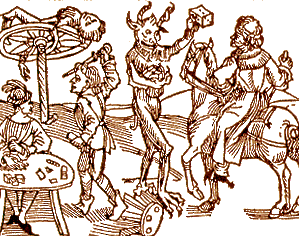
(Woodcut to Wie der Würffel auff ist Kumen (Nuremberg: Max Ayrer, 1489). Reprinted in and courtesy of The Complete Woodcuts of Albrecht Dürer, ed. Willi Kurth (New York: Dover, 1963)

The story goes something like this: 1) The first "frame" of the sequence is the right-hand half of the image, in which a travelling knight is stopped by the devil, who holds up a die to tempt the knight to gamble; 2) the second "frame" is the bottom-left-hand corner of the image, where a quarrel breaks out at the gambling table; 3) the third "frame" is the top-left-hand corner of the image, where the knight is punished by death on the wheel. By having the entire sequence in a single two-dimensional space, the image comments on the fact that narrative, unlike life, is never a gamble but always stacks the deck towards some fulfilling structural closure. (A similar statement is made in the Star Trek episode I analyze under Lesson Plans.) [Note from Lynn: Love this guy.]

George Kampis took out these lessons from this example, for his own introductory course:

  • Narratives can be visual
  • Time is Space here
  • Actions and events are consequences (causation), not just occurring in a sequence.
  • Narrative is therefore offering "explanation" — why did things happen?
  • But order has been imposed.

I would not argue that the woodcut is easy to read, at least for most of us. Reading this story requires background in themes and socio-cultural contexts that a lot of modern viewers don't have anymore. It's not as simple as "the baby cried" or even the Hemingway "for-sale" discourse format.

Causation in Vis

We look for cause and effect in sequences of events, which is why I suspect there’s so much confusion over correlation and causation in data reporting. Charlotte Linde, in Life Stories, talks about this as "narrative presupposition." She offers us the following two examples, which we read differently:

1. I got flustered and I backed the car into a tree. 2. I backed the car into a tree and I got flustered.
Linde toys with the idea that this is related to cognition, but falls back to suggesting it's a fact about English (and possibly related languages') story telling discourse and morphology. Regardless, it is a "bias" of interpretation we bring to bear on how we interpret sparse details juxtaposed. If a data reporter chooses details that juxtapose the rise of one thing with the rise (or fall) of another, the average reader will assume causation is implied by the reporter.

What's an example of a simple causation story in data vis? A timeseries of measures might be a good example. But without added context, it’s often just "X, then Y". Filling in some explanatory context on timelines has become standard, at least in journalism. The labels here help us contextualize the data, and arguably to infer some causation:

(Image by Ritchie King in a Quartz article.)

Here the designer has imposed order by suggesting causation or at least relevant correlations behind the measures shown over time and the labeling of events. Some of the labels may be just "informational," like the recent presidencies. For readers who know about the Clinton era economy vs. Reagan and Bush economies, the annotations carry more meaning. Regardless, by choosing to annotate in this way, the reporter suggests relationships in the minds of the reader, very deliberately. Less clearly related events also happened on those labelled time periods — births, deaths, scientific discoveries — and yet their relevance wouldn't be so "obvious" and so easy to glance over as reasonable. Economy and war go together like babies and mommies.

Because readers assume the author has juxtaposed items on purpose, suggesting odd relationships in your discourse automatically evokes weird stories in your reader's heads. These might be entertaining from an artistic perspective, of course...

(A super example from this paper on fallacy summarized on Steve's Politics Blog.

It's a little unlikely that lemon imports over time have a direct causal relation to accident rate, although we immediately want to figure out how they could!

Artistic &/or Journalistic

Is journalism better served by 2-year old storytelling with simple discourse forms ("X, then Y")? Maybe, for some purposes. Even so, there are a lot of unwritten implications behind every chart, from what's reported to how it's reported. It's easy to classify some work as simple propoganda — see Media Matters History of Dishonest Fox Charts for a lot of examples of apparent intentional misleading by implication.

Periscopic’s Stolen Lives gun deaths visualization was criticized by some for being un-journalistic, and yet, it makes its implications quite explicit and well-marked in the discourse (gray lines). The visualization walks the viewer through the interpretation with a slow intro, to show exactly where the artistic license begins to deviate from the data source.

(Visual from Periscopic's work.)

This work may be be more like Hemingway's for-sale story than a 2-year old's story, although in fact it leaves less to the imagination while it veers further from traditional journalism as it does so. Yet this is still data visualization taking an artistic narrative risk, for the sake of activism.

Wrapping Up (So I Can Watch TV)

Even very simple stories, whatever the discourse form, rely on the reader filling in a lot of invisible holes. Some of the interpretation we do is so "obvious" that only sociologists or cognitive scientists can make explicit the jumps we don't notice we're wired to make. Choice of structure, of juxtaposition, of annotation, of what's implied versus made explicit: these are discourse maneuvers that can clarify, mislead, open up possibilities, or even evoke emotion in surprising ways.

A willingness to borrow insights from other disciplines' thinking about these subjects was one of the reasons I liked Tapestry's programming. Emma Coats made me get out some old books, and writing this up helped tune my thinking a little bit. Good conference, and hopefully a thought-provoking post for a few readers.


Incidentally, some recent related articles: Periscopic's A Framework for Talking About Data Narration and Jen Christiansen's article "Don't Just Visualize Data — Visceralize It." [ETA: Also, a followup to this post by Robert Kosara at eagereyes.]

Sunday, November 15, 2009

Tips and Tidbits from the UI14 Conference

Back to blogging after a long hiatus of work and travel... UI14 in Boston had some good stuff for designers and managers! I heard a lot about techniques for creativity and design generation before winnowing; good reminders to generate multiple approaches before "settling."

Dan Rubin had his workshop group generate 20 different thumbnail sketches in 5 minutes. (Maybe it was less - it seemed like less.) Then combine the best aspects of their favorites into one bigger one. Hard, and a good way to make you get crazy early, if not go crazy, or just to think very broadly.

Leah Buley's charming "How to Be a UX Team of One" presentation is worth watching online. Her link includes her templates for wireframes with notes - useful for her excercise of 6 designs in 5 minutes (or less? again, I forget). After doing those sketches, she took a room vote on which idea in the 1-6 range the audience preferred out of their generated sketches. Most of the votes indicated it was not the first idea drawn.

There were some other interesting creativity exercises in Scott Berkun's excellent "Myths of Innovation" workshop (based on his excellent book of the same name). For a stuck team that's gone dry on good ideas, try brainstorming the worst product features possible for a while -- this will open up the wild and funny ideas. Then invert them, for the germ of some good ideas to pursue. Another alternative was to go from completely unconstrained brainstorming (such as "ideal features of the perfect cell phone") to slightly more constrained ("ideal features of a $10 cell phone").

I found Scott's most entertaining activity to be one in which the group listed 30-40 (again, early onset memory loss) random words - nouns describing things/activities/states and adjectives. Each small group had to pick 3 of them, brainstorm a new product or service around them, and create a pitch for it. All in ten minutes.

Strangely, from our workshop list with "TiVo" (I did not propose it!) and "guitar" and various sports... many of the groups picked the word "tomato." No idea why. But their weird product pitches were all very clever and funny. Scott pointed out afterward that this illustrates how a bunch of people who had never met before could self-organize, be creative, and even have a good time doing something that initially seemed impossible. On the "self-organization" topic, he noted that the person who takes notes in the group (self-nominated, of course) is usually the person who ends up delivering the pitch for the group, which also seemed to be true for several of these groups. As a conclusion to that one, he said that the reasons for this activity being difficult for many people (despite their success!) were these:

  • Creativity creates confusion
  • Unclear roles [group self-organization takes a few minutes or lots more]
  • Responses to uncertainty differ
  • Responses to subjective criteria differ
  • Group dynamics influence decisions
  • Time pressure [creates more stress]
  • Lack of trust / relationships [although I noticed that one team had a bunch of people from the same company, a team I wish I'd observed during the activity]

Scott gave out copies of his newest book, Confessions of a Public Speaker, at his second UI14 talk. That talk was great fun as well.

Dan Rubin's short talk on Visual Design tips was excellent as well. A couple of his tricks will definitely go in my toolbox, especially the use of an image that a client chooses for setting a color scheme using kuler. (My take on it: Choose a bunch of images that might convey the mood of a site or product that a customer wants, and be sure the palettes are sufficiently different. Ask her to choose the "mood" she likes, and generate the colors from sampling that image.) Another of his tricks - using a 1 pixel sample of a photo to generate a gradient lighting effect with layer blending - was deeply cool!

UI14 is a great conference, and this year it was in an even better venue than it has been before (a plush hotel in more accessible South Boston instead of cramped Cambridge). Some things that make it annually so good: power strips under every table, and working wifi; a great drinks party; long workshop sessions as well as sampler short talks; accessible speakers who hang out and attend each other's sessions (or else, just check the bar). For a tech-industry conference, it does an excellent job of being gender-balanced for speakers. UI14 also has the odd honor of being the funniest conferences I've been to in a while -- possibly because Berkun, Gerry McGovern, and Jared Spool are all very entertaining! Check it out next year.

Friday, May 08, 2009

In Defense of Hard Skills for Designers

The other day I was in a meeting in which evaluation criteria for developers came up; nice concrete stuff, like writing code that other people can read and modify, putting in comments, resulting bugs, etc. It made me pause and admire the local weather of that strange country. In my experience, it's vanishingly rare for an interaction designer, usability specialist, or User Experience professional to have such nice hard criteria applied in evaluation of their work. Far too often, we're judged on mushy subjective factors like whether some team likes working with us, or feels we're doing something valuable--often outside their expertise or range of view to make this judgment, but that rarely stops anyone. I have some stories about this subjective mushiness in my article in HCI Remixed, titled "Designing 'Up' in the Software Industry."

Why is this--sign of an immature field? evidence of double standards, for sure, but also imprecision of job role? Poor management, perhaps contributing?

I suspect it's related to the observation that many designers have trouble achieving credibility in their role. Scott Berkun's seminar for UIE on Why Designers Fail advocated working on "soft skills" over hard skills, such as learning ways to win friends and influence people via negotiation, diplomacy, and other interactional condiments.

Not to pick too hard on Scott - it's hard to disagree that people skills are valuable and most of us in the computer industry are weak in some of them - but I think it's generally NOT true that designers have sufficient hard skills. I think gaining and using hard skills are our best bet for being taken seriously in places full of skilled workers. Most interaction designers spend too much time in "soft" areas that can too easily look like matters of opinion to others, or overlap and sometimes threaten other existing professional roles like product management: user testing (which often looks like "anyone could do this"), observing people work and suggesting improvements to their tools, pointing out issues in existing products that could confuse users (heck, everyone has an opinion on that), scheduling and managing stakeholder meetings, writing requirements documents and functionality specs. Most of these activities are politically difficult, and don't make other colleagues drop in their tracks and say, "Oh, you're so valuable and provide skills we don't have!" As I pointed out in my HCI Remixed article, a common reaction to much of this work is, "Didn't we already know that?" Finding problems with software is relatively easy; creating solutions is not.

We can convey solid, indisputable value when we focus on creating concrete, skilled deliverables that NO ONE ELSE CAN MAKE. In economic crunch times like now, consultants hear this from the front line. If a client or potential client has someone on staff who can apparently do what they do, they're not a clear asset. Never mind that they have 15 years of experience doing it, if their value looks like primarily "opinion" or "process," it's not very convincing when it comes to opening the bank account.

Here are some of my suggestions for hard skills, that many interaction designers and usability folks could stand a more training in:

  • Technical prototyping skills: Flash programming, javascript/ajax, css, html site design, Flex, Expression. Use of the tools that are used by developers, at a basic prototyping level, is a solid PLUS, because you can make things that everyone can see are relevant to the end product.
  • Ability to make high quality visuals: Visual design training, skills with Illustrator, Photoshop, page layout applications, and other design tools for good looking mockups. Low fidelity may be useful and helpful with fast user testing and concept evolution, but you want to be able to make something your client or non-designer colleagues can't make. I know one case of a visual designer hired into an interaction design role because of the caliber of his mockups. Never mind how wrong this was for him and his manager eventually-- it got him the job to start with.
  • Data analysis: For user research, learn some solid statistics. Even just pivot charts! Maybe some VBA for automating actions in Excel. Eventually, data mining, increasingly important with the large amounts of data around. (This is a career growth area all on its own right now.)

I'm with Scott that it's not a highly valuable proposition for a usability engineer to learn to do a cognitive walkthrough when they already know how to do 5 other methods for usability evaluation. But that's the wrong "hard skill," in my opinion. One who learns to make beautiful designs, which no one else could have made, will have a serious edge in their job role. Same goes for other skilled, niche deliverables. True story: A client with a budget problem told me recently that she had people in-house who could do an InDesign layout project, and that my value to her was in the data analysis and recommendations I could deliver for her that no one else could do. Good thing I'm working on that array of hard skills!

If only the university programs for HCI, UX, and usability thought like this, designer credibility issues would start going away a little faster. And performance evaluations for more designers could be done in concrete terms like how much good stuff we MADE during the design process, not how much we talked in meetings and if the other people there liked us when we did.

Saturday, April 25, 2009

Why Failure Isn't Working for Me

A response to a number of posts and talks on failure recently, particularly this one by Michael Krigsman, Five Reasons to Discuss Project Failure, linked from Scott Berkun's blog.

Based on Krigsman's points, I wonder, Is failure really instructive? In my observation, there are a lot of people who don't learn from other people, or even hear what they say. Maybe they're "experiential" learners. Maybe they don't think like researchers--who are trained to build on other work--or they aren't smart. I personally hope they are genetic dead-ends. It seems a rare person who takes on board the lessons or advice from others; at least, it takes a listener, and someone who isn't arrogant.

On the subject of arrogance: A lot of organizations suffer from "not invented here" syndrome. They're in successful companies, don't see why they should do anything different, don't think they need to do other than tweak their current environment. And they're unlikely to hear from outsiders or new people. No matter how much they say they embrace change, learning, growth, new ideas... in general, in practice, it's not so true. Or it's better coming from someone internal with an extremely tailored message for that environment.

Do success stories really not work? The fun book Made to Stick doesn't entirely agree. One of my issues with stories of failure is that they end up being a lot like usability test results: Show you everything you did wrong, but provide no solutions for how to fix things. And it's hard to get the "right" lesson, because lessons are almost always hypothetical. IF we hadn't cut this feature, it would have sold better. IF we had done user testing earlier, we would have caught this. IF we'd had longer to develop the right architecture, this would be faster and people wouldn't be complaining about performance. IF IF IF. No one really knows, it's all just opinion.

If you don't understand your successes, you can't replicate them. And you can't use them to inspire anyone. You had a project team that cleaned up a disaster in record time and shipped something people loved. What was different about that team? What did they do better? Okay, it may be partly a comparison with the failure before, but it's surely instructive!

Root cause analysis of failure always has to skirt around sticky, difficult, subjective personality issues. This is often unproductive to discuss, and doesn't lead to positive outcomes. The people who name names look bad, and often suffer for it later. That guy who's the blocker for a zillion projects - everyone hates working with him, but he's critical path. Yes, it's been elevated to his boss before. VPs have been involved. Multiple VPs, on one occasion, during which ego bristles poked everyone. Nothing has changed. That guy is going to continue being a root cause problem on a lot of things. Talking about it means VPs and bosses are implicated too. And isn't it just personality issues for everyone involved? (Note, I advocate firing his ass, or moving him to another role; but I'm not in charge. The organizational dysfunction, which is usually just human nature, is in charge.)

design is invisible, till it fails.

Now, to switch onto on the subject of design failure. A hot topic among design gurus right now (see Spool on "Failure is Not an Option, It's a Requirement" and Scott's recent talk on "Why Designers Fail"), we're being told that good design involves failure and failure is important for innovation. I'd argue that designers themselves often know that design is iterative and exploratory, with important dead-ends that lead to strong results, but their managers or other necessary stakeholders don't know this. I hope Scott and Jared are being heard by these other folks, too, and not just by designers.

The people with the money are the ones that matter. They determine what constitutes failure, in the short term, like it or not. Many design consultants worry that client judgments don't take this iterative process into account. We are paid to be fast, creative, and accurate, all at the same time. Mistakes or dead-end work aren't seen as productive value for the money by many hiring managers. And their own sometimes flawed design judgments are at play in their judgments of our work. What should be a success is seen as a failure, through the squinty eyes of a manager that doesn't get it. It takes design talent to recognize design talent, yet most hiring managers aren't skilled or talented in this way.

This phenomenon leads to failures that shouldn't have been failures - good work was thrown out, bad work was done instead. Happens all the time. Happens on every dialog, every icon, every wording argument. Most of us live with failure very regularly: The little voice inside blaming us for not arguing the point just a little longer, for not standing up to that bully on the team about this important issue, for not getting to that other issue that's probably more controversial and yet more important for the user in the long run, for not making one more mockup to try to show how it could be better, or moving to Flash to show how it would work for real.... Oh yeah, we've got a lot of failure all the time. And our failures are much more visible than the guy writing some code on the backend that thrown an uncaught exception, which may not be noticed for years!

My point of greatest concern about these homages to failure right now is that they don't take into account power dynamics in most engineering organizations. (To be fair, Scott's talk does, and he found that managers who aren't skilled in design are a major cause of failures.) Designers are a minority discipline, and often we're trying to change processes and methods while also delivering on our work. We're trying to set an example with our deliverables and methods. The odds of success are already long against, given the weight of org history and number of people we need to convince. As minorities, we're often trying to argue for more headcount, and every misstep can be seen as another argument against hiring more of us.

Visible failures aren't generally a positive option, when disciplinary credibility is at stake.

Friday, April 10, 2009

CHI 09 Panel: Moving UX Into Strategic Importance

At CHI 2009, I took a lot of notes at the panel "Figuring Out the 'One Thing' That Will Move UX Into a Position of Strategic Importance." This is a rather random summary of it; see a similar topic in my post on User Experience Organizations discussed at BostonCHI a couple years ago.

Jim Nieters, Director of UX at Yahoo!, advocated speaking the language of business, and addressing business concerns in our design work and priorities. UX at Yahoo is now in marketing, after another reorganization. They will be providing input on the product funnel, helping to prioritize company efforts.

He reminded us that even at the executive level, it's a life or death battle, and everyone has someone to answer to at the end of the day. Convincing stakeholders of the design profession's value is less important than delivering as individuals; we need to be personally accountable for our work and stay focused on the right projects.

Regarding the standard issue of having too few resources: Invest in projects carefully. A team too diluted on too many projects can't be as visibly effective. Turn things down, and focus on the most important. Work on the revenue generators, and work with the business to understand the right problems and the solutions that can come from design.

During questions, he revealed that for products to move forward at Yahoo, they need "3 in a box": key stakeholders from Product Management, Engineering, and UX have to all be in agreement before work proceeds. Sounds good to me!

Laurie Pattison, Senior Director of UX at Oracle, was up next. Her message was that you get one chance, and have to sell yourself well. You only get one chance to make that first impression. At the management level, you have a calendar quarter to make an impact. Since you can't succeed at everything, you need to pick projects carefully, and provide business value. Businesses are in the business of money, after all.

As part of the sales process, deliver something other peers at the company can't do themselves. Make smarter wireframes, prototypes, or more attractive deliverables. Come up with innovative ideas that they can't think of themselves and the value will be clear.

Her example case study was a project to help reduce tech support calls. The team did simple usability studies and discovered that users couldn't find answers to items that were in the documentation. Their redesign put answers in context and reduced the need for the search functionality; the number of calls reduced as a result, and the bottom line was visible. The CEO was educated about the process and methods and it was a clear win for the team and their methods.

One questioner asked her why not just do this on every project, it's the standard research and design process. But resources limit what you can work on. "Pick projects that matter to the bottom line. You pick mind share or market share."

In a somewhat depressing note, several panelists agreed that your team (or your contributors) are only as good as the most recent success, that failure follows them around forever otherwise. "If you spend only ten minutes working on something because you don't have time, and it fails, people will remember you were associated with it and blame you. Better not to work on it at all." I'm disappointed when I hear this sentiment, given the recent discussions in other places about taking risks and embracing failure during design. I'm afraid failure may be a luxury for very well established teams.

Craig Peters, consulting as Awasu Design, argued that we need to pay more attention to the individual contributors in our organizations and their basic skills and effectiveness. "No matter what the strategy, if we don't think about the individual level interactions, the big picture won't be helped." He described a situation at Wells Fargo in which a UX team had reached a limit on their effectiveness; and he investigated and found that non-UX colleagues had had varying types of interactions with the team and found no consistency in their expertise or work. (I'm reading this in - Craig was pretty vague about the actual details of the findings and recommendations for improvement.)

During the questions, the panel and audience debated some on whether we count as a "young" field after 20 years of CHI conferences. Regardless, it does seem that different skills may be needed to convince different organization types and sizes.

Lauri represented the absent Killian Evers, UX Program Manager at PayPal, who argues for the need for program management skills in larger companies. Program managers can successfully bring metrics and rigor to UX and bridge UX and development. (I myself agree with the need for project management everywhere, but think that UX teams need to be able to work with software culture metrics, processes and tools, and there's no excuse for requiring a third party to manage this. But I may have misunderstood the points here.)

Some comments made during the question period, not all of which I was on board with:

  • If your company doesn't value your contributions, move on to another one. Corporate Darwinism works.
  • Don't waste too much time on ROI attempts. Testimonials from internal folks can go a long way. If you can find someone who needs something and you make an improvement, communicate it afterward with a story. Could even create internal portfolio of examples to help support your value.
  • "If you're in a confrontation or argument, you're already lost." (I find this of some concern; many dev cultures produce lots of argument and confrontations, and if UX people aren't allowed to play in those, the field is not level and we're really handicapped.)
  • The impression of many UX teams is "often you come in too late, you don't understand our jobs, our deadlines, our deliverables." My comment: Who's fault is this, actually? Bring us in earlier, etc.
  • UX teams without domain knowledge can be seen as liabilities. Response: Get them educated about the domain, it's part of onboarding.
Finally, there was an acknowledged tension between the desirability of being an outsider brought in for point expertise ("like a lawyer") or a team member long term. These are obviously very different models, for staffing, for hiring, for seeking positions of corporate influence.

At this panel and at the one on "Fault Lines of UX," individual contributors asked how they can make change as single UX people alone in non-UCD environments. There were no simple answers for these folks. I particularly feel for the student who said to me after the Fault Lines panel, "I was taught UCD very rigorously in school, and I thought everyone did it. Now I find out most companies don't. How can I proceed, what should I be doing?"

An ongoing exercise for our profession, as mentors, educators, and colleagues... We need to help her.

Sunday, March 29, 2009

So You Need to Do a Usability Test... But the Product So Obviously Sucks.

Most of us in interaction design jobs have been asked to do a usability test on something that we don't think is ready for prime time. You think it needs some design work before it even gets to users. The usual scenario is that your company or client is unwilling to listen to another stakeholder with design opinions (yours, or your team's), but will believe it coming from users. Either that, or they don't know what design is yet, but do have an idea that usability testing is a good idea.

Some strategies for turning this to your advantage, if your ultimate goal is being involved in the design, not the evaluation:

  • Make it a test that's just Pass/Fail. Don't allow room for wiggling on the results, or you wasted your time getting them data they don't want to hear. Agree up front on what this thing is supposed to support, scenarios they think it has to handle, and be firm on delivering the news afterwards. It's too easy to get wishy-washy about informal usability testing, and leave room for argument, otherwise.
  • Create alternate designs for use in the usability test. One of the best ways to educate the organization about the value of design is to DO IT. And to turn the test into an evaluation of multiple designs will help build your credibility and turn post-hoc evaluation into formative, and more useful, usability testing. Throw in some mockups at the end, or at the start, and ask for comments on those in comparison to the product that so clearly has problems, from your perspective.
  • Write the report before the test. No, not as unethical as it sounds - you won't deliver it, but you're checking on your skills to predict what's going to be hard to use. So, you got all worked up about how this thing is hard to use, for obvious reasons; now check to see if you were right! Better yet, have more than one person on your team do their own reports, privately, before the test, and seal them up. Afterwards, see who was the best at predicting the disaster. Chances are, the users will fail in ways never imagined (thanks to Kevin Berni for this line), and you'll be a little less cocky next time this situation comes up. But if you get it all right, you're building your case and confidence for pushing back on this kind of request next time around.
  • Ask others in the org to predict what might cause the users problems in the current design before the test. I used this tactic once when a QA organization felt the way I did about the usability of the product we were testing. I gave an award to the person with the most accurate prediction of user difficulty after the analysis. You want everyone in the company to know who has good insights into design and usability, right? People with good instincts need to be making the judgment calls, in the future. And you need to be able to illustrate that not everyone's opinion is equally valuable when it comes to making design decisions. Design insight requires talent and skill. This contest before the usability test helps identify talent-- skill development can come later.
Again, the only way you'll get involved in the earlier stages of design is if you show you can do that part, and what it entails. Make alternatives, and show why they are better. Next time, you'll be at the table for that part of the job instead.

Friday, February 13, 2009

CAD is Just a Tool: SolidWorks World 2009

The guest speakers at SolidWorks World 2009 really brought home to me how wonderful a rigorous design process can be - driving the product development, rather than struggling to catch up! There were 3 guest speakers that hammered on this: Sir Richard Branson of Virgin, and design managers from New Balance and Sony Ericsson.

Branson was charming and very sharp, as one might expect from his serial business successes. Rather than just a greedy mega-money maker, he came off as a human being, and reminded me of the late Randy Pausch in his advice to "have fun, or find something else to do." His approach to business showed him to be a design thinker from the get-go: His prime advice was to talk to customers and do a ton of research before you ever start making anything. And that the details will kill you: If your airplane seat is second most comfortable, you lost your edge. Hey, let's have standup bars so people can stretch their legs on long flights. Think differently, and solve real problems no one else has tackled!

Then we met designers from New Balance. Jon Hirschtick, a founder of SolidWorks, was shown on video interviewing them at the office first. I was amused by his physical dismissal of the pre-CAD design - he pushed it behind them, visibly, and wanted to get to the CAD part. Makes sense for a guy from a CAD company, but it's not the reality of the design process for the customers.

They showed many iterations with industrial designers sketching the soles and talked about "capturing the designer's vision" in the CAD tool - because that vision is driving their design. It's not the CAD tool or what's possible in it that's driving the product design! Few of their industrial designers use SolidWorks, they use Illustrator--noted by the Sony Ericsson manager up next to be "at least as complicated as SolidWorks if not more" (I say, YES - CAD manufacturers need to comprehend that other tools are professional caliber, too, and also quite complex). New Balance designers were shown drawing by hand on the interview video, as well.

CAD is the "middle part" of their design process. We saw nice rounds of 3D printing, and then an excellent example of making a mold in-house for a real prototype sole to glue onto the bottom of another shoe for field trials (see smooth-on.com).

The physical prototype on the shoe bottom was the "end" of that interview, but I shook my head sadly. The design process isn't over: They're field testing it now! There's a whole range of feedback to process, and design revisions to be made, based on how it feels to walk on! The design manager himself was wearing prototype soles on his feet during his presentation.

Oh, the frustration of getting the truncated design process, to focus only on CAD. Design is computer-aided, not computer-exclusive.

Then came Sony Ericsson. SE works hard to stay competitive in a crowded mobile market. In keeping with Branson's advice, they do a lot of research up front, and employ more cultural and social anthropology approaches than most companies. They look at consumer and design trends or "tendencies," to try to predict what will resonate in 2 years, to keep ahead. (Hirschtick acknowledged this was "a great model for all of us.")

Again, SE design starts in 2D with sketches and Illustrator. About half of their industrial designers want 3D CAD in hand, the others use other tools to express their vision. Their prototyping works the way software prototyping should, using less detail and fidelity initially, to get the egonomics and scale right. He talked about a "form language" they are trying to express first. The design teams produces product animations early in the process, to show to customers for input and feedback, well before development.

Like (most?) other designers, when asked what their biggest challenge is, they said, "Internal politics." Apart from politics, the other challenge cited was "staying fresh." Sometimes it pays to go off on a "no rules, no assumptions" design kick and get crazy. Question what makes the front different from the back of the phone, and why? Why should we sell through normal channels? What if we didn't??

Sony Ericsson wants tools for design that are very accessible, with fewer features for quick and simple use. Again, Photoshop and Illustrator are already more complex than most CAD tools, and industrial designers are experts with them. What I liked about this was the recognition that their design expertise and skill wasn't seen as useless simply because they didn't use CAD: It's the tools that have to speak to the designers better. (And, quite possibly, an employer that could make more time for learning more tools on the job.)

As a software designer who has spent more than the last decade trying to get design pre-coding taken seriously, I could only hope that the owners of software companies in the audience were thinking about how these successful businesses might teach them something. Important points, for me:

  • Design requires a lot of customer input up front - take the time to do it, and do it seriously. Consider using skills from anthropology, sociology, or cultural studies while doing this - because those people see things differently. (They might not, for instance, shove the pre-CAD design behind them to get to the CAD part of the company process.)
  • Design is iterative, even before coding/modeling: Review ideas, discuss them, and revise the design. For software, this can be a simple as mockups and sketches.
  • Prototypes are a part of design, in that they give the designer and team something to feel and play with and revise.
  • Prototypes should start low fidelity and get higher fidelity, as the design progresses. This means breaking the problem down into "first part" and "second part" etc. In software design, this is also doable, but rarely done and requires sufficient time and analysis.
  • Tools of a variety of types might be wanted and needed. A designer might still be great, even if they don't speak your tool language. Can you tool be made to speak their language? Can you change your process to incorporate other tools and, even better, other voices?
  • Good design can save you expensive mistakes - the CAD world has been preaching this for years, but few software companies have gotten it yet. Design it before you code it, if you want quality products.
Go forth and design better software, folks!

Sunday, February 01, 2009

Brainstorming Doesn't Necessarily Help

At my last permanent job, an expert on brainstorming techniques came in to give a talk to the design and development managers. See, we had a phase of our dev process we optimistically called "brainstorming," the tiny moment in which ideas should be generated--regardless of plausibility and regardless of source--for the problems we wanted to address in the release. I think I invited this fellow in to talk to us all about tricks for doing this well.

Oh, my naivete! The response to the talk was not as expected. The last thing this development group wanted -- particularly the managers-- was ways to generate more ideas. Like many companies, we had way too many ideas, and way too few resources to assign to them; and way too many bullheaded managers who wanted to try it their way, not some peon's way.

Bob Sutton, author of the famous No Asshole Rule about which I've blogged before, has a nice post that gets at this issue and others related to brainstorming. It's must reading, amid all the talk about "innovation" and idea generation that companies produce today.

Some of the most relevant quotes:

But I assert that brainstorming only makes a difference if it is part of a larger create process, as you see at IDEO, Pixar, and other places that do real creative work. If the group doesn't do some preparation and doesn't use the ideas generated -- if they don't later battle over which are best, prototype some ideas, test them, try to implement them -- then it is just a bunch of useless ideas and perhaps a fun meeting. ... Brainstorming is something that doesn't work well in organizational cultures that are very authoritarian, where people view meetings as places to crush others and their ideas, where people have trouble with ambiguity, or where people do not feel otherwise psychologically safe.
At that old company, I think we changed the name from "brainstorming" to something dull but honest, like "idea discussion." And even that was optimistic in an unsafe, authoritarian, argumentative culture.

Saturday, January 10, 2009

Animated Drawings (and Meta There-upon)

Today I ran across a whole class of items that are oddly similar, in different places: drawings animated, in not your usual way.

First, "Notebook," a video of a world in which paper and books are computers, in unexpected ways. What you draw is what you click on. It's more art than engineering, and I like the whimsy, especially the toaster.

Second, a wonderful new game you have to play to fully appreciate. CrayonPhysics Deluxe is remarkable. The demo video might look too good to be true, but it really does work exactly as shown, and I found myself grinning a lot as I played. Great for kids and casual gamers like me, it's forgiving, mellow, and can be played in short chunks. And I'd rather be playing it right now, to be honest! (I gather the iPhone version is not so impressive. You really need to be able to draw and immerse yourself in the screen world for this.)


Crayon Physics Deluxe from Petri Purho on Vimeo.

Last was a video I re-ran across while looking for some tips on animating stick figures. I pretty much stopped wanting to animate stickfolks after watching it: in case you haven't seen it, it's Animator vs. Animation. The sequel (Animator vs. Animation 2) is even more extreme, because the stick guy takes on the entire Windows OS. Satisfying!

Saturday, September 06, 2008

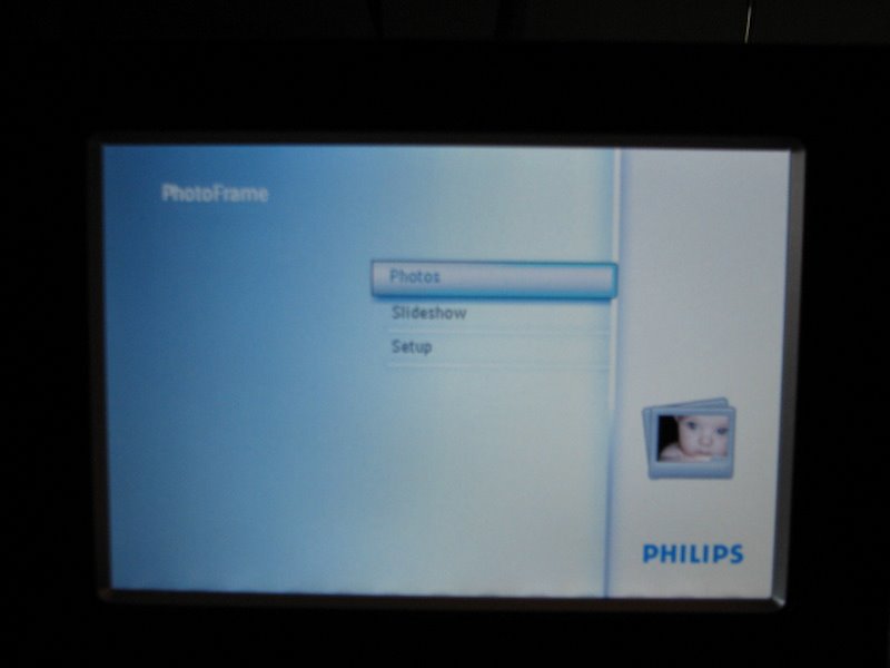
Task Failure in a Digital Frame Design

I shouldn't look a gift digital frame in the interface, but it contributed to a badly spent Labor Day, so I will: the Philips 7FF2M4. In February I posted a link to David Pogue's review of other digital frame designs that mostly got it all wrong; consider this a detailed sequel from yours truly.

This frame is not wifi or bluetooth enabled - so no home networking to connect to etc. Good, because I don't leave my PC with my photos on all the time. And I wanted to take this to the office. My gift-giver kindly included a 2GB card with it, too. My naive, starting assumptions for how this works, without having looked into digital frames much previously:

  1. I will be able to put photos on the card, or use one from a camera as is
  2. I will put it in the slot on the frame
  3. It will play a slideshow of all the pictures on the card.

The end. I expected to stick in the card and have it cycle through them, maybe with a nice dissolve between them. That's the task that I'd assume as designer, and design to support. But the difficulty for consumer electronics design seems to be keeping the product focused on the core task, and not getting lost in the options possible to throw in there. (I think most of these companies don't have UI designers on staff, honestly. Apple taught us about the importance of industrial design, but the UI part didn't come across so clearly to the world.)

Physically it's a nice frame, with a solid plugin foot that's heavy enough to hurt someone. I think it's a 7x5" display, although that's a bit vague on the box. It claims to do auto-rotation, to landscape or horizontal, which is nice - I remember that my smarter cameras know to rotate pics, but not all do, so my cards from my cameras might not work well "as is." Okay, I'm not averse to dragging pics onto the card from a computer.

Which I do, and then stick it in the frame. It does not play anything automatically except its own menu - and when I find the slideshow button (I do like the physical controls on the back) I try to play it. But it plays some generic Philips ads, not my pictures. What?

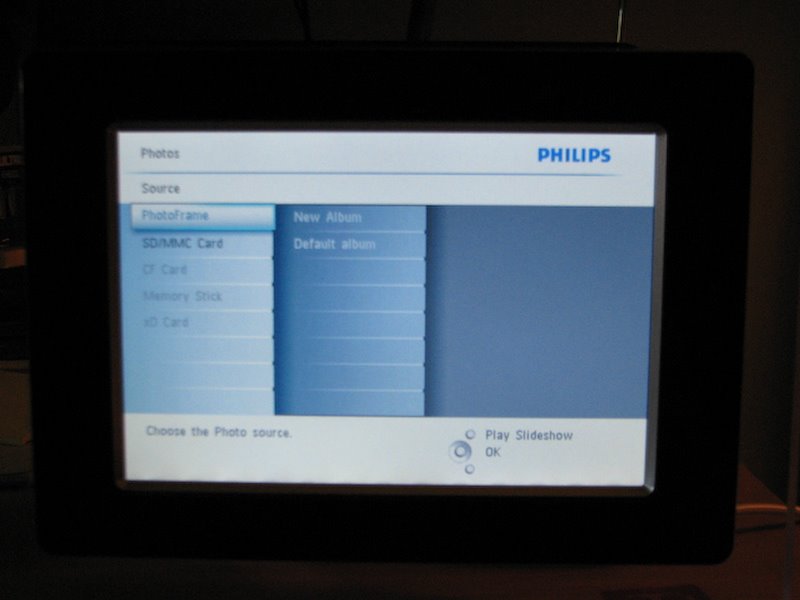
It turns out that you have to navigate through a menu to reach your card, and then into the directory on the card itself, and then it gets really complicated - you get the option of making "albums" there and other things. It's hard to get it to play a damned slide show! (Or find your pics, if you aren't familiar with your directory structure on your camera card.)

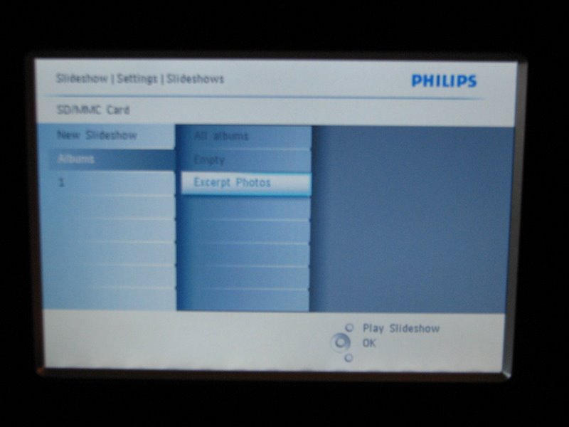
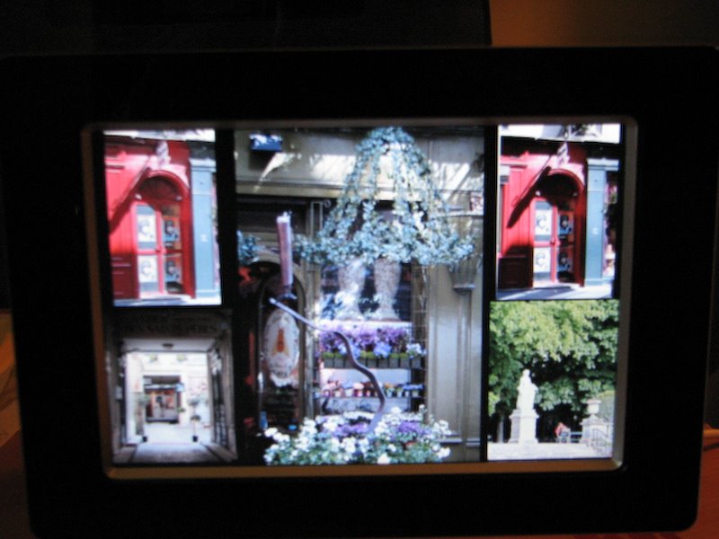
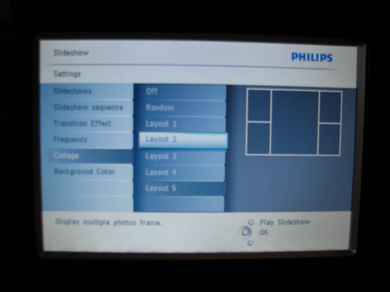
Eventually I managed to get an album and get a slideshow to play (you can see my abortive attempts called "1" and "Empty" and "Excerpted" above; my path involved debugging my card's directory issues with their provided software for creating "albums" on my card or frame, which I don't get much benefit from, I just want to play the contents of the directory!). The slideshow has some oddities; it has bad transitions, and a weird too-many-pictures-at-once display mode. It turns out this is a "collage" option on by default, which squeezes in 6 pictures into the 5x7" frame size, way too many for them to look good. You'll also notice it regularly uses two of the same one, an odd programming choice (is it meant to look good that way?):

I find the settings to choose another collage and it sure has a lot of them. Sheesh. The only one I really would consider using in a small frame size is 2-up, a split screen of 2 images, and that setting is NOT offered.

But then, there are lots and lots of settings...

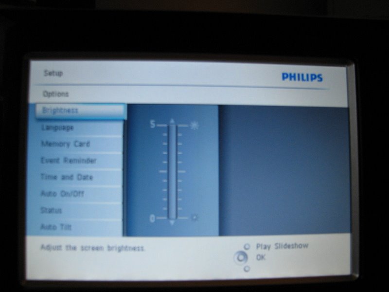
But the kicker is this: None of my choices stick. When I power down and restart it next morning, it's back to playing the Philips internal frame memory, and using a collage of 5 pictures. What the heck? With all those menus to go through, it requires some real work to get it into a state without too much setup time. I managed to erase the Philips frame pictures so when I hit slideshow it finds mine, but have not figured out how to get it to remember the collage style I prefer.

I realize the market is crowded with digital frames, but I suspect we are not really ready for complex feature wars yet. Ease of use out of the box seems like the most important aspect here. The task of playing photos (with simple defaults - dissolve and no collage mode, remember last directory played from) is not rocket science. Okay, there may be some clever design required for cases with multiple directories of photos embedded in a frame, but some code that FINDS THE PHOTOS instead of requiring the user to navigate through strange DCAM directories would seem doable. A very simple startup option in the case of multiple directories would seem doable too - which one do you want to play now? Let's assume for jollies that it's probably the card contents that should be the default, not the internal frame's limited memory.

    There are multiple photo directories. What do you want to see?
  • Play all my CARD photos (280 photos, Jan 2008)
  • Play CARD DIR1 (245 photos, 15 Jan 2008)
  • Play CARD DIR2 (35 photos, 16 Jan 2008)
  • Play FRAME photos (4 photos, 7 Jun 2007)

It wouldn't surface multiple card directories if they were just the automatic camera directories, only if they were made by a user in a non-camera manner. So the simplest case is just look for images and play them - card first. They can keep their buttons for getting to more interesting settings if they want, but any of that is advanced gravy. Plus, remember the damned last power-on choice! How often do I want to be fiddling with this thing? (Not ever.)

One Philips frame review at CNET says the next model is an improvement for ease of use.

Our biggest complaint about the 7FF was that the unit wasn't a little more intuitive to navigate right out of the box. Although it didn't take us that long to figure things out, the unit's internal GUI (graphical user interface) could have been a little more user-friendly. Philips seems to have gone out of its way to fix that problem in this next-generation model with a totally redesigned interface.

I sure hope so. I admit I doubt they get as close as my suggestion above... but I'd be pleasantly surprised if so.

Sunday, August 03, 2008

Staffing for User Experience: What Can Go Wrong

You decided to hire a bunch of interaction designers and "user experience" people to improve your product, service, or general business from a customer-focused design perspective. You were lucky enough to find some experienced folks, who've proven their worth at other companies.

It may not be obvious, even if you hired evangelists to help convince the rest of the company of their value, how many ways you can still get it wrong AFTER the hiring. It takes more than headcount! Your new people need to be empowered to make a difference on the product. The issues below amount to (a) cultural and process openness around adding more design into the team software mix, (b) how the dynamics of decision making in your company can impact design for evil rather than improvement.

  1. Did you hire the right people? Let's assume you did, but a couple reminders here: Your biases and your interviewer biases may be some of the problem you are actually hoping to solve. Did you hire looking for collaborative people who get along with everyone (and cave in an argument, in order to preserve the peace?). Did you hire people who do evaluation of other people's designs, or did you hire designers? Did you hire GOOD designers? (Would you know how to evaluate their design skills?) What kind of power dynamics are going on with the interviewers you lined up: Are any of them threatened by the whole idea of outside new people influencing the product? Are they looking for "yes" people or new ideas? Remember they may say something quite different from what they really secretly feel after 3 beers.
  2. Does anyone other than development or product management get a say in how things turn out? How much will these expert new hires be heard? A development manager who is used to being in control may not like having to invite someone new to his planning meetings; a product manager may be unhappy if your new hire questions her market research based on usability data. How much of the time will your new staff be looking for data and ways to convince people to listen, versus actually making an impact on the product? If you had to hire evangelists, you're set up for this problem from the start - expect a lot less productive impact on the product from your new hires, and a lot more organizational time suckage.
  3. Do you have ugly cultural problems you don't know about: Prejudice against non-"technical" input, assumptions that women aren't as smart or good at software or technical decisions. Women are more likely in UX/design than they are in engineering jobs, even if they started in development positions. Check out the dynamics at the whiteboard here, a scene I've watched many times...
  4. Will other people take UX team work as optional input to modify, redo, ignore? Does someone else secretly want their job; not realize it's a separate real job in the process; or actually HAVE their job on the project. I've seen teams where two people were meant to be the customer design input, and didn't agree, and it led to time-wasting fights for the whole group around them, with people taking sides on issues and duplicate work being done. I've seen plenty of QA teams forgetting about the spec, developers not reading or forgetting about the details, and other errors of omission that prevent design from being fully effective.
  5. Do you have decision processes that are functional in your company - or do you regularly have meetings that bog down with "votes" or too many inputs, and open more issues than they close on a regular basis? This environment won't scale well to adding players especially in design discussions. (If your team is arguing with the designer about whether to use radio buttons or checkboxes, you have a dysfunctional decision process which means you are wasting resources and time.)
  6. Is there enough time in your shipping cycle to actually add design as a separate process? Not a trivial question to laugh off; mistakes made early, in requirements and design, are much easier to fix than anything after some code has been written, assuming you have processes in place to catch them before you get too far. This well-known fact doesn't make most companies happier to slow down. I think it has something to do with what's seen as "progress" and "work" in the development cycle, and the glorification of risk-taking that exists in so many software companies that have money to burn.
  7. Does your company regularly bite off bigger projects than it can deliver in a release cycle? These giant projects are unlikely to be high quality when they ship after all the cuts and compromises are made to squeeze them in. Partial functionality is usually worse than no functionality because your company looks like it just didn't get what the customers were asking for. No UX person can entirely save you from this, but a good one consulted and involved in the process from the start might keep you focused on the must-haves for minimal usefulness.
  8. Have you got project management to track team issues and milestones and make sure things aren't grinding down to a halt, or loaded with bugs and unresolved issues. Are they also concerned about tracking design stages, and blocks to those deliverables, rather than just safeguarding developer efforts? (Before you say "of course," maybe you should check with the designers.) These things can add up and make everyone less useful in the end; software is a team effort.
  9. What will you do with the designs your designers produce -- they can make mockups till the cows of management come home from their offsite, but that doesn't mean it's useful in your process.
  10. Do you have your new UX people spread too thinly to be effective -- with an average of 20 developers to one designer (who is shared over multiple projects), there will be a large number of meetings they miss; bugs they don't have time to provide input on; bugs they don't have time to file; builds or releases they didn't get to see closely enough to catch last minute errors; bug review sessions they weren't at to push for the usability/experience bugs; doc they didn't look at to see if it covers the main use cases and important details; customers they didn't have time to call or visit. And spec modifications they couldn't keep up to date. Their morale will suffer proportionally to the things they don't have time to do that decrease their effectiveness.
  11. Is the UX person involved early enough to be (a) able to influence the crucial early decisions (b) and to be a true team player in the project, rather than an end-game consultant check-mark on your process? It's often in an overloaded (dysfunctional) environment that the designer or usability specialist is involved only at the end of the cycle to "review" and "bless" things. If you're tired of hearing from your new hires that they didn't know something had been decided, or that they wish they'd been consulted earlier, then you've got this problem headed your way. Remember it's much harder to effect change after code is written! And they want to be able to make an impact, otherwise they will be wasting their skills.
There are lots of ways to miss, even with good staff. I've been in good teams and bad teams for design process, but seen a lot of these failure modes. I'm keeping score of how many companies have teams that argue with their designer about radio buttons versus checkboxes, wasting valuable time in their cycle. The stats aren't looking good. But if you take care of your processes and oversee design as a separate stage and responsibility, your company can be better than that.

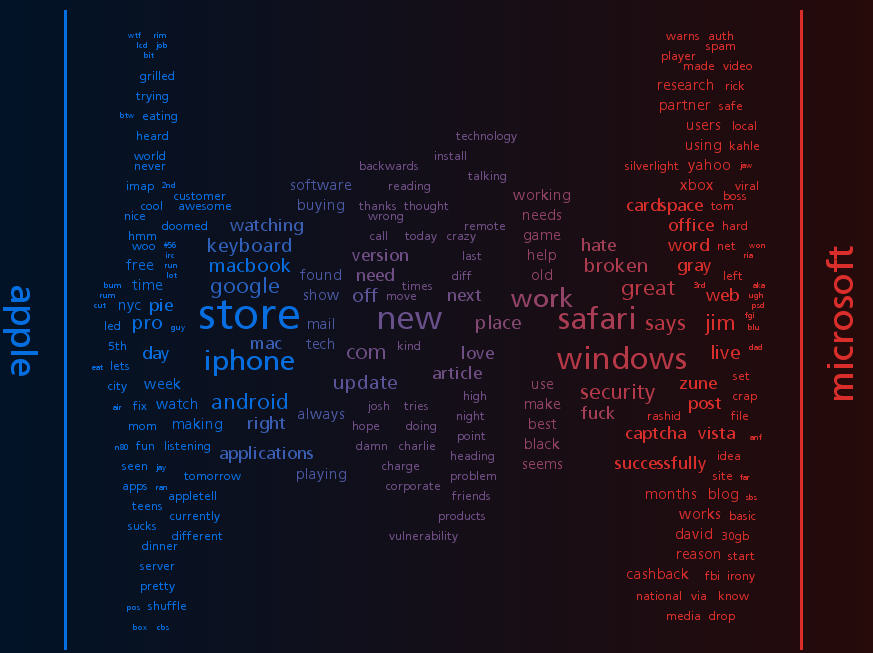
Wordle on Ghostweather

Playing with Jonathan Feinberg's artistic tag cloud generator Wordle, I plugged myself in (of course) and got this one (this is the "ghostly" color scheme):

Randomness is a powerful toy in design - it helps you discover things you wouldn't have seen with a purely organized eye. It's inspirational. It's fun.

Sunday, July 27, 2008

Some Fun Entries in the Create the Future Design Contest

Now that the Create the Future Design Contest is open and collecting entries, it's time to point out some of the reasons I love this contest. Before I do, I should say that although I help with the site design and administration, I have nothing whatever to do with judging, which is done by a panel of engineering and research experts recruited by NASA Tech Briefs. And my opinions won't mean anything to them!

One thing that makes this contest fun are the wacky ideas - the napkin sketches, the weird diagrams, the mad scientist schemes. Some of them just sound funny at first, but are actually quite earnest. Take, for example, the "Thumbtack Remover." Or the "Personal Transport Pod" (I especially like the solar panels). (Be sure to check out the scheme for the "Personal Safety Belt" by the same inventor, which slightly resembles a super hero's costume.) And then there's the eSpider, a recyclables pre-sorter with a hand that looks like a spider.

Some of the entries have terrific images, rendered with high-end tools like Rhino and SolidWorks. Here's a student entry using Rhino to illustrate a convertible boat. Another student entry uses Rhino to diagram a medical self-diagnosis unit, called Sintomatico. And there's a student design for a vertical bike rack, using SolidWorks, which makes any design look very professional. Here's a part of a SolidWorks entry for an electromagnetic rail motor:

Some have surprising descriptions - this one for a breast exam device features a quote from a famous columnist that I didn't expect, but supports the case! This one is for handling hair-oil storage, which makes me flash back on Clooney's hair treatments in "O Brother." In another odd hair-related device, you've got to check out the Bowman, which I find hilarious. He submitted pdfs, so be sure to open them up! Bowman entry on www.CreateTheFutureContest.com Some also have funny names, like the A.T.E.A.M, for the "ANTI-TERRORIST ECM-AUDIO MECHANISM."

A few words about the site and contest: While we are showing page view counts, there is no prize for page views this year. It was too much trouble to police last year. I will probably review and reset them any case, to keep them more or less believable. Please check out the entries with fewer page views right now, they are very deserving of eyeballs. There will be some form of public rating mechanism in October for another popular vote prize - development resources willing. Finally, if you like the home page, the flash banner of the Wright Brothers' plane with jet engines was done by an intern at SolidWorks, game design student from WPI Alex Schwartz. Awesome addition to the site.

If you have a blog and you post about the contest, I'll put your post link up on the site's press page.

Sunday, July 20, 2008

Designing the Stop Sign (the Agency Experience)

Having just given a workshop on setting yourself up as a consultant with some warnings about client types, this video is especially apropos. What if a corporation asked you to design a stop sign?

In the Freelanceswitch.com list of client types, I think they missed the Appreciative Hands-On Committee of Passive Aggressive Cheerleaders client. Who test your design on their 6 year olds!

Thanks for the timely pointer to Steve at Tingilinde...

Sunday, June 15, 2008

Let Your Designers Design!

We all know now that good design is a crucial element in a crowded market. But just because people in your company have strong feelings about design, doesn't make them good at it. Some of their ideas may be good, but that doesn't make them good at executing either. In the worst cases, they both think they have good ideas and think they can execute, and they can do neither. (Remember, incompetent people don't know they are incompetent.)

Signs of the problem in your org:

  1. You have designers on staff, but they're demoralized and frustrated. Designers are a special breed of person, more likely to leave when they can't accomplish what makes them tick than many others; they're driven by their skills and talents more than promotion opportunity inside a company or a domain in which they work.
  2. Consensus-driven culture has ground projects to a halt. You can't break out of decision-making meetings with a clear goal, and there are too many cooks involved. Because the designers aren't empowered to make the final design decision, and other (incompetent) people are weighing in or fighting with them. (See Scott Berkun's recent take on this, and an old take on why products don't end up usable that covers all this organizational stuff too.)
  3. You may have a lipservice executive level belief in design as important (ever since Apple made it profitable), but you have no headcount for it, and no org process for it. There are no goals in the marketing pipeline that focus on it, there are no metrics to measure it, and it's no one department or person's job. It's handled diffusely, and not managed effectively.
  4. Secretly, you or other middle-level managers think design is a technical thing, or the "fun" part for the technical folks, and it's best handled by developers as a kind of prize for the good ones. Don't bother trying to hire in this climate!
  5. Final decisions about what gets in the product and what's shippable are based on criteria or opinions that don't know much about how customers respond to your stuff. Bugs that in a one-in-a-million system configuration cause a crash are prioritized about correcting a layout problem that makes you look amateurish, or a typo that makes you look like a busload of idiots.
  6. You think it's all about the documentation - the customers just need to read more.
  7. You outsource all of your visual design, and that's what you mean by "design" anyway.
  8. You didn't realize people get degrees today in usability, human factors, interface design, interactive design, etc. In these degree programs they learn the correct ways to collect and interpret data, deliverables that communicate at different levels of fidelity, how to go from abstract to concrete, how to validate designs, and how to prototype. Corollary: You also think design is work that's "obvious" and easy, probably also because it doesn't involve writing (much) code.
  9. You don't have actual project managers on your staff. You make it someone else's job, usually a development manager's; this means design as a phase and design deliverables are not scheduled and monitored in the way that code production is. Instead, it's all "where's that damn spec, we need to start making this thing."
  10. Your designers are actually trying to steal the project management, so they can get some control over the process, but this is leaving them too busy to actually do design. They schedule meetings to get stakeholders together, they try to get the PM's to articulate what the heck the requirements are, they hire visual designers, they call customers... they never actually get to design, except after hours.
  11. You've got innovation projects going on in your company, but there aren't any designers working on getting things right from the start. (Chances are, they are too busy with 9 and 10 to be contributing even if invited.) But basically you feel that design is "icing" to make it look pretty after the big ideas are implemented. You think the real breakthroughs come from technical ideas, not ideas that come from watching people work or new interaction techniques or novel workflows. Never mind how expensive it is to get requirements wrong up front and have to "fix" things later. (There are any number of software studies on this, drop me a note if you want refs. I've seen startups go under from this, before they even got out the door with their product.)
  12. You've got internal folks like usability testers who are told they "facilitate" group processes but aren't empowered or able to make overruling design decisions. This is explicit support for consensus design or committee design, dangerous when everyone else is opinionated but incompetent.
Okay, I admit it felt good to get this list off my chest today. It's not the last time you'll see the subject cross this page. Let's hear it for design moving up the org chart; and for middle management and technical management understanding there are skills that might help with product big picture and end-game success!

Saturday, May 31, 2008

Mandatory Post on Twitter: A new form of MUDding?

Everyone else is doing it, so I'm posting about Twitter too. I admit I've been enjoying it, probably more so since I have less time than I used to for blogging, Bloglines, and keeping up with friends on LiveJournal.

Everyone who writes about Twitter has to compare it to other things. For me, it's most like what we did in MUDs when I used to hang out there (a kind of chat world, see MUDs and MOOs on wikipedia, and my book about one). We used to connect while working, and "idle" much of the day, but "wake up" to post links to things we thought were interesting, or to say what we were doing "in real life." We even watched TV together in a MUD group. In a MOO, you had to do something special to direct comments to someone, just like you do in Twitter (where you prepend "@name"). Voila, c'est Twitter; except that in a MUD you had to go somewhere to be in the space by connecting specially, it was less public, and a lot more synchronous. Plus not searchable from "outside" the MUD client. So, okay, it had some differences.

Other things it's like: How people change their "status" message in a chat client, and sometimes riff off other people's status messages. That's not archived in the way Twitter history is, though. And it's like SMS, in that's it's terse, but for a party. And it's like a very slow chat room, where no one really knows who's listening in or who might look at what you said later. (Watch out.)

Brief geeky research aside: There's an old paper by Clark and Brennan (1991) that's a goodie among people who study CMC (computer-mediated communication) that describes potential aspects of communication media, including whether they offer co-presence, visibility, co-temporality, and sequentiality of messages. To really consider how Twitter stacks up, you would also want to consider system features that characterize rich Internet communication tools, such as the potential for users to have private one-to-one and multi-party conversations that aren't recorded, what kind of message size is possible, availability of threading/sorting/filtering tools, ability to archive exchanges and/or prevent it, possibility of editing posts after they are made, ability to block messages from certain people.

Twitter is less synchronous so less co-temporaneous than internet chat or face-to-face or phone talk, the reviewability is possible but only fair in practice (in that you have to do some work to go back in a history to check what you missed), and interruptions between two-person exchanges are common. Threads are possibly even impolite. Private messaging is possible depending on the client used. Editing isn't possible after posting, but deletion is. The message length constraint strongly restricts the type of exchange that can happen, by design. Blocking of a kind is possible. You can filter your list of followed people to a "favorites" list if you want.

Which reminds me - all communication media allow for genres or registers of speech/writing, in which the style and topics can differ tremendously across groups of users and occasions of use. Generalizations about how people use Twitter will only be applicable to local groups of followers and their following. So I won't try. Give a look in and see what you think.

Because of the very public nature of Twitter, we get the possibility of search tools like Summize. Which means you can look up keywords or people and find out what's up with them. You can even subscribe to these searches by RSS, so thatt you can follow public chat that mentions your favorite product or TV show. (When I mentioned FIOS once, someone who works at Verizon started "following" my comments on Twitter.)

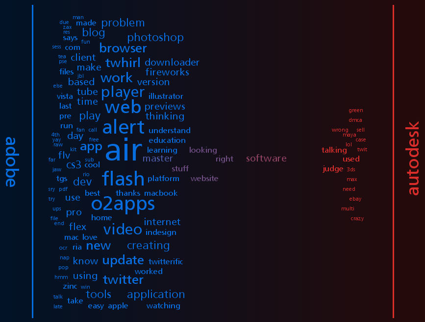
Summize also allows for interesting meta-search applications like Twitter Spectrum, allowing you to contrast word environments for two terms. Just for fun, here's a few charts of contrasts I find interesting. You can see who's talking more about what here.

Anywho, I'm enjoying Tweeting, although I still miss ElseMOO after all these years.

Sunday, May 18, 2008

CHI 2008 Conf: Usability Considered Harmful

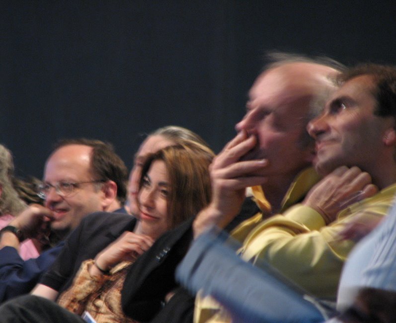
The premier human-computer interaction conference, aka CHI 2008 (pronounced "kai" not "chee") was in Florence, Italy this year. After missing last year's in Silicon Valley, I went despite the ruinous exchange rate. (Other local colleagues went to Italy for the conference, but blew it off to go skiing instead!) One of the more interesting and crowd-drawing sessions was the paper by Saul Greenberg and Bill Buxton, "Usability Evaluation Considered Harmful... Some of the Time." Following it was commentary by Bonnie John, Tom Rodden, Dan Olsen and the ever-sharp CHI attending audience. Here's Saul and Bill listening to the commentary: Buxton and Greenberg

An initial note: CHI as a conference has a huge percentage of academic and research attendees. How to make it "relevant" to the "practitioner" audience is a regular concern of the conference committee. Why research isn't necessarily relevant is one of the reasons for their paper, I think. (And for things I've spoken and written about in the past, too.)

The main argument was...

...We too often perceive … an unquestioning adoption of the doctrine of usability evaluation by interface researchers and practitioners. Usability evaluation is not a universal panacea. It does not guarantee user-centered design. It will not always validate a research interface. It does not always lead to a scientific outcome.
Their supporting arguments were these:
  • CHI reviewers require evaluation, and usually quantitative (lab study) testing results, as a part of a submitted paper (reflected in the submissions guidelines)
  • Quantitative usability studies are often the wrong type of study for certain kinds of design: such as inventions in prototype stage; other types of user study may be more correct for these.
  • In an argument familiar from Buxton's book Sketching User Experiences, a focus on usability evaluation too early in a development cycle produces poorer final results than will experimenting with more design concepts (or "sketches")
  • Early-stage technical innovations that are disruptive or paradigm changing may produce poor or ambiguous user testing results, which may prematurely kill them off as research topics -- when long-term these ideas might find audiences and produce large-scale social or practice change after adoption.

Greenberg and Buxton argue that CHI has too great a focus on scientific results (and poor ones at that), rather than on supporting good design and invention.

“Science has one methodology, art and design have another. Are we surprised that art and design are remarkable for their creativity and innovation? While we pride our rigorous stance, we also bemoan the lack of design and innovation. Could there be a correlation between methodology and results?”
Tom Rodden at CHI

Comments ran the gamut from polite disagreement about the counts of types of papers accepted at the conference, to observations that publication-treadmills don't allow time for disruptive risky innovation that can be studied longitudinally, especially for students in grad school. Saul asked the CHI audience to review papers differently -- after all, the audience there constitutes what gets in, and what's considered good work. What constitutes good work worthy of acceptance is in the hands of the reviewers in the room! Finally, it was noted that different, "riskier" work of a design or featuring ethnographic evaluation instead of user testing is regularly accepted at other conferences in the same ACM family: DIS, DUX, CSCW, even Ubicomp and UIST.

Most difficult, for me, is the idea that the CHI reviewing audience has the credibility and experience to review riskier design work that doesn't come along with (the right kind of) user study. With mostly academics and researchers on the reviewer list, I question whether this audience has the depth of practical design experience and credentials required to recognize and talk about "good design" with credibility. What do I require for credibility: having done a lot of real-world design, and having evaluated a lot of products from a customer-centric perspective. When I say "real world" I don't mean academic design - where it's notoriously easy to go wild and crazy. In the context of a business or large organization, the kinds of compromises that designers face are what separate the real good from the mediocre.

I would like to repeat that human computer interaction is not fully represented at CHI. The conference is just one forum. While it's true that CHI publication counts more than most others to researchers in this field, it doesn't necessarily represent the full range of activities and professional expertise in the broader field of interaction design.

Tuesday, May 06, 2008

Mini-UPA conference in Boston

Boston's mini-Usability conference is coming up on May 28 at Bentley. This is a reasonably priced one-day event that attracts quite a local crowd, and not a few non-locals. I had a good time at this last year, when I was a speaker on online community design. This year I am speaking about life as a consultant, and mistakes I made in my first year. Here's my abstract:
One year ago, I quit my job and started consulting full-time, after 10 years of industrial wage slavery. I was financially successful in this year, but made a lot of mistakes. I managed to fall into bad headhunter relationships, make mistakes in my accounting that required a 101 class to fix, became thoroughly confused about whether to be incorporated or not, and generally made a lot of newbie mistakes with a handful of clients ranging from garage startups to established software firms. Other local consultants gave me advice and I learned from my mistakes. I can tell you how I did it and what I could have done better; and how it compares to what other local consultants say. I will cover:
  • Your use of the internet to advertise yourself (search engine optimization, job sites, Linked In, blogs, etc.)
  • Portfolio work
  • Branding (logo, name, etc.)
  • Proposals
  • What to charge (the many factors and equations; plus: "they're charging WHAT and someone is really paying it??")
  • Headhunters and job offer pressures
  • Basic accounting and expenses to track
  • ... And other things I learned the very, very hard way, like the portable office equipment it might be nice to own because the client site is a cave with rocks to sit on.
You'll get a handout with the Top 10 Most Important Consulting Considerations in case you too want to do this!

BIO:Lynn Cherny has a Ph.D. from Stanford that she hasn't used in years, except for some statistical skills. She has 12 years of experience working at and/or managing interface design at companies including TiVo, Excite, Adobe, The MathWorks, and AT&T Labs. Her current consulting identity is Ghostweather Research & Design, LLC. She can be reached at lynn@ghostweather.com.

There are interesting names on the list of speakers, including Jared Spool and Chauncey Wilson, Beth Loring and Joe Dumas, plus a host of other local employers. The talks range from research methods to design case studies, with a bit of business thrown in (thankfully, for some of us!). It's even multi-track, reflecting how many submissions they get. And their cocktail hour is fun and well-stocked.