Saturday, May 31, 2008

Mandatory Post on Twitter: A new form of MUDding?

Everyone else is doing it, so I'm posting about Twitter too. I admit I've been enjoying it, probably more so since I have less time than I used to for blogging, Bloglines, and keeping up with friends on LiveJournal.

Everyone who writes about Twitter has to compare it to other things. For me, it's most like what we did in MUDs when I used to hang out there (a kind of chat world, see MUDs and MOOs on wikipedia, and my book about one). We used to connect while working, and "idle" much of the day, but "wake up" to post links to things we thought were interesting, or to say what we were doing "in real life." We even watched TV together in a MUD group. In a MOO, you had to do something special to direct comments to someone, just like you do in Twitter (where you prepend "@name"). Voila, c'est Twitter; except that in a MUD you had to go somewhere to be in the space by connecting specially, it was less public, and a lot more synchronous. Plus not searchable from "outside" the MUD client. So, okay, it had some differences.

Other things it's like: How people change their "status" message in a chat client, and sometimes riff off other people's status messages. That's not archived in the way Twitter history is, though. And it's like SMS, in that's it's terse, but for a party. And it's like a very slow chat room, where no one really knows who's listening in or who might look at what you said later. (Watch out.)

Brief geeky research aside: There's an old paper by Clark and Brennan (1991) that's a goodie among people who study CMC (computer-mediated communication) that describes potential aspects of communication media, including whether they offer co-presence, visibility, co-temporality, and sequentiality of messages. To really consider how Twitter stacks up, you would also want to consider system features that characterize rich Internet communication tools, such as the potential for users to have private one-to-one and multi-party conversations that aren't recorded, what kind of message size is possible, availability of threading/sorting/filtering tools, ability to archive exchanges and/or prevent it, possibility of editing posts after they are made, ability to block messages from certain people.

Twitter is less synchronous so less co-temporaneous than internet chat or face-to-face or phone talk, the reviewability is possible but only fair in practice (in that you have to do some work to go back in a history to check what you missed), and interruptions between two-person exchanges are common. Threads are possibly even impolite. Private messaging is possible depending on the client used. Editing isn't possible after posting, but deletion is. The message length constraint strongly restricts the type of exchange that can happen, by design. Blocking of a kind is possible. You can filter your list of followed people to a "favorites" list if you want.

Which reminds me - all communication media allow for genres or registers of speech/writing, in which the style and topics can differ tremendously across groups of users and occasions of use. Generalizations about how people use Twitter will only be applicable to local groups of followers and their following. So I won't try. Give a look in and see what you think.

Because of the very public nature of Twitter, we get the possibility of search tools like Summize. Which means you can look up keywords or people and find out what's up with them. You can even subscribe to these searches by RSS, so thatt you can follow public chat that mentions your favorite product or TV show. (When I mentioned FIOS once, someone who works at Verizon started "following" my comments on Twitter.)

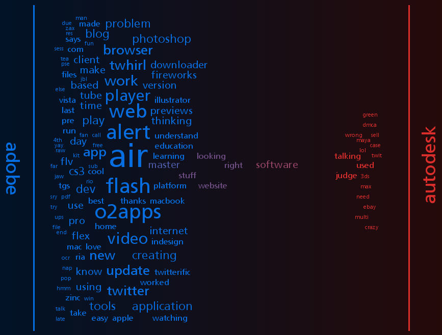
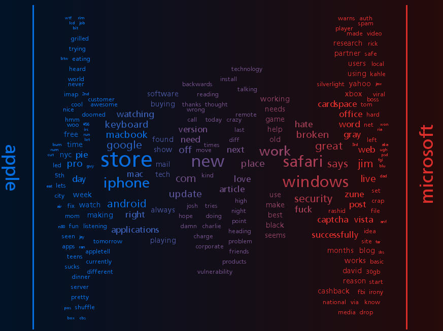
Summize also allows for interesting meta-search applications like Twitter Spectrum, allowing you to contrast word environments for two terms. Just for fun, here's a few charts of contrasts I find interesting. You can see who's talking more about what here.
Anywho, I'm enjoying Tweeting, although I still miss ElseMOO after all these years.

Sunday, May 18, 2008

CHI 2008 Conf: Usability Considered Harmful

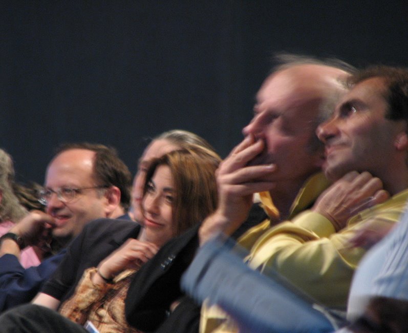
The premier human-computer interaction conference, aka CHI 2008 (pronounced "kai" not "chee") was in Florence, Italy this year. After missing last year's in Silicon Valley, I went despite the ruinous exchange rate. (Other local colleagues went to Italy for the conference, but blew it off to go skiing instead!) One of the more interesting and crowd-drawing sessions was the paper by Saul Greenberg and Bill Buxton, "Usability Evaluation Considered Harmful... Some of the Time." Following it was commentary by Bonnie John, Tom Rodden, Dan Olsen and the ever-sharp CHI attending audience. Here's Saul and Bill listening to the commentary: Buxton and Greenberg

An initial note: CHI as a conference has a huge percentage of academic and research attendees. How to make it "relevant" to the "practitioner" audience is a regular concern of the conference committee. Why research isn't necessarily relevant is one of the reasons for their paper, I think. (And for things I've spoken and written about in the past, too.)

The main argument was...

...We too often perceive … an unquestioning adoption of the doctrine of usability evaluation by interface researchers and practitioners. Usability evaluation is not a universal panacea. It does not guarantee user-centered design. It will not always validate a research interface. It does not always lead to a scientific outcome.
Their supporting arguments were these:
  • CHI reviewers require evaluation, and usually quantitative (lab study) testing results, as a part of a submitted paper (reflected in the submissions guidelines)
  • Quantitative usability studies are often the wrong type of study for certain kinds of design: such as inventions in prototype stage; other types of user study may be more correct for these.
  • In an argument familiar from Buxton's book Sketching User Experiences, a focus on usability evaluation too early in a development cycle produces poorer final results than will experimenting with more design concepts (or "sketches")
  • Early-stage technical innovations that are disruptive or paradigm changing may produce poor or ambiguous user testing results, which may prematurely kill them off as research topics -- when long-term these ideas might find audiences and produce large-scale social or practice change after adoption.

Greenberg and Buxton argue that CHI has too great a focus on scientific results (and poor ones at that), rather than on supporting good design and invention.

“Science has one methodology, art and design have another. Are we surprised that art and design are remarkable for their creativity and innovation? While we pride our rigorous stance, we also bemoan the lack of design and innovation. Could there be a correlation between methodology and results?”
Tom Rodden at CHI

Comments ran the gamut from polite disagreement about the counts of types of papers accepted at the conference, to observations that publication-treadmills don't allow time for disruptive risky innovation that can be studied longitudinally, especially for students in grad school. Saul asked the CHI audience to review papers differently -- after all, the audience there constitutes what gets in, and what's considered good work. What constitutes good work worthy of acceptance is in the hands of the reviewers in the room! Finally, it was noted that different, "riskier" work of a design or featuring ethnographic evaluation instead of user testing is regularly accepted at other conferences in the same ACM family: DIS, DUX, CSCW, even Ubicomp and UIST.

Most difficult, for me, is the idea that the CHI reviewing audience has the credibility and experience to review riskier design work that doesn't come along with (the right kind of) user study. With mostly academics and researchers on the reviewer list, I question whether this audience has the depth of practical design experience and credentials required to recognize and talk about "good design" with credibility. What do I require for credibility: having done a lot of real-world design, and having evaluated a lot of products from a customer-centric perspective. When I say "real world" I don't mean academic design - where it's notoriously easy to go wild and crazy. In the context of a business or large organization, the kinds of compromises that designers face are what separate the real good from the mediocre.

I would like to repeat that human computer interaction is not fully represented at CHI. The conference is just one forum. While it's true that CHI publication counts more than most others to researchers in this field, it doesn't necessarily represent the full range of activities and professional expertise in the broader field of interaction design.

Tuesday, May 06, 2008

Mini-UPA conference in Boston

Boston's mini-Usability conference is coming up on May 28 at Bentley. This is a reasonably priced one-day event that attracts quite a local crowd, and not a few non-locals. I had a good time at this last year, when I was a speaker on online community design. This year I am speaking about life as a consultant, and mistakes I made in my first year. Here's my abstract:
One year ago, I quit my job and started consulting full-time, after 10 years of industrial wage slavery. I was financially successful in this year, but made a lot of mistakes. I managed to fall into bad headhunter relationships, make mistakes in my accounting that required a 101 class to fix, became thoroughly confused about whether to be incorporated or not, and generally made a lot of newbie mistakes with a handful of clients ranging from garage startups to established software firms. Other local consultants gave me advice and I learned from my mistakes. I can tell you how I did it and what I could have done better; and how it compares to what other local consultants say. I will cover:
  • Your use of the internet to advertise yourself (search engine optimization, job sites, Linked In, blogs, etc.)
  • Portfolio work
  • Branding (logo, name, etc.)
  • Proposals
  • What to charge (the many factors and equations; plus: "they're charging WHAT and someone is really paying it??")
  • Headhunters and job offer pressures
  • Basic accounting and expenses to track
  • ... And other things I learned the very, very hard way, like the portable office equipment it might be nice to own because the client site is a cave with rocks to sit on.
You'll get a handout with the Top 10 Most Important Consulting Considerations in case you too want to do this!

BIO:Lynn Cherny has a Ph.D. from Stanford that she hasn't used in years, except for some statistical skills. She has 12 years of experience working at and/or managing interface design at companies including TiVo, Excite, Adobe, The MathWorks, and AT&T Labs. Her current consulting identity is Ghostweather Research & Design, LLC. She can be reached at lynn@ghostweather.com.

There are interesting names on the list of speakers, including Jared Spool and Chauncey Wilson, Beth Loring and Joe Dumas, plus a host of other local employers. The talks range from research methods to design case studies, with a bit of business thrown in (thankfully, for some of us!). It's even multi-track, reflecting how many submissions they get. And their cocktail hour is fun and well-stocked.

Sunday, April 27, 2008

NASA Tech Briefs: Create the Future Contest Awards in NYC

New York City, April 2008: In New York last week, the Create the Future Contest award winners were honored in a nice ceremony. The awards were presented over a swanky dinner and drinks at the Water Club in NYC. (Good thing I changed when I got there: a classic NYC taxi driver let me off early saying, "I can't turn right here. You have to cross there and go under that overpass, past the helicopter landing, and then it's on your left.")

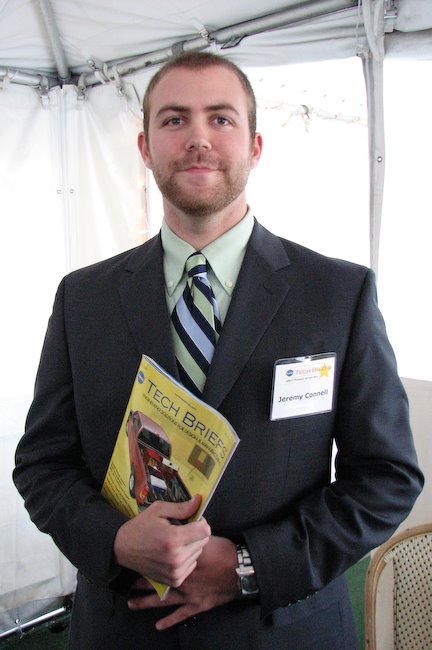
While I was pleased for all the qualified entrants-- almost 1000 this year, a record probably due to having a website -- I was most happy about the two student category winners. Jeremy Connell, a junior in Virginia, actually used SolidWorks for his cargo carrier design. Here he is holding the paper edition of NASA Tech Briefs, which features his winning design on the front cover! Jeremy Connell at NTB Contest Jeremy would like to get a job designing boats. I'm also hoping he'll intern at SolidWorks if he's available and we can work out the details.

The winner for the Transportation design category was student Corban Tillman-Dick, who is actually an economics major at Johns Hopkins. He's the designer of a more efficient engine, the Internally Radiating Impulse Engine. His brothers were all present for the award; they are trying to get funding to base a company on this design. Sadly, their father, who helped with the design, died suddenly in a car accident a few weeks earlier and could not attend with them. Here is Corban and a brother with Jeff Ray, CEO of SolidWorks: Corban Tillman-Dick

A few other winners -- Joseph Hollman designed a beacon locator for mine workers, shortly after a serious mining disaster last year. Here is Joseph receiving his award: Joseph Hollman with award

And Dr. Ajay Mahajan and colleagues were there to receive their Medical category prize for a 3D ultrasonic neuronavigation system for realtime image guided brain surgery. Ajay Mahajan

I'm afraid my camera batteries, bought for €1 in a Venice shop, did not hold out long enough for everyone's prize.

As you may recall, I was the consultant that designed and project managed the contest site for SolidWorks. This was the first year that SolidWorks was a major sponsor, as well as the first year there was any website featuring visible entries (and featuring a frenetic, viral "page view contest" which galvanized many students, not to mention bots). Jeff Ray also accepted the SolidWorks award for "Product of the Year" given by readers of NASA Tech Briefs, entirely coincidental with the co-sponsorship of the Create the Future Design Contest. (Obviously the contest was not judged based on software used by any entrant, and SolidWorks did not participate in the judging in any way.) Instead of a boring talking shot of Jeff Ray, I like this pic of him talking over drinks to our student winner who used SolidWorks.

Apart from the chance to see the sometimes wacky but always creative inventions, I got a lot out of seeing young designers do so well in the contest up against professional engineers. And in general, there were a lot of ideas that could make the world a better place with the right exposure and funding. Providing webspace for inventions and inventors is a good thing for us to do. We'll (and I'll) be doing the site and contest again this year! Stay tuned for another June launch.

Wednesday, April 23, 2008

Punitive Luxury at the Marriott Marquis

I just got back from an overnight work trip to NYC, where I was booked into the Marriott Marquis at Times Square. I disliked this experience, in oh so many ways.

How about this example of a nasty use of technology? Here's a $7 bottle of Fiji water that's on a weight-sensitive stand, the kind you see in heist movies where Tom Cruise is rapelling in to help himself to something way more fun than water.

The note on this bottle says, "Your account will be charged when this bottle is off the stand for more than 30 seconds." There was dust on the stand, because even the maids are afraid to disturb this gem. [Updated to add: a friend tells me her father stayed in another Marriott in a large American city and ran into the same thing. As he was going into his room, a cleaning woman in the hall warned him, "Don't move the water, don't move the water!!"]

Note that this was a room I was paying $400 for a night. I don't know what I got for it, to be honest. The sink wouldn't drain. And they also wanted me to pay $4.99 for their "tv-on-demand" DVR episodes of "Medium." (My first response, oh so naive, was "Wow, this hotel has DVRs in their rooms, awesome! I guess it's about time since we've all got them at home!" Then I saw the price for everything on it. Give me a break. Where's that warm fuzzy -- oh yeah, this isn't a brand experience, it's a technology scam.)

I didn't bother to try the Internet. They had more neat technology where their elevator collection resided. So many floors and so many attractions in this hotel, that they had a special scheduling routine in place: you enter your floor number, and it tells you which elevator to go wait beside. Despite this clever system of crowd management, their elevators were so busy that staff were escorting the more upset customers (incl. me) to the freight elevators for more realistic timing on their people-mover service. freight elevator with big bag When I got home, I came up with a few "nice" and possibly more interesting uses for their weight sensitive technology, instead of threatening their fleeced guests.

I know a lot of architects who love good hotel design -- but let me say, it's not just about architecture, it's about all the amenities and experience, including how they use their in-room technology. I'm still outraged!

Sunday, April 20, 2008

Open Source vs. Organizational Code

An interesting, free article from Harvard Business School working papers: Exploring the Duality between Product and Organizational Architectures: A Test of the Mirroring Hypothesis (scroll down for PDF link). From the abstract:
Specifically, products are often said to "mirror" the architectures of the organizations from which they come. Such a link, if confirmed empirically, would be important, given that product architecture has been shown to be an important predictor of, among other things: product performance; product variety; process flexibility; and future industry evolution. We explore this relationship in the software industry by use of a technique called Design Structure Matrices (DSMs), which allows us to visualize the architectures of different software products and to calculate metrics to compare their levels of modularity. We use DSMs to analyze a number of matched-pair products--products that fulfill the same function but that have been developed via contrasting modes of organization; specifically, closed-source (or proprietary) versus open-source (or distributed) development. Our results reveal significant differences in modularity, consistent with a view that distributed teams tend to develop more modular products. We conclude by highlighting some implications of this result and assessing how future work in this field should proceed, based upon these first steps in measuring "design."
I've seen work on this subject before (including similar diagrams that show code module relationships)-- not usually in business press, although it's nice to see this get a wide audience. Recently I read Becky Grinter's essay in HCI Remixed which reflects on Parnas 1972's "On the Criteria to Be Used in Decomposing Systems into Modules" and on Conway's Law: The structure of the code mirrors the communication of the organization that developed it. Or lack thereof.

More than that, I'd say the UI design and the broader corporate outside facing design often reflects the organization's internal structure and different goals. Marketing groups that don't talk to engineers, executives who don't get along, customer support and sales who don't speak -- these things all hit heavily on the face that a customer sees for the company. All of which can be reasons why "User Experience" as a group can't live low-down in any one part of a company, especially a big one.

More personally, I've started using R, an open-source competitor to MATLAB, and wondering about this stuff as I try to track down the open-source resources I need. I've been enjoying ramping up on R despite finding the documentation available and code quality of some libraries very hit-or-miss. MathWorks's doc team and their demos are one of their strengths. Regardless, R has a growing number of books and sites, and I've learned some simple concepts faster in R than I ever did for the same concepts in M-code. In many ways, I prefer the language to M, despite my belief that open-source usability is generally very poor [here we might have a discussion about usability of the language itself, for different tasks, versus that of GUIs or tools available for programming support, but I'm still thinking about the topic].

In short, R works; plus it's free, and it's powerful and extensible. (For just how free is free: compare about $4K for what I'd need for statistics and database access plus some reporting, with $0K, and that's pretty free.) I wonder how the code compares to to MATLAB's.

Saturday, March 29, 2008

Microscopic? Or Jelly?

The latter... from my new membership to the New England Aquarium, I think this is a kind of Japanese jellyfish. You can see everything it does, inside and out.

Business Week Top 50 is Out; Autodesk at TED

The "best performers of 2008" (already?) are up in a list at BusinessWeek Online. Despite what many (including BW) would call a recession, there were some healthy net incomes. Their interactive chart (sortable) is kind of fun; but in an interesting discrepancy, the sector identified for each company does not agree with their print mag's reporting, and this makes me a little suspicious of their rankings which were tied closely to sector identity. Apple (#6 this year) is called a hardware company in print, but IT online.

Handbag maker Coach is #1. Multiple good years for them. But skipping to the technology companies: Apple at 6, Cognizant Technology Solutions (an outsourcing consulting firm) at 19, Amazon at 23, Autodesk at 28, Google slipped to 34, and Microsoft is at 41. In companies not run by a white man in his mid-50's who looks distinguished and politiciany, we have just 2 women, at Avon (a company that got written up as having a "makeover" and looking "pretty") with Andrea Jung, and PepsiCo with the fantastic Indra Nooyi (Indian woman). I don't drink Pepsi because of her, but I like it better because of her.

How about that Autodesk, a company alma mater of mine! (Adobe wasn't there this year, but was last year on the strength of the CS3 release.) The writeup is especially interesting if you were there at Autodesk working on this area: "Autodesk's latest software makes architects and engineers more productive-- and injects visual oomph into their designs. Its new three-dimensional software, including Revit Architecture, lets architects model a building's face and sides in the same drawing. Even midprice PCs can run the programs, and that has expanded the [company's] market."

Autodesk had Revit (a local Boston-area acquisition) for many years, so it's hardly new. Midprice PC's are pretty peppy nowadays, so that claim may be true. For all the old-boy cronyism and management nastiness I thought it had, Autodesk does have a smashing smart CEO who cares personally about product design and usability, and now employs some of the best interface designers I've ever worked with (particularly from the Alias acquisition).

[Updated to add: Autodesk and Carl Bass were in form as sponsors at TED this year, with one of the Alias products making high-profile news too: check out how Alias's innovative Sketchbook Pro (rebranded for Autodesk of course) was used for the during-conference blogging report up at "Autodesk at TED2008". The Autodesk message is that they're about "design innovation" and sustainable design. Convincing with that great research and design team from Alias, for sure!]

Top 50 history: The BW Top 50 from 2006 (Apple at #1), and from 2007 here (Google at #1).

Sunday, March 23, 2008

Netflix Contest and Recommender Systems (short history)

I'm fascinated by the Netflix challenge: Netflix is offering one million dollars for an algorithm to improve recommendations based on movie ratings. Along with this go intermediate "progress" prizes of $50,000 per year the contest runs. The prize leaderboard is interesting reading, in that you can see who is entering teams, their results, and sometimes a bit about the team. Team Bellkor is a group of researchers from AT&T Labs, my first employer out of grad school. (I don't know these particular folks.) Netflix provides an interesting example of one company "funding" research at another company. The research lab folks are getting papers out of it, of course, probably the most important thing they need to do in a research lab (money comes second; although these days, proof that their work can impact a real business domain may beat everything else).

In another AT&T Labs connection, the Netflix prize FAQ cites an excellent overview paper on evaluation of recommender systems (pdf), co-authored by a colleague of mine, Loren Terveen, from the HCI department I was in at Bell Labs. Loren worked closely with Will Hill, one of the Bellcore researchers who (co-temporaneous with Pattie Maes at MIT and Paul Resnick) kicked off the work on recommender and ratings systems that you now find implemented all over the Internet. Recommender systems as a broad theme include all user ratings on products or comment postings (such as Amazon book ratings, or ratings implemented in almost all forum software now); they're intended to help others find good quality content by aggregates of ratings from other users, not from editorial oversight which is costly and therefore scales poorly to large amounts of content. There are important tweaks you can apply to your system or your filtering mechanism, such as "ratings of people like me" versus ratings of everyone, of course. (Netflix has some version of predicted "ratings for YOU", specifically, which I haven't investigated in any detail.)

I recommend glancing through Loren et al.'s paper, for a refreshingly meta perspective on a piece of technology that now defines a lot of assumptions behind what is called "web 2.0." As a more personal note, I wander among mostly non-research types these days, and the hot topics du jour (like "social networking") tend to get dropped into web system design discussions all the time, with a kind of naive "of course we need it" mentality. I can only sigh at how old I feel sometimes. Critical evaluation and careful implementation do matter, even for all the stuff that made it out of research projects into profit-making companies and community-platform toolkits.

As another personal note, I'm generally pleased by the level of researchy savvy I detect in the Netflix prize FAQ. Hey, if you're hiring at a software company, consider investing in some serious research-minded folks for competitive advantage!

Monday, March 10, 2008

Singles Ad Humor

Trying to ignore a sucky day, here are three coincidentally discovered items on dating that had me snickering this weekend. The first is the oldie but goodie by the very funny Joel Friesen, "WHY YOU SHOULD CONTINUE TO DATE ME; A SERIES OF CHARTS AND GRAPHS." For wacky uses of charts, it does not get much better. (Apparently she just concluded he was weird.)

Also from Joel, his second item of snigger-worthiness is his study of an online singles site's weirdest ads and criteria. This is in Fun with Lavalife. One of the finds:

Old White Ladies who Love Rap. If you refine a search down to its most basic elements you can find some pretty unique people. I looked for anyone over the age of 70 who lists rap music as their main source of inspiration. Oddly enough there is a bunch. But most seem to have accidentally filled in their age wrong, or they have incredible skin for a 103 year old gangsta.
Shortly after this, I looked over an art project on dating, called I Want You to Want Me, by Jonathan Harris and Sep Kamvar. I can't make out most of the screenshots, but the "Highlights" quotes rock. Here are a few:
  • I'm interested in meeting a lusty male who dreams deconstruction and dismantles stale ideologies
  • I'm looking for a virgin supermodel nymphomaniac with huge breasts that owns a liquor store.
  • I'm looking for someone who can make my heart beat fast (not to be confused with giving me a heart attack).
  • Looking for an entry level or junior administrative assistant who is willing to have some naughty fun with her older boss once a week, or maybe more if she’s willing.
That last one might be an actual job ad, not a singles ad. Who can tell? Now that I see these, I feel I missed a real data mining opportunity when I used one of these sites in California. It could have been so much more fun!

Thursday, March 06, 2008

2007 Usability Salary Study

The results from the 2007 Usability Professionals Assoc. salary survey are now available to UPA members. I am one, so I'm posting some highlights plus some new charts I made from their numeric data. Sadly, I can't get the raw data to try anything very interesting. A caveat first: The "usability" profession is only a sample of the jobs that relate to interface design, customer experience, interaction design, and other related titles. The survey reflects this (as you'll see) but does not necessarily reach all related disciplines. I'm particularly suspicious of the low numbers who responded from the US west coast, and suspect this is to do with general organizational regional politics (who belongs to what, who reads what, who cares). California in particular might bring up some of the numbers, from what I know of their salaries and consulting rates.

In general, salaries have gone up since 2005 by about $5000, most markedly outside the US (UK and Canada) and for women (who are, however, still paid less than men). Consider me irate that women aren't as valuable as men in most organizations, for most jobs, except secretarial.

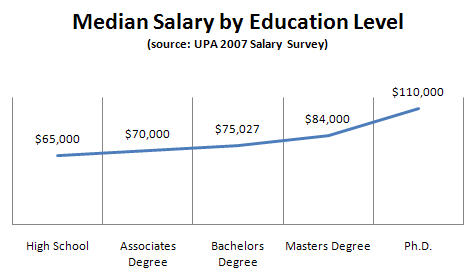
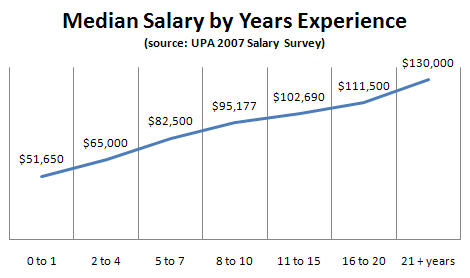
Some charts: there are linear relationships between salary and experience and salary and education level. Usability Salary by Education 2007 Usability Salary by Experience 2007

I don't know if there is any additive effect; for example, if you're me and have a Ph.D. and 12+ years experience, do you get even more? (That is, if you're not a hand-to-mouth consultant like me.)

There are interesting relationships between job title and salary. "Directorial" are the highest job bin reported, which is disappointing (in that I keep hoping there will be C-level design folks soon). "User Research" titles are the highest paid individual contributors. This makes sense to me if UR jobs are being filled by advanced degrees. I feel they should be -- statistics, experimental design, ethnography, strategic input -- these are not activities to hire a junior usability testing person to perform. And I think the software industry understands this more and more, based on the job ads I see. Usability Salary by Title 2007 Note that "usability" as a title component is now outpaid by "user experience." There were more respondents with the title "user experience practitioner" than for any other job title. This is good news, and appropriate; if a company understands that there is more to a good user experience than making it usable, then there is more involved in the job description and hiring criteria and it's also worth more. We're moving forward! (Even if women still lag behind.) Related to this, I'm personally interested in the chart of job "activities" practiced by the survey respondents. Usability testing is still way up there in frequency of mention in this surveyed pool, despite the shift in job titles. Design prototyping is close, but not at a par yet. I'm sorry to see this, since I don't think design should be done by non-designers and I don't think UX folks should be evaluating design produced by non-designers. I'm disappointed by how low quantitative activities and market research fall, but I assume this will pick up some steam as more senior quantitative user research folks are employed by UX departments. I'm especially disappointed by how low "requirements gathering" falls -- this being the number 1 cause of poor quality downstream, as found by many studies of root causes of software defects.

For a change of topic: In a sobering news story for those of us still trying to get design taken seriously as a strategic role, IT development salaries are projected to soar in the next year, well above what the data in the UPA survey shows. Read about it here.

Saturday, February 23, 2008

Brain Cloud

Kyle Gabler's home page charms me as much as his simple but fun and well-executed word association game: Human Brain Cloud. You play by typing in words you associate with other words, and he grows the network of associations on the fly. The graphs are pretty to watch, easy to explore, with great motion effects; and his page of stats on players is suprisingly extensive.

Also, I adore his cartoon art. :-)

Other viral, simple online games: the Free Rice game, Just Curious (answer a question before you can ask one), the ESP game (labelling images).

Monday, February 18, 2008

Colbert Bump for Books

I love this type of real world data analysis: Juice Analytics has done some data mining on book sales following author appearances on the Colbert Report, and finds that the more liberal folks get a bigger sales bump! Surprise!

Here is one of their graphs, normalized and aligned for when the authors so classified (by them) appeared and their change in sales figures inferred from Amazon rankings. They also cite an interesting academic study of whether used book sales cannibalize new book sales on Amazon, which finds they rarely do.

Sunday, February 17, 2008

Two Weird Videos: Geckos and Remote Viewing

Here are two quick strange items for the long weekend:

Why is a bug feeding a gecko? Altruism? Friendship? Some kind of symbiosis not yet understood, most definitely. For those afraid of bugs, this one looks like a piece of tree bark, nothing buggy about it. The gecko is green and attractive. Watch it here on the BBC site.

Remote viewing is a supposed ability to see things from a distance, sometimes as seen by another. It has been reportedly studied by the US military and CIA. Here is an interesting video study purporting to show it working under a controlled circumstance. I find it a bit distracting that the subject who performs the feat is impressed and surprised, too, but it is still fun to watch.

Sunday, February 10, 2008

Consumer Design is Easy?

Steve at tingilinde sent me a link to David Pogue's NYT piece on design flaws in digital picture frames. From the intro section:

"We learned deeply a few hard lessons," he said. "Consumer electronics is a very difficult business. It's difficult to get it right." ...

Maybe this particular guy is rightness challenged. Or maybe he meant that getting things right takes time, money and effort, which is true.

But it sounds like he's saying that it's hard to know what's right in product design, and he'll never convince me of that. A ten-year old could have identified the design flaws in the frames I tested this week.

I don't agree on all points -- Some of the design flaws he identifies are tricky "icing" on the consumer cake that it takes a clever designer and a budget to go after: like having a little pocket on the frame back for a remote control. Nice to have, but not mandatory, even for a good consumer experience.

But getting things right does take time, money, and effort; as well as "big-picture" design management of the sort lacking at all but few companies. Someone needs to remember the people you're designing for, and to represent that by stepping backwards out of the details of schedule and bug counts and putting into perspective: "...Hey, can your Grandfather use this for the baby pictures you're sending?" It's the responsible executive's position to make the call to change the schedule to accommodate the experience-breaker issues that will threaten you in a crowded market, and to champion processes like in-home user testing as part of the design cycle.

Kodak, who comes out pretty well for their frame design in his piece, hires interaction designers, although I don't know if they have a Chief Design Officer. So why hire an interaction designer instead of, say, a 10-year old? 10 year old finds fossil. Because most 10 year olds aren't up to arguing with project managers and engineering schedules, and generally keeping their head both in the gritty details and well outside, for that important user perspective.

Pogue's piece is still good and also funny. As a former TiVo designer mystified by the crapness of most "consumer" electronics design, I especially liked this one:

Question 10: Which is the right way to label the jacks and buttons: White lettering on black (or vice versa), white on white (Momento), or with no text labels at all (eStarling)?

We did think of this at TiVo (of course), but I still wish we had added a little LED flashlight dongle to the back, since there's always bad light at the back of your cabinet!

Thursday, February 07, 2008

Genetics and Environment: Are You Depressed?

A good, clear article on the role of genetic predisposition vs. upbringing and occurrence of depression lives at Psychology Today in The Identity Dance. Although there are genes that may suggest a higher chance of developing certain mental illnesses, including depression, your upbringing has a lot to do with how likely you are to succumb during trigger events.

The results were striking: 43 percent of subjects who had the short genes and who had experienced four or more tumultuous events became clinically depressed. By contrast, only 17 percent of the long-gene people who had endured four or more stressful events wound up depressed—no more than the rate of depression in the general population. People with the short gene who experienced no stressful events fared pretty well too—they also became depressed at the average rate. Clearly, it was the combination of hard knocks and short genes that more than doubled the risk of depression.

... Moffitt and Caspi have found a similar relationship between another gene and antisocial behavior. Abused and neglected children with a gene responsible for low levels of monoamine oxidase in the brain were nine times more likely to engage in violent or other antisocial behavior as adults than were people with the same gene who were not mistreated. Finnish scientists have since found similar effects on genes for novelty seeking—a trait associated with attention deficit hyperactivity disorder. Children who had the genes and who were also raised by strict, emotionally distant parents were much more likely to engage in risky behavior and make impulsive decisions as adults than children with the same genes who were raised in more tolerant and accepting environments.

The saddest part of the article is the alcoholic monkey, though.

Sunday, February 03, 2008

Spoon Bending Parties

I had no idea people were still bending spoons with their minds, but apparently so-! Uri Geller was famous for this in the 1970ies, and is generally believed to have been a fraud. But now there is a new craze for this activity, with a lot of people claiming you too can bend your cutlery into very weird shapes with the power of concentration -- ideally, in a party atmosphere.

Jack Houck, a former engineer, hosts "PK" parties in which large groups of people bend ordinary cutlery. He has some instructions and a short video up on his site. His parties are covered in an article with good photos of twisted fork tines at Mind-Energy.com. One of the attendees, Dean Radin, succeeded (and wrote about it) and has even been invited to speak at Google. (Gratuitous connection to the software industry that you didn't expect...!)

Also on Mind-Energy, reader and bender Shannan Rohde posts video, instructions, and photos of himself bending a sad little spoon.

As usual, I wonder why people aren't doing more useful things with this skill. Lack of imagination? Too much crappy cutlery in their lives?

I gave it a half-hearted shot, but haven't succeeded yet. If you do succeed, post me a note? Or if you hear of a PK party nearby, invite me along. Perhaps I lack the right party mood, post-Superbowl!

Sunday, January 27, 2008

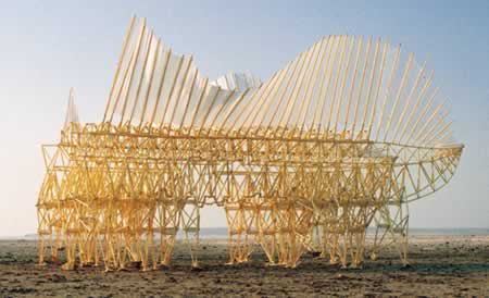
Theo Jansen's Strandbeests

One of the excellent presentation's at SolidWorks World 2008 was the keynote by Theo Jansen, maker of strange tube sculpture creatures that walk on the sand, powered by wind. The man is brilliantly mad, and his obsession and philosophy are very interesting to see -- apparently for much of the geek world, given his press coverage in recent years (see Wikipedia links).

Worth the videos at TED 2007, and the explanation here on YouTube from ArtFutura for how they walk can be viewed in this Physics Engine demo of a model of one walking over obstacles.

Tuesday, January 22, 2008

A Look Inside SolidWorks

SolidWorks World, the annual user convention for SolidWorks CAD users, is going on now in San Diego. I'm consulting with the company, and have been doing usability research out here. (Rather strangely, I appeared in a photo posted by one of our blogger users here. The gentleman I am talking too was just made extremely happy by a brief chat with the founder of SolidWorks, who remembers his name every time he sees him.)

SolidWorks' latest release featured some major changes to the UI, which caused a bit of a ruckus among the experienced users. Matt Lombard, author of the SolidWorks Bible, is one of the ruckusers. Along with posting pictures of me (hah), Matt also just posted a YouTube interview with one of the best guys at SolidWorks and one of my clients there, Jim Wilkinson. To see some inside scoop on how the company works, you can watch it on YouTube linked from Matt's blog.

A final note: It's a credit to SolidWorks that someone like Jim exists there and has authority. Not only is he a good manager, but he's universally well-respected AND well-liked by everyone who meets him, internally and externally; and he's active in the user forums answering customer questions on top of his ever-expanding day job. Jim saw a need for a usability team long before most CAD companies found out such a thing exists (for the rest of them, that was only 2.5 years ago). Kudos to SolidWorks for having such great employees and managers. It explains a lot about the product success.

Saturday, January 19, 2008

Tips for Solo Travelers

An unsolicited link sent to me by another blogger, thinking it might be of interest, and it was-! Don't you love the Internet? Here are 40+ Safety Tips for the Solo Traveler, with special ones for women travelers. I admit to not having thought of or heard of some of these myself. For instance, don't hang the sign outside your hotel door ordering a breakfast for one at 7am; this may advertise to unsavories that you're in your room alone and willing to answer the door at that hour without checking who's there.

The great thing about lists like this, that make you really paranoid, is that you can decide how far you want to go down the risk-avoidance path, and not go that far. Or, maybe, go there if you're in a nasty-looking hotel.