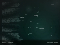
There seems to be an explosion of information visualization artwork suddenly, I suppose because the tools to create it are ripe and available. (Data is available as well, especially if you work inside a Yahoo or Google, but that's not even necessary.) But, curmudgeonly, I'm irritable at it, because so few of them feel polished into usefulness or offer useful interactivity. Infovis needs usability (and evaluation), too, like other design artifacts.
Other observations on infovis displays of recent months: time series data is the current black of infovis -- showing changes over time, usually in animation format. Perhaps it was last season's black, because it's everywhere in the current crop of visualizations, including those on Yahoo's design site (traffic issues in LA, trips -- similar to the beautiful one in processing of airline flight patterns). This makes tremendous sense -- as humans we live in 4 dimensions and it's nice to get information about that 4th one. However, just because it's visible, doesn't make the story it's telling useful. Sometimes you want to take an insight from the time progression you watched and flatten it back into 2 or 3 dimensions to get the story summarized in a form that's useful without it disappearing in time. I don't see this option to convert easily from "playback" to flat summary of a time window in most time series animations, and would often like it. (Bar charts that move over time aren't what I'm talking about, because those are still moving!) Notice that this request asks for not just visualization, but actual interactive tools to play with the data and explore it!
The other thing many folks are exploring, and I think less successfully, is text data. Unstructured text offers a few obvious and old hooks: context around specific words and word or phrase frequencies. Beyond that, things get hard fast, because you have to think about parsers or other complex data mining models. Text vis is the ultra-violet of infovis. There are a couple projects on Yahoo's page that inspect word use at the basic level: the pronoun context display, and the answer cloud frequency display (why are piercings and hysterectomies showing up so often? Is this an artifact of the time window she looked at or something about the user populations issues?).

Regardless of the curmudgeony post, it's nice to know where Joy Mountford is these days.
I'm with you -- visualization gadgets that don't let you dig into anything and are just animations or static views don't do much for me. I don't see how they're going to yield any insight unless you can play with filtering and slicing the data.
ReplyDeleteWhen fooling around with visualizing data of my own the gadgets aren't useful to me without a way to go from some blip or other thing that jumps out of me in the "visualized" view to the raw data so I can see what was going on there.
Of course, I imagine the folks doing most of these visualization demos from places like Yahoo! aren't even allowed to permit access to more detailed data.
Hey Ken,
ReplyDeleteHave you looked at Many Eyes at IBM?
Their whole agenda is exactly this -- allow people to look at a visual and then play with the data themselves. No animations, but they're adding chart/graphics types all the time.
It's at http://services.alphaworks.ibm.com/manyeyes/home