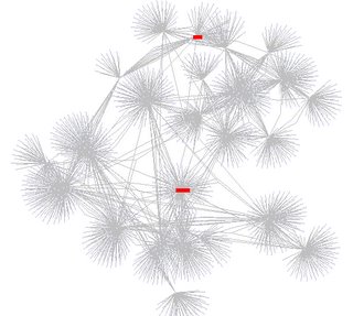
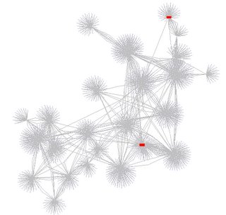
A year ago I did a survey on memes on LiveJournal that garnered a whole lot more responses than I anticipated. I presented some data from that survey at an informal workshop last year at the CHI conference, and revisited the same data again a year later (this week). Here are two pictures I generated of the friends' lists of 222 people, with the same 2 people highlighted in red in 2005 and in 2006.
2005:

2006:

I believe the latter one shows less network connectivity. I have some stats to support it. Stay tuned...
PS. I used Jeff Heer's prefuse toolkit to make these pictures.
No comments:
Post a Comment